A few years ago, researchers at MIT confirmed that fonts impact our emotions when reading. A bad font can make us unconsciously frown, while a good font can make us feel good.
Last week I decided to conduct my own experiment to see how much impact fonts and font sizes have on reader engagement.

Experimenting With Fonts
First off, I wanted to see which font generated the most clicks from my content. Using VWO, I tested three different fonts; Arial, Georgia, and Verdana.
Arial

Georgia

Verdana
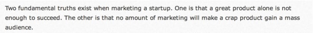
I anticipated that Georgia would be the most engaging font. After all, Georgia is used by many of the most ‘readable’ websites, such as Medium.com and Signal vs. Noise. I expected Verdana would perform poorly, as… well, it’s a bit ugly.

While I was correct in guessing that Georgia generated the highest rate of click engagement, I was wrong about Verdana. In fact, Verdana out performed Arial by 29.1%.
Of course, not all clicks are created equal. What if all of the Verdana readers are clicking to get away from the ugly font?
Nope. Using heatmaps and click maps I was able to compare what people were clicking on. With Verdana, 5% of clicks indicated that the reader had lost interest, while this number was around 13% with Arial.
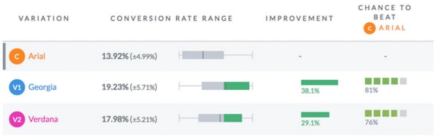
Verdana vs. Arial

We found that the intensity of clicks on the Verdana and Georgia variations were higher further down the page than with Arial. This suggests that people were reading for longer on the Verdana and Georgia variations.
So, I changed VentureHarbour.com’s font from Arial to Georgia. It’s too early to come to any hard conclusions, but I’ve noticed that our bounce rate and average time on site have both improved by a noticeable margin.
Experimenting with Font Size
After confirming that Georgia was the best performing font for this site, I wanted to know what size the font should be to provide the best readability and engagement.
Logically, I expected the larger the font was (until a point), the more readable it would be.
Wrong, again.

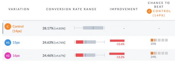
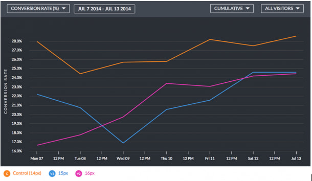
First I tested 14px vs. 15px vs. 16px. Using the same methods outlined above, it turned out that 14px generated the highest level of engagement.
Note: I also increased the line height by one pixel for every pixel increase in font size.
This was surprising, as I’d previously read studies on how larger fonts increase emotional and attention cortical responses. Anecdotally, many websites that are considered highly readable are using fonts over 20px in size.
To double check the accuracy of my results, I ran an identical experiment testing 10px, 14px, 18px and 21px.
Again, 14px won.
To me, this suggests what every experienced A/B tester will tell you. What works for one person, may not work for someone else. For this blog’s design, and the font we’re using, 14px seems to be the sweet spot.
Line height, line width, letter spacing, colour & more
There are so many other aspects to your font that affect how your readers interpret your content.
Right now, i’m running tests around line width to see how much impact this makes. While the results are inconclusive, it’s becoming clear that nothing is insignificant when it comes to choosing your font.
What impacts how we feel about fonts?
Our preference for certain fonts is partly due to our socialisation and partly due to objective readability.
In England, Serif fonts are often used by authoritative newspapers, while block fonts are more typical with tabloid newspapers.
In the United States, the font Helvetica is used in Government tax forms.
As such, we learn to associate certain connotations of trust or mistrust with different fonts.
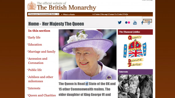
For example, the Queen’s official webpage uses serif fonts almost exclusively. But look what happens when we change these to fonts typically used by tabloids. Immediately, the content feels less trustworthy.

Then there’s objective readability.
Serif fonts like Georgia were originally used by the print press, as the serifs are proven to help the eye move from letter to letter faster.
When the first PC’s were launched, screen resolutions were low. Serif fonts had to be created using vectors, which just didn’t look right with the low number of pixels. So, designers began to using sans-serif fonts for web pages.
Since then, our screen resolutions have come a long way.
There is, of course, no such thing as a best font. However, some are better than others due to the connotations we associate with them, or their objective readability.