In many cases, the homepage will be the first thing users see of your brand. The big challenge with homepage design is you’ve got represent your entire business and offer an overview of everything you have to offer.
Talk about mixed messages.
With so much going on, it takes time to refine the perfect homepage design. It’s no wonder major brands change theirs so often – but the key is to make changes based on data, not intuition. Which starts with knowing what to test on your homepage.
So here are twelve killer homepage A/B test ideas – all back by research
#1: Sticky vs non-sticky Navigation
UX research: Sticky menus are 22% faster to navigate
With your navigation design finished, there one test I always recommend running on your homepage. A sticky navigation sits at the top (or side) of the browser window, remaining in view as users scroll.


A regular navigation simply sits at the top of the page or wherever else you decide to put it. Sticky navs can be particularly useful for modern homepages where users scroll through one message after the other.
Don’t simply go for the sticky nav, though, test it.
#2: Hero section copy and visuals
UX research: It takes users 50 milliseconds to form an opinion about your site
Hero sections often look simple (and arguably should be, visually), but there’s nothing easy about designing them. This is where you need to sum up your business and everything it has to offer in a handful of words and a limited set of visual elements.


That’s a lot to squeeze into one browser window.
Don’t expect to get it right first time. Test variations of your hero design with different messages, selling points and visual content. If you’ve got a CTA in your hero section, conversions are obviously one thing to think about – but there’s more. You can’t expect everyone to convert
You can’t expect everyone to convert but you want those who don’t to scroll down, not hit the back button.
#3: Primary CTA copy and position
UX research: Use multiple CTAs on a long page to chunk it up into mini sections


Whether it’s in your hero section, just below it or somewhere further down the page, your primary CTA is one of the most important sections of your homepage. By primary CTA I mean the first call to action that prompts users to complete the most important conversion/action on your homepage.
Once again, you’ll want to test different variations of your CTA copy but it’s also important to consider position. Where on your homepage is that CTA going to be most effective and where should it fit into the wider story?

In many cases, you’ll also want put additional CTAs for your primary conversion/action and place them at other positions on your homepage. Placement can make all the difference with conversion rates so test them out in different places.
#4: The order of your products, services or benefits
UX research: Appreciate that like any great sales pitch, there is an optimized order to the information presented
Should you lead with your most profitable product/service or your most popular? Which benefit do users really care about most as they’re scrolling down the page? Or could it be you’ll get better results by ditching the product/service section altogether and focusing on the core benefits with your homepage?
These are the kind of questions you can only answer with A/B testing.
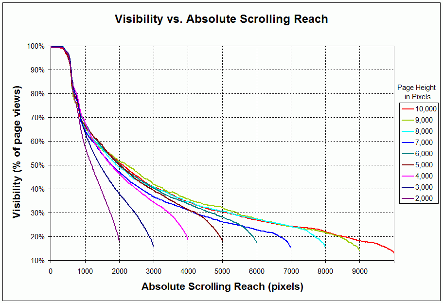
Also, consider layouts and how they adapt for mobile. A three column div quickly turns into one long vertical div, which changes the order of content as users scroll.
#5: Form length and position
UX research: Shorter forms don’t always mean more conversions
There’s a common misconception that shorter forms increase conversion rates. While this may be true in some cases, there are plenty of occasions where longer forms perform better than shorter variations. Once again, this highlights the importance of testing.
Position is also important with forms as well. As with CTAs, you’re not restricted to a single form design or location – just be aware that every addition/variation is another variable to test.
#6: Single vs multi-step form
UX research: Multi-step forms can increase conversion by up to 300%
We’ve been testing multi-step forms for the last five years and the results have been pretty conclusive. There’s still something of a science to designing multi-step forms that convert (which is why we came up with Leadformly) but there are two key lessons we’ve learned over the last half decade.
First, longer forms tend to perform better for the conversions that matter most. And, secondly, multi-step forms convert better still by solving the typical UX issues longer web forms can bring.
#7: Test your additional lead gen tactics

UX research: Interruptions are bad for UX, not necessarily conversions
Whether you’re using pop-ups, live chat widgets or any other kind of additional lead generation tactics on your homepage, always test them out. Sure, you might be increasing subscriptions but are you kissing goodbye to potential customers in the process?
Popups (and your other lead gen strategies) might work on parts of your site, but the homepage won’t necessarily be one of them.
#8: Social proof options

UX research: 63% of consumers indicate they are more likely to purchase from a site if it has product ratings and reviews
Social proof is a tried and tested method of installing trust in users. You have customer reviews, testimonials, customer badges, case studies, awards and many other kinds of social proof to choose from.
You probably don’t want to use them all. But you do want to test out different options to see which combination has the biggest impact.
#9: Final call-to-action
UX research: This CTA at the bottom of the page got 3x more conversions
Don’t let users reach the bottom of your homepage without a final call-to-action. If they make it this far, they clearly haven’t found what they’re looking for. Which means, unless you come up with one final offer that peaks their interest, the exit door is likely their next destination.
Once again, test the message and the copy rather than button colours and font styles. Try to pinpoint what offer will keep these users involved with your brand.
#10: Footer content
UX research: “The footer of your page is important! Users do pay quite a bit of attention to that area of your page.“
Aside from web forms, footers have got to be one of the most overlooked elements on a website. Again, this isn’t specific to your homepage only but it does bring an end to the user experience on your homepage for many users.
Don’t simply chuck a bunch of links and contact details in your footer. Be more strategic about things and test different variations.
Ask yourself what you expect users to do when they make it as far as the footer on your homepage.
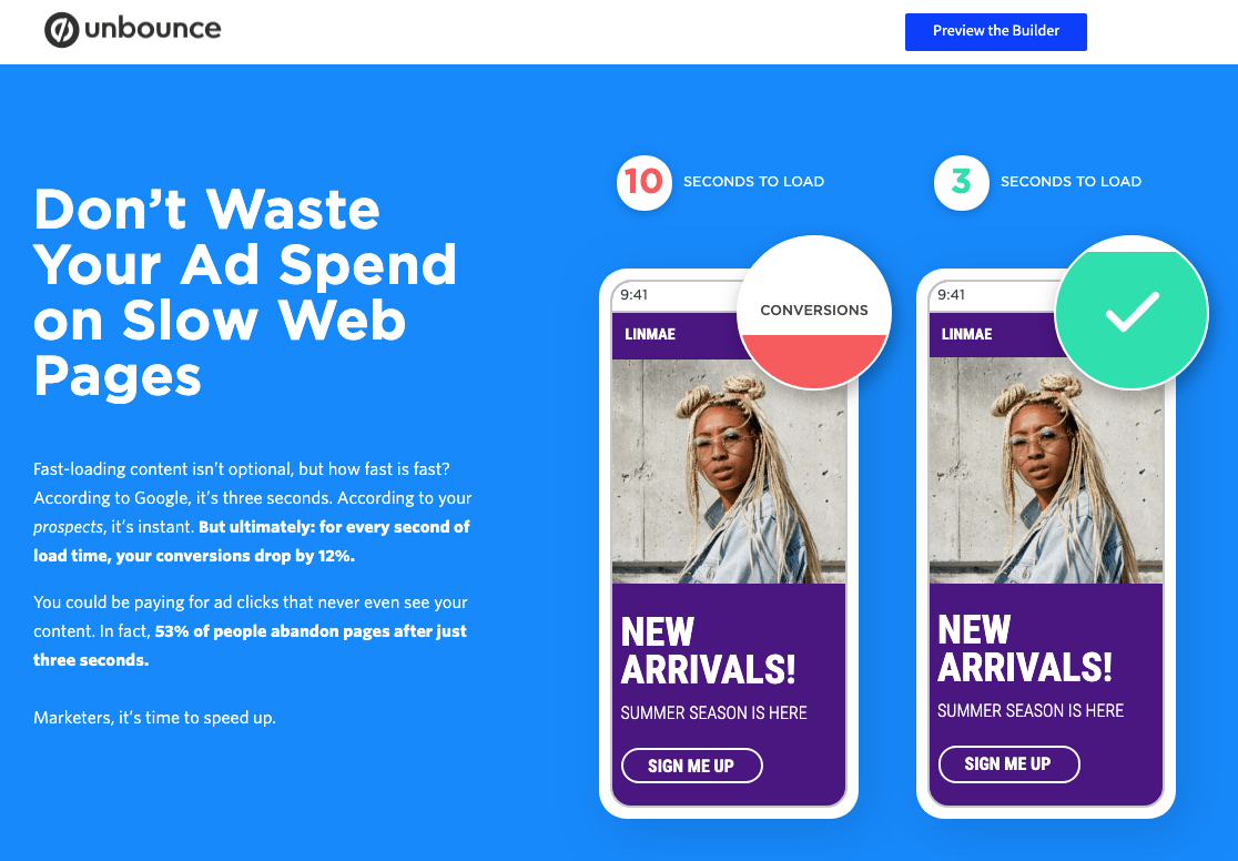
#11: Light-weight vs fully-featured
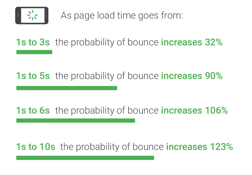
UX research: “No matter what, faster is better and less is more“
Google tells us pages should load in no more than 2-3 seconds – and even that’s pushing it from a bounce rate and conversion point of view.
The problem is, every image, animation, third-party plugin, embedded code and other resource adds bulk to your loading times. So test a version of your site without these against one with them. If those animations are losing more leads than they’re generating, lose them.
#12: Identify distractions and conversion killers

UX research: In the ResearchXL model, distraction falls under the heuristic analysis category
Distraction is a conversion killer and you want to remove every instance of it possible. The problem with distractions is you can’t measure them; they’re heuristic. Which means you’ll need to interpret your analytics data effectively to identify potential distractions and then test them, before removing anything.
The last thing you want to do is remove something you assume is distracting that actually contributes to conversions.
Test the things that really matter
A/B testing is no joke. It takes time and effort to get conclusive results from your tests, which only makes it more important that you choose the right elements to test. Changing a font style probably isn’t going to drastically improve the UX of your homepage or increase conversions. So focus on the areas that really make an impact on the experience visitors have and the actions they take.