
As the online consumer journey continues to get longer for most purchases, it’s increasingly difficult to get quick conversions. People do a lot of research before buying these days and the list of competitors fighting for their attention only grows.
Which means we have to work harder to instil that sense of urgency in people; something that gives them the itch to convert now, rather than walk away and reconsider things.
So today we’re looking at 19 examples of how you can add urgency to your landing pages and make it difficult for users to put the purchase off any longer.
#1: The countdown

Instapage comes with a countdown timer feature
The countdown is a classic urgency tactic – one that’s not always used to the best effect on landing pages. Essentially, there are two approaches to using a countdown timer. The first tells users they only have a certain amount of time to take action. Eg: Telling users they only have x-amount of time to sign up for your webinar.
The other approach is to countdown the start of something desirable, like an event or product launch. More on that second approach later.
#2: Scarcity
People don’t like missing out and this anxiety intensifies the desire to buy before it’s too late. So, if time itself isn’t running out, then limited stock can be the ideal way to push interested buyers over the edge.
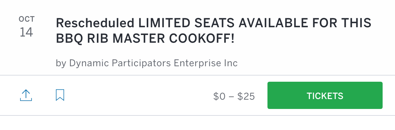 Whether it’s limited stock, limited tickets or whatever else, the fear of missing out drives people to buy now rather than risk waiting. This works particularly well for events or seasonal promotions where there’s a fixed date coming up (essentially a time limit) and scarcity to double up on the dose of urgency.
#3: Temporary deals
 If consumers hate missing out, there’s nothing that bugs them more than missing out on a good deal. Supermarkets make an absolute mockery of us by selling us things we don’t need – and all it takes is a special offer deal.
This tactic is great for purchases that involve a lot of thinking – e.g.: consumer electronics. The hesitation of buying the wrong phone, laptop or TV quickly disappears when a temporary deal comes along.
The same thing goes for things we buy regularly, like clothes, wine and accessories for other products (e.g.: camera lenses, car parts, etc.).
#4: Timing words
A more subtle way to create a sense of urgency is to use timing words in your CTA copy.

The obvious format is CTA + now/today but there are plenty of other approaches. In fact, our last example also uses timing words to reinforce the notion of a temporary deal: “Offers Ending Soon“.
#5: Temporary free access
I’m not talking about free trials that users can sign up to at any time here. I’m talking about a set window where people get free access to your product/service. Like the free weekends Sky TV occasionally offers or this free week from Findmypast.co.uk.

The urgency comes from knowing this might be the only chance for users to try something out before potentially buying it. This is ideal for brands who don’t generally offer a free trial.
#6: Promise quick results
Another subtle way to add urgency to your landing pages is to promise quick results. By making it clear things will quickly improve by using your product, you’re making it equally clear that the sooner they sign up the sooner things will change.

This is particularly effective for platforms designed to improve business performance – like the Crazy Egg example above. Just make sure you can live up to your promise, or you’ll have a bunch of unhappy customers and negative feedback on your hands.
#7: Coming soon

Every major game release, new iPhone, relentless Marvel sequel and countless other products hit the market to huge demand. The coming soon phenomenon one that leaves consumers more agitated than anything, literally counting down the days until they can click that buy button.
If you can command that kind of anticipation before releasing a new product, use it to your full advantage.
#8: Reservations, pre-orders
When you’ve got a product that drives people crazy with anticipation, offering reservations and pre-orders can keep everyone happy. You get a bunch of conversions piling up before your product even hits the shelves (so to speak) and consumers feel reassured there’ll be one with their name on it when it finally does get released.

There’s nothing worse than waiting for that all-important release date, only to find out the stocks run dry in minutes or the website crashes. Consumers won’t want to take this risk and pre-orders will be hard to resist in the build-up. This is especially true if you’re the retailer of a product rather than the manufacturer.
#9: Booking phases
When you’re selling tickets for a major event, putting all your tickets up for grabs at the same time seems like the obvious choice. But Glastonbury used to sell tickets in phases and FIFA still does the same for the World Cup and other global football events.
Splitting sales into different windows does two things. First, it means there are fewer tickets on sale for each window, which means buyers feel the urge to secure one as quickly as possible. And then you have multiple rounds of that anticipation working in your favour as well.
#10: Use the calendar

It’s amazing how much the calendar influences our buying decisions. We buy new clothes as the seasons change, pay double for chocolates and roses on Valentine’s Day and lose all sense completely at Christmas.
Calendar events are one of your best weapons when it comes to creating a sense of urgency with consumers. We see this in summer sales, back-to-school promotions, Black Friday and all manner of calendar events encouraging us to buy before it’s too late.
#11: Show delivery estimates
The worst thing about buying products online is having to wait for them to arrive in the post. Showing users you’re working hard to reduce the waiting time as much as possible is a big deal when it comes to choosing who to buy from.

Be as specific as you possibly can with your delivery time estimates – and make sure you live up to them. GiffGaff tells customers ordering a new phone from its website that they’ll be holding their new handset the very next day, as long as they place their order before 10pm Mon-Sat and 7pm on Sundays.
Not only is that about as good as you can expect from a delivery service (it’s also free) but it tells users they only need to click that button NOW to get that new phone in their hands the following day.
#12: Loss aversion
Loss aversion is a psychological phenomenon where the fear of losing something is greater than the sense of gaining something of the same value. Essentially, loss aversion is why we’ll act desperately to avoid losing £10 but act with far less intent to gain £10.

Which means, by giving something to users for nothing, the prospect of losing it makes them more likely to convert. It could be a free bet, a discount coupon or a free product if they place their order now. That “if” creates the sense of urgency by making it clear that not converting now means they’ll lose their freebie, even though they never really had it.
#13: Offer protection

Everything we value in life and business is constantly under threat. Our health is at risk from the latest cancer-causing foods, our jobs are under threat from artificial intelligence and our businesses are never far from being outdone by our closest rivals.

In a similar vein to loss aversion, we naturally want to protect the things we already value. We hate the idea of Google algorithm updates hurting our current rate of traffic or the notion of losing customers to a rival business. And we’ll take action to protect the things we hold dear from the things we fear most.
#14: Stop what you’re doing
Human nature is a funny thing. No matter good or bad things are going for us we always crave for more. Even the most successful business owners want their empires to grow bigger and dominate their respective market. Even the most strict dieters kick themselves when they discover their favourite fruit is packed with the wrong kind of sugar.
There’s nothing worse than finding out we’ve been doing something wrong all these years without even knowing it. Worse still, can be knowing we’re doing something wrong and having no clue how to put it right.
This is where the Stop what you’re doing approach works so well. Essentially, you tell users to get their act together, stop hurting their own interests and provide the solution in one powerful CTA. Where’s the urgency? Well, the sooner they “stop” and convert, the sooner they’ll put an end to the harm they’re causing themselves or their business.
#15: The bandwagon effect

Not long ago we ran an article looking at how you can use the bandwagon effect to boost conversion rates. The bandwagon effect is where we make decisions based on the actions of others. For example, when you hear about the leading brands in your industry all making success of a new technology trend, it’s hard to resist following in their footsteps.
Last year’s chatbot rush was a perfect example of this in action.
The same thing happens when a new investment opportunity arises. Investors want to get in quick and see the best return on their investment before everyone else jumps on the bandwagon.
For more info on how to use the bandwagon effect to boost conversions, check out these 7 ways to use the technique (with examples).
#16: Exclusivity

Exclusivity is a powerful thing when status counts or special benefits are up for grabs. You’ll often find business owners want the enterprise version of your software, even if a cheaper package is enough for them -purely because they think their business should be using top of the line software.
As for VIP accounts, don’t just reward members with benefits; reward them with prestige. Put a VIP icon on thier profile pictures for everyone to see. Those who don’t have one will feel the constant itch to upgrade their accounts – not only for the better features but also the status.
It might be superficial but it works.
#17: Visual urgency
Using visual elements to create a sense of urgency brings us deep into the psychological side of web design. I don’t want to go too far into this because obsessing over the psychological impact of colours and font choices will be counterproductive.

Your visuals should at least reinforce the urgency your copy is trying to create, though. Now TV promises to give users access to all of the TV shows they want and nothing else, so they never miss out on their favourite shows again. The visual content reinforces this by assigning bold colours to different types of TV and piling up the free passes that are only a click away.
Do you want to keep missing out or click for instant access right now?
#18: Personalisation
Personalisation uses everything we know about a user to help us deliver a message that resonates with their needs/wants. For example, Airbnb features homes, experiences and recommended destinations based on your previous activity.
When it comes to landing pages, we aim to deliver a message that’s as relevant as possible to the ad a user clicks – which is why every campaign should have its own unique landing page.
However, the latest suite of personalisation tools allows us to deliver different messages to audience segments. For example, you can offer repeat visitors a one-off discount to make the final commitment. Or, you can create a custom message for users based on the query they typed into search. So, let’s say someone types in, “most reliable web hosting provider”, you can make reliability and customer care the focus on your message.
For this kind of personalisation, check out VWO, Adobe Target, Optimizely and similar tools.
#19: Be problematic
One of the most fundamental techniques in landing page messaging is to focus on the problem rather than your product. Much like the Stop what you’re doing approach, this plants the seed in people’s minds that something isn’t right.
And when there’s a problem, we tend to want to fix it.

If I tell you Leadformly builds intelligent and interactive forms, you’re not really going to care. If I tell you this will generate more leads then maybe you might start paying attention. But if I ask whether you’re “Not getting enough qualified leads from your website?” then you’re automatically questioning the issue yourself.
Chances are you’re not getting enough qualified needs and you certainly wouldn’t turn down the chance of getting more. Suddenly the notion of intelligent and interactive forms that generate more leads is much harder to resist.
Walk away now and you’re missing out
This is the message you want to leave in people’s minds when you use the techniques we’ve looked at in this article. You already know these users are interested in what you’ve got to offer but the aim is to get them converting now, rather than walking away and potentially choosing one of your competitors.
Most landing pages and calls to action will use a combination of these techniques to tell users now is the time to act. Try not to be too aggressive with your approach but feel free to make it clear to people that they’ll be missing out on a one-off discount or some other kind of incentive if they don’t commit right now.
You’ll be amazed by the results this can have.
FAQ
Combining multiple urgency tactics—such as countdowns, scarcity messaging, and timing words—creates a layered psychological effect that’s more persuasive than relying on a single method. The article demonstrates that the most successful landing pages use at least two complementary urgency techniques simultaneously, such as pairing a countdown timer with limited stock notifications.
The key is using authentic scarcity and time constraints based on genuine business conditions rather than artificial deadlines. For example, offering temporary free access or pre-order options leverages real limitations in your product availability or service capacity, which feels honest to customers whilst still motivating immediate action.
Specific countdown timers and reservation-based messaging outperform vague urgency language on landing pages because they give visitors a concrete reason to act now. Rather than saying ‘limited time offer,’ displaying an actual countdown clock or ‘only 3 spots remaining’ creates measurable pressure that drives higher conversion rates.
Yes, WordPress landing pages can implement urgency through countdown timer plugins and dynamic content blocks that display scarcity messages and temporary deal notifications. Most modern page builders like Elementor and Divi include built-in countdown widgets, making it straightforward to add urgency elements without coding.
Countdown timers should typically run between 24 to 72 hours to balance believability with conversion pressure—shorter timers feel manipulative whilst longer ones reduce urgency impact. The optimal duration depends on your sales cycle; B2B services may need 7 days, whilst e-commerce flash sales work best with 24-48 hour windows.
Scarcity limits availability (e.g., ‘only 5 spots left’), whilst urgency limits time (e.g., ‘offer expires Friday’). Both drive conversions, but scarcity works better for high-value offers and services, whereas urgency messaging is more effective for time-sensitive promotions and product launches.
Yes, result-focused urgency messaging like ‘see results in 7 days’ or ‘get certified in 30 days’ creates urgency by emphasising speed of transformation rather than just time limits. This approach works particularly well for SaaS, courses, and coaching services where the customer benefit is tied to rapid outcomes.


