Running a successful conversion rate optimisation (CRO) campaign is easier said than done. Statistical significance can be a challenge in itself and this doesn’t guarantee you’ll even get a positive result when you get enough data to draw conclusions.
Arguably, the most difficult part about conversion optimisation is pinpointing what to test.
So, in this article, I’ve got 10 excellent CRO case studies you can replicate to increase conversions on your own website. I’m not just going to rattle off a bunch of stories about optimising CTAs, though. Instead, I’ve got 10 case studies that each address different aspects of business websites – from web forms to pricing pages and, of course, CTAs – so you can apply each of these success stories to your own site.
#1: How Venture Harbour increased conversions by 743% with multistep forms

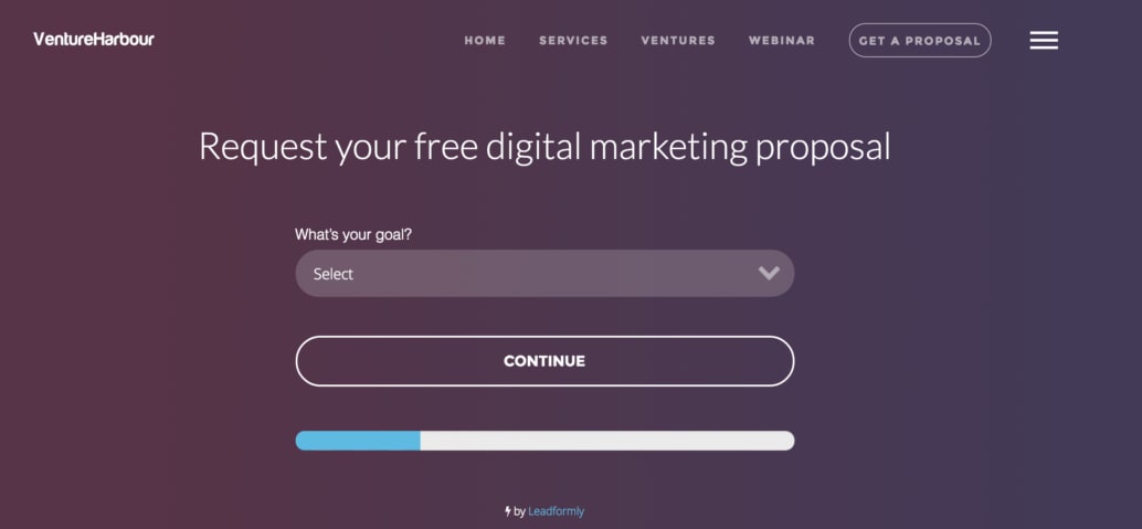
Goal: Increase web form conversion rates.
Test: Ongoing form analytics, tests and optimisations.
Results: Conversion rates increased by 743% on the Venture Harbour enquiry form (from 0.96% to 8.1%).
We may as well start with our own case study, showing how we managed to increase conversion rates on our website through form optimisation. We’re not just being biased here (maybe a little) but the results from this ongoing CRO campaign have been incredible.
It all started when our CEO, Marcus Taylor, inadvertently started experimenting with multi-step forms on one of our previous ventures. The nature of WhatIsMyComfortZone.com meant he couldn’t reduce the number of fields on the website’s primary form to an acceptable number.
The site simply couldn’t function without getting detailed information from users.
This led Marcus to the multi-step format, which guides users through a series of questions, one at a time – rather than bombarding them with a long form to fill out. He was so impressed with the performance that he decided to test it on other ventures, including our own website.
The results were even more remarkable.
After implementing multi-step forms on the Venture Harbour website, using a tool called Leadformly, we saw conversions increase by more than 300% within the first week.
We weren’t done yet, though.
By using Leadformly’s form analytics tools, we were able to see where users were running into problems with our forms and test new variations to remove issues getting in the way of conversions. To this day, we continue to measure web form performance and run CRO tests to refine our designs this way.
Almost five years later and we’ve increased conversions on our website from 0.96% to 8.1% – an incredible 743% increase!
Read the full CRO case study here.
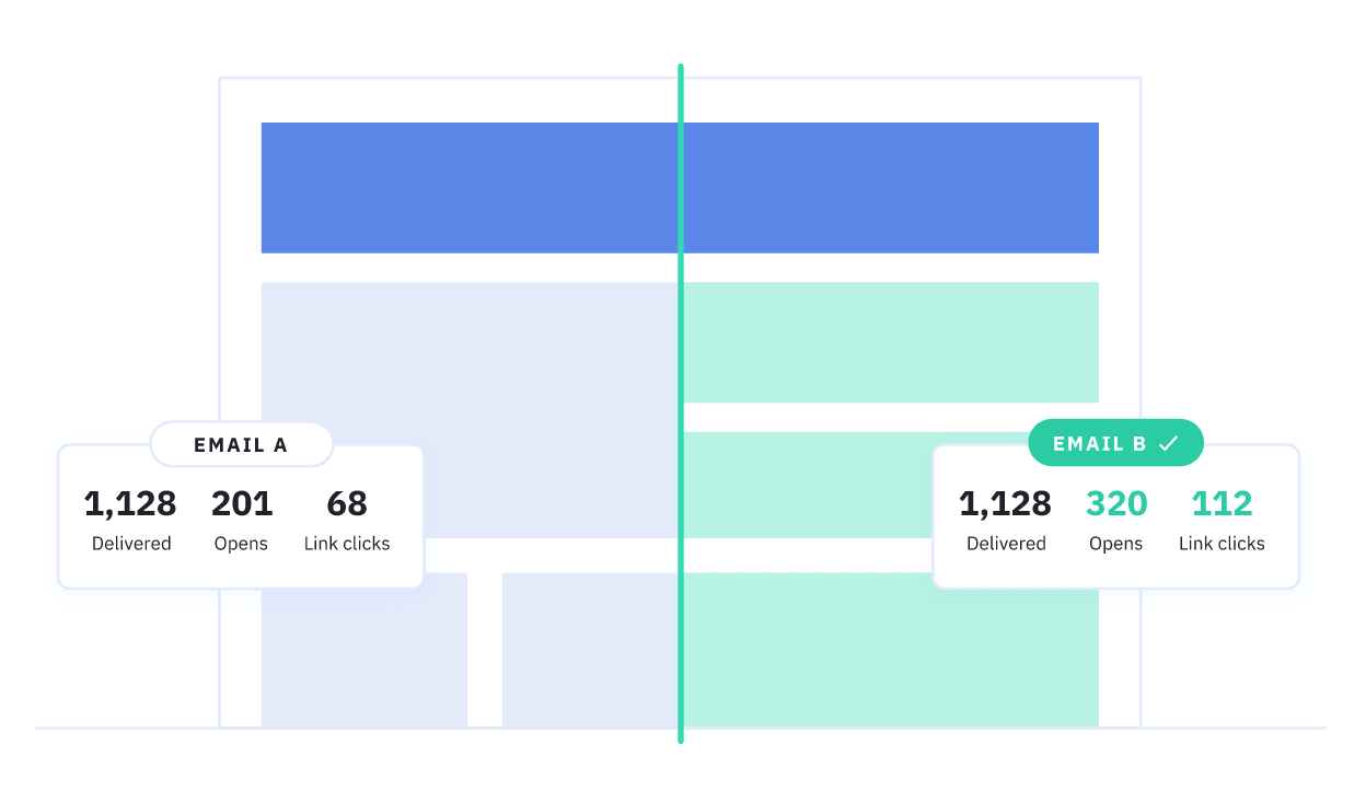
#2: How DashThis turned 50% more free trial users into paying customers

Goal: Increase the number of free trial users who buy into the paid version of its platform.
Tests: Simplify the onboarding process. Identify problems preventing users from setting up the software quickly and getting results before the trial ends.
Results:
- 50% increase in free trial users turning into paying customers within 10 months.
- Increased customer satisfaction by 140%.
- New feature opportunities identified.
Next, we have this case study from CRO software provider Hotjar, which shows how DashThis used the platform to turn 50% more free trial users into paying customers over the course of 10 months.
DashThis allows marketers to create automated marketing reports and it’s a really great tool. The problem was, most of the people signing up to its free trial were encountering problems that were preventing them from setting up and using the tool correctly.
“One of the particular challenges DashThis was facing was the onboarding process. When a user starts a free trial, it’s important that (s)he learns how to use the tool as quickly and easily as possible. The first two steps of the onboarding funnel (adding an integration and a data source) seemed way harder to complete than the others.”
DashThis turned to Hotjar for help, using the CRO tool to look at user sessions and see where they were running into problems. This allowed the company to pinpoint a number of minor design issues that were stopping users from getting to grips with the platform – things like buttons not being bold enough and confusing layouts.

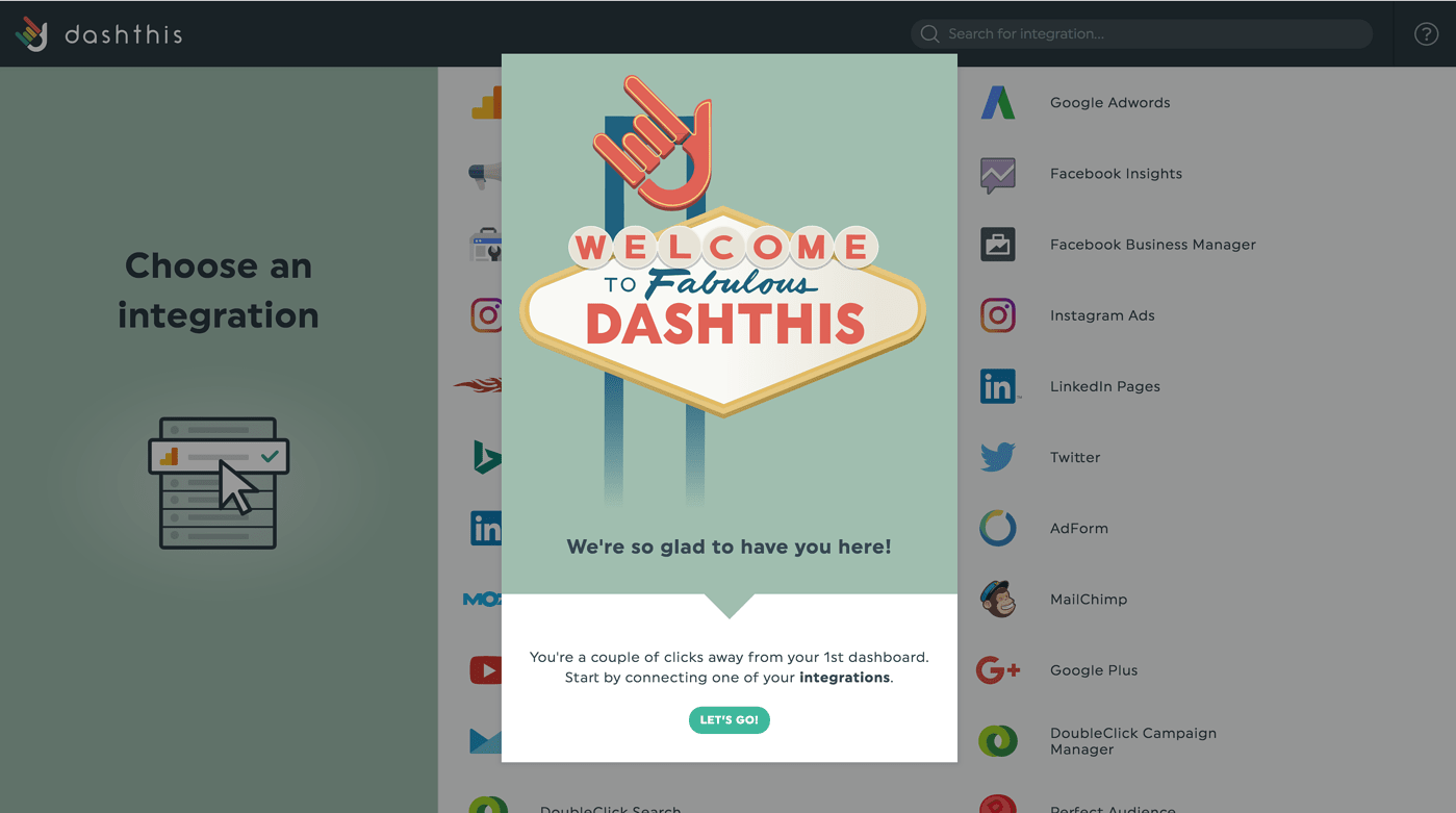
With these insights, DashThis was able to tweak the design of its software to improve the user experience, remove these friction points and identify new feature opportunities – like adding pop-up hints and tutorial videos to guide users through the setup process.
The results speak for themselves: 50% more free trial users were paying up for the software and customer satisfaction was up by 140% within 10 months of starting this CRO campaign.
You can read the full case study here.
#3: How Avid increased transactions +34% with A/B testing

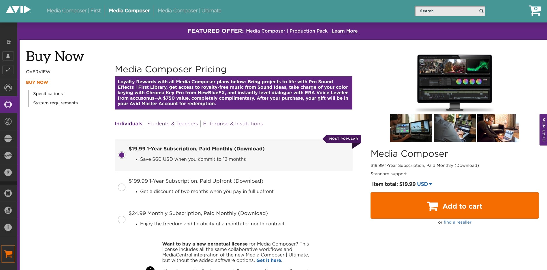
Goal: Avid wanted to increase conversion rates and increase customer loyalty by making special offers more prominent on its site.
Test: Test placement of special offers, design of CTAs and CTA copy.
Result: Conversions increase by 34%.
This next CRO case study comes to you from AB Tasty, showing you how multimedia content creation platform Avid increased the percentage of users who bought into its special offers.
Avis ran a relatively simple A/B test with one variation using purple banners to highlight special offers going against a second variation where they were presented in bold as a bullet point under each purchase option.
Ultimately, the first variation with offers highlighted in bold came out on top and Avid earned itself a 34% boost in conversions.
#4: How comScore increased lead generation +69% by testing customer testimonials

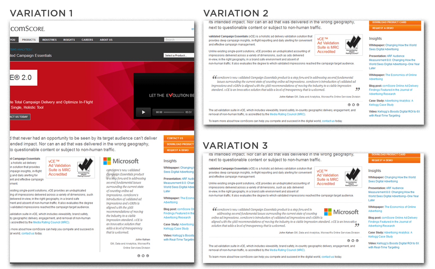
Goal: Increase conversion rates by using social proof on the comScore homepage.
Test: A three-way multivariate test pitching different customer testimonial designs and placements against each other.
Result: Conversions increase by 69%.
Optimizely offers up this next case study, showcasing comScore’s CRO campaign to boost conversion rates on its homepage by utilising social proof. More specifically, the company’s hypothesis was that putting a greater emphasis on customer testimonials would have a positive impact upon conversions and it devised a three-way multivariate split test to try out different testimonial designs and placements.
Variation 1 featured a vertically-aligned testimonial, alongside product descriptions, with the customer’s logo prominently showing at the top. Variation 2 placed a horizontal testimonial below the product descriptions without a logo and Variation 3 also used a horizontal placement below the product description but, this time featuring the customer logo.
Variation 1 came out on top with a +69% increase in conversions while Variation 3 achieved a +30.5% increase ahead of Variation 2 with +14.8%.
You can read the case study in full here.
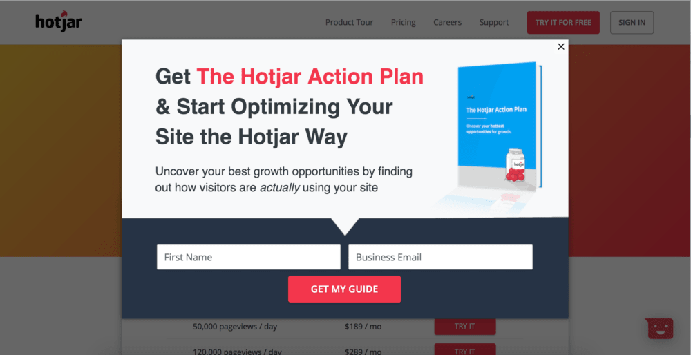
#5: How Hotjar generated 408 leads in three weeks by testing pop-ups

Goal: Capture leads from users who are about to leave the Hotjar’s using exit-intent pop-ups.
Test: Place an exit intent pop-up on the pricing page for first-time visitors who look like they’re about to leave the site.
Results:
- 408 new leads in the space of three weeks
- 60-70 new users per month from the pop-up
- Converted 3% of those leads into paying Hotjar customers
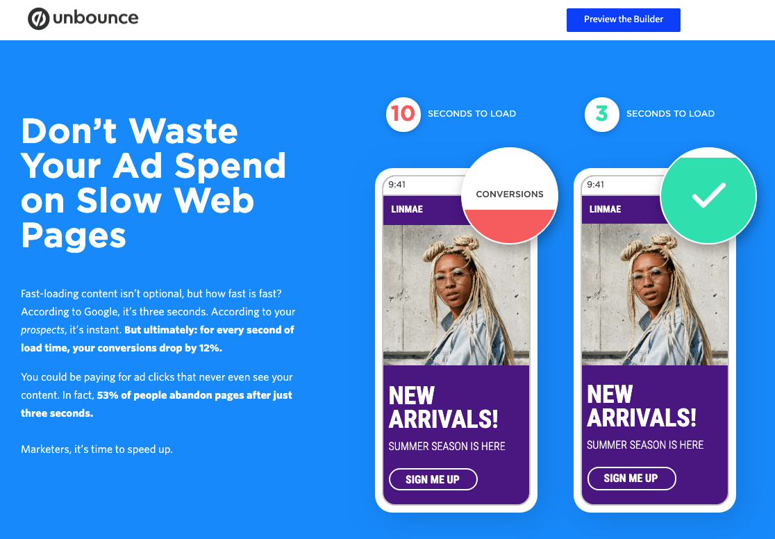
Now it’s time for a case study from Unbounce, showing how it (somewhat ironically) helped CRO software provider Hotjar increase conversions on its website. While Unbonce is best known as a landing page builder, it comes with a handy feature that uses exit-intent pop-ups to try and capture leads from visitors who are about to leave your website.
Hotjar wanted some of this action.

So it implemented an exit-intent pop-up on the pricing page of its website and set it to only trigger for first-time visitors who look like they’re about to leave the site – all of which is incredibly easy to do with Unbounce.
When a user looks like they’re about to leave, they’re greeted with a pop-up offering them the Hotjar Action Plan, which promises to help them uncover their “best growth opportunities” by finding out how visitors are using their website.
It’s a classic example of free content in exchange for an email address that allows Hotjar to turn outgoing traffic into leads and chase them up, rather than simply letting them go.
The test worked a treat, too. The pop-up converted 408 visitors in its first three weeks and is now generated between 60-70 new leads per month – all from visitors who would otherwise leave Hotjar’s website. Most importantly, 3% of these users end up converting into paying Hotjar customers, which equates to roughly two new customers every month who’ll continue to pay a monthly fee for using Hotjar’s software.
#6: How Evernote increased user retention by 15% with UserTesting


Goal: Drive down the cost of user testing and gain insights that will boost customer retention.
Test: Evernote turned to UserTesting to conduct user testing at scale.
Results: A 15% increase in customer retention and UserTesting remains a part of Evernote’s product development cycle, to this day.
This case study comes to you from UserTesting, an online platform that allows brands to tap into a community of user testers and gain valuable insights. Evernote had conducted its own user testing programmes in the past but the process was proving too time and cost inefficient.
This led the company to UserTesting, which has a pool of participants ready to call upon.
“In addition to hearing the study participants as they narrate through their actions and decisions, Evernote product managers and designers are able to watch where the testers’ hands are physically tapping, swiping, and even resting. This was especially helpful on Android since multiple devices run on the platform. Because the device type had an impact on the experience, the team needed to be able to identify and fix ergonomics issues before new products were released to the public.”
The end result was a 15% increase in user retention for Evernote and UserTesting remains to be a part of the company’s product development process, which tells you a lot.
It’s a short case study but it highlights the importance (and challenges) of user testing while acting as a nice little promo for the benefits of UserTesting.
Everybody wins.
#7: How AliveCor increased revenue by 27.39% with A/B testing

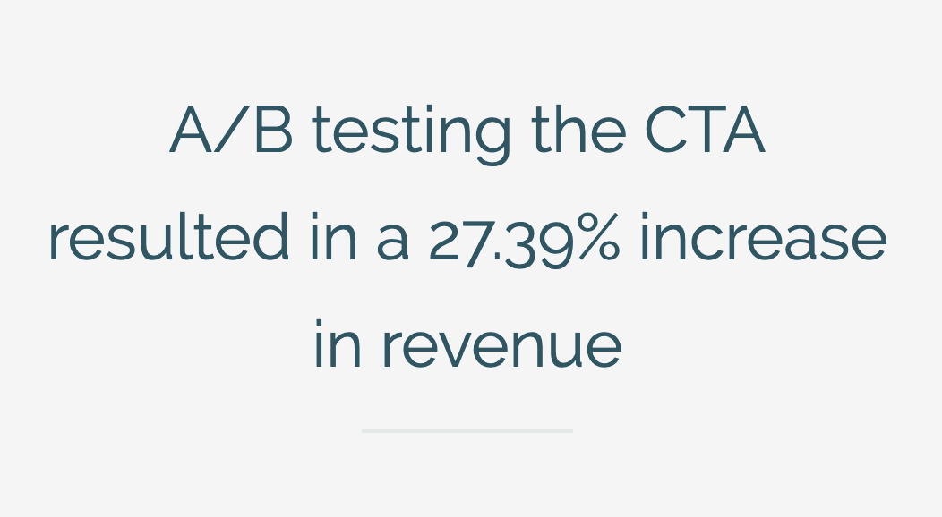
Goal: Increase conversions by optimising CTAs on AliveCor’s website.
Test: A/B testing design and copy variations on selected CTAs.
Results: A 27.39 increase in revenue.
Of course, it wouldn’t be right to have a list of CRO case studies without at least one that looks at CTAs. I’ve purposely focused on different types of tests in this article so far to make the point that CRO involves a lot more than optimising calls to action. However, CTAs are incredibly important and we’ve got Omniconvert to thank for this next case study.
It’s a classic case of A/B testing CTA copy and designs but the results more than validate the process:
- Uplift of +2.46% on add to cart rate
- Revenue increased by +27.39% on variation
- Conversion rate increased by +25.74%
- Engagement increased with a +5.82% uplift
That’s right, a revenue increase of +27.39% from running this test, which is by far the most important KPI of any CRO campaign.
To find out how AliveCor pulled it off, you can download your copy of this case study here.
#8: How Humana increased CTA clicks by 433%

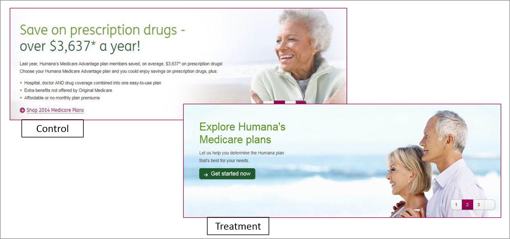
Source: Marketing Experiments
Goal: Increase landing page conversions by improving hero section design and CTA.
Test: A series of A/B tests to pit design improvements against each other and continually improve results.
Results:
- 433% increase in CTA clicks in the first test
- A further 192% increase in CTA clicks in the second test
This is a bit of a classic CRO case study that I’m pulling out of the archives here but it’s still relevant enough to feature in CRO articles by the likes of Crazy Egg (and Venture Harbour, of course).
The reasons I think this case study is still relevant now is that it shows the fundamentals of hero section and CTA design in action – many of which a lot of brands still fail to implement.
If you’re one of these brands, it’s time to get your act together.


This case study from Marketing Experiments pinpoints the following three key issues with Humana’s control design:
- It has too much copy
- It doesn’t have a strong call-to-action
- It doesn’t have a clear, concise message
How do your landing page hero sections stack up against this list of essentials? If the answer is not so great and you’re in need of some motivation to put things right, this Variation resulted in a massive 433% increase in CTA clicks for Humana.


By adding plenty of white space, reducing CTA copy into a clear, concise message and using an image that highlights the key benefit of its services more effectively, Humana achieved a big win with this A/B test.
The company didn’t pat itself on the back, though.


Instead, it continued to test CTA copy variations in order to improve results further, which ended up increasing CTA clicks by another 192%. This reaffirms another CRO essential: that one test is never enough – no matter how great you think the results may be.
#9: How New Balance doubled in-store sales & reduced cost by 50% with mobile CRO

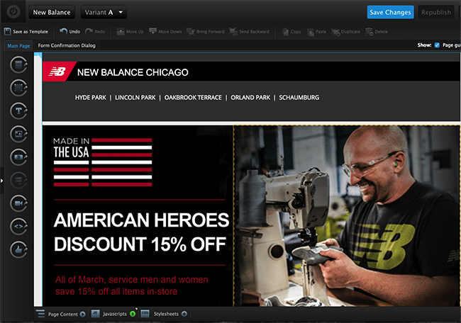
Goal: Convert leads to in-store sales by offering special discounts in exchange for visitors’ email addresses.
Test: Optimise Facebook ads, landing pages and implement email marketing automation.
Result: Doubled sales for New Balance Chicago at half of the cost prior to running this campaign.
We’re back with another Unbounce case study now, this time showing New Balance Chicago doubled sales while halving its marketing spend with a combination of Facebook Ads, landing pages and email automation.
The case study shows you how the company optimised this three-pronged marketing strategy to achieve some impressive results – a worthy read for any retail brand (B2C or B2B) looking to drive more in-store sales from digital leads.
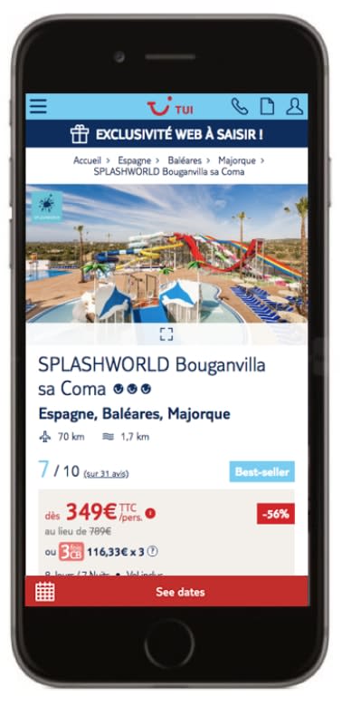
#10: How TUI optimised its product pages to increase conversions by 150%

Goal: Increase user engagement among holiday planners (bottom of the sales funnel) and increase conversion across all devices.
Test: A/B test design variations for package holiday pages.
Results:
- Increase conversions by 150% on mobile
- Increase conversions by 79% on desktop and mobile
Lastly, we’ve got one more case study from AB Tasty for you, showing how travel company TUI increased conversions across all device types by A/B testing design improvements.
“TUI decided to experiment with the visuals and call to action (CTA) paired with each vacation offering using an A/B test. In the variation, the CTA was changed to, ‘See dates,’ and was placed above the destination image next to the price per customer. In this layout, the destination visual was resized to fit the entire width of the section, in the hopes of being more eye-catching to users.”
The same variation was optimised for mobile and it significantly increased conversion across all devices – by 150% on mobile and 79% on desktop and tablet.
Now, it’s your turn to create your own CRO success stories
So, there you have it. These CRO case studies should give you all kinds of ideas to inspire your own tests and improve results across the parts of your website that matter most (hint: not only CTAs).
Make sure you get in touch with us if you get any results worth sharing, too – we’re always on the lookout for new case studies to feature in upcoming articles.