This is an issue I encountered time and again early on in my career. I would create campaigns that targeted the right audiences and craft messages that convinced them to take action but, when it came down to it, the conversion rates simply weren’t there.
Why? Because users weren’t completing web forms.
This sparked a long crusade to solve the web form problem and five years later I finally cracked it (you can read about my journey here). Now, I want to share my insights with you and the best way to do this is explain by using examples.
What are we looking at in this article?
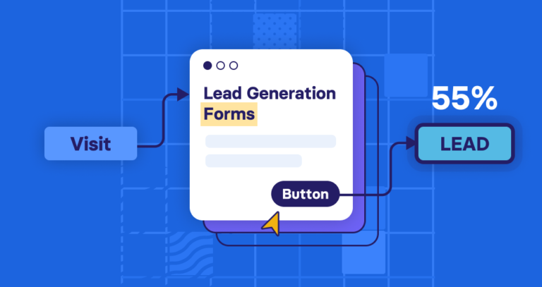
In this article, I’ve got 25+ of the best lead generation form examples that I’ve seen over the past year. All of these examples are up-to-date forms used by leading brands and I’m going to explain why each of them works so well. In some cases, I’ll focus purely on the web form used by these brands while, in other cases, I’ll look at the broader lead generation strategy the forms are a part of.
Here’s a quick preview of the forms we’ll be looking at and what you can expect to learn from each example:
- BrokerNotes: The form with an unbelievable 46% conversion rate.
- Lemonade: The almost perfect multi-step form (and how it could be better).
- Uber: How the company achieves instant, in-form lead segmentation.
- Medium: possibly the easiest sign-up process ever.
- Marketingautomationinsider.com: Using free tools to capture leads and multi-step forms to segment them.
- Website Grader: Using free tools to generate software demo sign-ups.
- Hotjar: Create a “nothing to lose” mindset as a lead magnet.
- Xero: How to improve form UX by breaking best practices.
- Zendesk: An alternative take on the multi-step format.
- SingleGrain: How to qualify paid vs unpaid leads.
- Comparethemarket.com: A masterclass in Reducing clicks and typing workload.
- eHarmony: The perfect match of high intent and intuitiveness.
- Quick Base: A two-step free trial form.
- ActiveCampaign: The art of getting the vital piece of information first.
- Crazy Egg: The instant reward tactic.
- Unbounce: Qualifying free demo sign-up leads with your form.
- Stitch Fix: Using personalisation to make the longest forms engaging.
- Care/of: The hyper-personalised multi-step form that promises to give users a better life.
- Square: A good multi-step template for financial service companies.
- The Zebra: Gamified lead generation.
- Sendinblue: The free account + easy sign-up hook.
- HubSpot: The free tool forever + upselling tactic.
- Ancestry: Knowing when friction is a good thing.
- Moz’s Free SEO Analysis Tool: The free tool + free software strategy.
As you’ll see from the majority of examples in this article, the most successful lead generation forms/campaigns tend to use something called multi-step forms, which allows brands to capture the data they need from users without resorting to long, intimidating forms.
This will all make sense by the time we’ve looked at a few examples.
1. BrokerNotes (The form that converts at 46%)
A colleague of mine designed a homepage lead gen form for BrokerNotes that, literally overnight, increased the conversion rate from 11% to 46%.

Here’s the form:

We came up with this design after months of surveying users, recording user sessions in HotJar, crunching Google Analytics data, and applying everything we knew about behavioural science to improving the design.
Takeaway #1: Don’t make your forms look like forms
A key concept behind designing this form was to not make it look like a form. Despite common wisdom suggesting that you shouldn’t try to reinvent the wheel with things like forms, people just don’t like forms. When was the last time you got excited after being told to fill out a form? Exactly.

By using non-standard user interface (UI) elements, such as large clickable images and toggle sliders, the form was fun and felt more like using a tool. Of course, the data captured at the end of it was identical to if we used a traditional form.
Takeaway #2: Reduce cognitive load using clickable elements
From a psychological perspective, every UI element required motor action (a mouse click or movement) rather than a cognitive action (having to think and type).
In the same way that a piece of software may be more intensive on your computer’s RAM than others, motor actions are less ‘load intensive’ on the brain than cognitive actions. Therefore by reducing cognitive load – i.e. the amount the user has to think to complete the form, we made it easier for users, increasing form completions.
Takeaway #3: Use conditional logic to ask better questions
Another tactic used is conditional logic to hide/display certain questions to certain users. For example, if someone said they were a beginner trader, we wouldn’t ask them which trading platform they prefer, as it’s unlikely they’d have one. For someone who answered that they were an expert, this is an important question to ask.

While this sounds like common sense, most forms ask the same cookie-cutter questions to every user. Conditional logic allows you to capture more information on users, while segmenting them better, by asking the most relevant questions to different audience segments.
2. Lemonade (The almost perfect multi-step form)
Lemonade takes the pain out of finding insurance with its conversational, personalised multi-step form that takes the pain out of data submission.
Lemonade has even put a face and a name to its chatty form to enhance the conversational feel to the experience. More importantly, it makes the process all about the end user, mentioning you by name and guiding you through the key questions, one by one.
Lemonade makes good use of many of the best practices we promote here at Venture Harbour when it comes to multi-step form design – from limiting the number of questions per step to using image selector buttons wherever possible.
Lemonade’s form is so close to getting a 10/10 score it pains me but the company has left one crucial feature out: a progress bar to show users how much of the form they’ve completed.
3. Uber (Instant lead segmentation)
Uber has the challenge of segmenting two distinctly different types of leads: drivers and passengers. The company gets right to the point with this task by asking users what they want from its app – none of this sign up first and we’ll ask the question later nonsense.
This approach instantly segments Uber leads and allows the company to deliver one of two forms to each type of prospect.
The lesson here is that brands serving two sides of the same service (e.g.: an eLearning for both publishers and learners) need to get segment lead types with the first interaction.
4. Medium (possibly the easiest sign-up process ever)
Medium’s brand is all about simplicity and singing up to the platform is perfectly aligned with this value. This may well be the easiest sign-up process I’ve ever used (it’s certainly up there), which only takes a couple of clicks if you use the Google or Facebook options.
Social sign-ups aren’t exactly groundbreaking but even the email sign-up process is buttery smooth.
All you do is type in your email address, type in a verification code and you’re done.
5. Marketingautomationinsider.com (The free tool that segments leads)
Marketing Automation Insider (MAI) helps business owners choose the right automation software for their needs. It’s a free tool that guides them through some simple questions (similar to Lemonade) and then provides them with a free list of recommended tools.
There are a few key things happening here. First of all, the end user is getting something of value for free, which ramps up the incentive to use the tool and complete the form (great for completion rates, conversion rates and all of that good stuff).
Secondly, there’s that progress bar Lemonade is so dearly missing, which not only tells users how much of the form they’ve completed but compels them to keep filling it out, due to a psychological phenomenon known as loss aversion (also great for completions, conversions, etc.).
Finally, the biggest success with this form is that the Q&A style format (also used by Lemonade) allows MAI to gather all of the information it needs about prospects to segment them with great accuracy.
6. HubSpot’s Website Grader (The ‘free tool’ for demo sign-ups)
While it might look like a simple tool, HubSpot’s website grader is really a lead generation form in disguise. What’s great about it is that it only asks for two pieces of information before it begins to give you value.
After you’ve entered your web address and email, you’re giving a personalised web audit of your site’s performance. If you click ‘Try HubSpot for Free’ you’ll be asked for more information – if not they’ll still get in touch to try and sell their software.

The lesson here is once again noticing the power of a simple form and giving your visitors some value (e.g. an audit) in return for their details.
7. Hotjar (The nothing to lose lead magnet)
Hotjar takes a different approach with its free trial strategy by allowing users to try its “Business” plan free for 15 days and then revert to the free version of its software if they’re not satisfied.
It’s a simple sign-up process and a relatively modest form but it leverages the nothing to lose mentality. And that’s not all. The free version of Hotjar’s software is a pretty capable tool that would satisfy a lot of businesses/marketers but these users don’t pay the bill.
By encouraging users to try out the paid business plan first, Hotjar is counting on them to see enough value in the paid features that they can’t give them up when the free trial is over. Users who would normally be happy with the free version find themselves paying up for features they don’t want to lose (another application of loss aversion).
8. Xero (How to break UX guidelines and improve the experience)
Among designers, there’s a never-ending debate about whether form fields should have a title above the field box, or just placeholder text. The argument goes like this: Form fields look better with no title. However, when the user clicks the form field and starts typing, placeholder text disappears, which is a bad user experience.
As you can see, Xero has opted not to have titles above the form fields (except for the country field). But wait…
Xero have created a simple, yet slick, solution by moving the field placeholder text to the title as soon as you start typing:

This simple feature is a smart and stylish solution to the form field / title debate.
9. Zendesk (A different take on the multi-step format)
It’s always helpful to see different variations of design conventions and Zendesk has an alternative take on the multistep form approach that’s worth looking at.
Essentially, we’re dealing with a traditional form design broken up into three sections with a more vertical feel to it.
Vertically stacked form fields a vertical progress bar break away from the horizontal setup we’re more used to seeing from multi-step forms. Above all, this example shows how traditional designs can fit into the multi-step format and illustrates the power of breaking longer forms into more digestible chunks.
10. Single Grain (How to qualify paid leads)
Earlier, we looked at how Uber segments the sign-up process for drivers and passengers. Now we have a similar tactic from Single Grain but, this time, it’s being used to qualify two different types of leads: those willing to pay for the agency’s services and those simply looking for free information.
This allows Single Grain to prioritise the leads that demonstrate an early intent to work with the agency on a paid basis. Users who are simply looking to engage with the company’s free content are asked to provide some basic information (company name, company size, etc.) and Single Grain then places them on the relevant email marketing list. 
So the agency can prioritise its efforts on leads that declare interest in doing business with them while placing the rest on relevant lists to nurture with email and content marketing campaigns, which will be designed to turn those weaker leads into potential customers over time.
11.
CompareTheMarket.com (Reducing clicks and typing workload)
Comparethemarket.com has one of the most difficult jobs I’ve ever seen in terms of designing web forms. This is where users go to compare prices for a range of insurance, energy and financial services – all of which require extensive data submission.
The company isn’t going to win any awards for the visual aesthetic of its forms but deserves a lot of credit for the functionality worked into these complex forms. It starts with segmenting lead types on the homepage and directing users to separate forms, relevant to the specific service they’re interested in.
If you’ve ever requested an insurance quote online you know just how long and dull the process can be. CompareTheMarket.com have reduced the amount of clicks required to complete this form to the absolute minimum.
One of the ways they do this is by asking questions in a logical order. This enables CompareTheMarket.com to set the most probable answers as defaults to future questions.
For example, once I’ve entered my vehicle registration number, all of the following questions are already answered by default:
Another area that CompareTheMarket.com are particularly strong in is providing good explanations for ambiguous questions. Instead of the usual question mark tooltips, CompareTheMarket.com have full pop out explainers with icons when you hover over any question.
Their handling of optional fields is also particularly interesting. Using the same pop-out explainers from above, CompareTheMarket.com explain how filling out optional fields will benefit your quote. This is a great balance between allowing users who’re in a rush to skip these questions, but still capturing extra information from users who are willing to invest more time to get a better or more accurate outcome.
12. eHarmony (The perfect match of high intent and intuitiveness)
A lot of the best form designs start with knowing what users are looking for before they start filling them out. In the case of eHarmony, people visit the site looking for love and it’s hard to think of an instance where desire and intent could be much higher.
People who visit this website want what the company is selling.
To maximise the number of users who start filling out its form, eHarmony emphasises the free aspect of signing up. It then removes friction by using a multi-step design with click/touch button image selectors to get the session started.
eHarmony knows that high intent means people are willing to provide in-depth information about themselves and, thanks to the nature of the company’s service, users understand they’ll be getting better results by filling out more details about themselves.
Thanks to this intent, users are happy to deal with longer forms but eHarmony still works hard to reduce friction where it matters. By switching to a quiz-style format and implementing multiple-choice touch answers, typing is reduced to a bare minimum.
13.
Quick Base (A two-step free trial form)
Quick Base doesn’t go all out on the multi-step format. Instead, it’s gone for a two-step design that explicitly says how many stages users need to complete.
There is a bit of psychological trickery going on here, though. By only asking for a business email address and a password on step one, the user can’t help but assume step two will require a similar amount of effort.
However, Quick Base more than doubles the number of fields on step two, banking on the fact that users won’t give up on the session after they’ve already invested time in completing step one.
14.
ActiveCampaign (Getting the vital piece of information first)
ActiveCampaign produces one of my favourite multi-step forms in this article. While most lead generation forms are hidden behind a CTA button, ActiveCampaign gets right to the point by asking users to type in their email address before they click any CTA.
Aside from removing friction and making it (almost too) easy for users to start the sign-up process, I like the fact that ActiveCampaign captures email addresses in the first interaction, which allows it to chase up failed sign-ups with automated emails.
Next up, ActiveCampaign guides users through a personalised multi-step process that captures all the data it needs.
This creates an engaging experience where the brand appears genuinely interested to find out more about the business users own/work for.
For a sign-up process that requires as much information as this, ActiveCampaign guides users through the entire form effortlessly while leaving little room for data input errors on the user’s part.
15. Crazyegg
One of the most significant factors affecting form conversion rates is how much motivation your visitors have to use them in the first place. One of the best ways to increase this motivation is to ensure that your forms sell the benefits of using your form
Crazyegg is a great example of this. Their homepage lead capture form clearly explains that by using their form I will receive a heatmap that will tell me what��s making my website visitors leave.

While this form is designed to connect to my Google account and capture my information as a lead, the wording focuses on the value I’m about to receive.
16. Unbounce (Free demo lead qualification)
Unbounce doesn’t bow to the pressure of reducing friction everywhere it can with its sign-up forms. In fact, the process for signing up for a free trial is pretty extensive.
Unbounce kicks things off by asking users to select which version of its software they want to try out for free. There’s a lot of psychology working here and the most important is a cognitive bias known as anchoring. Basically, by showing the $399+ price tag first, the Premium $159 asking price instantly seems quite reasonable.
Without this tactic, human nature is instinctively attracted to the cheapest price.
The other key thing Unbounce is doing here is qualifying leads upon sign-up. We’ve already seen this in a number of forms in this article but Unbounce is pushing for far more information than we’ve seen in previous examples, even down to the billing information in step two.
The company has decided that in-depth, accurate information and leads that demonstrate a strong interest in its software are more valuable than simply maximising the number of users who sign up for a free trial.
It all comes down to what your goals and priorities are.
17. Stitch Fix (The hyper-personalised quiz)
Stitch Fix sends its customers clothes to try, based on their preferences and personalised fashion advice from industry professionals. This highly-personalised service gives the company full freedom to ask all the information it needs from users because they know the more info they submit, the better the service they’re going to receive.
To keep this process intuitive, Stitch Fix has designed a hyper-personalised quiz-style sign-up process that gets to know more about each individual user. Each time a user selects an option, they get feedback from the form, as you can see above.
The sign-up process is quite long but the experience remains engaging and the constant sense that data entry will be rewarded keeps you progressing.
18. Care/of (The hyper-personalised multi-step form that gives you a better life)
Care/of gets even more personal than Stitch Fix by providing users with a recommended programme of vitamins, nutrients and other dietary supplements to boost their health. It’s hard to get much more personal (or rewarding) than a form that literally promises to improve the quality of your life. 
Care/of provides personalised diary/health advice and it needs to reinforce the idea that every customer is treated as an individual. So, it comes as no surprise that the form kicks things off by asking for your name and addressing you directly.
That’s a good start but the nature of Care/of’s services means that superficial personalisation has little value. This sign-up process needs to get detailed information from users for the benefit making the best recommendations.
The sign-up process doesn’t disappoint, either. Multiple choice questions are matched with image selector buttons to create a quick, detailed sign-up process that helps Care/of segment leads and deliver better follow-up content.
19. Square (A good multi-step template for financial service companies)
Like many brands, Square doesn’t have the luxury of getting users to sign up for an account and then push them for more details in follow-up emails. The payment service company needs to get detailed information from prospective customers, as they sign up, in order to create a functioning account.
Like many examples in this article, Square relies on a multi-step form design to break this process up into stages while reducing the need to type wherever possible.
It’s not the most engaging example but users signing up for financial services expect there to be a certain amount of manual typing and data entry. You’re not going to trust a company like this if they make the sign-up process too easy.
For financial service companies, Square’s multi-step design is a decent template to start with.
20. The Zebra (gamified lead generation)
TheZebra.com has one of the best insurance lead capture forms I’ve ever seen. They not only have stunning landing pages, but the process of capturing information is incredibly well thought out.
Once you’ve entered some basic information, TheZebra ‘gamifies’ its lead capture form by improving the accuracy of your insurance quote as you enter more information. When you answer additional questions, a percentage meter increases in real time, encouraging you to answer even more questions.
Insurance is an inherently tough industry for lead capture forms, and TheZebra have created one of the best forms I’ve seen taking into account a tonne of insights that typically result in higher engagement.
We’ve looked at a few insurance providers in this article and The Zebra might just be the most impressive of the bunch.
21. Sendinblue (The free account + easy sign-up hook)
Sendinblue uses the classic lead hook of offering a free version of its software platform with the aim of converting users into paid customers.
To pull this off, the company makes it incredibly easy to sign up for an account and then focuses its email marketing efforts on nurturing leads into customers over an ongoing period. All users need to do is provide their company name, email address and a password.
All that’s left is to check their email and confirm their account. It couldn’t really be any easier and this shows how Sendinblue is, unlike some previous options we’ve looked at, favouring lead volume over initial quality.
22. HubSpot (The free tool forever + upselling tactic)
HubSpot’s lead generation strategy has a lot in common with Sendinblue’s but it’s far more ambitious. While Sendinblue offers a single software platform, HubSpot provides a range of different software solutions that businesses can select and combine to suit their needs.
This includes a number of free tools, including HubSpot’s impressive CRM platform that is absolutely free, forever.
HubSpot uses this free CRM to capture leads and then focuses on upselling/cross-selling them to paid tools in the future.
So while HubSpot is being accurate when it says you can use its software for free, the reality is far more complex and you have to applaud the company for creating a highly-effective lead generation strategy.
In terms of the form experience, HubSpot makes signing up very easy and adds some personalisation to increase engagement.
But, in this scenario, it’s the wider lead generation strategy that’s that star, not the actual form itself.
23. Ancestry (Knowing when friction is a good thing)
It turns out genealogy is the second-most popular online activity with more time being spent on sites like Ancestry.com than any other category (except for pornography). So, clearly, people are willing to invest time in filling out personal details for this particular online pursuit.
Long form friction? Forget about it. When you’ve got a user base on your hands that is willing to provide information and understand that it adds value to the experience, you’ve got licence to take this to your advantage.
24. Moz’s Free SEO Analysis Tool (The free tool + free software strategy)
We’ve already looked at a number of companies that use free tools to generate leads by Moz takes this one step further by using a free tool to reel users in and then upsell (if you can call it that) to the free version of its software platform.
The long-term aim is to get users signed up to a paid version of Moz’s software platform but this two-step soft-sell approach helps turn luke-warm leads into genuine prospects.
Summary
If you have a lead generation site that you want to optimise, here’s my advice:
Understand cognitive biases
Look at the Wikipedia page for cognitive biases. This page lists all of the known and proven ways in which humans make decisions (often irrationally). If you’ve ever wondered why certain conversion optimisation or usability principles work, often it’s grounded in one of these biases.
You’ll also find articles on our blog exploring these and how to use them for lead generation strategies and conversion optimisation campaigns.
Test big changes first
Don’t waste time testing your call-to-action text – create a radically different form that solves the same problem in a different way. Test that. As we saw in example #1, that’s how you go from converting at 11% to 46% overnight.
Focus on aspects that actually matter to the end user. You’re not going to somehow hypnotise people by changing your CTA button colour but you might make a significant impact on conversion rates by removing barriers to form completion.
Finally, take notes from the examples we’ve looked at in this article and apply these ideas to your own lead generation forms and strategies. Think about your goals, the kind of data you need to capture and see which of these examples could act as a template for your next campaign.
FAQ
The best converting forms minimise friction by asking only essential questions and using progressive profiling to gather data gradually. BrokerNotes achieves a 46% conversion rate by keeping their form simple and focused on immediate value rather than overwhelming prospects with unnecessary fields.
High-converting forms typically use between 3-5 fields maximum, as each additional field reduces conversion rates by approximately 5-10%. Multi-step forms like Lemonade’s approach can overcome this by breaking questions across multiple pages, making the process feel less intimidating whilst gathering comprehensive data.
Free tools and assessments consistently outperform generic downloadables because they provide immediate value during the signup process. HubSpot’s Website Grader and Hotjar’s lead magnets demonstrate how offering instant results encourages prospects to complete forms without hesitation.
Phone number fields significantly reduce form completion rates and should only be included if absolutely necessary for your sales process. Email-first approaches like Medium’s signup strategy prioritise capturing contact information that prospects are comfortable sharing, allowing you to request phone numbers later in the sales conversation.
Smart form logic automatically routes prospects based on their answers, allowing you to qualify leads instantly without manual sorting. Uber’s segmentation approach and Marketing Automation Insider’s free tool demonstrate how conditional fields can identify high-intent prospects and tailor follow-up messaging accordingly.
Lead generation forms are designed to attract new prospects with incentives and minimal friction, whilst contact forms are meant for existing interested parties to request information. The 25 examples in this article focus on conversion-optimised lead generation forms that use free tools, multi-step processes, and strategic questioning to build your prospect database.
Using a single form for multiple audiences dilutes your ability to qualify leads effectively and personalise follow-up. Audience-specific forms with tailored questions and relevant lead magnets convert significantly better, as demonstrated by Uber’s instant segmentation approach which creates different experiences based on user intent.


“Make forms that don’t look like forms” – that’s an impressive statement. As a conversion-led visual thinker, I have been quite infatuated with interactive marketing tools that guarantee a boost in sales and conversions. The lead gen forms like that of Hubspot’s Marketing Grader, BrokerNotes and Toptal are highly effective, and I believe it’s because they are designed well, with pics/icons to boost visual appeal. Thanks a lot for putting together this article. Great insights and examples! :)
A pity this level of marketing expertise and intelligent advice is not available to SMEs. We need you!
Great article. Enjoyed the post and liked all the mention points. Nice collection of high converting lead generation forms. You can also add social login to the list. Social login allows your users to authenticate themselves into the website by using their existing social media account. This will save users time and give first-party data to the marketers. Thanks for sharing the great content.