Let’s cut to the chase; every user that comes to your website and doesn’t convert is a waste of your time and marketing budget. Maximising the number of people who take profitable actions on your site is your top priority and, in the moment that matters most, it’s your call-to-action that give users the final push (or so you hope).
Essentially, these are the most important parts of your site. Get your call-to-action wrong and everything else on the page is just a waste of pixels. And, to help you create CTAs that get results from day one, here are 15 call-to-action best practices to increase conversions.
#1: Make it actionable
Any good call-to-action tells users precisely what you expect them to do. If you want people to sign up, tell them. If you want them to download your mobile app, make yourself absolutely clear.
Your CTA buttons should like they’re ordering people around. Do this now. Do this next. The first word on your button wants to be a verb (start, buy, download, etc.) and the rest of your button text will normally convey value or create a sense of urgency.
#2: Focus on the value
People don’t click your CTA buttons for the fun of it. To get conversions you need to convince people you have something valuable to offer and a small amount of text before your button is often all you have to make believers out of them.
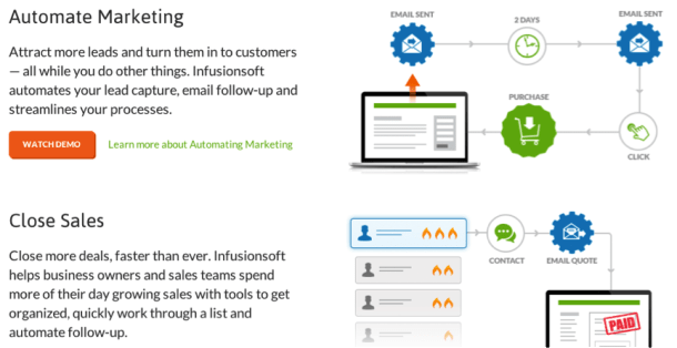
Infusionsoft tells marketers and business owners exactly what they stand to gain by using their platform. You should do the same with your own calls to action.
#3: Create a sense of urgency
People hate to feel like they’re missing out on something and creating a sense of urgency in your CTAs implies this is precisely what’ll happen if users don’t act now. This is especially powerful when you hang temporary discounts and other incentives in front of people’s faces.
You don’t have to be quite this aggressive with your own approach, though. By simply adding the word “now” to your buttons, you can create a more subtle sense of urgency to encourage clicks.
#4: Make it personal
Every user should feel like your website is speaking to them and them alone. This is why using actionable language is so powerful, because it makes your content sounds like it’s talking to them personally. And you can take this a step further by addressing them directly in your CTA text.
The small amount of research into using first (I, me, my) vs second person (you, your) tenses in CTAs suggests the first person might be more effective, but this is by no means conclusive. Either way, they’re both highly effective.
#5: Ease user concerns
Everybody likes to buy in confidence and, if you can reassure people they’ve got nothing to lose by clicking your CTA button, there’s little reason for them to resist.
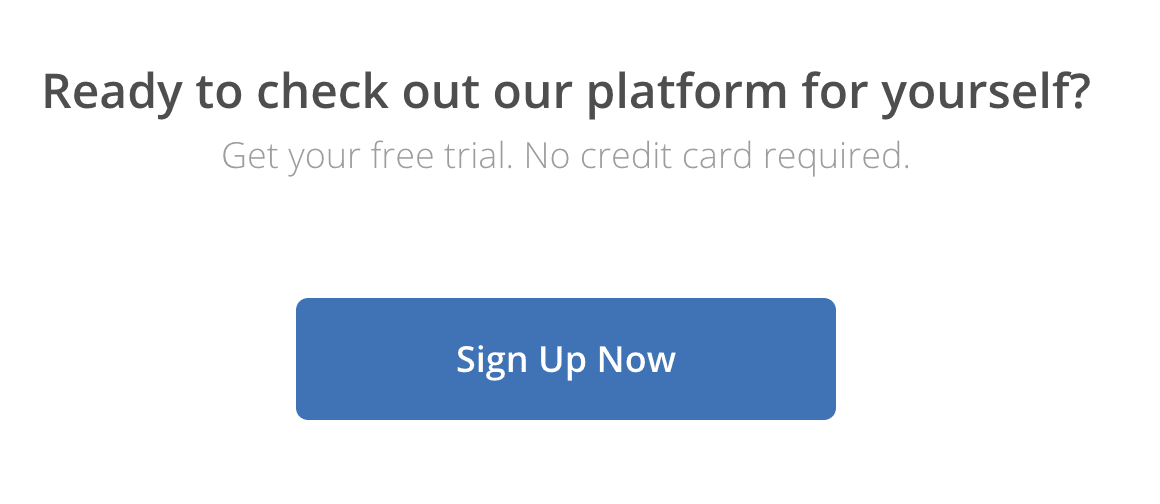
ActiveCampaign knows people don’t like filling out credit card details for the sake of a free trial. So it moves to reassure people that they can sign up for free without handing over any payment details.
#6: Make it stand out
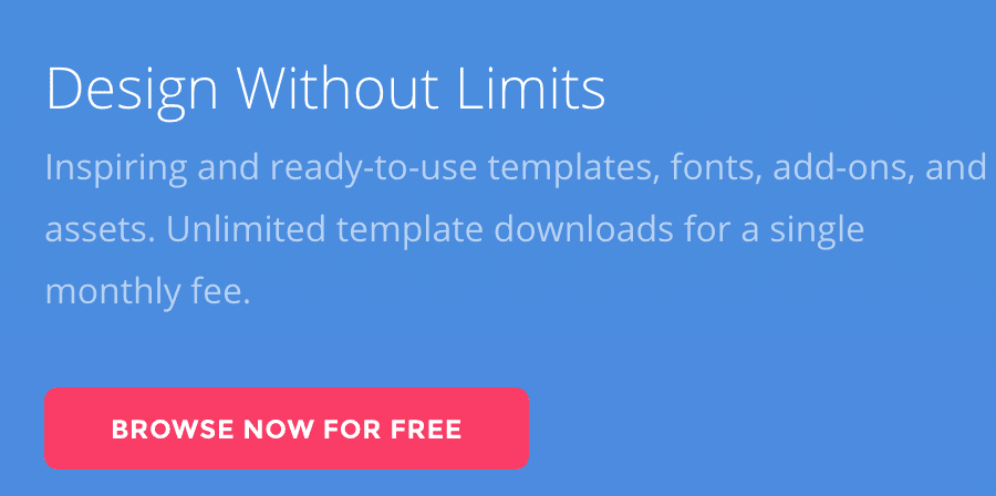
You can’t expect people to convert if they never see your call-to-action so you better make sure they stand out. Colour contrast is your best friend when it comes to making a CTA button stand out and Invision opts for a very un-subtle pink to capture your attention.
It’s not only buttons that can gain from the high-contrast treatment either. You can create full CTA sections on your page to make them unmissable.
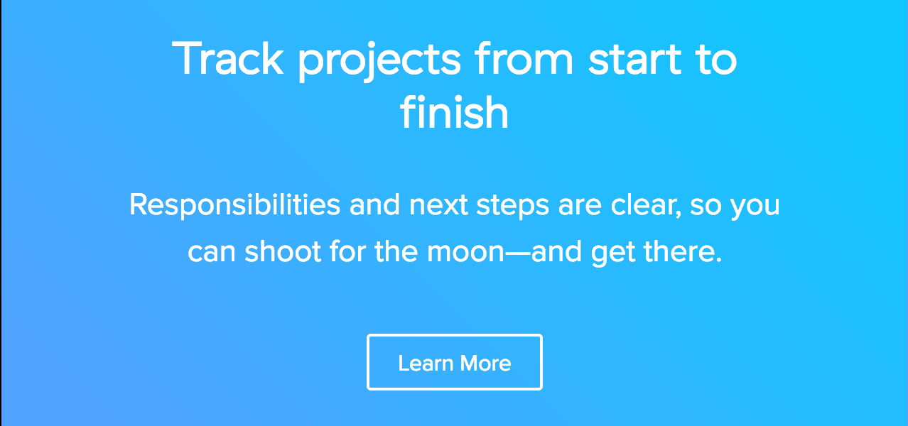
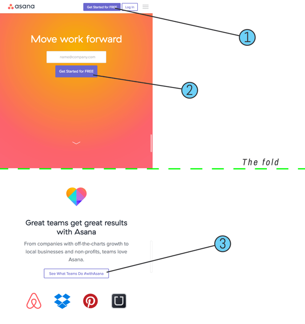
Asana cuts through its white homepage with a bright blue call-to-action section you can’t ignore.
#7: Think beyond the fold
It’s tempting to place CTAs above the fold by default but this isn’t always the best approach. If you can create incentive within a few words, then above the fold CTAs are great –particularly on homepages and landing pages.
 However, if you need to explain more about your offer before you hit people with a call-to-action, you might be better off placing your CTA further down the page. And there’s nothing wrong with having multiple calls to action on your homepage, if you’re targeting more than one action (just don’t go overboard.)
As you can see above, Asana starts with a simple CTA above the fold and places another one below the fold once it conveys more of its message. This is a common design trend for modern homepages, but I don’t recommend this approach on landing pages, which should typically focus on a single goal.
#8: Prioritise one call-to-action
Although giving users too many choices is generally a bad idea, there may be times when you can’t confine your CTA to a single action. In these cases, you’ll need to prioritise the most important action so users don’t get stuck between options.
Here’s how Sketch gives users the option of downloading a free trial while still making that all-important buy button the priority.
#9: Don’t be too creative with button designs
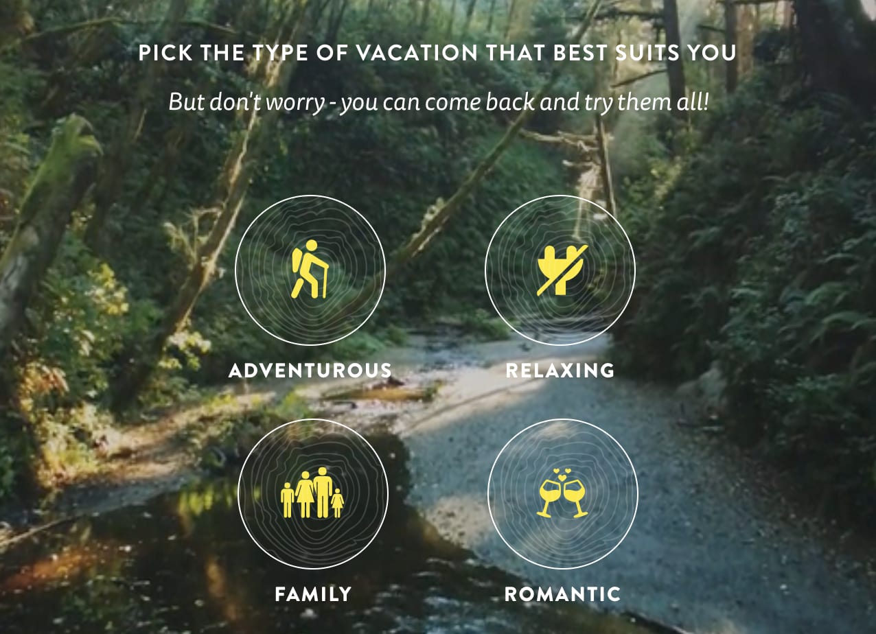
Call-to-action buttons are an accepted UI element that visually tells users there’s something to click. So if your buttons don’t actually look like buttons then people might never realise they’re supposed to do anything.
Above you can see four buttons used on the Visit Humboldt website. The site may get away with these but it’s not 100% clear whether they’re buttons or icons. Most users will probably figure it out but it’s a risk you don’t want to take – so don’t try too hard to reinvent the button.
#10: Make it readable
This sounds pretty straightforward but there’s more to readability than you might realise We’ve already mentioned contrast and this an important part of it – but there’s more.
Choosing your fonts wisely is a good place to start making sure your text and buttons are large enough to capture attention and read well. There’s also a lot of psychology behind legible text. For example, the human brain recognises the shapes of words before they actually read them, which makes all caps more difficult for us to read.
Going back to our Asana example from before, note the use of font size, spacing and lowercase text – as well as strong colour contrast.
#11: Make it easy to convert
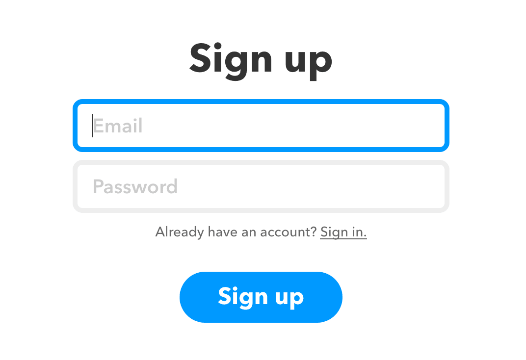
If you expect people to take action on your site, don’t make it difficult for them. Do everything you can to create easy conversions on your site so users have no reason to refuse. For example, on your sign up forms ask for the minimum amount of information possible – only an email address if you can get away with it.
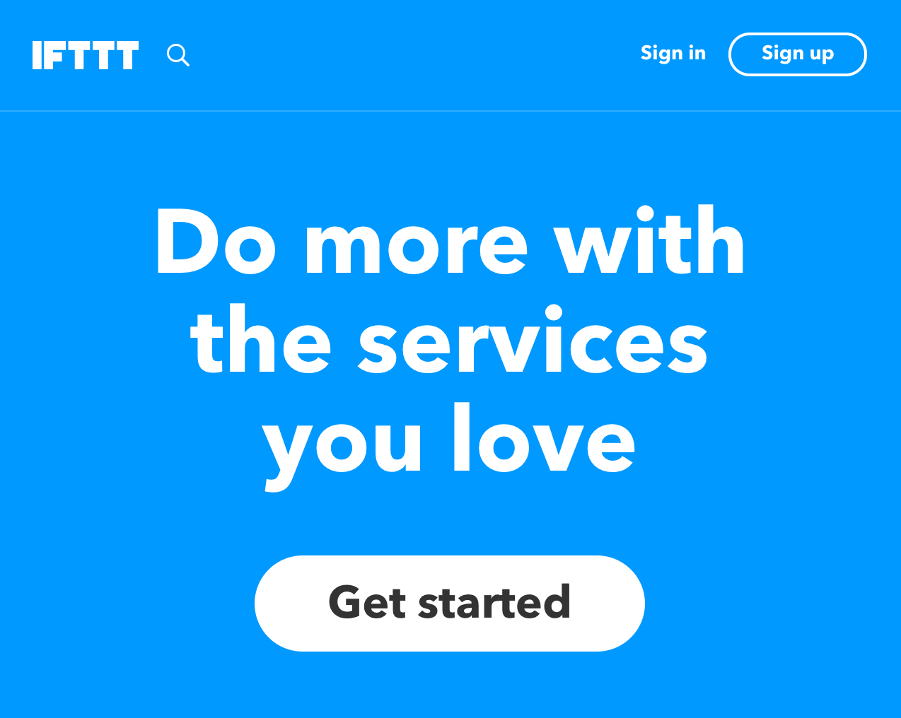
The form above implies it couldn’t be easier to get started with IFTTT, even if there are further stages to the sign-up process. Forget about asking people to retype their email address and passwords and you certainly don’t need phone numbers or anything else at this stage.
#12: Have at least one CTA on every page
Every visitor is a potential lead and you’re missing an opportunity if you don’t ask them all to convert in one way or another. So put at least one call to action on every page and don’t simply repeat the same CTA every time. Ask yourself why users come to this specific page and how you can turn that reason into a valuable lead.
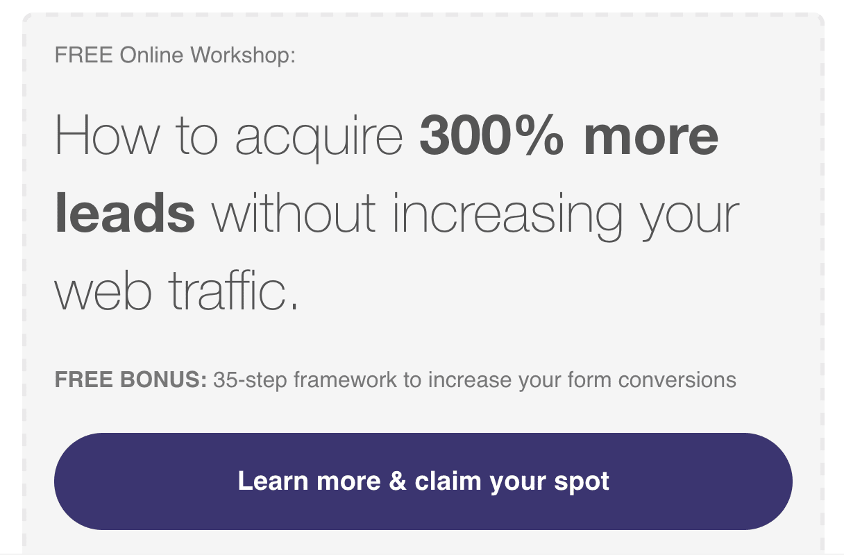
We put CTAs at the bottom of our blog posts to convert readers once they’ve finished reading our wonderful content.
Even on your blog posts, ask users to sign up to your newsletter, download an e-book or visit a product/service page offering a solution to the problem your article discusses.
#13: Put a CTA at the bottom of every page
You’ll hear a lot of people recommend not doing this but bare with me. Most visitors will hopefully never reach the bottom of your page because they’ll find something compelling long before they get that far. But what about the visitors who do reach the bottom of your page?
In most cases, people end up at the footer of your site because they haven’t found what they were looking for. And when people can’t find what they’re looking for, they tend to leave.
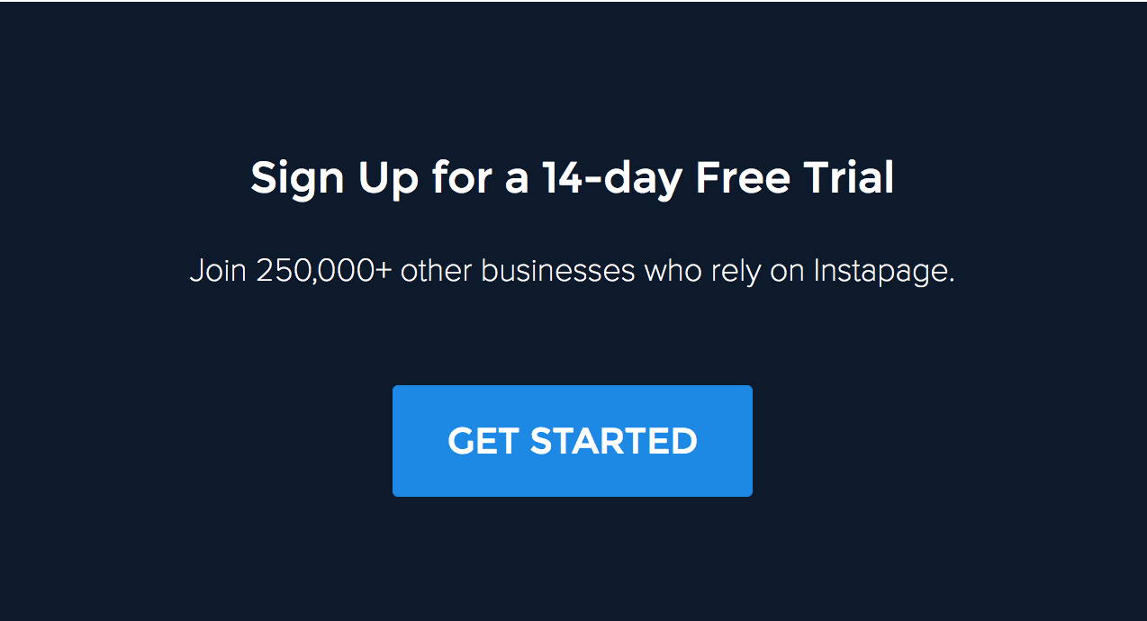
Instapage gives users one last call to sign up for a 14-day free trial when they reach the bottom of a page.
Don’t sit there and let potential leads slip away. Put a call-to-action at the bottom of every page and give users a reason to keep interacting with your brand.
#14: Use exit pop-ups as the final incentive
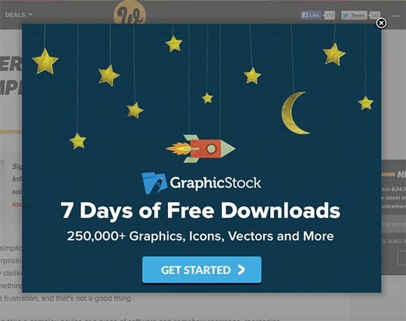
We recently published an article looking at how you can use exit pop-ups to generate leads that would otherwise leave your site. Yes, I know pop-ups are a UX taboo, but these things really convert and exit pop-ups are about as unobtrusive as they come.
The thing is you probably won’t get results by simply repeating the same offer you proposed on the page. It didn’t work the first time and you’ll only frustrate users by forcing the same message upon them. So try to come up with something compelling enough to make them think twice about leaving.
#15: Don’t get bogged down in tests
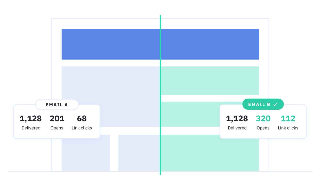
While I don’t want to discourage you from testing CTA variations, don’t get bogged down in switching button colours. They’re really not that important. Focus your efforts on creating a more compelling a call to action by making your offer clear, increasing the value proposition, increasing urgency and other factors that evoke a genuine emotional response from people.
A great call-to-action does two things: first, it grabs people’ attention and then it turns their interest into real buying intent. The 15 best practices we’ve looked at today pretty much take you through all the key elements of a call-to-action that stop people scrolling and inspires them to take action. As with any list of best practices, these are general guidelines more than absolute rules. But they should get you off to a good start with designing calls to action that get results from the moment they go live.


