Designing calls to action that convert is one of the most important and difficult tasks for marketers and online businesses. There are tonnes of best practices you can follow and guidelines to help you create more compelling CTAs yet the vast majority of brands fall short when it comes to putting these into practice.
Today I’ve got 19 examples of killer CTAs you should learn from. Each example comes with at least one image and an explanation of what makes it such a good call to action. So read on, take notes and get ready to start designing calls to action that convert from the day they go live.
Call to action examples
#1: Looker
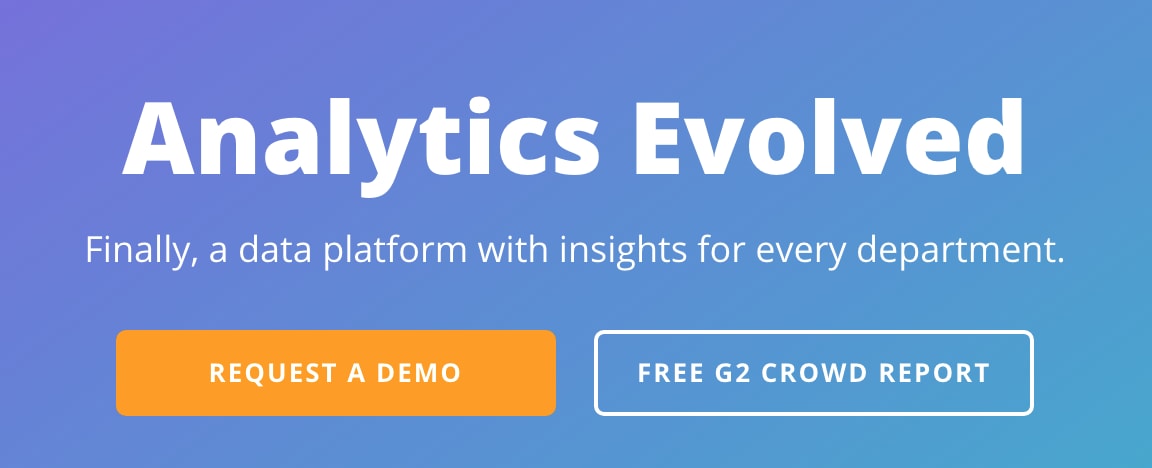
Analytics is something every department needs in a modern business but it can be daunting for people with no experience of handling data. Looker aims to solve this problem by creating a visual analytics platform that turns data into graphs and sharts anyone can take insights from.
The call to action on its homepage is the first thing you see when the page loads. Small, punchy and convincing, it gets the platform’s value proposition across instantly.
Visually speaking, it’s bold and attention-grabbing with good use of colour, contrast and font size/styles. Also, notice how it presents two CTA buttons with its primary conversion goal highlighted in orange to make it stand out.
#2: Evernote
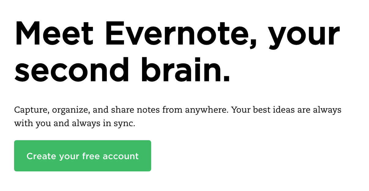
Evernote takes all of the design cues we mentioned in our first example: bold text, different font styles and a brightly coloured CTA button. Once again, it captures the core value proposition of using Evernote in a punchy headline and a subline.
Pay attention to the CTA button text, which uses the second-person “your” (first vs second term tense is a big CTA button talking point) and one of the most important the power words in copywriting: “free”.
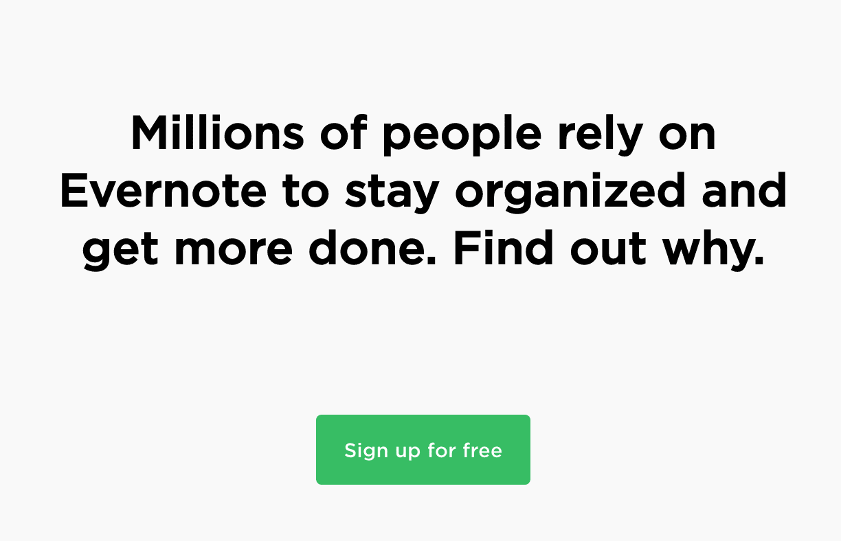
Further down the page, you’ll find another CTA taking most of the same design principles, except it drops the headline-subline format in favour of a single line of bold text and slightly different CTA button text. That power word “free” is there, though.
#3: Kissmetrics
You would hope Kissmetrics would know how to put a decent call to action together but it’s surprising how many players in the marketing industry come up with underwhelming CTAs.
Kissmetrics gets it spot on with this example, though. What business doesn’t want to “get, keep and grow” their customer base?
Kissmetrics seems to like this CTA (hopefully from highly successful testing) so much that it repeats it further down the page, only dropping the subline and throwing in an extra CTA button to give users another option.
#4: Plated
This call to action from Plated is one of my favourite examples of what I call an all-inclusive CTA. I’m talking about a call to action that speaks out to everyone who reads it. I mean, who on this planet doesn’t like food? And, in this busy lifestyle we’re all compelled to live, who on Earth wouldn’t like the time or resources to eat better meals at the end of the day.
#5: Shakr
I’m not normally a fan of animated CTAs because the animation tends to distract attention away from the message itself. In this case, I think Shakr justifies the animated CTA by targeting specific audiences and use cases where it’s the “best video maker”.
#6: Lush
Aside from creating a visually compelling CTA that jumps out from the page, Lush has adapted the man call to action on its homepage for Valentine’s Day. It’s highlighted a crucial time of the year for its brand tailored its cire message to suit.
Christmas isn’t the only calendar event that matters to businesses.
Scroll down the page and you can see Lush has also adapted its content strategy for Valentine’s Day and used it to capture leads at the top of the sales funnel.
#7: Tableau
Tableau is another analytics provider with a difference and it needs to find a way to communicate this difference in a CTA. The brand has identified one of the biggest problems businesses face when it comes to data: turning all those numbers into something that actually has a positive impact on their profit margins.
For anyone who’s tried to unleash the full power of data and failed, this CTA will speak out to them.
#8: Hotjar
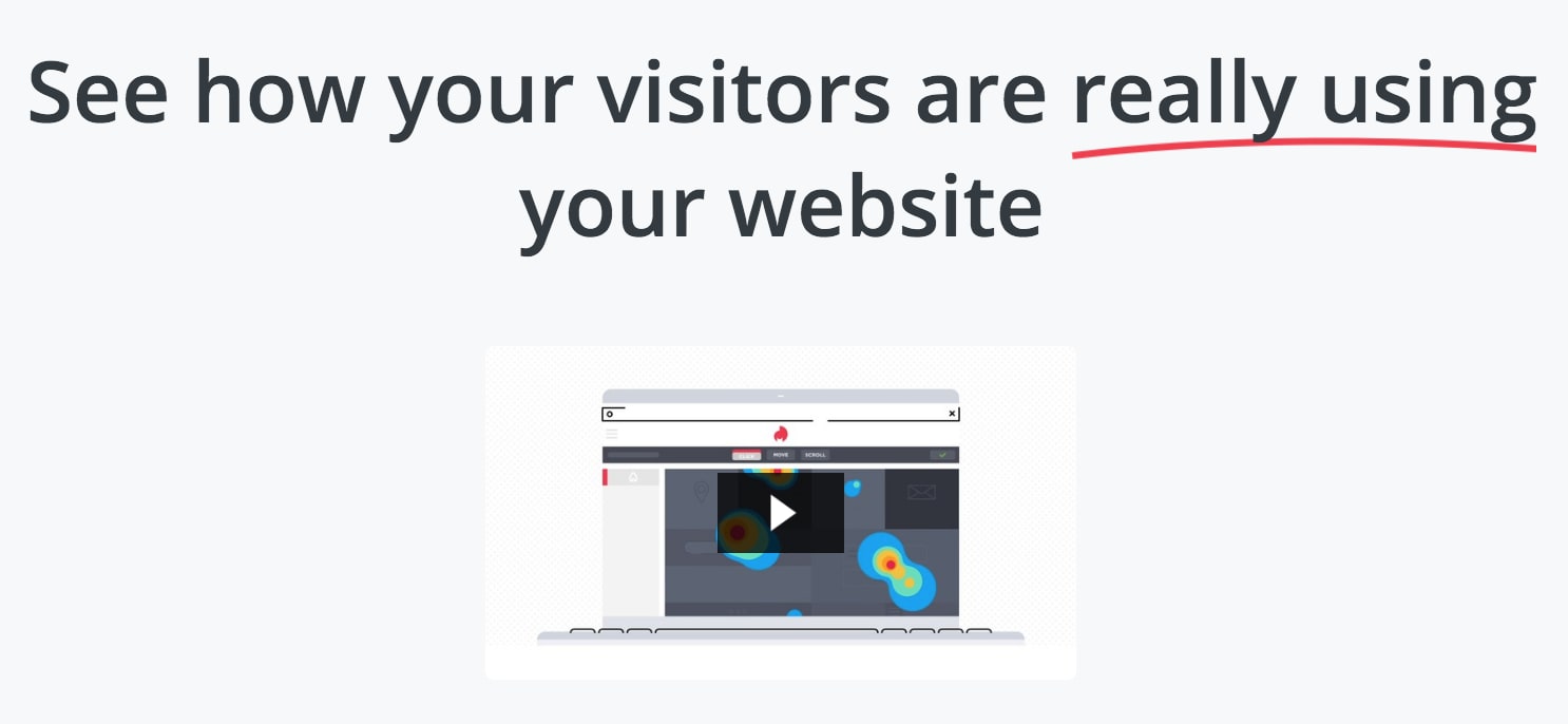
Hotjar provides a more niche kind of analytics platform in the shape of heatmapping to help you understand what users are doing on your site. Once again, it can be difficult to know exactly which elements of the page users have/haven’t seen and where they’ve clicked from numbers alone.
Hotjar promises to show you how your visitors are really using your website.
#9: Campaign Monitor
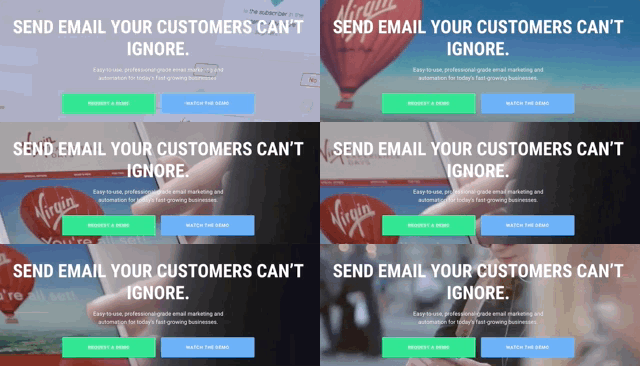
Campaign Monitor does something else I don’t often like to see with a CTA in the hero section of a homepage: the overly-used video background. Aside from being a gimmick, you risk taking attention away from the message in your call to action by taking this approach – so use with caution.
There are always exceptions, though, and I think Campaign Monitor qualifies with this call to action design. With an overlay darkening the video background, there’s just enough contrast for the white text to stand out (only just, mind you) and those double CTA buttons both capture attention as the brightest elements on the page.
#10: Dropbox
Dropbox is one of the earliest and biggest successes of the cloud computing startup boom. This CTA captures the Silicon Valley tone perfectly with talk of creative energy, modern workspaces and focusing on the things that matter.
That magic power word makes another appearance in the Dropbox CTA button as well. Above all, Dropbox gets across its value proposition quickly in language its target audiences resonate with.
#11: Pocket
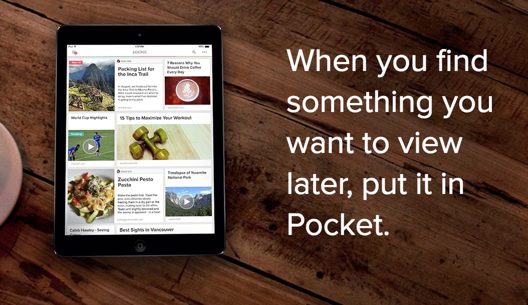
Pocket is a tool designed for a very specific use case: allowing people to save content and web pages for later. This makes it much easier to create a concise call to action that explains why people should use Pocket. Unlike Dropbox, Pocket decides to spell this out in plain language rather than dress it up in startup lingo.
A different approach but an effective one.
#12: CXL Institute
This CTA from Conversion XL’s CXL Institute isn’t much to look at. In fact, it’s safe to say it’s the ugliest call to action we’ll be looking at in this article but I want you to pay attention to the copy:
- “Learn from the top performers to become one”
- “Online courses on growth, digital marketing, optimization, analytics, persuasion. Perfect for teams.”
- “World’s leading practitioners teaching you their best stuff.”
Almost every word on those three lines promotes CXL Institute as the best place to learn core values Conversion XL’s target audience crave the most. It seems there isn’t a course for attractive web design but I imagine the section in creating a compelling CTA is pretty good.
#13: Bulletproof
Bulletproof opts for a slider of three different CTAs for the hero section of its homepage. I’m not the biggest fan of sliders normally but this one is visually sleek, well balanced and perfectly optimised for mobile.
Again, CTAs are bold and full of contrast while the “Save 10%” button text in the first slide is a great example of compelling copy.
#14: Netflix
Netflix has a habit of creating great CTAs and this one is no exception. “See what’s next” hints at the binge watching tendencies people are so vulnerable to when watching series on Netflix, reinforcing its brand image as something people can’t get enough of, something everyone should try.
Then we have “watch anywhere” in the subline which promotes the mobile aspect of the platform for people who want to watch their favourite shows as soon as a new episode is out, regardless of where they are. While the “cancel anytime” benefit tells people they’ve got nothing to lose by signing up for that incredibly tempting free trial.
#15: Spotify
Spotify is for music listeners what Netflix is for film/TV fans and it also knows how to nail a call to action. It doesn’t even ask desktop users to create an account, allowing them to open up the web player and start listening with one click.
Then we have the mobile CTA which also highlights the free version of Spotify ahead of the paid premium version. Of course, Spotify gets ad revenue from people who use its free version so there’s incentive to keep enough people using the free version of its app.
#16: Codecademy
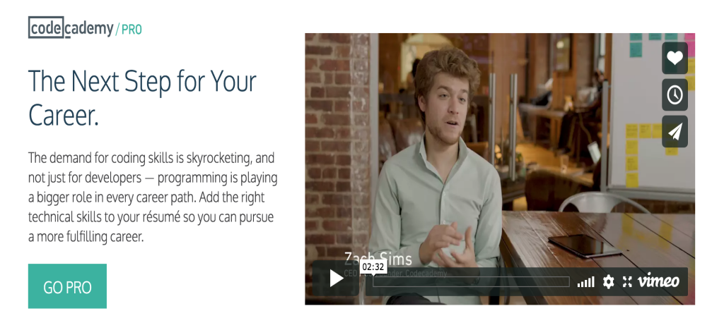
Codecademy keeps it simple with the CTA in the hero section of its homepage. After all, this is what the brand is all about: making the complex art of programming simple to learn for everyone.
It’s the interactive element of Codecademy that set it apart from the other online resources for learning code when it first hit the scene – and there aren’t many that make interactivity a priority, even now.
Oh yeah, and Codecademy is also free.
At least it was until it launched Codecademy Pro, a paid version of the platform that helps users take their coding skills to the next level – or “the next step for your career” as it puts it in the CTA.
#17: Unbounce
As an industry leading landing page builder, Unbounce can’t really afford to come up with subpar CTAs. And the company has refined its CTAs over the years, mostly focusing on the same selling points: creating high-converting landing pages quickly.
This is still true today and its latest CTA is one of the best examples I’ve seen from Unbounce.
#18: TaxJar
TaxJar absolutely nails its value proposition in this CTA and there’s not much more to say about it. Automating tax calculations, reporting and filings may not be the most glamorous of services but it sounds like a dream come true for just about every business owner.
#19: Usabilla
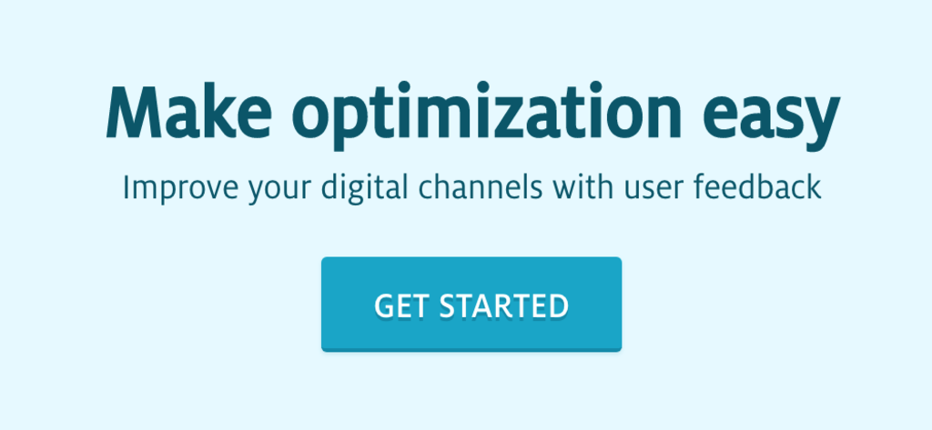
Usabilla is a platform that makes user testing easier and more insightful for marketers and businesses alike. In other words, it makes optimisation easy and what CTA to wrap up our list of examples. Clean, concise and right to the point, this call to action perfectly sums up the Usabilla selling point just three words (or ten if you include the subline).
What’s the main takeaway from these examples?
The key takeaway from the examples we’ve looked at today is it’s the copywriting in your CTAs that really matters. I’m not saying design isn’t important but the role of design here is to take a back seat and let the message in your CTA copy speak loudest.
Bold colours, font choices, contrast and placement are all vital CTA design choices but they serve to make your call to action jump out of the page and give your copy the best chance of getting its message across.
The real challenge in creating CTAs that convert is coming up with punchy, compelling copy that makes hard for users to scroll past without clicking.

