


Once upon a time, the internet was a platform for storing, accessing and exchanging information. This was a time before Google, social media and banner ads. In fact, there was no need for paid advertising in the early days of the web because online transactions weren’t a thing yet.
Then came the web form, which facilitated the submission of user data to a server through their local browser. Before long internet users could sign up to newsletters using their email address and it wouldn’t be long before the first pizza was ordered online (kind of).
The evolution of the web form has shaped the internet as a business and commerce platform. Without them, there would be no search engines, online transactions, user accounts or a need for any of the marketing technologies we associate with the web today.
Every online conversion that’s ever completed has taken place via a web form and it’s amazing how many marketers underestimate the importance of their forms. It helps to understand the history of the web forms, how they’ve evolved over the years and how they’ve shaped the internet as we know it.
What are we looking at in this article?
This article provides an overview of the history of web forms and how they’ve evolved over the past 30-or-so years. In the grand scheme of this, this is a relatively short history, but it’s also one of the most important in terms of shaping the modern web - and all of the marketing principles associated with it.
Here are the sections we’ll be covering in this article:
- What did the first web form look like?
- 1995 - 2004: Web forms 1.0 including early email sign up, online order and payment forms.
- 2004 - 2008: The transformative years influenced by the rise of social media, e-commerce, early UX principles and the first form builders.
- 2008 - 2015: Web forms 2.0 defined by the mobile web, responsive design, new coding technologies and a greater focus on form UX principles.
- 2016 - 2020: Web forms mature with the influence of mobile app design principles, the next generation of form builders and the arrival of GDPR.
- Web forms beyond 2020 and how you can bring your forms up to standard.
Each section includes valuable design lessons that are still relevant today and demonstrate how they have changed over time - and why. If you’re looking for a crash course in form design best practices with an understanding of where they came from, this is the article for you.
What did the first web form look like?
This depends on what you consider the first web form to be - and it’s a debatable point. The first breed of digital forms that allowed users to perform actions on the internet emerged in 1989 and 1990 but these were nothing like the web forms we know today.
Let’s start with the internet’s first search engine, which was released on September 10, 1990. Archie was developed by three university students at McGill University Montreal: Alan Emtage, Peter Deutsch and Bill Heelen.
The name Archie comes from the word archive.
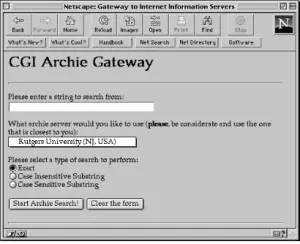
This could be a contender for the world’s first internet form but Archie was released before any websites even existed.
Back in 1990, the web was simply a network of FTP files and you could only access them by using a local client (such as Archie) telneting to a server directly or requesting access through email.
The first website launched on August 6, 1991, developed by Tim Berners-Lee - the same man who created HTML, the World Wide Web (WWW), the first web browser and the internet as we know it.
The image above shows what the first website ever created looked like in 1992 and, as you can see, there are no forms in sight.
In fact, the HTML form element didn’t even exist at this point. On October 29, 1991, Berners-Lee published a document entitled HTML Tags where he listed all 18 of the HTML tags that existed at the time:
- <title>
- <nextid>
- <a>
- <isindex>
- <plaintext>
- <listing>
- <p>
- <h1>…<h6>
- <address>
- <hp1>
- <hp2>
- <dl>
- <dt>
- <dd>
- <ul>
- <li>
- <menu>
- <dir>
The first HTML web forms started appearing in 1993 and the earliest example I’m aware of is Aliweb, which is regarded as the web’s first proper search engine. Developed by Dutch engineer Martijn Koster, Aliweb’s name pays tribute to its predecessor (Archie-Like Indexing in the Web) and here’s what it looked like back in the day:
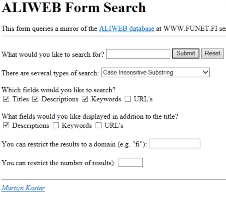
Aliweb was announced in 1993 and officially presented at the first World Wide Web conference (WWW1), held in Switzerland over May 25-May 27, 1994. So I’m more inclined to consider this the first web form but there are debates about this as well.
Over the next couple of years, some of the biggest names in internet technology would emerge, including Yahoo, Amazon, eBay and Linda.com - all before the end of 1995.
There were several important developments that would shape the future of web forms throughout 1995, too. In May, the term user experience was first applied to web design followed by the release of PHP 1.0 on June 8 and JavaScript 1.0 on December 4 - two programming languages that would shape the future of web forms.
On November 24, 1995, the IETF organisation published the RFC 1866 specification for HTML 2.0, which introduced official support for the <form> HTML tag, as well as the <input> tags that feature so heavily in forms to this day.
So, by the end of 1995, the age of web forms had officially begun.
1995 - 2004: Web forms 1.0
The first generation of true web forms began in 1995 and ended with the arrival of Web 2.0 in 2004. Over a nine-year period, the humble web form changed immensely - not only in terms of the roles (and number of roles) they were playing but also the design and functionality.
The first wave of web forms were little more than input fields for capturing email addresses, names and perhaps phone numbers. We’re talking about early email sign-up forms, as you can see in the 1996 screenshot from Lynda.com above and one from Alistapart.com in 1999, below.
At this point, online payments weren’t really a thing and they couldn’t be because none of the credit card or major payment services companies supported them.
However, there was some early innovation.
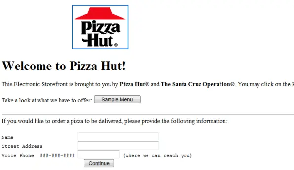
In 1994, Pizza Hut started started accepting online food orders in the US but users had to provide their phone number so the company could call each individual customer to take a credit card payment over the phone.
In the early days of eBay, people would hand over cash while meeting sellers in-person or pay for items with cheques. Meanwhile, Amazon purchases were mostly paid for using credit cards over the phone and this was the norm back then.
Credit cards weren’t even a big thing offline in the mid-90s. To put things into perspective, there were just 2 billion non-cash payments made in 1997 during a time when interest rates made credit card payments a luxury for most.
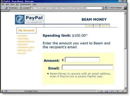
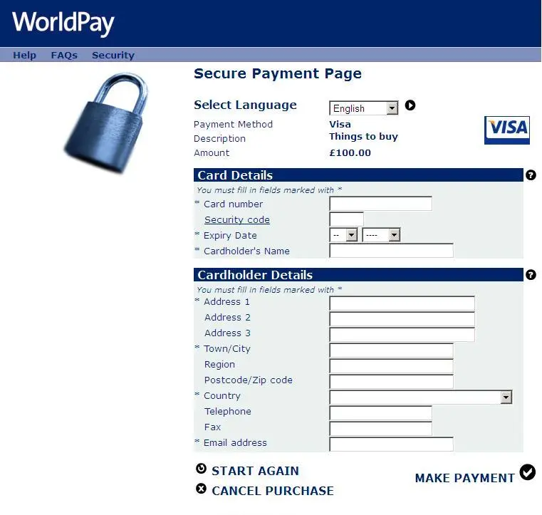
Really, we had to wait until PayPal came along in 1999 for online payments to start going mainstream, paving the way for digital payments on eBay. Over the following three years, PayPal normalised the concept of online payments, opened up the concept of e-commerce and forced financial companies to start taking online payments seriously.
In October 2002, eBay bought PayPal for $1.5 billion and credit card suppliers were increasingly supporting online payments in order to stay relevant in the booming age of e-commerce.
For many years to come, we would see payments forms like the one above, accepting payments via PayPal and supported cards. Now, we’re getting to the point where web forms are fundamental to every important online action: purchases, account creation, email sign-ups, downloads and anything else you can think of.
2004 - 2008: The transformative years
By 2004, the internet was already moving into its next stage of evolution. In 1999, web design and UX innovator, Darcy DiNucci, first referenced the concept of Web 2.0 in an article entitled Fragmented Future.
He accurately predicted the next stage of internet would see the majority of content on websites created shared by the users themselves. In the same year, his vision started coming true with the release of Blogger.com although it would take many years for DiNucci’s vision to fully materialise.
The rise of social media and sign-up forms
On August 1, 2003, MySpace launched as the first modern social network to capture the world’s attention and the platform had more than one million users by February 2004.
MySpace started a succession of transformative years that would ultimately develop into the Web 2.0 that Darcy DiNucci had predicted and web forms were given a crucial new role as the interface for new users to create personal accounts.
Until MySpace came along, your typical internet users would have one or two accounts with the likes of eBay and Amazon, in addition to whatever email service they were using. However, MySpace captured the world’s attention and turned the web into an entertainment platform users could own through their personal accounts.
At the time MySpace felt like it was taking over the world but, in reality, it was only warming it up for a takeover few could have imagined.
Come February 10, 2004, Flickr launched as the first image-sharing social media platform and a year later, on February 14th, 2005, YouTube became the first video-centric social network. Then came Reddit in June 2005 while talk of a new social media platform continued to gain traction.
In September 2006, Facebook went global and secured more than 12 million monthly active users by the end of the year.
e-commerce and payment forms get serious
While the social media networks were emerging thick and fast, e-commerce platforms, checkouts and payment forms were maturing at a solid rate. PayPal was establishing itself as the go-to option for online purchases but banks and major credit card providers were all supporting online credit card and debit card payments to keep themselves relevant in the digital age.
https://www.youtube.com/watch?v=RkM247AbZuE
With online card payments becoming increasingly common, e-commerce brands were forced to start thinking about payment forms more seriously.
At the same time, more e-commerce platforms were following the Amazon and eBay model of asking users to create accounts, which started shaping the familiar conversion sequence of basket, sign-up, checkout and payment form design - all with a focus on conversion rates.
Unfortunately, payment forms were a major conversion rate killer, forcing users to fill out sensitive data every time they wanted to complete a purchase. At this point, developers had no secure means of storing payment details for use in-browser and autocomplete wouldn’t arrive for many years to come.
The only way to save users from typefests was to get them signed up to an account and get their card details stored on your server for future purchases.
By 2006, the average conversion rate was around 1% and cart abandonment rates were around the 60% region. Keep in mind that this was before the mobile web took off and website owners only had one experience to optimise for: desktop. Despite this, conversion rates were pretty low in 2006 and abandonment rates were already high before mobile even came along.
Form UX and best practices gain interest
During the 2004-2008 transformative period, the e-commerce boom was in full effect and the internet was becoming the marketing channel we all know it as today.
Forms were no longer a mediocre contact channel, they were lead generation forms, payment forms, subscriptions forms and the gateway to every important conversion goal for businesses building an online strategy.
Increasingly, web form performance became a priority for digital brands and the concepts of form UX and best practices were catching on and evolving at the same time.
Forms were still pretty crude at this point but keep in mind we’d gone from forms like this:
To forms more like this:

So we’re already seeing some important design principles being applied to web forms by 2008:
- Vertical form designs
- Left-aligned labels and form fields
- One field per line
- Similar fields grouped together
- Required fields
Of course, there was a lot of variation and some brands prioritised form UX and conversion rates more than others. But, by the end of this transformative period, form optimisation and A/B testing were established as key marketing strategies for brands that wanted to turn visitors into paying customers.

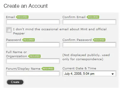
The form above was used by Box.net in 2008 and this was about as good as things got back then. Form length wasn’t the priority it is now and it was standard procedure to ask users to confirm their email address and password when creating an account.
There were still plenty of brands catching up on concepts like single columns, vertical layouts and many of the best practices we consider to be basic now. But the most important thing at this stage was that brands, marketers and designers were thinking seriously about form UX and the impact it has on business goals.
Form builders make their impact
By 2005, a range of form builders were on the market, designed to help website owners create web forms without writing the code from scratch. By this point, WordPress had solidified itself as the CRM of choice and form builder plugins started to fill the same role.
This was great in the sense that anyone with a website could easily create web forms without any real coding knowledge. Form builders also helped raise the overall standard of form quality, too, by providing templates that users could easily edit and add to their sites.
As more UX principles and best practices were worked into the templates, the more the quality of your typical web form increased and this was good news for business owners and website users.
There was one big problem with early form builders, though. While they initially helped raise the quality of web forms and make them easier to create, progress would later stagnate.
New advances in form UX and best practices would take a long time to find their way into the templates provided by form builders and the quality failed to keep up with progress.
Form builders stopped progressing around the 2010 period.
This was only made worse as the mobile web took off and form evolution progressed at a much faster rate. By the time mobile internet was becoming a priority in 2010, form builders simply couldn’t keep up and they actually held progress back during a period where platforms like WordPress meant people could create a website without writing any code.
Unfortunately, the tools that allowed website owners to add forms to their websites without writing any code simply weren’t up to scratch, which means their web forms weren’t either.
Funnily enough, a new breed of form builders would arrive in 2016 and completely turn the tables. Rather than holding back progress, today’s form builders are one of the strongest drivers of innovation - and we’ll come back to this later.
2008 - 2015: Web forms 2.0
While it’s accurate to say the era of Web 2.0 began in 2003 with the arrival of social platforms like MySpace, it took several years for the web to fully transition and design principles to fully adapt.
By 2008, the internet was truly immersed in Web 2.0 and this was reflected in form designs. On July 11, 2008, the iPhone 3G launched alongside the App Store and the mobile revolution had officially begun.
Again, it would take many years for the web and design principles to catch up to mobile technology but the prospect of optimising for smaller screens and delivering experiences across desktop and mobile forced designers to question everything about form UX.
Mobile forms design trends
Mobile optimisation was a nightmare for designers and developers in the early years and, despite all the progress that has been made since the iPhone 3G rolled out, there’s still work to be done in 2020 in terms of delivering better mobile experiences.
Back in 2008, the entire web was designed for desktop devices and their larger screens. Mobile introduced so many unforeseen complications and that progress was slow and, at times, painful.
In 2010, Smashing Magazine published an article on “modern” mobile form solutions including the following image:
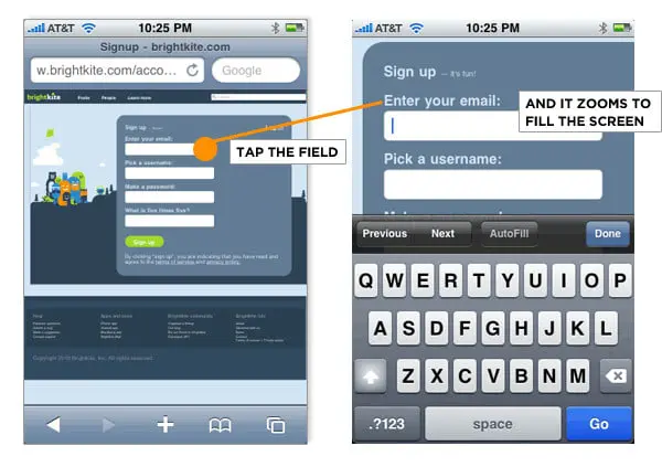
At this point, responsive design and adaptive font sizes weren’t on the agenda. Instead, mobile browsers adopted a “field zoom” feature that zoomed in on input fields to make them easier to select and interact with.
There were problems with this solution, though - namely the fact that left-aligned labels would disappear when field zoom was applied.
This is a perfect example of how every early solution to mobile UX issues opened up other issues and mobile optimisation existed in a state of poor compromises for a number of years.
It was only after responsive design started catching on in 2012 that progress was made with optimising forms for multiple devices.
HTML5 forms
Before we take a look at the impact responsive design had on form design, let’s talk about another technology that was instrumental in the new age of web forms: HTML5.
Although the official specification of HTML5 wouldn’t be finalised until October 2014, the markup language was already being used by developers - to varying extents - as far back as 2008.
One of the most important aspects of HTML5 (or, at least, one of the most widely used at the time) was the form specification. HTML5 introduced a range of new features and input types that made forms easier to build and drastically improved the experience of filling them out, especially for mobile users.
HTML5 input fields
HTML5 allowed developers to mark up their form inputs to determine which type of keyboard pops up on users’ mobile. So when they click on an email field, the @ and .com keys automatically show up next to the space bar so users don’t have to find and type these manually.
Likewise, when users select a tel field to type in their phone number, the number pad automatically appears instead of the usual QWERTY keyboard.
HTML5 also introduced input fields for URLs, numbers, colours, number ranges, dates, time, week, month and more - all of which reduced the amount of typing required from users on mobile devices.
HTML5 placeholders
Placeholders was another big feature of HTML5, allowing developers to place temporary text in form fields that provide users with context about the information they should provide.
When users click on a specific field, the placeholder text disappears and they can type in their data, as normal. Placeholders are designed to provide users with contextual hints or suggestions about what to type in.
However, a lot of designers misused placeholders as a replacement for labels. While this can be visually appealing, it’s poor form UX because the placeholder vanishes as soon as the user enters a from field. There’s no guarantee users have read the text by this point or can remember what they were supposed to type in.
This can add confusion and friction - not to mention remove the contextual benefit placeholders are designed to provide, in the first place.
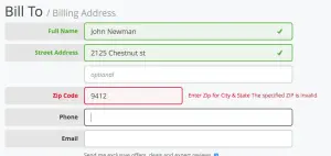
HTML5 validation
Another key feature of HTML5 was form validation, which provides visual feedback to help users complete forms correctly. Form validation would develop into a key form design principle in the years ahead but HTML5 validation never offered the server-side protection websites need.
So HTML5 validation never really caught on but it did, at least, help highlight the importance of client-side validation and visual feedback - and we’ll look at this in more detail later.
The impact of responsive design on web forms
The concept of responsive web design was coined by Ethan Marcotte in 2010 in an article published on Alistapart.com. By using CSS media queries, developers could style layouts and the size of elements depending on the size of a user’s browser window, allowing them to create a single website that delivers different experiences on desktop and mobile.
Users would no longer have to pinch zoom desktop layouts on their phones and the days of field zoom were coming to an end.
However, it took time for website owners to adopt responsive frameworks and it wasn’t until 2012 that the concept even started to catch on in the mainstream web - and it would take several more years for responsive websites to become the norm.
Despite slow adoption, web forms were one of the first elements to benefit from responsive design principles and, even if website owners didn’t convert their entire site to a responsive design, it was relatively easy to optimise forms for mobile devices using the same principles.
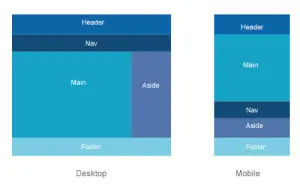
At the very least, companies could design a form for smaller screens and place it in a column for desktops and then switch to 100%-width for mobile devices. So the form above would simply look like this on mobile:
Over the next few years, responsive design would gradually establish itself as the accepted method of optimising for mobile and desktop. During this time, a series of web form best practices would emerge as designers aimed to produce consistently positive experience across both device types - and close the gap on desktop vs mobile conversion rates.
Large input fields and optimising for touch
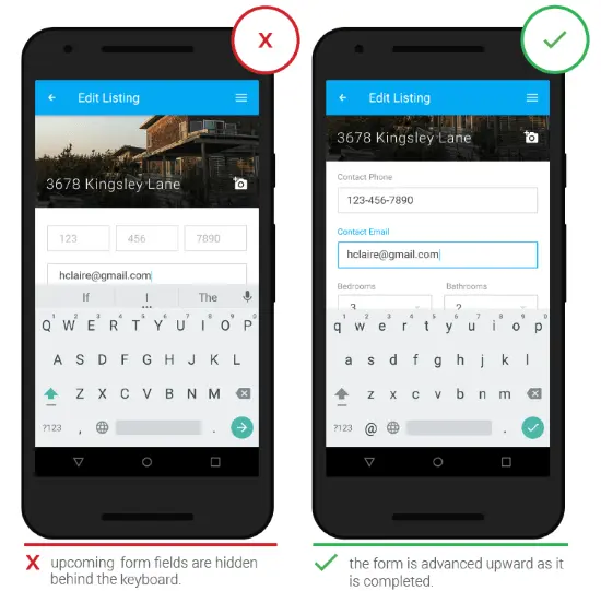
With responsive design removing the need for field and pinch zooming, designers had to rethink the practical design of form inputs. The default height for an HTML input field is around 20px and, on a pixel-dense mobile screen, that’s a lot smaller than your average finger.
So a bunch of standard HTML input fields stacked vertically is a nightmare to work with on mobile devices, even for someone with skinnier fingers. Accurately selecting the correct input field, radio button or dropdown menu is a game of pure chance and the plain HTML forms of the past no longer cut it in the mobile age.
Not only did designers have to create forms for multiple screen sizes, they also had to optimise for touch. We may take this for granted now but the entire web had been designed with mice, keywords, tab keys and shortcuts in mind - all of which became irrelevant as soon as you tried to access the same site on a mobile device.
Source: Smashing Magazine
As a result, input fields grew bigger with the use of padding in CSS and spacing between fields also grew with the use of greater margin values - both of which made it easier to select input fields with accuracy on touch devices.
This had a huge impact on the visual and structural design of web forms and cemented the concept of touch optimisation. It also highlighted the difficulty of interacting with web forms on mobile devices, which was a serious problem considering the importance they play in every type of conversion goals.
Web forms quickly became a priority for innovative designers who were building their vision of mobile UX.
Single-column layouts
The design concept for single-column forms predates the mobile but the dimensions of mobile screens forced designers to adopt this principle en masse.
Narrow vertical screens naturally lend towards vertically stacked input fields with labels left-aligned above its respective field
Single-column form designs first emerged as a strategy for making form layouts more readable and easy to digest, based on how the human mind and eyes process information.
So there was already a gradual shift towards this design principle before the mobile web came along. But the emergence of smaller screens certainly helped single-column forms become the norm.
Full-width form designs
With single-column form designs and larger input fields, the natural progression was a move towards full-width forms that fill mobile displays. This involved sizing form fields with 100% width to fill the screen and then adding a small amount of padding to the form itself to add a little spacing either side - similar to the image below.
Source: Smashing Magazine
Visually speaking, this aligns form fields with the right side of the screen and create a better sense of balance. It also helps the eye navigate forms faster without any interruptions due to inconsistent fields widths.
Likewise, it also maximises the space available on mobile displays and improves the touch experience further.
Aside from the visuals, though, full-width designs automatically adapt to fill their containers - including the browser window. So you can create a full-width form, knowing it will always resize to fill the mobile display and simply switch to a different layout for desktop.
This would become a key practice of responsive design as the variety of screen sizes increased over the years ahead.
Source: Mockplus.com
Full-width forms also encouraged designers to use larger submit buttons to fill the same space and this had a major influence on how CTA buttons were designed in general. Not only were buttons getting taller to make them easier to tap on touchscreens, they were now getting wider and allowing more space for bolder text or more convincing CTA copy.
Form length
One of the biggest effects mobile had on form design was the greater emphasis it placed on form length. Keep in mind that email and password confirmation fields were still slowly dying out at this point and the average form required a substantial amount of scrolling to complete - in addition to the challenges of selecting fields and typing on mobile.
The easiest way to solve this issue was to make forms shorter by removing any unnecessary fields. So there were some obvious steps that caught on during this period:
- Removing email and password confirmation fields
- Removing phone number fields, unless really necessary
- Only using one field for name inputs (not first name and second name)
- Minimising the number of fields where possible
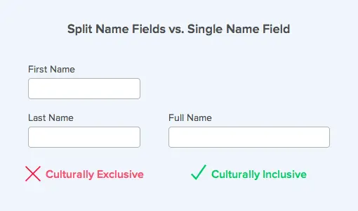
UX Movement also highlights the cultural implications of separate first and last name fields
Obviously, reducing the number of form fields solves the scrolling problem on mobile and it also helps to reduce the workload of field selection and typing. However, there are problems with simply trying to make forms as short as possible.
Above all, businesses need to collect data from most types of conversions. Sure, you can minimise an account creation form to one email input field, if you want but you still need to capture personal data before an account can be properly created.
For a lot of conversion types, though, you simply can’t reduce form length a great amount. There are only so many fields you can remove from a payment form, for example. Likewise, you can’t create an online insurance form without collecting a significant amount of financial information.
Likewise, marketing strategies rely on using lead and customer data to deliver relevant messages and experiences - something you’ll struggle to do by making every form as short as possible.
So the concept of short forms helped solve a lot of UX issues on mobile but, like so many ideas in the early years of mobile optimisation, it was a compromise that also created a lot of problems - and it would take an entirely different solution to solve these.
Auto-fill reduces the need for typing
In 2011, Google Chrome introduced a feature called autofill that allows users to autocomplete repetitive details, such as their name, email and address. Nowadays, this is a standard feature for all major browsers but it was an innovative step at the time.
This feature can save users from a significant amount of typing when filling out forms - and not only on mobile, either. It does rely on data being stored in the browser, though, and there were some early security concerns related to passwords and card numbers but these have been addressed over the years (whether they’ve been resolved sufficiently is another debate).
Developers retained the ability to set autocomplete to “on” or “off” for individual forms and users can disable the feature completely in their browser settings.
Form validation
Earlier, we briefly talked about HTML5 form validation that provides users with real-time feedback to help them complete forms successfully.
There are several reasons why you don’t want to rely on HTML5 validation, though - namely the fact that it doesn’t provide any server-side validation to protect your site from malicious code. You also don’t have full control over how HTML5 validation is implemented.
By 2010, the accepted best practice for form validation was to combine PHP server-side validation with JavaScript client-side validation - the latter of which provides visual feedback in the browser, which you can style with 100% freedom.
This Smashing Magazine article from 2009 offers a good summary of the popular approaches at the time. These methods haven’t changed a great deal over the years, either, but they have been refined and combined in different ways.
Over the next few years, the concept of inline form validation would catch on, where JavaScript (or AJAX) code provides real-time feedback for users as they fill out forms.
According to research from Baymard Institute, only 13% of checkouts were using live inline form validation in 2012 but this number would rise to 60% by 2016.
In the early years, inline form validation was a double-edged sword. While, in principle, it aimed to make forms more usable and increase the number of successful submissions, it also made forms far more complex to build and added a lot of variables, which could either benefit or harm the user experience.
So the quality of validation varied a lot and it would take a few years for best practices to evolve and templates to emerge for form validation that adds minimal friction.
AJAX forms
Windows developed AJAX (Asynchronous JavaScript And XML) back in 1999. Often confused as a programming language, AJAX is actually a combination of development techniques using in-browser XMLHttpRequest objects to request data from a web server and then JavaScript and the HTML DOM to use and display that data).
AJAX allows you to do all kinds of wonderful stuff like change HTML content without reloading the page, pull in data after a page has loaded and send data to a server in the background.
In more practical terms, you can use AJAX to submit form data without the default page reload/redirect function. Which means users can hit the submit button and their data will be sent to your server without any interruption to the user experience.
Better yet, you can animate the data submission to show users that they’ve successfully completed the form and even add a confirmation message.
By 2010, AJAX form submission was catching on and the principle has stuck around ever since and evolved to provide a stronger UX for users. The phrase AJAX has changed into a few different names (AJAJ being one of them) and the Fetch API applies the same principles to the Promise object, rather than the XMLHttpRequest object.
Either way, the principle has stuck ever since and only improved over time.
That’s not all AJAX had to offer for forms, either. As part of the drive to make forms shorter and faster to complete, developers started using AJAX to create autocomplete dropdown menus that narrow down the options of a large list to save users from scrolling through one themselves.
A common use case for this is when you need a user to select their nationality or when airline websites/apps ask users to choose which airports they want to fly to and from. By adding a <dataset> to the form HTML code, filled with the option values, developers can show these options that match the characters users have already typed in.
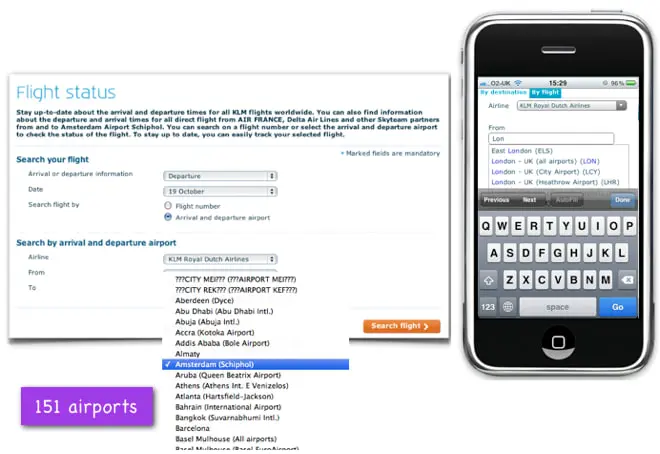
Source: UX Booth
So, by the time a user types “Lo” into the input field, they have a list of options for London airports that they can select without any unnecessary typing.
This is another trend that has stood the test of time to become a staple form best practice. And the concept of reducing the amount of typing users have to do to complete forms would become a key principle of form optimisation - one that would eventually help designers progress from the idea of making forms as short as possible as a fix-all solution.
jQuery multi-step forms
In 2006, a new JavaScript library called jQuery was released with the promise of simplifying some of the core functions of JS, such as event handling, HTML DOM manipulation, CSS animation and AJAX.
As of July 2020, jQuery is used on 75.9% of all websites with a 97.5% market share within the JavaScript library niche.
By 2010, jQuery was commonly used to handle client-side validation and trigger AJAX submissions to submit user data without reloading the page. This jQuery-AJAX combination would be the go-to format for web forms for more than a decade - and this, more or less, remains the case today.
Aside from making JavaScript functions significantly easier to learn and apply, jQuery also allows developers to create plugins using its open-source library, which means you can find plenty of jQuery-AJAX form plugins to add to any website or app.
With a relatively basic understanding of JS and jQuery, amateur developers could build advanced web apps and interfaces that would have previously required extensive JavaScript skills.
Suddenly web form validation was a feature you could plug in and customise on any web project - as long as you had enough coding skills to embed and debug the plugin.
However, jQuery’s biggest contribution to form design came a few years later with the emergence of multi-step forms in 2013 or so.
The multi-step concept changed everything for web forms, allowing designers to chop forms into smaller, digestible parts to make them more inviting to users.
Instead of taking out every field possible to create shorter forms, designers were now able to create forms that capture all of the data businesses need without the psychological friction longer forms typically suffer from.
Roughly 20 years after the first HTML web forms emerged, multi-step designs marked the biggest jump in evolution since 1993 and this wasn’t merely a visual change. This was a structural innovation that would have the biggest impact on the performance of web forms, to date, and overcome much of the friction that held conversion rates back for so many years.
In 2013, Venture Harbour CEO, Marcus Taylor, stumbled across the multi-form design concept before it had really caught on - something he would later call “one of the best discoveries I’ve made in my career”.
After a gruelling battle to optimise lead generation forms on his latest venture, Marcus tested a relatively simple multistep form and was amazed to find it multiplied conversions by more than 300%.
Despite asking more questions than other variations (name, email, phone number, salary and more), the multi-step form converted an incredible 53% of visitors into leads over an 18-month period.
Needless to say, Marcus wanted to analyse these numbers in greater detail, test more variations and find out why this multi-step design had such a large impact on conversion rates - above all, he wanted to know it wasn’t a fluke.
So this is how one of the biggest investigations that Venture Harbour has embarked on began and it would lead to some of our most important breakthroughs, as well as one of the most innovative lead generation tools currently on the market.
2016-2020: Web forms mature
With technologies like jQuery and AJAX now in the mainstream, designers had all of the tools they needed to create web forms that achieved more ambitious marketing objectives.
By 2016, web form best practices were coming along nicely and key solutions such as inline validation, AJAX submission and multi-step forms were solving some of the oldest problems in form UX.
Mobile optimisation and responsive design were also standard procedure by this point. All of the pieces were in place for web forms to mature and, over the next few years, the emphasis on user experience, conversion rates and performance would only increase.
The influence of mobile apps
When Apple first launched the App Store in 2008, the internet was unprepared for the mobile revolution. It took years for website owners and developers to get to grips with mobile optimisation and even by 2016 there was still a lot of progress to be made.
In April 2015, Google rolled out its mobile-friendly algorithm update in an effort to encourage website owners to take mobile UX more seriously.
While progress was generally slow, form optimisation benefited greatly from the progression of mobile app design. Every innovation and minor UX trend that improved the experience of using mobile apps naturally found their way into general form design principles.
Source: UX Planet
One of the benefits of mobile app design is that you only have to optimise the experience for smaller displays, whereas responsive design requires designers to think about a variety of screen sizes.
A common problem with the responsive design principle is that a lot of designers instinctively create experiences for desktop screens and then try to scale them down for smaller devices. This encourages a mindset of reduction and removal, forcing you to cut things out that were important enough to include but too bulky for smaller screens.
This problem was so persistent that designers increasingly adopted the principle of mobile-first design where consistent experiences could be created and scaled up for all devices.
Either way, this problem didn’t exist in the mobile-only world of mobile app design and form innovation was able to flourish within the confines of smaller screens and touch optimisation.

Source: UX Planet
Big names like Airbnb were creating some of the most usable forms around and the same design conventions could be applied to web forms. While some web elements - for example, navigation menus - don’t scale particularly well between different screen sizes, mobile form designs are easy to scale across all displays.
Through mobile apps we also started seeing interactive sliders, toggle switches selectable image buttons that users can engage with via touch.
So while designers were still grappling with the challenges of optimising websites for multiple devices, web forms were benefiting from every step of progress in mobile form design.
Above all, the key principle was reducing the amount of typing and physical interactions required by users and optimising forms for touch - all of which made form designs more efficient across devices and improved the overall experience of web forms in general.
The next generation of form builders arrives
As web form UX and design principles matured, the coding aspect of creating modern forms for multiple devices also became more complex. We’re no longer talking about basic HTML forms that send information to a database.
Now, we’re in the age of dynamic web forms that validate data entry in real-time, animate interactions to provide visual feedback and use touch elements like image selector buttons and range sliders. We’ve got predictive drop-down menus, postcode lookups and GPS location detection to reduce typing. And we’ve also got multi-step form designs, progress bars and a bunch of other developments promising to create a better experience for users and increase conversion rates.
The question is, how is anyone supposed to create these forms without extensive coding skills? And if you do have the coding knowledge, how long is it going to take to create custom forms for every purpose?
The old days of form builders are truly behind us now
Luckily, while form design and UX were evolving, progress was also being made at the software level and form builders started to come of age between the 2016-2020 period, too.
As concepts like multi-step forms and interactive elements caught on, a number of form builders stepped up and started incorporating these as core features in their software, allowing website owners to build dynamic forms quickly without writing any code.
Where the first generation of form builders almost held back innovation with repetitive templates, the next breed of tools were built by some of the biggest innovators in form design and their platforms are at the centre of progress in form UX today.
Earlier, we explained how Venture Harbour CEO, Marcus Taylor, discovered the conversion power of multi-step forms and embarked on a journey of optimising this concept as a lead generation strategy. And, after three years, of testing and refining multi-step form designs, Venture Harbour launched a multi-step form builder that captures 3X more leads with smart, interactive experiences.
In 2016, this was the most innovative form builder on the market and, over the next few years, many of the key techniques/features built into the software would become accepted best practices for high-converting forms.
The software threw out tired design conventions that left web forms looking like the image above and used innovative technology and CRO insights to make forms look more like this:
While most of the industry was obsessed with making forms as short as possible to maximise conversions, this software stepped back from best practices defined by marketers and looked at scientific studies testing human psychology and the impact upon user experiences and actions.
Psychological principles like choice fatigue and cognitive biases such as the sunk cost fallacy inspired the form templates and design conventions built into the software.
It quickly became apparent that form length doesn’t mean much of anything to the end user. What matters are the techniques you use to reduce the amount of typing needed, optimise them for mobile experiences and create an engaging experience that encourages users to complete your forms.
These principles led to key features like image selector buttons that require no typing - buttons that users can simply tap on mobile devices. They also inspired the progress bar that you can add to every form, which psychologically encourages users to complete your form (based on the sunk cost fallacy mentioned above). And then we had innovative technologies like conditional logic, which programmatically removes irrelevant questions from your multi-step form, based on the information users provide along the way.
This multi-step form builder hit the market in 2016 and the next generation of form builders had arrived. Now, anyone could create high-converting forms for cross-device experiences without writing a single line of code.
2018: GDPR
On May 25, 2018, the General Data Protection Regulation (GDPR) came into effect across the European Union and the UK. From this point forward, any business collecting personal data (that could be used to identify individuals) from people in the EU and the UK would have to follow GDPR guidelines, regardless of where that business operates.
So businesses in the US and territories outside of Europe still have to be GDPR-compliant for any data they collect from people in the EU and the UK.
GDPR was voted into adoption by the European Parliament back in March 2014 with an overwhelming majority of 621 votes in favour vs 10 against and 22 abstentions. On May 24, 2016, the EU announced that GDPR would come into force on May 25, 2018, giving businesses two more years to prepare for the biggest transition of data privacy laws in history.
Businesses that failed to comply with GDPR guidelines were told they could face fines of up to €20 million or 4% of their annual, whichever is higher.
Unsurprisingly, the business world responded with dismay over the news that fines could be so high and the realisation that two years isn’t all that long to revamp a business’ entire data processing system.
Google Trends data shows that interest in GDPR picked up towards the end of 2016 and gradually increased until a major spike in the days building up to May 25. The highest volume of Google Searches for “GDPR” was conducted between May 20-May 26, which highlights the panic that had set in on deadline day.
Marketing strategies rely on data to deliver relevant messages and it was clear that things were going to be different after May 2018. However, one thing that GDPR made clear was that a lot of businesses and marketers knew very little about existing privacy laws that meant you already needed permission from users to use their data for marketing communications.
This was already the case under existing ePrivacy laws although GDPR introduced a range of new regulations over how you secure consent from users.
For example, under the GDPR regulations, email consent and other uses of personal data must be acquired separately and clearly stated, instead of using a blanket consent form for all purposes.
So now we see a lot of consent forms that look like this when we visit websites for the first time - or every time if we refuse to give consent.
Another approach is to collect consent from users in multiple stages, as you need it. For example, you can use a simple consent banner for cookies when users first arrive on your website because that’s all you really need at this point.
A small cookie consent pop-up showing at the bottom of the homepage.
You can then ask for additional consent as it becomes relevant. For example, if you want to use the data collected from one of your forms to send marketing emails to a user, ask for this consent specifically using an additional step on your multi-step form.
Place this as the final step of your form and it adds very little friction to the experience, too, because users have already completed your form and they’re unlikely to abandon after almost completing it.
If you need to capture consent for multiple purposes, you can do this easily by using toggle switches on the final stage of your form. Once again, users are unlikely to abandon your form at this point and touch toggle switches are perfectly optimised for mobile experiences, too.
Consent is merely a few taps away and you don’t need to hit new visitors with a barrage of consent options as soon as they land on your website.
Web forms beyond 2020
Web forms have come a long way since the early ’90s but the vast majority of brands are yet to catch up with the design conventions of the past decade. Anyone who uses the internet knows that most forms are still stuck in the past and it’s time for businesses to step up their game.
After all, every lead you generate comes through some kind of form so why wouldn’t this be a priority in your conversion optimisation strategy? And, if you’re not converting as many leads as you could be, it only makes sense to start at the source by bringing your web forms up to the standards of 2020 and beyond.
Switch to multi-step forms
Solve the form length problem by switching to multi-step forms so you can collect the data you need for your marketing strategies without hurting the user experience.
Show progress bars
Progress bars give users an idea of how long your multi-step forms but they actually play a far more important psychological role. Users become increasingly unlikely to quit the session as they fill out more of your forms, due to a cognitive bias known as the sunk cost fallacy.
Basically, the progress bar shows users that they’ve already invested time in filling out the majority of your form and they’ll naturally feel like this time is lost or wasted if they give up now. This allows you to save the most problematic stages of your form (GDPR consent, for example) and significantly reduce the risk of losing conversions.
Reduce typing
The biggest lesson we’ve learned from optimising forms non-stop over the past ten years is that form length isn’t an issue at all. The problem with traditional form designs is the amount of typing users are forced to do and the workload only multiplies with every field.
By reducing the amount of typing required from users, you’re removing the negative friction that makes traditional form designs so problematic.
Optimise for touch experiences
While there are plenty of techniques you can use to reduce typing (removing fields, autofill, etc.), the most effective method is replacing input fields with image selector buttons.
This approach not only solves the typing problem but it provides a far more intuitive experience on mobile and other touch devices. It also keeps the experience consistent across all devices and makes your forms both faster and more engaging to complete.
Apply conditional logic to remove irrelevant questions
Aside from typing, the next issue longer forms typically suffer from is showing too many irrelevant fields to users. The more data you aim to collect with your forms, the more likely you are to include fields that some users won’t complete.
This doesn’t only add length to your forms, but also reduces relevance and leaves spaces for users to abandon it before completion.
Conditional logic solves this problem by removing fields and questions that aren’t relevant to users, based on the information they provide. This fits perfectly with the multi-step format because users never see your form in full.
Irrelevant questions are simply removed in the background and users never see them.
Conditional logic also allows you to create more complex forms and get detailed information from users. You can use this technique to segment leads as they complete your form.
For example, you can ask how much budget potential clients have to work with so you can prioritise which leads to follow-up first. Or which type of project prospects are getting in touch about so you can focus on the most profitable leads.
Conditional logic makes your forms more relevant and engaging for users, which is good news for conversion rates. Not only that, but it helps you capture more in-depth data that allows you to do some impressive stuff in terms of lead qualification, scoring and segmentation.
Use a dedicated form analytics tool
While there are plenty of analytics tools and marketing platforms that offer extensive reporting features, they tend to fall very short on form analytics. We’ve also seen some dedicated form analytics tools hit the market in recent years but most of them only provide basic metrics like completion rates.
You need more than this to properly optimise forms and maximise conversions.
We experienced this problem first-hand when we were in the early stages of building a multi-step form builder. None of the analytics tools on the market were sufficient so we decided to build one into the software ourselves.
With this software, you get performance reports for every single field to highlight where users are experiencing problems with your forms. This allows you to identify conversion killers and optimise or remove them without any guesswork.
Advanced form analytics gives you the data you need to optimise your forms efficiently and see results faster.
Apply intuitive form validation
Validation should help users complete your forms, not get in their way. In the early days of server-side validation, designers and developers got a little carried away with validating every field and making it difficult for users to progress through fields and submit their info.
This isn’t the purpose of validation, though, and all you’re aiming to do is get accurate information from users. Above all, you need to make sure a user successfully submits their email address and it can help to provide live feedback for certain actions - showing an animation for when usernames are already taken.
This is another strength of combining multi-step forms with image selector buttons and conditional logic. You remove the chance for inaccurate info being submitted and you only need to worry about the key essentials, like contact details.
Use an invisible spam filter
It’s well-known that CAPTCHAs are bad for conversion rates and you can’t blame users for quitting the session when they’re held up by one of these things.
The good news is, you don’t need to rely on these as a spam filter. One alternative is to use something called a “honeypot” system that basically adds an invisible field to your forms that users can’t see but bots will fill out.
A simple piece of validation blocks submissions when this field is complete and genuine users will submit without any problems. This is the solution we’ve built into modern multi-step form builders and you won’t find any option to add CAPTCHAs - they’re just not necessary.
Summary
Web forms have evolved a lot over the years, allowing for different types of conversions to take place and (hopefully) making them easier to complete. With a mix of new technologies and progressive design principles, modern web forms should be your biggest asset when it comes to turning traffic into leads and customers.
If they’re not, you’ve got some work to do - and the concepts we’ve covered in this article should help you get there.