


A good landing page has two jobs. First, it should inspire visitors to convert on the spot. And, failing that, it needs to generate some kind of secondary lead you can nurture further along the buying process.
When a landing page does none of the above, it has failed to do its job.
Sadly, one of the biggest barriers to conversions on landing pages is those pesky forms. Master the art of landing page form design and you’ll see an instant uplift in conversions. And, to help you make this happen, we’ve got 15 landinage page form best practices and examples to learn from today.
01Multi-step forms outperform single-step forms
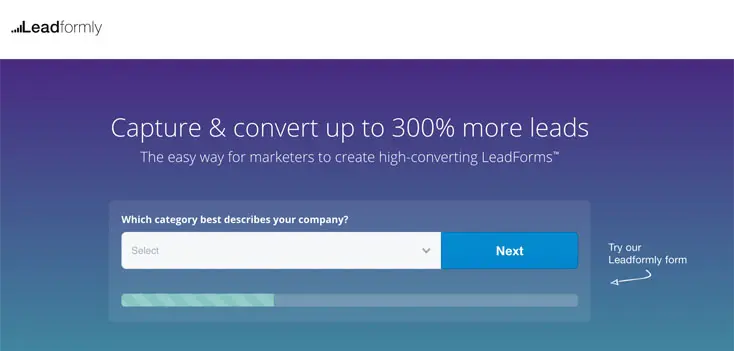
We see multi-step forms outperform single-step versions time and again. We’ve tested this across various industries and forms for different conversion types. The numbers tell us that people find multi-step forms less intimidation, which increases the number of users who start filling them out and the number of those who complete them.
We’re not the only ones who have seen this kind of results. The UK Government’s Digital Service (among others) has also found multi-step forms provide the best experience and highest conversion rates. And, after seeing similar results in the vast majority of our own tests, we figured it was time to build a platform that makes multi-step form design straightforward.
02Short forms for secondary conversions
As a general rule, you should stick to short forms for secondary conversions. Basic actions like email sign-ups, general enquiries and searches want to be as quick and easy as possible for users.

In the example above, you can see ActiveCampaign sticks to a two-field form design for its free trial CTA. Users are then taken straight to the dashboard to get started with their free trial - no messing around.

03Longer forms for primary conversions
Once users are more committed to your offer, they’ll be willing to work harder for conversions. In fact, they’ll often expect and want to provide more information on your forms.

Bluehost goes for a familiar form design for users who have decided to sign up with a domain name they already own.
For example, ActiveCampaign users understand they’ll have to provide payment details to start using the full version of the tool. Likewise, Holiday goers expect to fill out all the essential info when they reserve something. They want it in their name, fully reserved without any mistakes.
Once again, use multi-step forms to make the process more intuitive and implement a progress bar to show users how they’re getting on.
04Hide hero forms behind CTA buttons
Don’t bombard users with a form as soon as they land on your page. Let your primary call-t0-action work its magic uninterrupted and hide your hero forms behind that CTA button.
05Use a form analytics tool
The only way to know your landing page forms are performing is with data. With Google Analytics you can see how many people fail to complete your forms but you can’t find out why. So get yourself a dedicated form analytics tool that shows you which fields people are having problems with and what needs fixing.
You can check out our other favourite form analytics tools for more recommendations.
06Redesign before removing important fields
One of the most important principles in form design is to remove every unnecessary field. But what happens when users have problems with a field that provides important data for your lead nurturing process?

In these cases, try to redesign your form before you start pulling out important fields. You may find simply rewording your labels or switching to a multi-step format solves the problem. In the example above, the shorter form actually performed worse than the original version, but tweaking the field labels improved conversions by almost 20%.
07Create incentive

The longer your forms are, the more incentive it’ll take for users to complete them. This is where your landing page copy needs to shine and inspire users to take action. No matter how good your form designs may be, zero incentive means users have little reason to start filling them out - let alone complete them.
With landing page forms, the calls to action surrounding them are probably the most important part of this. However, the rest of your landing page copy becomes increasingly important as users scroll further down the page.
For tips on how to create landing page copy, head over to our 101 Landing Page Optimisation Tips article. First, though, it’s time to talk about those calls to action.
08CTAs - ‘I want to…’
Our next tip was originally posted in this article by Marcus, but it’s well worth repeating. If you want an easy template to creating CTAs that convert, ask yourself what your audience really wants and finish the sentence “I want to…”.

In the example above, Unbounce has decided its target customers want to build landing pages quickly and increase conversions. From there the landing page copy pretty much writes itself and Unbounce has only tweaked the same message over recent years.
09Stick to single column layouts

Single column layouts are important for a number of reasons. Above all, they’re easier for users to quickly interpret and they look less intimidating. Even though neither form design looks appealing, you can see how the first example above is far more user-friendly than the second.
Aside from visual layout, single column designs are much easier to make mobile-friendly. Which brings us on to our next point.
10Design for mobile first
There’s far more to designing forms for mobile than making them responsive (although this is a good place to start).
First, use the correct HTML5 markup so user keyboards pop-up in the correct format for typing phone numbers, email addresses and other input types. Also, make the most of mobile features like cameras, geolocation and touch screens.

For example, asking users to take a photo of their card rather than type their details out can drastically reduce friction.
11Use contrast to full effect
Something most form designs fail to do is make the most of contrast. Aside from helping users to navigate their way through a form, good use of contrast can reduce potential distractions from other elements on the page.

The bold blue and white design of Salesforce’s free trial sign-up isn’t the prettiest form you’ll ever see, but it doesn’t let anything else hog the limelight.
Contrast is also another important factor in optimising forms for mobile. Remember people could be outside or in brightly lit places that make low-contrast designs almost impossible to use.
12Reduce typing
One of the most important factors in form optimisation is reducing the need for users to type. Image buttons, sliders and other touch elements make the form filling out process much easier for users - especially for those on mobile, once again.
Avoid asking people to retype their passwords, email addresses or other information. Also, enable browser auto-fill so users don;t need to retype the same old information out every time they use a form.
13Go easy on the validation
Form validation is a tricky thing. It’s great to have it if it helps users fill out your forms correctly the first time; not so great if it makes it harder to submit than necessary.
First of all, you will need to use validation to prevent server attacks and malicious code. You can do all that in the background, though, far out of users’ sight.

If you use validation to help users submit forms successfully, make sure it’s inline and provides feedback as they type. Also, don’t make it too strict so that typing +44 instead of 0 for phone numbers causes problems.
Remember, the aim isn’t to prevent form submissions; it’s to help users complete them successfully the first time around.
14Forget CAPTCHAs, there are better approaches
One thing I hate to see still being used as spam prevention is CAPTCHAs. It’s not your users’ fault if you can’t come up with a better system for preventing spam - so don’t punish them with these horrible things.

Like I say, you can use validation behind the scenes to rule out spam. A common trick is the use hidden fields that spam bots will fill out (but users won’t) and then block submission with your hidden field completed.
Not a CAPTCHA in sight.
15Know where to send users next

One of the most common form design mistakes I see is a lack of thought regarding where to send users next. It’s fine if your form uses AJAX to pop-up and disappear after submission but do you really want users to stay on the same page?
If you do, that’s great - job done.
Otherwise, you’ll want to be a bit more strategic about where you send them next. Do you need users to confirm their account sign-up, get started with their free demo or try to move them on to the next conversion as soon as possible?
Choose wisely and maintain a good user experience.
Build better forms today
If you want to increase conversions from your own landing pages forms, check out some form builder recommendations. They’re built from the ground up using form best practices and user testing results. Otherwise, you can check out another article of ours offering even more form design best practices and UX tips.
FAQ
What is the ideal length for a landing page form?
The ideal length depends on your conversion goal: use short forms (2-3 fields) for secondary conversions like newsletter signups, and longer forms (5+ fields) for primary conversions like demo requests or purchases. Multi-step forms also outperform single-step forms by breaking the process into digestible sections, which reduces abandonment rates and improves completion rates.
Should I hide my landing page form behind a CTA button?
Yes, hiding forms behind CTA buttons can improve performance on landing pages with multiple conversion goals. This approach prevents form fatigue and allows you to present your hero message first before asking for commitment, making it particularly effective when you want to generate both immediate conversions and secondary leads.
How do I reduce landing page form abandonment?
Reduce form abandonment by using form analytics tools to identify where users drop off and which fields cause the most friction. Before removing fields entirely, redesign the form experience first—consider breaking it into multi-step forms, simplifying field labels, or using progressive profiling to ask for information gradually rather than all at once.
What makes a good landing page form CTA button?
The most effective landing page form CTAs use action-oriented language that focuses on user benefit rather than generic phrases. Use CTAs that start with ‘I want to…’ (such as ‘I want to book a demo’ or ‘I want to get started’) because they align with user intent and increase psychological commitment to the conversion action.
How can I improve landing page form conversion rates?
Create a compelling incentive that motivates users to complete your form, whether that’s a discount, free resource, exclusive access, or time-limited offer. Combine this with proper form structure—using multi-step forms for complex conversions and short forms for simple ones—and analyse your form data to continuously optimise field placement and messaging.
What are the best practices for landing page form design?
Best practices include matching form length to your conversion type, using form analytics tools to test and optimise performance, and structuring CTAs around user benefits rather than company needs. Additionally, consider hiding forms behind buttons on pages with multiple goals, and always test redesigns before removing fields that might be important to your conversion process.
Should landing page forms be single-step or multi-step?
Multi-step forms consistently outperform single-step forms across most conversion types because they reduce cognitive load and make the process feel less overwhelming to users. However, for very simple conversions (like email captures), a single short form may still work—the key is testing both approaches with your specific audience.