

Landing pages are one of the most important lead generation tools in your marketing strategy. These are the pages that convert PPC traffic into paying customers, generate email sign-ups, get your lead gen content ranking in organic search and promote your products/services via social media.
Although you want to optimise your entire website for conversions, most of these are going to take place on landing pages (or product pages for e-commerce brands).
So you need to make sure you have a knack for designing landing pages that convert - and optimising them to address issues and improve performance over time. In this in-depth guide, I’m going to show you how to design high-converting landing pages, one step at a time.
What are we looking at in this list?
This guide aims to give you a complete walkthrough of the design process for creating high-converting landing pages. As you can probably guess, this is going to be a pretty long article and I’ve broken things down into the following categories:
- Preparation****: All the planning and prep work that goes into designing killer landing pages.
- Building a framework****: How to design frameworks that will make it easier and faster to create landing pages in the future.
- Landing page content****: Content doesn’t get the attention it deserves but this is what really separates high-converting landing pages from the rest - so let’s make sure you nail this part.
- Psychological techniques****: Use these powerful methods to create compelling content and influence buying decisions.
- Design each landing page section****: How to design every section of your landing page, from top to bottom.
- Maximise conversions****: How to optimise your landing pages to improve performance over time.
You can click on the bold text in that list to jump ahead to each section and make sure you bookmark this article so you can come back to it for future reference.
By the time you’re done with this guide, you’ll have a solid understanding of the entire process involved in designing landing pages that achieve high conversion rates, generate leads and add genuine value to your business.
So let’s get started by looking at how to plan and prepare for your first killer landing page.
Plan ahead for every landing page
As with anything in marketing, planning is at the heart of success and getting this stage of the process right will benefit every landing page you design in the future. The planning state also gets easier (and faster) the more times you do it. So don’t be afraid to invest some extra time into this early on - you’ll be rewarded for it later.
Step #1: Get a decent landing page builder
The first thing to know about designing killer landing pages is that you need to create a lot of them. Ideally, every unique campaign goal should have its own unique landing page and you may even create multiple pages for different target audiences.
“Companies with 30 or more landing pages generate 7 times more leads than those with fewer than 10.”
According to a study by Preface Studios, companies with 30 or more landing pages generate seven times more leads than those with fewer than 10 - that’s three times as many landing pages generating seven times as many leads.
You’re going to need some help to build and test all of those landing pages and there are some great landing page tools like Unbounce, Instapage and Leadpages that offer drag-and-drop page builders - so you can design landing pages quickly without writing any code.
Step #2: Define your audience for each landing page
The reason you need to create a lot of landing pages is because you want to target specific user needs for each audience and the general rule is, the more relevant you are with your messaging, the higher your conversion rates and other KPIs should be.
Let’s say you’re promoting a software platform that makes it easier to manage a business. Instead of creating one landing page with a message saying how much time and money your product can save businesses, you want to create separate landing pages for your specific target audience - e.g.: accountants, events organisers, creatives, high-end marketing agencies and whichever audiences are most suitable for your product (and profitable for your brand).
By defining these audiences, you can identify what their biggest goals are associated with a product like yours and build your campaign messages around them, instead of targeting everyone with generic messages.
This is crucial to landing page design.
Step #3: Define your conversion goals
Every time you sit down to create a new landing page, the first thing you need to clarify is what your conversion goal is. Are you asking users to buy right now, sign up to a free trial, download some lead gen content, attend a webinar, sign up to your email list - or some other kind of conversion goal?
Whatever it is, you’re not going to create a compelling landing page message unless you know precisely what you’re trying to get users to do. So make sure you define your conversion goal as soon as you start planning to create a new landing page and keep this at the forefront of your mind with every design choice you make.
One of the easiest traps to fall into with landing page design is to get distracted from your conversion goal and this is where you start making decisions for the wrong reasons.
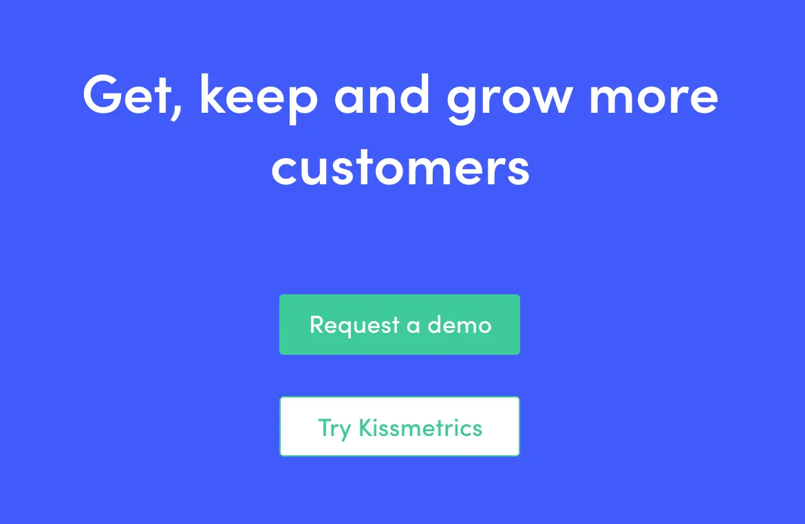
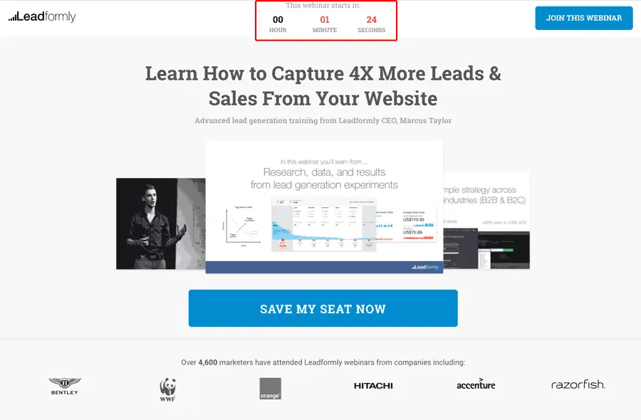
Despite what many landing page guides and best practice articles will tell you, it’s perfectly acceptable to have more than one conversion goal on the same landing page (as seen in the Kissmetrics example above). In fact, I would go as far as recommending you have two conversion goals for every landing page you create.
The trick is to pinpoint what your primary conversion goals is and make this the star of your landing page. Your primary conversion goal should dominate the page and command roughly 90% of user attention. Your secondary conversion goals is there for visitors who aren’t quite ready to commit but are interested enough to complete a less demanding action that will keep them engaged with your brand and allow you to continue targeting them with messages.
Step #4: Craft your landing page message
With your target audience and conversion goals defined, you’re ready to start crafting the message for your landing page. This is where your audience research is really going to pay off and the better you are at pinpointing the unique needs of each audience, the easier crafting high converting messages will be.
At this stage, you don’t need to worry about perfecting the content for your entire landing page - we’ll come to that later. For now, focus your attention on the key selling point you’re aiming to leverage. You should be able to create a single headline based on this that will resonate with your target audience and become the basis of your entire landing page message.
Once you’ve got this, you’ll have a working version of your landing page headline and a solid basis for the message in your hero section, which you can refine later on. This core message will also be the focus of your PPC ads, snippets in organic listings, and social posts - whatever people are clicking on to reach your landing page.
Step #5: Build campaigns around your landing pages
As I mentioned in the previous point, the key message of your landing page will pretty much be the same message in your PPC ads, social posts and whatever else you’re using to promote them. In other words, this message will be the basis of your entire campaigns that revolve around each landing page.
To make this process easier and keep everything tied together as it should be (consistency is important here), I recommend you plan each campaign in the following order:
- Choose your conversion goal(s)
- Choose your target audiences
- Choose your promotion channels (PPC, organic search, social, email, etc.)
- Define your key message
- Make this message consistent across each campaign, including the channels you use to bring traffic to your landing pages
Personally, I find this easier to build campaigns around landing pages because it’s the message on these pages and the selling points you communicate that need to be communicated at every point of the campaign - from keyword research to ad/post copy and the targeting options you use to get your message seen by the right audience.
Build a landing page framework
When you’re building and optimising landing pages on an ongoing basis, it really helps to have a framework in place (or multiple frameworks) to cut out repetitive design work. You can create these in any decent landing page builder, giving you a starting point in terms of layout, design conventions and style choices.
Aside from saving you a whole bunch of time, this will also help you keep styles consistent across every landing page you create.
Here are some tips to get you started.
Step #6: Ditch the navigation header
I’ve mentioned this one a few times on the Venture Habour blog and it’s a general best practice to follow for landing page design. Unlike a homepage, which is designed to connect users with the most relevant parts of your website, a landing page should have clear conversion goals and you don’t want users getting distracted with other things.
Navigation menus can distract users from your conversion goals.
Having a navigation menu at the top of your pages simply gives users the opportunity to click through to parts of your website that aren’t going to generate conversions.
Remove navigation menus from your landing pages to keep users focused on the task at hand.
People click through to your landing pages because the message in your ad, search listing, social post or email piqued their interest. They’re already invested in your conversion goal (at least to some extent) and you’ve often paid to get them this far - so don’t give them the chance to venture off track.
Get rid of those navigation menus and keep your landing page traffic on track.
Step #7: Start with a single column layout
Another best practice I recommend for every landing page you design is single-column layouts. By this, I mean the main structure of your page vertically stacks full-width divs on top of each other and this works particularly well with centre-aligned text, as you can see below:
Source: Instapage**, Getquip.com
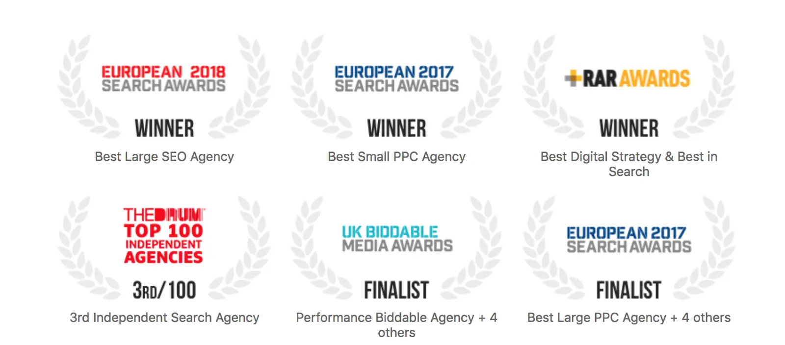
Now, this doesn’t mean you can’t throw in the odd set of columns where you need to show multiple versions of related content, which you can also see in the section above where Quip lists three awards and certifications for its product.
However, the general template here is single columns with full-width divs stacked on top of each other and divs containing three columns where you want to create lists of benefits, awards, testimonials and other groups of related content.
There are a lot of reasons why this template is a good way to go:
- Your landing pages will be consistent in terms of design and styles (font choices, styles, sizes, layouts, margins, etc.)
- Full-width divs force you to create concise messages, focusing on a single point in each section.
- This gives each message greater impact, reduces distractions and makes your pages easier to navigate.
- This format will also make the message in each section more memorable
- Full-width layouts are responsive by default so you’re landing pages are pretty much optimised for mobile before you even begin (just make sure your text and images are sized for responsive design).
- Single columns give you a lot of whitespace to work with, making your core messages and CTA button stand out more.
- You can align text and other pieces of content to make your CTAs more prominent (more on this in step #10).
- Having this kind of template in place will make designing future landing pages faster, easier and more effective.
- You can simply add new sections into your existing template when needed.
- You can optimise each section individually to improve performance and increase conversions on step at a time.
The only real downside to this approach is that you might become over-reliant on templates and miss creative opportunities to do something different. However, in the vast majority of cases, consistency is going to outperform innovation and productivity is certainly going to better with a solid set of templates on your side.
Step #8: Stick to three columns where possible
Although I generally recommend single-column layouts for landing pages, there are parts of each page that are going to group together multiple versions of similar info, essentially in the form of visual lists. This is common for lists of benefits, key features, social proof and other elements where you need to display groups of info.
These will show as columns on desktop and wider display, but expand into full-width divs on mobile.
As a rough guide, you’re going to have 1-3 of these sections on every landing page you design and you really don’t want to have any more than that. Remember these are going to stack into vertical lists for mobile users and your landing pages will quickly become too much for mobile scrolling.
Also, stick to three columns wherever possible when you’re creating these list sections. These will reduce the vertical scrolling required of mobile users but there are more important reasons for this, which I’ve outlined in previous articles.
I call this the magic number technique where lists of three are more effective than any number and here are a lot of design and psychological reasons for this:
- The rule of odds: A design principle that describes how having an odd number of elements/subjects in view makes them more visually appealing.
- The rule of three: A writing principle that describes how a trio of events or characters is more satisfying than other numbers.
- Cognitive load: Keeping the rule of odds in mind, lists of there are much easier to digest and remember than lists of five or longer
- Memory capacity: Studies reveal the human mind is only capable of remembering roughly four pieces of information at any one time.
- Anchoring bias: A psychological habit that describes how people place more importance on the first piece of information they receive, which also influences how they interpret following pieces of information.
- The serial position effect: A psychological habit that describes how the first and last piece of information on a list have more impact and prove more memorable.
So, what you want to do is create lists of three with the most important piece of information coming first and the second most important piece of information coming last. Human psychology will pretty much do the rest of the work for you and the only real challenge left is condensing larger lists of information into lists of three.
Step #9: Choose where to place your CTAs
CTA placement is one of the most important decisions you’re going to make with each landing page and this is something that could vary from one page to another. You’ll also want to experiment with placement by testing different positions to see which ones work best for you.
However, I still recommend using templates to place your CTAs in the early days so you can keep things consistent. This will make your data more reliable when it comes to testing variations at later stages.
There are two basic approaches to CTA placement: above the fold for high-intent users who don’t need any extra convincing to convert and below the fold for users who’ll need more information before taking action.
Now, the best placement for each landing page is going to depend on how high user intent is when they land on your page, how demanding your conversion goal is (e.g.: purchase vs free download), how effective your targeting is and various other factors.
As a starting point, you might decide to put CTAs in your hero sections and then repeat the same CTA (same conversion goal, slightly different wording) multiple times throughout your landing page so you can effectively cover both bases for high-intent users and those who need more convincing.
As your campaigns become more sophisticated, you can then start to be more decisive with your CTA placement, based on how much intent you expect your landing page traffic to have.
Finally, I recommend having a second CTA at the bottom of your landing page, prompting users to complete your secondary conversion if they’re not ready to buy into your first one.
Step #10: Use the inverted pyramid for CTAs
Earlier, I mentioned using text and other pieces of content in single-column layouts to make your CTAs more prominent and this strategy uses a design technique known as the inverted pyramid. This creates a visual arrow (or inverted pyramid) that literally points to your CTA or other important parts of your pages.
This is a crucial design concept used in landing page design, email marketing and just about any strategy that uses calls to action. Aside from using this to make your CTA more prominent, you’ll also want to make sure you’re not inadvertently using this technique in the wrong places to make less important elements stand out more than they should.
Step #11: Choose your colour scheme
Colour schemes are one area where you want a solid amount of consistency across your landing pages. You shouldn’t really need to be selecting colours when you design new landing pages because 90% of these choices will be baked into your templates.
You’ll want to create a base colour scheme that implements your brand colours, sets tones and styles (e.g.: pastel colours vs vibrant colours, etc.) and have a collection of background colours, highlight colours, font colours, CTA buttons and all the key elements on your pages.
Step #12: Choose your fonts
Fonts should have even more consistency than colours across your landing pages and you should stick to a relatively small library of font choices, styles, eights and colours assigned to specific elements (e.g.: headings, subheadings, paragraph text, etc.).
Again, you shouldn’t really be making any decisions as you create new landing pages; these fonts should automatically be assigned to the relevant elements as you add text. Of course, you retain the freedom to make any mild changes where necessary (e.g.: switching to a thin italic version of the same font to differentiate a specific line of text from others).
Step #13: Design your forms
You should have a good idea of what web forms you’re going to need (email sign-up, account creation, demo sign-up, product purchase, etc.) based on your conversion goals. Each of these forms is going to appear across multiple landing pages so it’s a good idea to design them first as this will make it much easier to maintain consistency.
This way, you can simply choose which form to embed on your landing page and you’re good to go. We create high-converting multistep forms (which have been found to increase conversions by up to 743%). You can choose forms from pre-built templates, create your own using drag-and-drop builders and embed them on any page across your entire website.
Crucially, these forms also come with dedicated form optimisation tools so you can improve UX, remove barriers and truly maximise conversion rates - something far too many businesses overlook.
Step #14: Design your landing page footer
Another area of landing pages that doesn’t get as much attention as it deserves is the humble footer. While it’s tempting to simply throw everyting you couldn’t fit elsewhere into your footer, this is poor design choice when you consider the fact users that make it this far probably haven’t found what they’re looking for after scrolling the entire length of your page.
Your footer needs to step in here and give people a reason to stay engaged with your brand or you risk losing them altogether.
Now, you have some decisions to make:
- Do you add another CTA with a gentle conversion goal?
- Do you include links to other parts of your website that might interest these users?
- Do you hit them with a special offer to increase incentive?
- Do you offer something for free to get users on board your email marketing efforts?
- Do you create a generic footer and accept these leads aren’t interested?
The right approach for you depends on your conversion goals and how much value you place on maximising conversions vs maximising value per conversion. This is something you’ll need to test on an ongoing basis but the key lesson here is that footers are an important part of your landing pages - so take them seriously and optimise for performance.
Design the content for your landing page
With your templates sorted, it’s time to turn our attention to the content on each landing page and this is where the bulk of your time should be spent when you’re creating new landing pages. Your templates should take out as much of the visual design process as possible so you can focus your efforts on crafting messages that influence buying decisions.
Here’s what you need to do.
Step #15: Create your landing page headline
The headline in your landing page should encompass your entire offer and key selling point in half a dozen words or so. That’s no easy task but this is where your audience research is going to prove its worth and segmenting your campaigns to target niche audiences will also help with this.
Keep in mind that your landing page headlines should be almost identical to the headline in your ad, search listing or social posts users initially clicked on to get there.
I can’t reiterate this enough: your headline is the core message of your entire campaign; the reason users click through and, ultimately, the reasons they’re going to convert (or not). If you can’t condense this into a single headline, then you probably don’t know what the core message of your campaign is or what’s going to convince people to click through and convert.
If you’re stuck on this, focus on the pain points of your target audeinces and pinpoint what your product, service, lead generation content or whatever else is going to do to fix them. This “solution” is what people are buying into, whether it’s a suite of business software or a new dress - the same principle applies.
If you want to create high-converting landing pages, start by mastering the process of creating headlines. Doing this covers so many of the fundamental bases that things will start falling into place throughout the rest of the page.
Step #16: Complete your hero message
The hero section is the first thing users see when they land on your page. This is where your landing page headline greets them and the remaining content is essentially a brief expansion on this key offer.
Like I say, master your headlines and the content for your hero section almost writes itself.
You may also want to include a CTA in your hero section and I’ll talk about this more in the next section. For now, though, focus on creating a subline that expands upon your headline and adds value to your overall message. Make sure you really encompass the key benefit of what people are going to get from converting.
In the example above, Toggl leads with a question and answers with the single key benefit its product has to offer. One key benefit should be enough and, once again, if you can’t condense your hero section content into a single selling point, then you haven’t defined your key message well enough.
Step #17: Create the copy for your CTAs
Next, you’re going to want to create the copy for your CTAs and the content for these is going to look a little different, depending on where they are on your page. If you’re including a CTA in your hero section, you’re headline and subheading are your CTA copy and the only element missing, in this case, is the CTA button.
This is what we see from the above CTA, which comes from one of InVision’s landing pages. For the CTAs further down your page, you need to write these in accordance with the wider narrative in your page content because these messages are going to work together to inspire action as users scroll down your page.
For users who don’t buy into your first CTA, you need to showcase what they’re going to gain in more detail. You might follow up with key benefits, comparisons with competitor brands, GIFs or embedded videos highlighting your best features - whatever you decide is going to help people make that buying decision.
Either way, you want to adapt your CTA copy throughout the page to reinforce your message, as it becomes more involved. This will take some time (and testing) so don’t be afraid to refine your CTA messages after your campaign goes live.
Find out what works with your target audiences and implement your findings on future landing pages.
Step #18: Define your key benefits
I mentioned key benefits in the previous section and this is one of the most important parts of any landing page. Most users are going to scroll past your first CTA and this is where you need to hit them with the most tempting selling points, the key benefits that your offer is going to bring to their lives.
As I explained in Step #8, I strongly recommend you condensing your list of benefits into three points. Psychologically, this makes gives your benefits more impact and makes them more memorable and, from a design perspective, easier for users to scan, digest and understand.
This design approach also works really well in responsive designs.
All you need to do now is condense your list of benefits into three key points. Really try to pinpoint the benefits that are going to encourage users to buy and this is something else you may need to test over time.
Lead with your most important benefit and finish with the second-most important. Finally, follow up with a CTA calling upon users to buy into those key benefits you worked so hard to define.
Step #19: Determine what else users need to know
Pretty much every landing page you’re going to create will have a hero section, primary CTA and a section of key benefits, followed by a section CTA. You can pretty bank that format as a starting template. Where things will start to vary more is the content that comes after those benefits and this is where you need to pinpoint what additional information users need to increase their purchase intent.
If you’ve got a complex product/service or there’s a lot of competition in your field (and you have to work harder to differentiate), you may need to explain more about your product/service.
This is where the general rule of benefits vs features is really important.
Try not to be too descriptive about what your product or service can do; focus on communicating on what it can do for the end user. This may sound straightforward but a lot of businesses get this horribly wrong. Features are merely tools that help people accomplish things and this isn’t what people are really buying into.
They’re buying into a feeling: the feeling that you’re going to improve their lives somehow. This applies just as much to consumer tech products that are entirely feature-driven. For example, the iPhone 11 Pro sports an innovative camera with lenses but nobody really cares about that.
People will buy the iPhone 11 Pro because they feel good having the latest premium handset in their possession and they buy into the camera gimmick because they think it will make their Instagram feeds more interesting.
It might sound superficial but it sells.
If you’re not lucky enough to have the selling might of Apple, then you’re going to have to work even harder to capture the emotive trigger that compels people to buy. And, once you’ve convinced people that your product is for them, your next aim is to remove any lingering doubts they might have to prevent them from hitting the buy button.
This is where reassurances like free trials, money-back guarantees, warranties and other forms of protection that make people feel like they’ve got nothing to lose.
Step #20: Choose your social proof methods
Social proof is another powerful tool for easing buyer concerns and there are various methods you can use to reduce anxiety and build trust. Here’s a quick look at some of your options to give you an idea of where to start:
- Customer reviews: Especially from trusted third-party platforms like Google Reviews and Trustpilot.
- High score averages: Studies show that an average score of 4.2-5.5 out of 5 on review platforms has the biggest positive impact on conversions.
- Expert reviews: Having your business, products or services reviewed positively by industry experts is a major seal of approval for new customers.
- Press coverage: You must be doing something right if major publications are writing about you.
- Testimonials: Accounts from your existing customers that quickly explain what you’ve achieved for them.
- Case studies: A more in-depth look at what your business or product has done to help your existing customers.
- Well-known clients: Having a portfolio of well-known brands trust your business then why shouldn’t new users?
- Industry awards: Another seal of approval from your industry peers and a suggestion that you beat your competitors to the prize.
- Partnerships: A vote of confidence from brands that want to be associated with your business.
You only want a maximum of 3-4 types of social proof on each landing page but the right combination of social proof options can vary from one page to another. So it makes sense to choose which options you’re going to work with and create the content for them all now. This way you can design each method and test combinations on each page to determine what has the best impact.
Step #21: Create/source your visual content
With your text content sorted, it’s time to think about visuals and you’re going to need some quality images to inspire visitors. Invest in some professional photography or design to get these visuals sorted and you’ll also want to build a library of visual content you can use across every landing page - e.g.: icons, logos, mockups, charts and whatever else you’re going to need.
Consistency is important so you need to make sure you’ve got enough icons, for example, in the same style for all of your landing pages (including future ones).
In an ideal world, you’ll have an in-house or freelance designer who can deliver what you need, when you need it. Otherwise, you’ll want to look at resource websites like Envato Elements where you can download graphics or simple design tools like Canva to create what you need.
Supercharge your landing page copy with these psychological techniques
Just when you thought you’d finished with your landing page copy, I’ve got a bunch of tips to help you supercharge your content and make it too compelling to resist. You’ve laid out all of the important stuff by this stage and these psychological techniques are going to add the finishing touches that really influence buying decisions.
You’ve laid out all of the important stuff by this stage and these psychological techniques are going to add the finishing touches that really influence buying decisions.
Step #22: Build incentive throughout your landing pages (and campaigns)
People have a natural resistance to parting with their money - and so they should. They also have an instinctive lack of trust for brands they don’t already trust and this is something any savvy consumer or business mind should have, especially in today’s online world.
Added to these natural doubts people might have about doing business with you, there are all kinds of obstacles getting in the way. Forms need to be filled out, payment details need to be provided and, in many cases, customers need to wait for their purchase to delivered or set up for them.
The truth is, people have far more reasons not to buy from you than they have to buy from you.
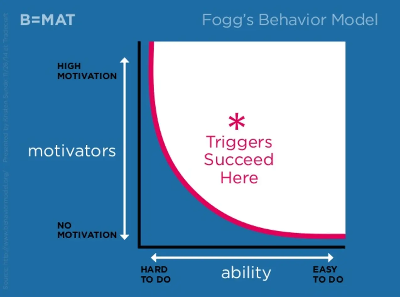
To overcome this, you’re going to follow something called the Fogg Behavior Model that illustrates how purchase intent overcomes conversion barriers. essentially, the harder it is for people to complete your conversion goals, the more you need to create incentive and motivate people to overcome those barriers.
If the reward is perceived to be big enough, people will go to whatever lengths necessary to get it.
Apply this philosophy to your landing page copy but also strategise your entire campaigns to increase incentive the further users progress along the sales funnel. This will make it increasingly difficult for them to abandon before the finish line.
Step #23: Create a sense of scarcity
You can also use people’s built-in anxiety to increase sales and scarcity is one of the most fundamental marketing principles used to give prospects the final push. Scarcity uses the natural fear of missing out to coerce people into making buying decisions they possibly wouldn’t make otherwise.
There are two types of scarcity you’ll see all over the web and other marketing channels:
- Supply scarcity: This tells people there’s a limited quantity of a product or availability of something.
- Time scarcity: This tells people there’s a time limit on an offer and it’ll be gone for good if they leave it too late.
These two forms of scarcity are used in all kinds of ways - from countdown timers to time-limited offers to more subtle methods like VIP memberships or content that implies scarcity, such as CTAs like “Get your [product] while you still can”.
You’ll see blatant scarcity tactics used all the time on hotel booking apps and e-commerce stores but the best brands know how to create a sense of scarcity without making it obvious - and this is where it proves most influential.
For example, a software company might create a beta programme with “limited” spaces for customers, giving them free access to features prior to rolling them out across all accounts. The trick is, non-premium members will suddenly lose access to premium features when they’re fully released. After reaping the benefits of these features, losing them will be tough and the only solution is to upgrade to the pro version to get them back.
Step #24: Influence buyer decisions with these cognitive biases
Scarcity is a powerful tool in marketing but there are all kinds of psychological triggers you can use to influence buying decisions. I’ve written about cognitive biases and how you can use them to create ultra-compelling CTAs before and here are some of the powerful strategies used by brands:
- Loss aversion: People’s natural fear of losing or missing out on something.
- Anchoring: Our tendency to be more influenced by the first piece of information we receive than those which follow.
- The halo effect: The reason first impressions are so difficult to change.
- Sunk cost bias: The compulsion to complete something once you’ve already invested time into it.
- The endowment effect: Causes people to place additional value on items they own vs those they don’t.
- The mere exposure effect: Why people tend to favour things they’re already familiar with.
- The serial position effect: How the first and last items on a list appear to be more important than the others.
- Reciprocity: Why, when you do something for someone, they have a natural tendency to want to do something for you in return.
- The Baader-Meinhof Phenomenon: After you see something for the first time, this causes you to suddenly start noticing everywhere.
- The Verbatim effect: The reason we remember the gist of what we’re told rather than the specific details.
- Clustering: Our habit of clustering similar pieces of information together to make them more memorable.
I’ve already explained why the serial position effect is one of many reasons lists of threes are powerful in landing page design - and this is just one example of how these principles can be used to create compelling pages.
Get familiar with these cognitive biases and make them a heavy feature in all of your marketing efforts.
Design each section of your landing page
Now, we’re ready to start actually designing the key elements on your landing page and this is where we’re going to focus purely on visual design. In this section, we’re going to look at the following sections, which you’ll need for pretty much every landing page you create:
- Hero section
- Calls to action
- Key benefits
- Social proof
- Final CTA
In many cases, these are the only sections you’ll need for a landing page (plus your header and footer) and pretty much every landing page you create will need these key sections.
Step #25: Design your hero section
First up, we have the hero section and there are two approaches I want to focus on here. The first one is a centre-aligned design with a heading, subheading, CTA button and background image.
This is one of the most common but effective hero section formats and it’s really simple to create. A large heading is followed by a subline in smaller text (possibly a little too small in the example below) and a CTA button.
Source: Daily Harvest
This creates the inverted pyramid CTA design I mentioned in Step #10, literally pointing users to the conversion goal. This is a great approach if you know purchase intent is high or your offer is very simple - like the offer of getting more fruit and veg into your diet.
For more complex messages, you can still take the centre-aligned approach but expand upon your offer further down the page. Or, you can left-align your hero text and balance this with an image that communicates your core offer, as Unbounce does in the example below.
Source: Unbounce
In this case, the left-aligned text is balanced by the image on the right, allowing Unboucne to visually communicate the copy in its hero section. This is also a common approach but it’s much more difficult to pull off and you can see how Unbounce’s hero section has a lot going on.
I’m sure they’ve tested this design and found it works but my advice is to get familiar with design layout principles and make sure you understand what you’re doing before you start left-aligning text in hero sections.
Step #26: Design your CTAs
We already looked at designing the layout and structure of CTAs Step #10 and that all-important inverted pyramid design principle. I’m not going to repeat that again in this step, though, especially when there are so many other points we need to cover on CTA design.
Mastering the principles of CTA design will improve every other aspect of your landing pages because the same rules generally apply everywhere in web design.
We’ve already looked at CTA copy and layout, which means the remaining principles you need to master are:
- Text styles: Fonts, weights, styles and sizes of text.
- Colours: The colour of your text, CTA button and background colour.
- Whitespace: The space between different elements in your CTA (and the space between your CTA and other elements on the page).
- Contrast: Colour contrast is the most important of these but you can also use size, style and placement contrast.
First, let’s talk about contrast because this impacts the other three principles in that list. White backgrounds and black text offer the strongest possible colour contrast for your CTAs so start with this as your default design.
If your CTA comes after a section that’s already using a white background and black text, then choose a bold colour from your scheme (you already chose these in Step #11) and use white text to invert the contrast.
You’ve already chosen your fonts but you’re going to use style contrast (different fonts, font styles, weights, sizes, cases, etc.) to make each piece of your CTA text stand out. This is especially important if you have multiple lines of text to work with in your CTA.
Aside from making your entire CTA stand out, it’s that button that really needs to jump out at users and this is where contrast needs to be bumped up to 100%. White text generally the way to go with a bold highlight colour used for the button itself - just make sure you have strong constrats with the background, your CTA copy and the text in your button.
Contrast is your best friend in CTA design so be sure to learn the design principles behind it - as well as text styles, colours and whitespace. Your whole landing page designs will improve by doing this and, ultimately, so will your conversion rates.
Step #27: Design your list of benefits
We’ve already looked at the magic number technique and why lists of three benefits are generally most effective (Step #8) but now let’s look at the visual design of your benefits.
Once again, there’s a really great template you can use for this section time and again. First, you’re going to need some icons or graphics that visually represent each benefit. This does three things:
- It makes your benefits stand out visually
- The icons visually explain each benefit
- This allows you to use less text
All in all, you end up with an attention-grabbing and visually compelling list of benefits. All that’s left is to add a title in bold for each benefit and then add some smaller text offering a brief description of each one.
Done.
Step #28: Create your social proof section
You’ve already decided which types of social proof you’re going to use and what kind of content to include. Now, it’s time to create the visual design for them and the approach will vary for each type of social proof.
For lists of clients, partners and press coverage, it’s best to use their logos to create stencil icons in the same colour (ideally white on coloured backgrounds or black/bold colours on white backgrounds.)
For testimonials, you have more design choices to make in terms of format. All I will say is, make sure you include pictures of each customer, their full name, their company and job position (if relevant) and genuine quotes.
If you’re going to use customer reviews, I recommend embedding them directly fro third-party sources, as this will make them more trustworthy.
For industry awards, you should be able to download official icons or logos from each award provider and then you need to think of how you can make these look consistent together.
Step #29: Design your final CTA
Now, it’s time to design your final CTA and apply everything we’ve looked at in this guide regarding CTA design. All the same lessons apply here but the key difference with this final CTA is that it needs to seem like an effortless action for users who haven’t bought into your main conversion goal.
You’ve done everything you can to get these users on board but, for whatever reason, they’re not ready (0r willing) to take that step right now. So you need to finish off with a compelling CTA that gets their email address into your system, which you can use to reach out to these leads with your email marketing campaigns (as well as remarketing).
Maximise landing page conversions
By now, you should be designing quality landing pages that inspire purchase decisions - congratulations for making it this far! However, there’s always room for improvement and this is where we look at how you can really maximise those conversion rates.
Step #30: Optimise for speed
The most important thing you need to know about landing page conversions is that speed matters. Forget about tweaking design choices if your pages are taking too long to load because you’ve already lost the game. Google recommends pages load in under three seconds to minimise bounce rates - and this means mobile loading times on 3G connections.
If your pages are taking longer than that, you’ve got a problem.
Use Google’s free Page Speed Insights tool for a basic analysis of your pages and see how you can reduce loading times. The key thing is to minimise the load on the end user’s browser and you can do this by:
- Using quality hosting services
- Using a landing page builder and templates designed for speed
- Minimising server requests
- Taking it easy on JavaScript, plugins, etc,
- Optimising images
- Compressing files (CSS, JS, etc.)
- Using clean code
- Caching (only helps return visitors)
- Using a CDN (reduces loading times for users far away from your server location)
Unbounce research finds that a majority of marketers don’t consider page speed to be a priority. Forget about those guys; be the minority that nails page speed and enjoy all those extra conversions they’re missing out on.
Step #31: Create remarketing campaigns
Google Ads remarketing campaigns allow you to target people who have visited your landing pages and not converted. This is a crucial strategy for maximising conversion rates and the best thing about remarketing is that you can use it to target organic traffic as well.
You can also run remarketing campaigns on Facebook, Instagram, LinkedIn and most of the major social advertising platform.
Check out our 10 advanced remarketing techniques that increase conversions for our insider tips on converting those lost leads.
Step #32: Segment your landing page leads
Not all conversions are equally valuable to your brand (in fact, some of them won’t be valuable at all) and you need a way to determine which leads really matter. To do this, you need to segment your leads into categorised lists, which allows you to deliver relevant messages in future interactions and prioritise which leads to focus your attention (and budget) on.
Read our guide to lead segmentation for an in-depth explanation on how to do this.
You can partially segment leads, depending on which conversion goal they complete but this doesn’t give you enough info to accurately target them with convincing content.
We segment our leads while they sign up by asking relevant questions about their needs and this allows us to send relevant messages from the first interaction after their initial conversion.
To manage your segmented leads, you’re going to need a solid customer relationship management (CRM) platform so you can keep track of leads as they progress along the customer journey.
We use ActiveCampaign as our CRM because it packs some of the best email and marketing automation features into a single platform that helps you guide each lead along the buying process and beyond. Leads become paying customers and customers become regular buyers - read our ActiveCampaign review for more details.
Step #33: Reduce attention ratio
The more things happening on your landing page, the more there is to distract users from your conversion goals. This is one of the key reasons I recommend removing navigation menus and sticking to minimal single column layouts.
Here’s the definition of attention ratio from Unbounce:
The ratio of links on a landing page to the number of campaign conversion goals. In an optimized campaign, your attention ratio should be 1:1. Because every campaign has one goal, every corresponding landing page should have only one call to action – one place to click.
Sound advice from one of the leading names in landing page optimisation.
Step #34: A/B test your landing page messages
A/B testing is a key tool in conversion rate optimisation (CRO) but many marketers get stuck in a rut testing the wrong things on their page. Sure, in principle, any change could have an impact on conversion rates, but you want to focus your attention on what’s going to have the biggest positive impact.
Let me be clear: by far the most important thing to A/B test on your landing page is the content.
This is what convinces users to convert (or not) and perfecting this will have the greatest long-term impact on conversions. Test different messages, selling points, key benefits, psychological techniques and landing page copy to see what really influences your target audiences.
Don’t make small changes - at least not to begin with. Make dramatic changes to pinpoint which key messages resonate, core benefits really attract users and what type of language inspires action. You can refine the smaller details later once you’ve got the core fundamentals nailed.
Step #35: A/B test different versions of each landing page section
You’ll also want to A/B test different version of each section on your landing page to confirm or improve your design choices. The trick is to only change one section at a time so you can confirm which version achieves the best result. You might want to start by testing CTA placement and the placement of other sections to determine the most effective order.
Once you’re happy everything is in the right place, start optimising your hero section and first CTA. Then move on to other sections to try and improve results. Test different lists of benefits, combinations of social proof and secondary CTAs to see how they impact conversions.
Step #36: A/B test your CTAs
Normally, CTAs are the first thing mentioned when it comes to A/B testing and this is fair enough - they’re one of the most important elements on your landing pages. I do think CTA optimisation is a little misunderstood, though, or maybe it would be better to say I think it’s missold by software companies selling CRO tools.
When it comes to testing CTAs, the two most important factors are the copy in your CTA and the placement of them - both of which we’ve already looked at. The next most important thing is the content that comes before your CTAs because this is what sets users up for them.
Once you’ve got these things sorted, you can start looking at the finer details of your CTAs and test variations. Don’t jump right ahead to testing CTA button colours and fonts before you’ve got copy, placement and the rest of your content optimised - no matter what you read online.
Step #37: Optimise your pages with heatmaps
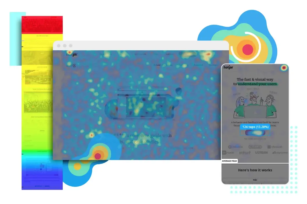
Heatmaps allow you to see what users get up to on your landing pages: what they’re clicking, what they’re not clicking, where they scroll to and which elements of your page they see. This confirms whether users are seeing your CTAs, clicking them or scrolling right past them, allowing you to fix or rule out some of the most crucial conversion killers your landing pages might suffer from.
We use Hotjar for its excellent heatmaps and you can read our review for more details.
Step #38: Use event measurement to optimise your pages and campaigns
Event measurement is a Google Analytics feature that allows you to track user actions like button clicks and other interactions with page elements. This allows you to track events like CTA button clicks to pinpoint instances where users click to convert but fail to complete the conversion, for example.
Event measurement is a powerful feature but we use something called site tracking in ActiveCampaign that does a similar job, but with one key difference. With site tracking, we’re able to assign these actions to individual users with much greater accuracy and, aside from optimising for conversions, we can use this data to send more relevant messages to users based on the actions they take on our site.
Step #39: Run user testing/feedback campaigns
In this data-driven marketing industry, it can be easy to forget the power of reaching out to people for honest feedback. No respectable software developer would release a platform without testing it with real users and marketers should be taking the same approach with their own creations.
This happens to be another great aspect of Hotjar. It comes with a suite of tools for getting feedback from users, including polls, surveys and live feedback from website users.
Don’t underestimate the power of getting feedback from the people actually engaging with your landing pages.
Become a landing page design master
With everything we’ve covered in this guide, the only thing left is to put it all into practice and start designing landing pages that convert from day one - and improve over time. Just a quick reminder: bookmark this article so you can come back to it when you’re designing landing pages. It won’t be long before you’ve got all of this in your locker and landing page design feels like second nature.