


According to research from Unbounce, the average conversion rate on business landing pages is 4.02%. In some industries, these averages can drop as low as 2.6% or reach as high as 6.1% but the key point here is that 90%+ of the traffic that lands on your site isn’t converting into anything valuable.
Source: Unbounce
In fairness, we’ve been hearing these kinds of statistics for years now and average conversion rates are on the up - largely thanks to a major adoption of conversion rate optimisation (CRO) and a better understanding of best practices, such as mobile optimisation.
When talk turns to conversion optimisation, though, there’s one element that tends to dominate the conversion: calls to action (CTAs). There’s good reason for this, too, because it’s the CTAs that seal the deal and push potential buyers over the finishing line - roughly 4% of the time, anyway.
Considering their importance and the amount of room for improving conversion rates, CTAs deserve to dominate the conversation but marketers are all too often guilty of talking about them in the wrong way.
Ask a marketer for advice on CTAs and they’ll probably tell you about button colours, font styles, placement and various other design aspects - all of which are important considerations which may have an impact on your conversion rates. However, there’s rarely any talk about what influences buying decisions most in those final crucial moments.
Well, this is precisely what we’re going to talk about in this article. We’re talking about CTA psychology and 11 trusted principles that’ll really make a difference to your conversion rates.
What are we looking at in this article?
Like I say, there are tonnes of articles out there offering tips on designing CTAs, covering placement, button colours, font styles, colour contrast and all the usual design aspects. Those articles are great for what they are but we’ve got enough of them already so I’m not going to repeat any of that stuff here.
Instead, we’re going to look at something that doesn’t get much coverage at all: the psychology of what makes a high-converting CTA.
Now, I say this doesn’t get much coverage because there are some articles covering CTA psychology, but they tend to focus on things like the subliminal effect of colours, power words, visual cues and other basic design principles.
Again, these are all worth knowing about but they don’t really get into deep psychology of what makes people click CTAs.
This is what we’re looking at in this article and there are 11 key principles coming up:
- Loss aversion: People’s natural fear of losing or missing out on something.
- Anchoring: Our tendency to be more influenced by the first piece of information we receive than those which follow.
- The halo effect: The reason first impressions are so difficult to change.
- Sunk cost bias: The compulsion to complete something once you’ve already invested time into it.
- The endowment effect: Causes people to place additional value on items they own vs those they don’t.
- The mere exposure effect: Why people tend to favour things they’re already familiar with.
- The serial position effect: How the first and last items on a list appear to be more important than the others.
- Reciprocity: Why, when you do something for someone, they have a natural tendency to want to do something for you in return.
- The Baader-Meinhof Phenomenon: After you see something for the first time, this causes you to suddenly start noticing everywhere.
- The Verbatim effect: The reason we remember the gist of what we’re told rather than the specific details.
- Clustering: Our habit of clustering similar pieces of information together to make them more memorable.
So those are the 11 psychological principles we’re going to be looking at in this article and I’ll be explaining how you can use each of these to create CTAs that really make people click.
01Loss aversion
Source: Invespcro.com
What is it?
Loss aversion is a cognitive bias that causes us to fear loss more than we value gaining something of the same value. We’re quite literally more frustrated to lose £10 than we are happy to find one in the pockets of an old pair of jeans.
How it makes people click
As Khalid Saleh explains in this article for Invespcro.com, coupons are a classic loss aversion tactic that has boomed an entire sub-industry of e-commerce. So, why have brands like Groupon been so successful?

Well, one reason coupons are more effective than regular sales is because brands are giving consumers something imaginary - a coupon they feel as if they actually own. And, the fear of missing out on this discount is greater than the sense of gain they’ll get from a regular discount of the same value.
Another way brands exploit loss aversion is by placing time limits on special deals. This creates a sense of urgency because users feel like they’re going to lose out on the opportunity of getting a special deal.
Likewise, you can also create a sense of urgency by using scarcity to trigger loss aversion. You’ll see this all the time on hotel booking sites like Booking.com where every listing seems to tell you how many times a room was booked in the last hour and how few rooms are left available - all designed to make people fear they’re moments away from missing out on their room of choice.
These might sound like crude tactics but they work. We all think we’re too smart to fall for blatant marketing ploys but try telling yourself there’s no rush to book when your partner has their heart set on that suite with a view of the city lights.
For more insights into how loss aversion makes people click, take a look at our article on how to increase conversions using loss aversion.
02Anchoring
What is it?
Anchoring is another bias where people assign more significance to the first piece of information they receive. For example, the first review someone reads about a product, service or brand will have more of an impact on them than the second or third.
How it makes people click
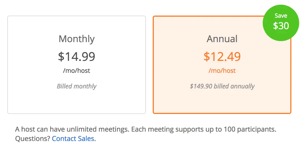
The most common use of anchoring you’ll probably come across is manipulating people’s perception of prices. Essentially, if you start with a more expensive price and then follow with something cheaper, the second price instantly feels like a good deal. This is because the first price set the bar of price expectation and anything lower than that will undercut this new-found perception of a default price.
You see this all the time from retailers who display the RRP of an item and then show the discount price.
Software companies often use this tactic, too, by leading with a more expensive plan and then following up with a cheaper option. Instantly, those cheaper plans seem reasonably priced and the sense of this increases with larger price differences.
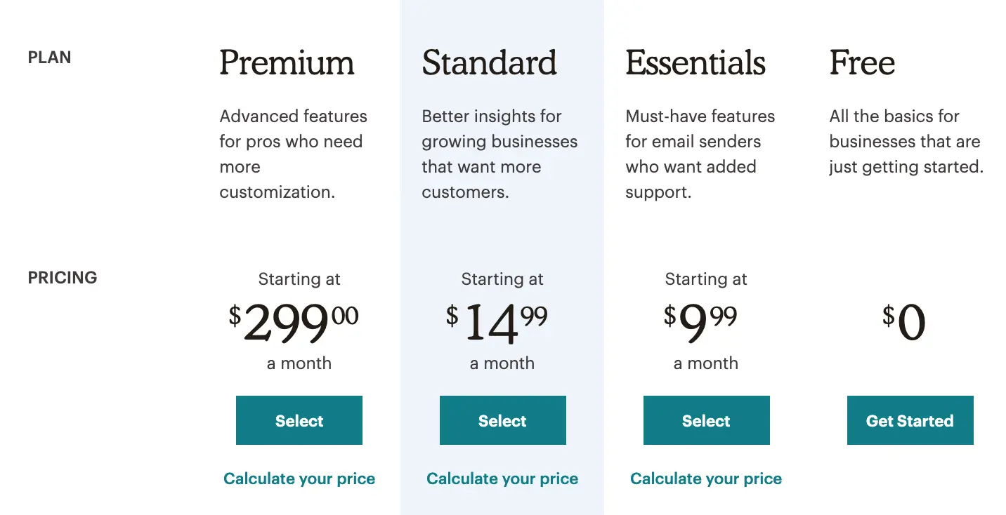
Let’s face it, $14.99 per month sounds very reasonable when the bar is first set at $299.00 per month. Yet, somehow, this doesn’t sound like such a great deal when the first price you see is free and you’re suddenly questioning why you should pay $9.99 or $14.99 per month - forget about $299.
03The halo effect
What is it?
The halo effect explains how our first impressions influence the way we interpret information about the same thing. This is one reason why loading graphics are a poor solution to slow loading times because they essentially telling people you’re a brand that’s going to keep them waiting.
How it makes people click
Loading times aren’t the only thing that can make a bad impression on people. User experience in general and the overall design of your site can leave a lasting impression on people - or simply give them enough reason to quit your site altogether and head back to search or wherever they were before clicking through.
First impressions count and poor design/UX is going to get you off to a really bad start.
The halo effect also helps to explain why delivering the right messages, as soon as possible, is so important. Imagine someone clicks through to your site looking for adventure holiday ideas and they see a generic travel page that doesn’t mention anything about adventure trips.
By failing to confirm that you provide exactly what this user is looking for, you plant that seed of doubt in their mind that you can’t deliver what it wants. This provokes a cautious mindset that’s going to force people to scrutinise everything in more detail - assuming they don’t click right back to Google.
Compare this to someone who instantly sees adventure activities when they click through to a landing page, confirms this brand has what they’re looking for and already starts imagining themselves dune riding in the desert before they even click through to the next page.
The halo effect is also one of many psychological factors that make branding, reach and exposure so important. If someone sees your brand sitting at the top of Google for their search query, they’re automatically going to assume you’re bigger and better than companies ranking below you, even though have no genuine experience to base this on.
For more tips on how the halo effect influences buying decisions, check out these seven examples of how it can increase conversions.
04Sunk cost bias
What is it?
Otherwise known as the sunk cost fallacy, sunk cost bias describes how people continue on with something simply because they’ve already invested time, money or other resources into it. This explains why people often overeat when they’ve paid for a meal at a restaurant or go to an event when they’re not feeling up to it because they’ve already bought a ticket.
How it makes people click
When people invest time or money into something, it feels like those resources have been wasted if the desired outcome isn’t achieved. For example, if you spend three hours in different shops, looking for a new pair of running shoes, it feels like you wasted that time if you don’t walk away with a box of shoes in one hand.
However, it feels like a successful use of time if you end up buying what you set out to get.
The funny thing is, if you’ve already spent three hours looking, you feel compelled to continue looking until you find the right pair, to avoid the feeling that you’ve wasted those hours, even though you’ll end up losing more time in the process.
Even more telling is that you’re increasingly likely to make a rash purchase decision and buy a pair of running shoes you wouldn’t normally wear or spend more than you initially intended to - all to avoid that illogical sense perception of wasting time.
We make use of the sunk cost bias on our web forms by implementing progress bars. Sure, these are great for telling people how many more questions there are to fill out but, more importantly, users are far less likely to quit a form once they’re past the halfway point because they feel they’ll lose more time than they gain by quitting now.
You can also use sunk cost bias to keep customers buying from you.
This is how camera companies make it so difficult for photographers to switch to rival brands, by encouraging them to invest money in lenses, essentially forcing them to keep buying from them.
Software companies can also trigger the sunk cost bias by encouraging users to create personal profiles and heavily customise the platform. The more time and effort users put into getting a piece of software how they like it, the more difficult it becomes to abandon and start from scratch with another provider.
Check out our article on how to use the sunk cost bias to increase conversions for more ideas.
05The endowment effect
What is it?
The endowment effect occurs when people overvalue something they own or have a perception of ownership.
How it makes people click
In 1991, Richard Thaler, Daniel Kahneman and Jack Knetsch conducted an experiment, giving one group of students a coffee mug and another group nothing. The group with mugs were then asked how much they would be willing to sell them for. The other group were asked how much they would be willing to pay for the exact same mug.
The group who were given mugs demanded significantly more money than the group without mugs were willing to pay ($7.12 vs $2.87 averages).
This is due to the endowment effect, which encourages people to place more value on an item they own than they would if they had no sense of ownership.
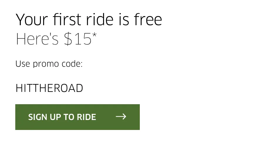
Marketers manipulate this all the time by giving potential customers something to establish this sense of ownership, which then increases its value in their minds. When Uber gives you a free ride, you develop a sense of ownership over this offer - it’s yours and the wording of this offer is no accident.
When software companies like Deezer offer people two free months on its premium plan for free, the aim is to make users feel like the premium version is truly theirs. This increases the value of the plan in their minds and makes them far more likely to pay up for the full price when their free two months is up.
The more you can create this sense of ownership before the actual purchase is made, the greater your chances are of sealing the deal - and you can find out more ways to use this technique in our endowment effect examples post.
06The mere exposure effect
What is it?
Otherwise known as the familiarity principle, the mere exposure effect explains why people are more likely to buy from brands they know. For example, people are more likely to buy Nike running shoes than shoes from a brand they don’t know, even if they’ve never worn a pair of Nikes before.
How it makes people click
Earlier, I explained how the halo effect helps with branding campaigns and the mere exposure effect is another key psychological factor at play here. Essentially, this psychological phenomenon explains why people favour things they’re familiar with over those they’re not.
This is especially true when a band has a particular reputation or association with something. For example, German cars have a reputation for being reliable and well-engineered but this association is built more on reputation than it is on personal experience.
Likewise, Skyscanner is associated with cheap flights even though it doesn’t do anything different than other flight comparison platforms. The simple fact is the mere exposure effect and strong branding builds these reputations and perception of trust in people who have no prior experience of dealing with brands or their products/services.
07The serial position effect
Source: Wikipedia
What is it?
The serial position effect explains how people remember the first and last items on a list more easily than the items in between. While numerous studies have also pointed towards people subconsciously interpreting these two items as more important than others.
How it makes people click
There are two psychological principles at work in the serial position effect:
- The primacy effect: Where people assign more value to the first piece of information they receive and stand more chance of remembering it.
- The recency effect: Where humans simply stand more chance of remembering the most recent piece of information they receive.
Combine these two principles together and you have the serial position effect, which explains why the first and last items on a list are more memorable than items in the middle.
This principle is crucial when it comes to delivering messages as it tells us to lead with our most important piece of info. You can apply this to entire pages and email designs, lists of benefits and product descriptions.
Layouts of three are especially effective as they allow you to put your most important messages either side of a supplementary offer and you can apply the same principle to information people need to remember.
We use this same principle on our website to quickly explain how it works. Our aim here is to showcase how easy the platform is to use so we condense the most complex stages (building and styling forms) either side of the simple steps, choosing templates and capturing leads.
The takeaways people get from this is that they can simply choose a template, play with a few settings and watch the leads roll in. All they need to do is click that blue button and start using the platform for free.
You learn more about boosting conversions with the serial position effect from this article with examples included.
08Reciprocity
What is it?
When someone does something for you, reciprocity describes the compulsion you have to do something for them in return. Or, when someone receives something for free, they then feel compelled to give something back in return.
How it makes people click
Reciprocity was first introduced by Dr Robert Cialdini in his book, Influence: The Psychology of Persuasion. He cites studies where restaurant customers are given mints with their bill and how this affected the tips they left for staff. Customers who received a free mint with their bill left higher tips by an average of 3.3% but those who were given two mints left a massive 20% more in tips, on average.
This tactic has been used by brands for decades and one of the most common pre-digital examples was companies giving out free samples. Those tiny sachets of perfume and washing up liquid not only give people a chance to try out the product themselves, but also create a sense of debt towards the brand sending them.
Copyblogger offers a collection of free eBooks for writers.
We also see reciprocity everywhere in modern marketing with free content, free downloads, free trials, free gifts, free anything.
There are two key principles you need to understand to make reciprocity work, though:
- Give first: To trigger reciprocity, you have to be the first one to give and offer something to prospects without any obvious reward.
- Value: You have to offer something of perceived value and the greater this perception of value is, the greater the more prospects feel obliged to repay.
Offering discounts on items or adding free gifts to purchases doesn’t trigger reciprocity because it requires the customer to give first. People need to feel like they’re really getting something of value for free without any obligation to do anything in return. Psychology will take care of the rest and naturally compel these people to repay something of a similar perceived value.
This doesn’t need to be a one-on-one exchange, either. You can give potential customers free gifts over an extended period of time to increase their sense of debt and continue to do so after they’re paying customers to keep them buying from you. Reciprocity plays a key role in the reason customer loyalty rewards are so effective, constantly topping up that compulsion to remain loyal.
09The Baader-Meinhof Phenomenon
What is it?
The Baader-Meinhof Phenomenon - or the frequency illusion - occurs when you encounter something for the first time and then it appears to be everywhere you look.
How it makes people click
According to PS Mag, this psychological habit is caused by two cognitive processes: selective attention and confirmation bias.
“The first, selective attention, kicks in when you’re struck by a new word, thing, or idea; after that, you unconsciously keep an eye out for it, and as a result find it surprisingly often.”
And then:
“The second process, confirmation bias, reassures you that each sighting is further proof of your impression that the thing has gained overnight omnipresence.”
This is why branding campaigns are so important but there are a couple of things you need to be doing consistently to pull this off:
- First, to trigger selective attention you need to grab people’s attention to begin with - and this is where your ads need to make a real impact.
- Second, to follow this up and trigger confirmation bias, you also need to be a constant presence on the platforms your target audiences are using.
Ever wonder by major brands spend so much money just to have their logos seen by millions of people at major sporting events? The Baader-Meinhof Phenomenon will help your ads cut through the noise, emphasise your brand message and make potential customers more likely to click before they even land on your page.
10The Verbatim effect
What is it?
The verbatim effect describes how people tend to remember the gist of things they’re told, rather than specific details. It also explains why people memorise concise, short messages more easily than longer, complex pieces of information.
How it makes people click
Essentially, you need to cut to the chase when it comes to important content: CTAs, product descriptions, landing pages and anything else that should be memorable or influential.
The best landing pages have short, concise and powerful messages that have more impact than an entire essay could.
The verbatim effect should be something you keep in mind with every piece of content you create. However, it should be a key principle in the creative process of building landing pages, designing page content, creating ads and every other resource that’s designed to influence buying decisions.
The verbatim effect will help you nurture lost leads, too. For example, when someone clicks on your ad, which has a concise, punchy message, and sees the same core bits of info repeated on your landing page, this reinforces the message this visitors establishes with your brand.
Toggl keeps it simple on its homepage, simply conveying the message that its software tool will save time and boost productivity. That’s all people are going to remember - not the precise wording or any longer content about how the platform works.
So after a visitor leaves a page like this (after seeing the same message in an ad and then again on a landing page), targeting these users with the same message via remarketing ads is going to keep this concept fresh in their mind and continuously build this brand associated with the idea.
Over time, the brand becomes synonymous with this topic.
11Clustering
What is it?
Clustering is a cognitive habit where people try to group pieces of similar information together in order to remember more. For example, when you create a shopping list, you’re more likely to remember a higher number of items if you group them into categories (e.g.: meat, dairy, grains, etc.) than you will if you list them randomly.
How it makes people click
Clustering is most important when it comes to page design and content organisation. We’ve already looked at how the serial position effect impacts lists and layouts. We’ve also looked at how the verbatim effect causes people to remember basic concepts rather than specific details. And, now we have clustering, which describes how people naturally group pieces of information together in order to make them more memorable.
We can see how this influence app designed, as in the screenshot of the Any.do app above.
Studies show that most people can only remember seven pieces of information at any one time - give or take two in either direction. Which means you should be optimising content in a way that conveys a maximum of five details at once.
So, if you’ve got more than five services to promote on your website, for example, you might want to try and condense them into categories or only list five of them on your homepage.
What comes before the CTA is just as important
In this article, we’ve looked at genuine psychological factors that influence how people perceive information and make decisions. We haven’t looked at CTA button colours or discussed sans vs sans-serif fonts because those are minimal influencers when it comes to inspiring action.
The most important takeaway from this article should be that the content that comes before the CTA is just as important as anything else. It’s how you set users up with ad copy, page content, layouts and emotional triggers that will determine what they do when they arrive at your CTAs.
So don’t just focus on how your CTAs look; optimise the path to finding them and make the most of the psychological tools at your disposal to influence people’s mindsets before they reach your calls to action.