


In this article, we’re looking at another psychological device used by marketers to influence buyer decisions. This time we’ll be talking about the serial position effect, which helps explain why the order you reveal information to users has such a big impact on conversion rates.
Once you’ve got your head around the serial position effect, you’ll be creating landing pages, ordering product listings and drafting ad copy in an entirely different way. So let’s look at what the serial position effect is and how you can use it to boost your conversion rates.
What is the serial position effect?
The serial position effect explains why humans tend to remember the first and last item on a list while easily forgetting the points in between. Hermann Ebbinghaus first coined the phrase in the late 19th century and his findings were backed by Murdock and Bennet in a series of tests during the 1960s.
The serial position effect is essentially the combination of two other effects:
- The primacy effect
- The recency effect
The primacy effect simply says we tend to remember the first few piece of information in a list than those in the middle. We also assume these first bits of information are more important than the ones that follow, making the primacy effect very similar to anchoring bias, which we looked at earlier this year.
Then we have the recency effect, which says we tend to remember the last few pieces of information in a list more than those in the middle. Once again, we have a habit of assuming these last bits of info are more important than those in the middle.
Source: Wikipedia
Combine these two psychological tendencies and you have the serial position effect, which says we tend to remember the first and last piece of information we’re told and put greater emphasis on their importance.
This probably gives you a good idea of how the serial position effect can be used in marketing but let’s look at some examples and use cases.
01Priciest item first
Crazy Egg isn’t the only software company to lead with the most expensive option on its pricing page. Logic may suggest you want to start with the cheapest option to suggest your prices are lower but those $79/monthplans are going to seem expensive if the first thing users see is your $29/monthbasic plan. Lead with your $189/monthoption and $79/monthsuddenly seems like a reasonable price for a premium package.
02Targeting bottom ad placement
When you’re paying for ads on a platform like Google Ads, you know that sitting in the first ad position is a lucrative place to be. However, it’s also the most expensive ad position for any given search query. Which means you could save a lot of ad spend by aiming to sit in the final position of the top pack in search results - particularly if you can make your ad stand out.
In the example above, Jetcouncil.com uses review extensions and sitelink extensions to make its ad stand out while targeting the third position in this pack. Not only does this leave it in a good place to generate clicks but they’ll also come cheaper than they would from targeting the top spot.
Let’s not forget Google puts ads at the top and bottom of search results, essentially making them the first and last listing users see on each page.
03Ordering page content
The serial position effect is incredibly useful when it comes to ordering content on important pages - particularly homepages and landing pages. As you might expect, it’s important to lead with your most important message and end on a high, reserving those middle positions for less important information.
As you can see in the example above, Asana starts strong with its core value proposition and a call to action compelling people to sign up right away. Then Asana invites people to learn more about the key features of its platform and earn trust by showing existing clients, before ending with another call to action.
04Lead with your deal clincher
If you identify free delivery as a key deal clincher for your online store (and it often is), don’t wait to tell users about it. Shout it out to new users and remind return visitors that free delivery comes as standard - something they’ll come to associate with your brand.
H&M leads with this message at the top of its homepage, before it even shows users any products. And one of the last thing it shows visitors is another set of potential deal-clinchers at towards the bottom of its homepage.
By leading and ending with these key selling points, H&M emphasises these deal clinchers and makes them more memorable as users continue to browse its site.
05Lead with your best performers
Whether it’s your best selling product or most engaging blog post from the previous month, leading with your best performer only increases the chance of boosting results further.
This is why publications feature their most popular content at the top of the page, why online stores place their best selling products at the top of the page and why Udemy leads with its most popular courses first.
06Lists of three
The downside of the serial position effect is we’re pretty useless at remembering long lists of information. So, if you reel off 18 benefits of using your product, the vast majority of them are going to be lost on people.
This is why you’ll see lists of three so commonly on homepages, landing pages and product pages. Check out the Leadformly website and you’ll see lists of threes all over the place. We know people are likely to remember the first point on any of our lists. We know they’re likely to remember the last point as well and limiting the number of middle points to one makes all three points easier to remember.
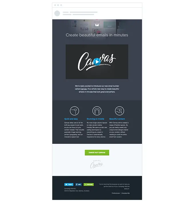
07Serial position emails
One of the most important places to utilise the serial position effect is in your email marketing campaigns. As this article from Campaign Monitor explains, the subject line is the first thing people will see in your emails - and this is what needs to convince them your mail is worth reading.
It’s a good idea to echo your subject line in the first point of your email, much in the same way you do with ad headlines and landing pages. This reaffirms your main points, adds emphasis to it and makes it significantly more memorable for users who click through to read your emails.
Once again, there’s room for the less important pieces of information in the middle of your emails and placing a secondary CTA at the bottom of your templates is a tried and tested approach.
For emails with a lot of information, remember to start with the first few most important points and end with the remaining key bits of info at the end. The same thing also applies to any lists you include on your designs. When you have a lot of info to get across, use the serial position effect to enhance the most important points.
Get your info in order
Users consume a lot of content as they work their way through the buying process and the way you order your information is a crucial factor in how far they progress. It’s not only a case of getting your most important points across, but also knowing which pages to guide users to and how to craft your next message - all part of nurturing leads towards the final purchase.
Anytime you have multiple messages to get across or lots of information to provide, the first thing to do is see if you can condense your points. A more concise set of info will always be easier to digest and remember; whether it will also convert more effectively is something you’ll have to find out in testing.
Either way, the serial position effect is always there to help you order your information. Which you can use in everything from landing page design, ordering links in a navigation menu, creating UI interface layouts and modest bullet point lists on your web pages.