


One of the best discoveries I’ve made in my career was finding out how well multi-step forms convert - and it all happened by accident (kind of like how penicillin was discovered by mistake).
Back in 2014, I had just launched an online calculator for measuring people’s “comfort zones,” which was designed to encourage us all to take more risks and habitually achieve bigger things.
Anyway, this calculator was called (unoriginally) WhatIsMyComfortZone.com and due to the nature of the tool, traditional web forms were no use to us. We needed to capture in-depth information about users but long forms were killing our conversion rates.
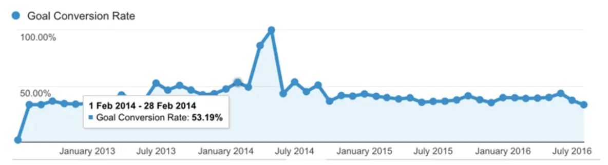
After a lot of research and testing, we stumbled across the concept of multi-step forms and designed one for ourselves. This was the Eureka moment. The multi-step form converted 53% of site visitors into leads, despite asking a lot of questions (including email, name, phone number and salary).
And, just like that, we solved one of the most common problems brands face when it comes to form conversion rates - and busted one of the biggest myths about form optimisation.
What exactly are multi-step forms?
Multistep forms aren’t an unknown thing in the marketing industry but they are underutilised. It seems the entire industry is too busy trying to create the shortest forms possible and remove every point of friction to take a step back and think this is the problem, how do we fix it?
More on that later but, for now, let’s just clarify what multi-step forms are exactly.
According to HubSpot:
“A multi-step form is a long form that is broken into multiple pieces. They’re used to make long forms, such as shipping or registration forms, less intimidating and daunting. By allowing customers and leads to complete their information in smaller chunks, you create a positive user experience and increase conversions.”
I guess that accurately describes what multi-step forms are but I’m not sure it really explains why they are like this.
Imagine a user loads up a web page and sees dozens of form fields. How likely do you think that person is to start filling out the form, let alone complete the entire form, fill it out correctly and then hit the submit button?
The more form fields users see, the greater the workload you’re placing in front of them. At this point, it all comes down to how much users want what you’re offering. If the reward is high enough, people will complete the form but users are generally getting very little from most conversions (a newsletter, coupon or paying for something with their hard-earned money).
So what happens when you need in-depth data and the conversion reward is smaller than the length of your form? This is the problem we faced with WhatIsMyComfortZone.com.
Now, imagine a user who loads a webpage and only sees the first form field. The others are hidden, which completely removes the intimidation they naturally feel when they’re presented with a page full of fields. There’s no reason not to start filling out the form and, suddenly, even small rewards become more compelling.
When should you use multi-step forms?
The popular “golden rule” of form design is that shorter forms convert more users because they produce the least amount of friction but, in practice, this only works in a limited set of scenarios - for example, when people are signing in to an account they already own.
When it comes to lead generation, shorter forms are problematic for two reasons:
-
They make conversions less relevant to the user
-
They limit the data you can collect
-
Limited data makes your follow-up messages less relevant
Think about it. You’re not going to sell a lot of t-shirts if you remove the field that allows users to choose their size. You also can’t get paid if you remove the payment details section of your checkout. These are necessary (and expected) friction points that enhance the experience, as long as you’re able to implement them in the right way.
Over the past five years, I’ve tested multi-step forms across a lot of industries and site types. For lead generation specifically, I’ve yet to see a traditional one-step form that converts better than a multi-step version with the same questions.
When we changed the consulting enquiry form on this site from a basic WordPress contact form to a multi-step form, our conversion rate went from 0.96% to 8.1% (a 743% increase in leads!).
When we started using a multi-step ‘tool-like’ form on a B2C financial lead gen site we used to run our conversion rate increased from 11% to 46%.
Vendio, a website-building tool, ran a similar test that resulted in a 59% increase in leads. Tinkoff bank also saw an increase in credit card applications using a multi-step form.
Why do multi-step forms convert so well?
It may seem counterintuitive that adding more steps to a form would increase results. The common wisdom in conversion optimisation is that less is more, particularly when it comes to forms.
So why isn’t this the case with multi-step forms? Here are a few possible reasons:
- Multi-step forms reduce psychological friction
- The first impression appears less overwhelming
- The progress bars encourage users to complete the form
- You can ask ‘sensitive’ questions (e.g. email address) on the final step when users have more ‘skin in the game’ from filling out previous steps
Okay, so those are the key reasons multi-step forms provide a better experience for the user and increase conversion rates. However, we can make that list of benefits much longer if we design multi-step forms with conversions in mind and address some of the key issues traditional forms struggle with.
This is where multi-step forms result in major conversion uplifts.
8 tricks for multi-step forms that convert like crazy
01Ask low friction questions on the first step
The beauty of multi-step forms is that you can start your form with a low-friction question that engages potential leads.
Typically, I recommend starting a multi-step form with a question like ‘What’s your goal?’. Not only is it a low-friction question, it also puts your potential leads in the frame of mind where they’re thinking about the benefit of your product/service.
02Use image selector buttons to reduce typing
Let’s think about the biggest design problem with traditional forms for a moment. What’s the real source of negative friction here? Is it getting relevant information from users that enhance the experience for them? No, of course not. It’s the way traditional form designs force users to submit this information - the problem is typing.
Manually filling out forms by typing every detail is the real issue here. It makes longer forms time-consuming and every text field increases the likelihood of a user typing an error, which either leads to failed submissions or incorrect data.
One of the biggest design innovations we’ve built into Leadformly is image selector buttons, which essentially create a visual alternative to radio buttons. Unlike radio buttons, though, these image buttons create a visually compelling format that’s perfectly optimised for mobile, thanks to the large, touchable buttons.
This one feature solves the biggest problem with filling out forms and one of the biggest conversion killers on mobile devices.
Image selector buttons also create a multiple-choice dynamic, which removes the possibility for typing errors and allows you to segment leads as they fill out your forms. As we’ll look at in trick #8, this systems perfectly sets you up for using conditional logic, which will help you improve the quality of leads you’re generating from your multi-step forms (it’s not all about quantity, after all).
03Show users that they’ve already made progress
According to the ‘endowed progress effect’, which is a proven bias around how the human brain makes decisions, we’re more likely to complete an action if there’s an illusion of progress.
Put plainly, telling someone that they’re 20% complete (when they start an activity) increases the likelihood of them completing that activity. This was proven in a study that gave people buying coffee one of two loyalty card stamps:
- One had eight spots to stamp
- One had ten spots to stamp, but two had already been stamped
In both situations, people had to buy eight coffees to claim a free coffee. However, the one that had two spots already stamped increased the likelihood of people becoming loyal to that coffee shop and buying more coffee.
When applied to multi-step forms, if you start your form with a progress bar that subtly implies that they’re already made some progress, you will increase your completion rate.
Screen Shot 2016-08-08 at 08.57.13
This is why all multi-step forms built-in Leadformly start with the progress bar already showing that progress has been made.
04Ask one or two questions per step – but don’t have too many steps
I’ve found that it works best when you ask one or two questions per step. This way the form appears less overwhelming and feels faster to progress through.
The caveat, however, is that this is true if your form contains 2-10 questions. If you’re asking more than 10 questions, you may want to group more questions per step to prevent having a form that appears to have an endless number of steps.
05Use conditional logic to personalise the questions on later steps
Conditional logic enables you to only display a question if a previous question was answered in a certain way.
For example, in the form below the question ‘what are you looking for in a broker?’ is only displayed if someone answers ‘experienced’ or ‘expert’ to a previous question asking how experienced they are at trading.
This is because a beginner trader might be confused by this question, causing them to abandon the form.
The great thing about multi-step forms is that you can make them feel very conversational by personalising the steps based on their previous answers.
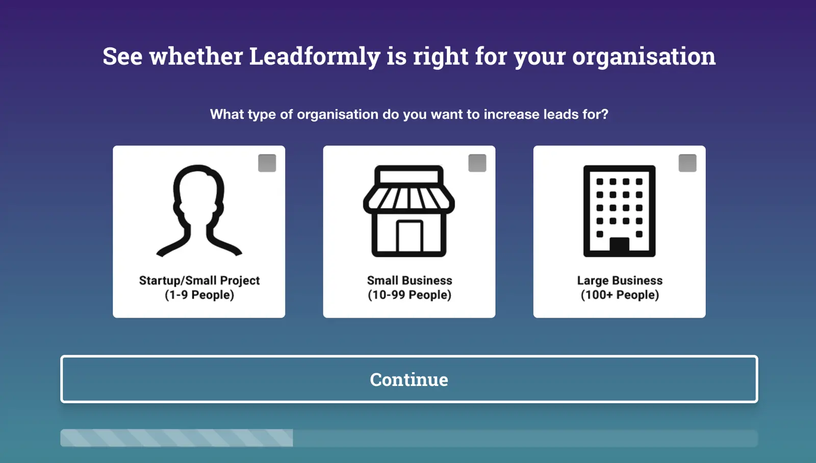
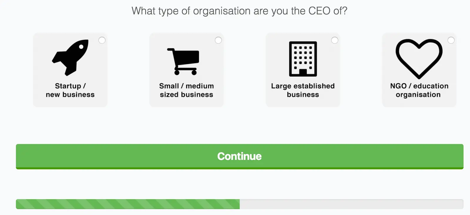
For example, in the form below you can see that the question on step 2 asks “Which company are you the CEO of?”. The form ‘knows’ that they’re the CEO as they previously answered that they’re the CEO in a previous question.
If you want to get really hyper-targeted, you can even make the thank you pages personalised based on how people answered questions in your form.
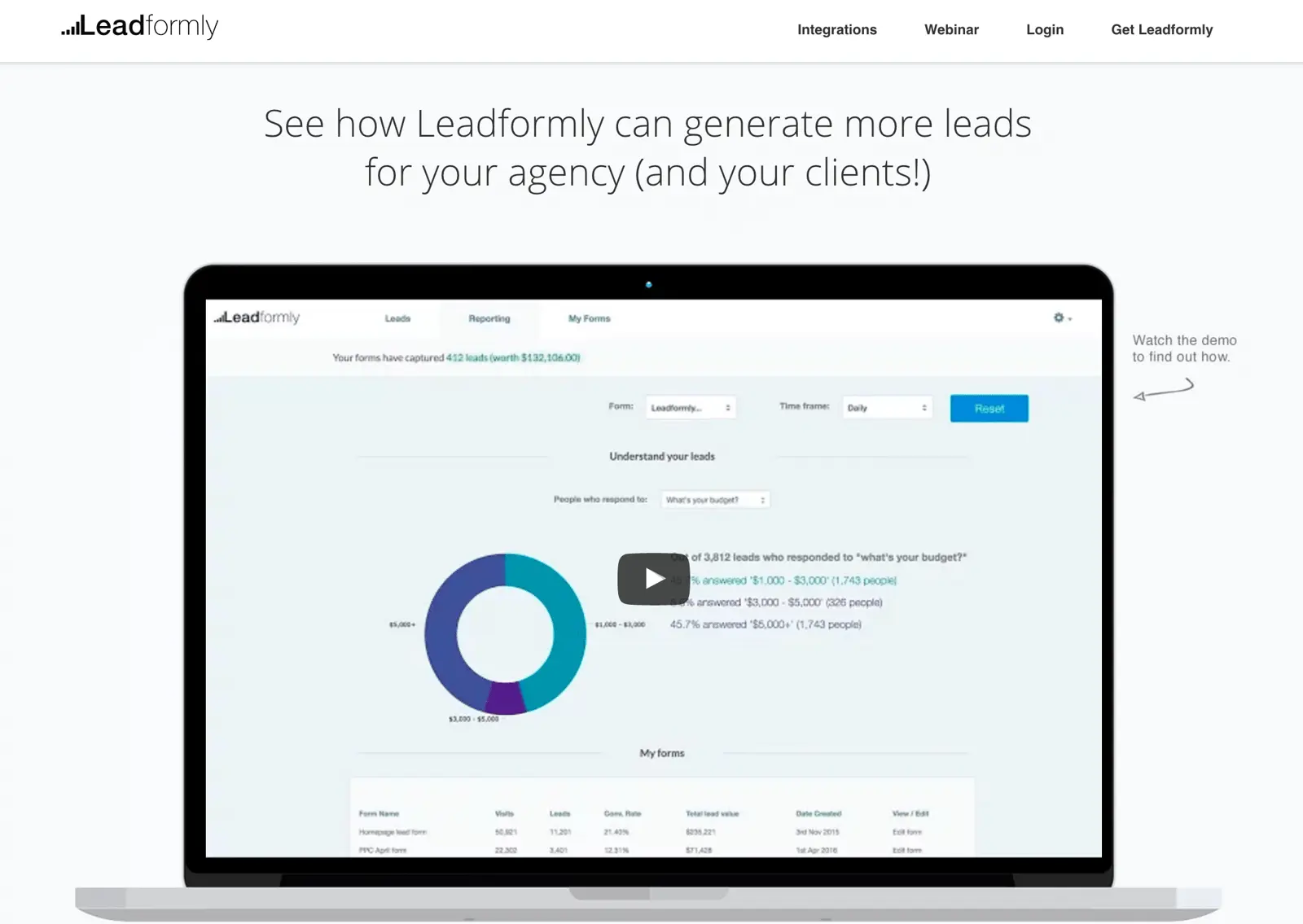
Leadformly does this with the form on its homepage. If you answer that you’re an agency, for example, it takes you to a page with a video talking about how agencies use Leadformly, FAQs aimed at agencies etc. Similarly, if you say you’re a startup, or enterprise, you’re also taken to a hyper-targeted page.
06Make it clear which step users are on and how many steps are left
When creating a multi-step form, progress bars are absolutely essential. Without them, there is no indication as to how much time or effort users have to invest to complete your form.
There are various ways you can show progress. You can use traditional progress bars (my favourite), you could say ‘X% complete’, or you could even say ‘you’re on step 2/4’. The important things is that you communicate two essential pieces of information:
- Where are you right now.
- How long until you’re done.
07Offer immediate value upon submitting the form
When it comes to increasing form conversion rates, the most effective yet least talked about tactic is improving the ‘outcome’.
To illustrate the point, imagine that you built an awful form with 50 questions. Perhaps 0.5% of your visitors would fill it out.
Now imagine you offered everyone that used it a free Ferrari. The conversion rate would shoot up to 100% – despite nothing in the form itself changing. This illustrates how important the outcome of using your form is.
As a general rule, I’ve found that the highest form conversion rates come from offering a tangible instant outcome.
When giving instant value doesn’t make sense, offer your leads something tangible in return for submitting your lead form like a proposal, a 30-minute consultation call, or a free information pack.
08Ask questions that benefit both you and your leads
I’m regularly asked which questions should be included on a form. The simple answer is that you shouldn’t ask anything your potential leads won’t want to give you.
Phone numbers, for example.
Asking for phone numbers is common practice, but is one of the most significant causes of form abandonment. Most people don’t want sales people distracting them by calling them up.
There are exceptions, of course.
phone1
The questions in your form should at minimum be questions your leads are happy to answer. Ideally, they should actually benefit them.
For example, I know that entering my travel dates into a travel site’s form will benefit me by helping me get accurate availability and pricing information. I wouldn’t, however, be happy giving a phone number at this stage.
How to design multi-step forms without writing any code
During our original multi-step form experiments, we had to code every detail ourselves and fine-tune each form until we achieved peak performance. However, this approach simply isn’t manageable on an ongoing basis. What we needed was a tool that would help us create, test and optimise multiple forms at the same time - and this kind of tool simply didn’t exist at the time.
So we decided to build our own and bake all of the multi-step form secrets we’d uncovered into a tool that allows anyone to create forms at scale without writing any code.
Choose the multi-step format
In Leadformly, you can create both single-step (all questions on the same page) and multistep forms. By default, new forms start with Step 1 in the editor and all you need to do is click the Add a new step button to create a multi-step format.
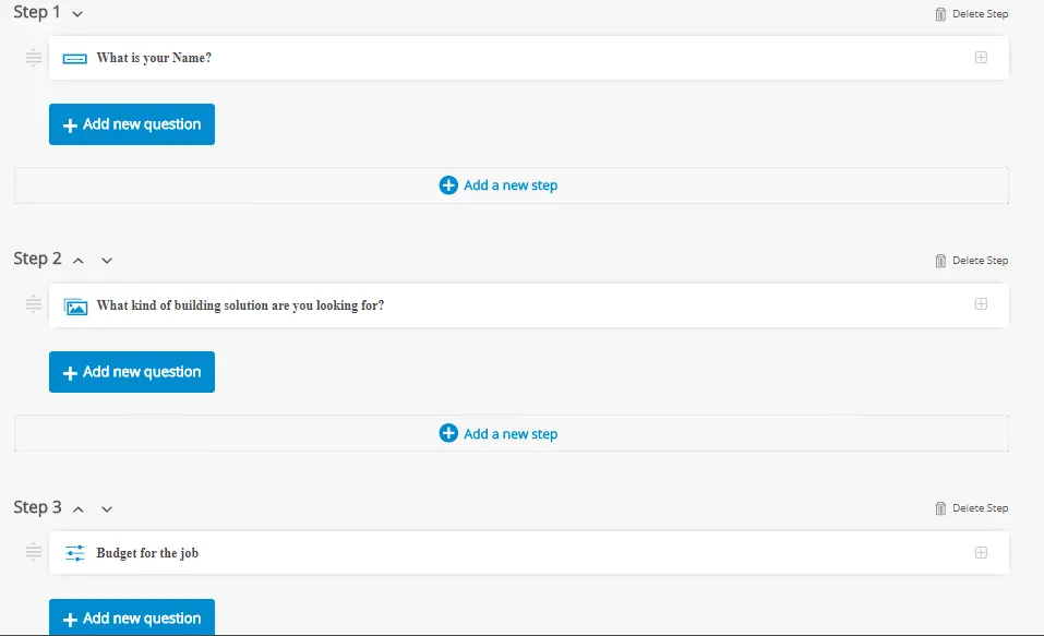
You can delete a step at any time or change the order of steps by clicking the arrow buttons next to the step number (top-right). You can also add questions to any given step by clicking the Add a new question button - just remember that’s it’s best to stick to 1-2 questions per step.
Set your question parameters
Leadformly gives you a lot of control over the type of questions you can ask users. This is something you can test and experiment with over time to further improve performance but it’s good to be familiar with your options before you publish your first form.
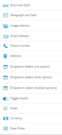
First, of all, you’ll want to get familiar with the question types at your disposal.
To select a question type in the form editor, simply click on the question field and you’ll see the following drop-down options:
The first option asks you to select the type of question you want to ask and you can type how this question will appear on the form in the text box below it. You can also add placeholder text if you want to give users a clue about how to answer a question.
You can also define whether users need to provide an answer to each question to progress by switching the Require answer toggle. The final setting is for using conditional logic, which means the question will only show if it’s relevant based on answers to previous questions.
Conditional logic can’t be used on slider, currency or date picker question types.
Add conditional logic to relevant questions
Adding conditional logic to a question will mean it only shows when the answer to a previous question makes this information necessary. For example, you might ask users which service they’re interested in and then show a series of questions specific to each service.
By using conditional logic on these follow-up questions you can ensure users only see the questions relevant to the service they selected, allowing you to get highly-relevant information without lengthy forms.
You can set conditional logic for the following question types, based on these criteria:
- Short text field - Options: Contains or Does not contain
- Paragraph field - Options: Contains or Does not contain
- Image selector - Options: Equals, Does not equal, Contains or Does not contain
- Email address - Options: Equals or Does not equal
- Phone number - Options: Equals or Does not equal
- Address - Options: Equals or Does not equal
- Dropdown (select one option) - Options: Equals, Does not equal, Contains or Does not contain
- Dropdown (select other option) - Options: Equals, Does not equal, Contains or Does not contain
- Dropdown (select multiple options) - Options: Equals, Does not equal, Contains or Does not contain
- Toggle switch - Options: Equals or Does not equal
The only question types that can’t use conditional logic are slider, currency and date picker types.
The key to using conditional logic effectively is to strategically plan out and structure your forms. The idea is to reduce the number of questions users see and maximise relevance without creating excessively long forms. However, the real magic of conditional logic is being able to segment leads while they’re filling out your forms and get relevant information that will help you qualify and score leads at the first conversion.
So think strategically about the information you want to get from prospects and use conditional logic to determine which leads meet your criteria.
Define your final step
Every multi-step form needs a final step and this is the best place to ask users for contact information. This is where you’ll add fields for details like names, numbers and email addresses and then define your call to action.
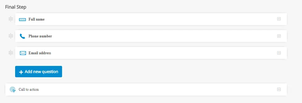
By leaving this until the last stage, users have already filled out your entire form and they’re going to be less reluctant to provide some extra contact details, such as a phone number (you can leave this optional, remember).
You can also set the text in your CTA button and select additional options, such as showing T&Cs, sending data to your email marketing software, using webhooks and sending data via hidden fields.
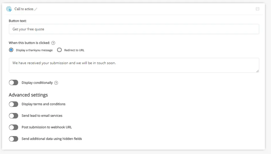
Once you’ve completed this stage, you can click the Save button and customise the visual design of your form.
Customise the design of your form
Leaformly’s drag-and-drop form editor gives you full freedom over the design of your forms without writing any custom code (you can add custom CSS if you prefer, though).
Simply work your way through the left-hand column of design options to edit the visual appearance of your forms. Leadofrmly comes with a built-in library of templates for you to choose from so you never need to design a form from scratch while still having 100% freedom to make any changes you want.
This is important from a testing perspective as much as the initial design process.
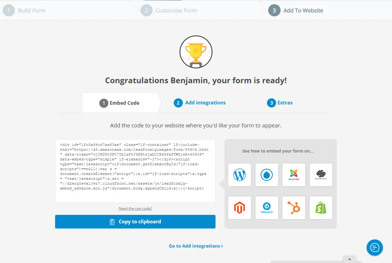
Once you’re happy with your form, you can embed it to any web page using the embed code generator. Simply copy the code and add it to your page. You’ll find documentation on how to do this for the most popular CMS platforms like WordPress and Joomla, if this is something you’ve never done before.
And there you have it. You’ve now entered the high-converting world of multi-step forms.