Conversion rate optimisation (CRO) is an essential marketing strategy but knowing what to test can be a real nightmare – especially if you’re only just getting started with CRO. Choose the wrong tests and you’re going to waste valuable time, budget and other resources that have no positive impact on your business.
Keep this up and conversion optimisation soon becomes expensive.
Knowing what to test is crucial and understanding which elements of your pages have the most impact on conversion rates is the key to profitable optimisation. To help you get started, here are nine simple CRO fixes that yield big results – insights that took us years to discover for ourselves.
#1: Reduce loading times
If you’re looking to make an instant impact on conversions, the first place to start is loading times. You can’t convert visitors if they click back to search because your pages are taking too long to load. A tell-tale sign that your pages are taking too long to load is a combination of high bounce rates and users only staying on your page for a matter of seconds.


Google’s free page speed tool measures your loading times and offers advice on how to speed things up.
Run your pages through a free page speed test and compare this to the average time spent on each page. If there’s not a great deal of difference between those two numbers, there’s a good chance loading times are getting in the way of your conversion rates.
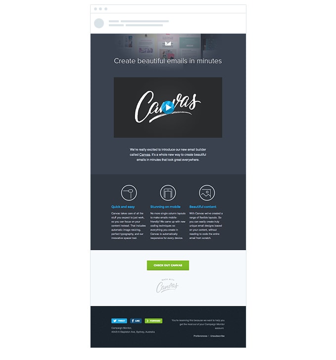
#2: Use single-column layouts
This is a general design principle you should apply to every page on your website. Your homepage, product/service pages, landing pages, web forms and even your email designs should focus on single column layouts.
By this, I mean full-width divs stacked vertically on top of each other. This makes it easier to prioritise messages, make your content more scannable and create layouts that point user attention to the most important elements of your page.


Set this as your template for every new page and you’ll be able to create high-converting resources in no time. All that’s left is to determine the right message to put across.
Tip: Single-column layouts also make responsive design a breeze but there are parts of your page (service sections, product feeds, etc.), where you might want to triple up into three columns for desktops and larger displays.
#3: The magic number technique
Three really is the magic number when it comes to grouping pieces of information together.
Why is that?
Well, it turns out the human brain is only really capable of remembering three or four pieces of new information at any one time – any more than that and the details start to get a little fuzzy and some might disappear altogether.
Next, we also have a psychological phenomenon, known as the serial position effect, where people naturally interpret the first and last piece of info on a list as being the most important.

There’s also the rule of three in writing and the rule of odds in design – a whole bunch of reasons why you should be grouping pieces of info into sets of threes.
The trick is to lead with the most important point and end with the second most important point (serial position effect) because these will have the most impact and be more memorable.
#4: the inverted pyramid
We’ve looked at the inverted pyramid in previous articles and this is one of the most important design principles in CRO.


This technique vertically stacks content with centre-aligned text, which gradually decreases in width. This creates an inverted pyramid or, in other words, an arrow pointing directly to your CTA button.
Again, make this template the default starting place for your CTA designs and all you really need to worry about is crafting the right message for your CTA copy.
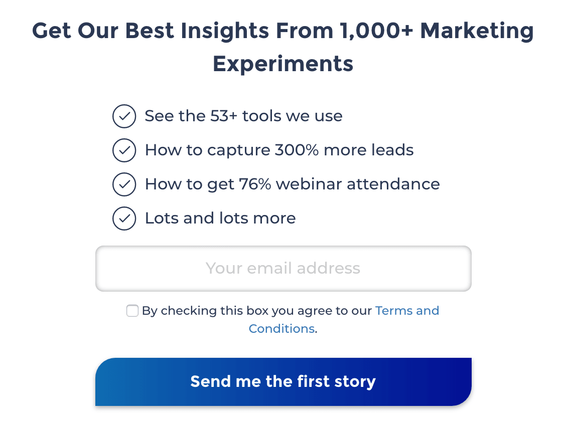
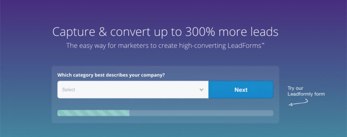
#5: Use multi-step forms
Of all the CRO tests we’ve run here at Venture Harbour, this is the one that has yielded the biggest returns on a consistent basis.
We’re talking about increasing conversions by 300%-743% for ourselves and our clients.
Like many companies, we weren’t too impressed with our firm conversion rates (or our clients’ either). So we decided to do something about it and went back to the drawing board with form design.
We soon realised shorter forms don’t always increase conversions and third-party tests confirmed our own findings. We also determined shorter forms reduce the quality of conversions and the relevance of marketing messages you’re able to send.
What we needed was a way to make longer forms more user-friendly and the answer lied in multi-step form designs.
This breakthrough allowed us to achieve so much more with web forms:
- Form length becomes irrelevant (to a large extent).
- You can ask more questions, get more data.
- This allows you to segment and prioritise form leads.
- You can also send more relevant follow-up messages.
- By using conditional logic, multi-step forms only ask relevant questions based on the info users provide as they complete your forms.
The results were so effective that we took these findings and engineered our own form builder tool, called Leadformly – so you can turn years of CRO testing and insight into higher conversion rates.
#6: Remove navigation from landing pages
This one couldn’t be more simple but it makes a massive impact on your landing page designs. If you’re not doing so already, get rid of those navigation menus on your landing pages.
Zoho used to feature complex navigation menus on its landing pages.
Landing pages are designed to achieve highly specific conversion goals and all navigation menus do is allow users to stay off course. So get rid of those things and make sure visitors are staying focused on the key message of your landing pages.

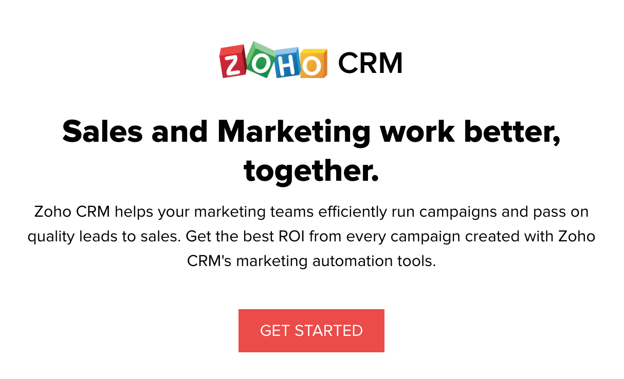
Zoho has ditched the nav menus in recent landing pages to keep users locked into the conversion process.
You can always test a subtle navigation menu in your footer of you want to give users an escape route but it probably won’t do much for your conversion rates.
#7: Place your CTA button further down the page
This might sound counterintuitive and it certainly goes against the old philosophy of placing CTA buttons above the fold. But ask yourself how many users are going to land on your page, see that CTA button in the hero section and convert on the spot without needing any more convincing whatsoever.
Try placing your CTA button further down the page and put your effort into creating page copy that actually encourages people to convert.

By all means, keep a CTA button in the hero section if you can’t bear to let go of it, but I recommend repeating that CTA further down the page to give your landing page content a chance to make an impact, rather than simply filling up the page.
#8: Put a different CTA at the bottom of your pages
The majority of visitors who reach the bottom of your web pages aren’t going to buy into the offer of your main CTA. No need to worry, though, because you’re going to place another CTA at the bottom of your pages with an entirely different offer.
This CTA isn’t competing with the main offer of your page. Instead, you’re going to ask users to complete a much softer conversion, like downloading some free content or signing up for a webinar – something encouraging them to hand over their email address.
Capture these leads with a softer conversion and you’ve got everything you need to nurture them along the buying process.
#9: Try exit-intent pop-ups
If that CTA at the bottom of your pages doesn’t do the trick, there’s still one last throw of the dice. Exit-intent pop-ups give you the chance to prompt users with a final CTA that only triggers of they look like they’re about to leave your site.
Now, by this stage, they haven’t bought into your main offer and they haven’t taken the bait with your secondary conversion goal either. Clearly, conversion intent is very low for these visitors and you’re about to interrupt the user experience by making it harder to leave your site – so you really need to get this one right.


Instead of asking users to do something for you, offer them something that’s really difficult to turn up. It could be a money-off coupon for a future purchase, a free month trial of your premium software package or access to an online tool that’ll keep them engaged with your primary conversion goal.
Small changes, big returns
By testing the minor changes we’ve looked at in this article, you should be able to make a serious impact on your conversion rates and this will get you off to a great start with CRO.
By the time you’re done with these, you’ll not only have higher conversion rates, but you’ll also be a lot more comfortable with running tests and yielding positive results. And, more importantly, you’ll have enough experience and user data to see what needs testing next.