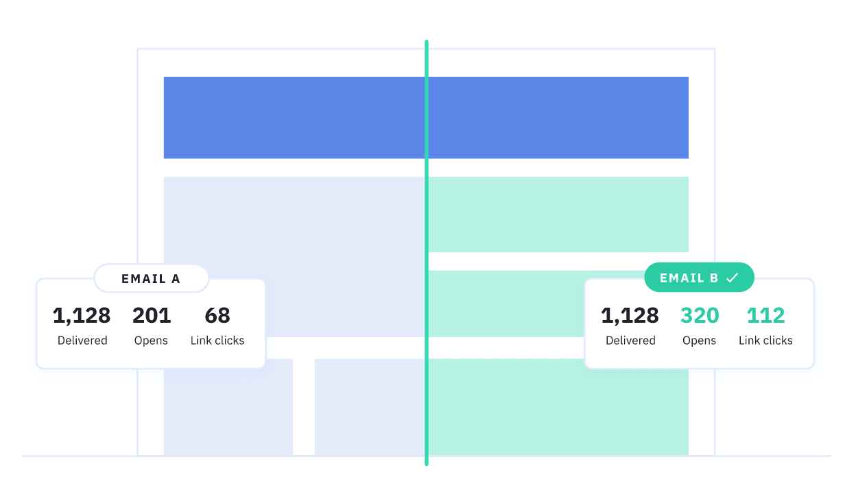
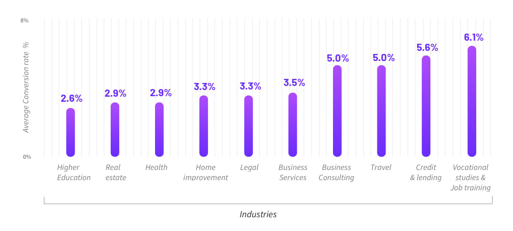
According to insights from Unbounce, the average conversion rate for landing pages is 4.02% although this does vary from one industry to another. Either way, the vast majority of visitors who land on your site are going to leave without completing any valuable action and increasing conversion rates is an ongoing priority.
An effective conversion optimisation strategy starts with knowing which parts of your website to optimise. You need to identify where your site is killing conversions and put suitable fixes in place. This will require some digging around on your part, provided you have access to the right data.
However, there are some guaranteed areas where your website is going to losing conversions, which means you can start optimising these while you compile the necessary data for other issues. Here are 11 places your website is losing conversions – and how to fix them.
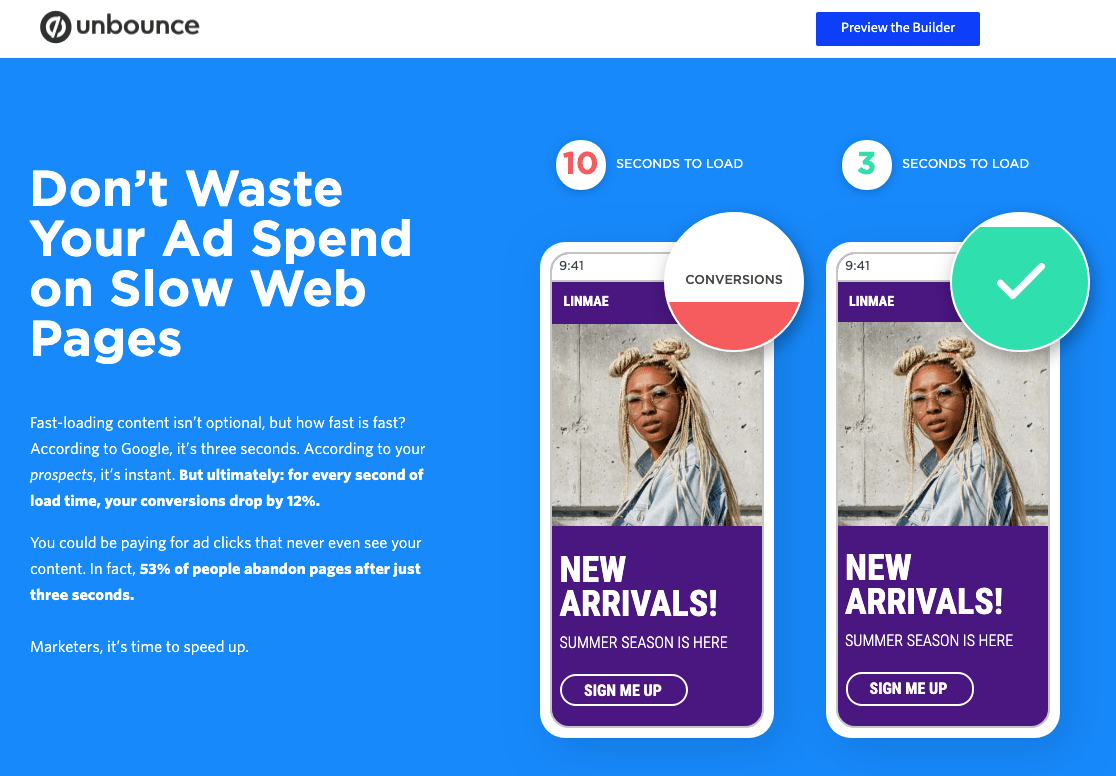
#1: Slow loading times
This is the worst way to lose potential conversions because you don’t even get the chance to put your message across if people quit the session before your page even loads.
According to Google’s latest research, it takes a whopping seven seconds for the average landing page to load on mobile, which is way too long. The craziest part of that stat is that average loading times have halved since Google released its previous insights on mobile loading times – the average was roughly 14 seconds a couple of years back.
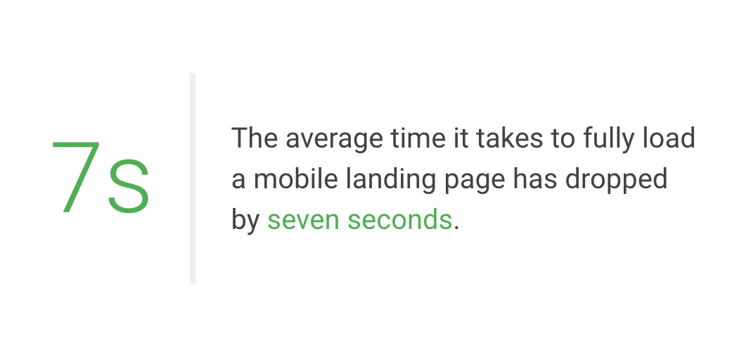
Clearly, loading times a problem for users and conversion rates alike so make sure you’ve got these in check before you start anything more ambitious with your conversion optimisation efforts.
How to fix this conversion killer
Start by making sure the code used to build your website is clean and up-to-date. You don’t want some sluggish WordPress theme or rogue JavaScript code bringing your loading times to a standstill.

Google PageSpeed Insights can help you with the basics of optimising pages for speed.
Next, you need to think seriously about server requests and the number of resources your pages are going to load. Every code file, image, web font, API and other resource increases the number of server requests and the total amount of information that needs to be downloaded.
Minimise these as much as you can.
Next, make sure your images, code files and other resources are compressed (or minimised) to reduce download times.
#2: Targeting broad audiences
When it comes to turning traffic into conversions, leads, customers and all the other good stuff, relevance is key. This means you need to be bringing in the right kind of visitors in the first place. If you’re targeting broad audiences, you’re making it difficult for yourself to create compelling messages, as their individual interests will vary.
How to fix this conversion killer
You’re going to start by identifying your key target audiences and how their interests in your brand differ. For example, a productivity software provider might want to target freelancers, small business owner and management teams at brands with multiple business locations across the country – all of which will have different interests from the exact same product.
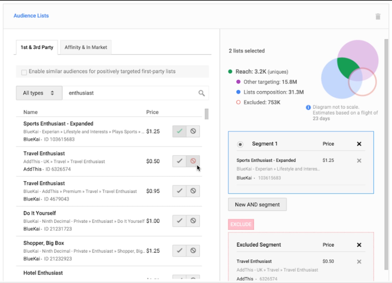
Audience targeting for display ads on Google Ads.
You want to create marketing campaigns for each of your target audiences with these unique interests at the heart of every message you deliver. Target long-tail keywords for your organic SEO and paid search campaigns, make full use of the targeting options available of your PPC platforms to pinpoint these audiences and create ad groups appealing to their unique interests.
By targeting narrower audiences, you should be bringing in a higher quality of traffic that has a stringer purchase intent than board audiences with a general interest in what you’re selling
#3: Irrelevant messages on your landing pages
The thing with targeting more specific audiences through inbound marketing is you need to be just as relevant with the messages on your landing pages. If you pitch a key selling point to users in one of your ads/posts but your landing page doesn’t match the same point of interest that convinced users to click through, you’re going to end up with some nasty bounce rates.
With paid advertising, it’s also worth remembering that platforms like Google and Facebook also look at the relevance of your landing pages and consider this when scoring the quality of your campaigns. The lower your scores, the worse your overall PPC performance will become and the more you’ll need to spend to keep your ads being seen.
A definite lose-lose scenario.
How to fix this conversion killer
The first step to creating relevant landing pages is to create unique landing pages for every advertising campaign. You’re crafting unique ads for these campaigns and you need to match these up with their own landing pages with the same highly-relevant messages for each target audience.
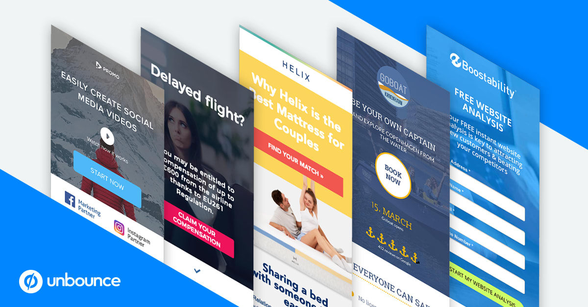
Use a landing page builder like Unbounce and you’ll have no problem creating new landing pages for every advertising campaign. Make sure the key selling point in your ads, posts and inbound content features boldly at the top of each landing page because this is why individual users click through to begin with.
You’re already targeting more specific target audiences with each campaign, which has increased the quality of the traffic landing on your site. Now, you’re also increasing the quality of the pages they land on and delivering compelling messages to each type of visitor – all of which is good news for conversion rates.
#4: Distracting content on your landing pages
Now, we’re getting into the specific design elements of your pages and this is a common trap many brands fall into. You may have followed all the best practices with your landing page design and featured all the key elements that are designed to increase conversions: great images, videos, social proof, etc.
So why haven’t your conversion rates hit the roof?
Well, there could be any number of reasons but the first things you’ll want to check is that none of your on-page elements are distracting user attention away from the parts of the page that really matter.
For example, you don’t want those expensive images taking attention away from your CTAs or visitors using up all their click power on playing your video when there are CTA buttons and web forms to complete.
How to fix this conversion killer
To fix this issue, you need to know which page elements users are seeing and interacting with. This is where tools like Hotjar come into play, allowing you to see how users scroll down your page and which elements they click or tap.
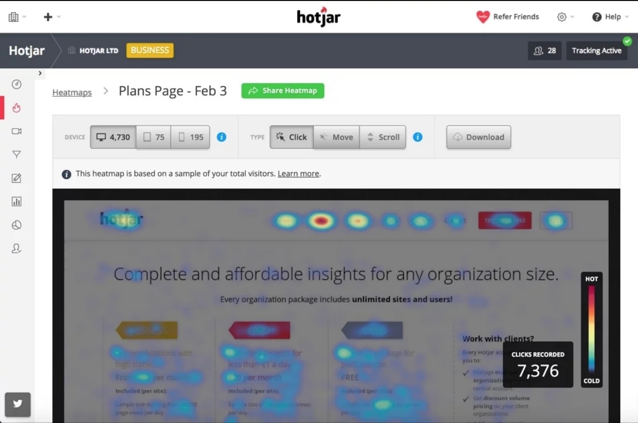
This allows you to determine whether users actually see your calls to action or scroll right past them. CTAs aren’t the only element worth paying attention to either. You can check whether visitors are spending enough time with the key pieces of content on your page to absorb the message you’re trying to get across.
If they’re not, you need to rethink the balance of your page and test new ways to get people engaging with the parts of your pages that matter most.
#5: Your navigation is sending users off-course
Navigation is a tricky thing at the best of times and the more pages your website has, the bigger your challenge is going to be. In terms of SEO, you want to have pages for everything you’re aiming to rank for but you don’t want this site structure to make navigating your website too complex.
If you’re a business selling a wide range of services or a highly complex product, this can be a problem. If you’re in the e-commerce game, things can be even worse.
In terms of conversion rates, the biggest danger with complex navigation is you can end up sending users off-course. For example, when someone lands on your homepage, you’re trying to communicate the value of your entire business and this normally involves links to various different parts of your website (service pages, product pages, case studies, etc.).
All of these have the potential to send users off-track and away from your CTAs.
How to fix this conversion killer
If we’re talking about landing pages, the best thing you can do is remove the navigation menu altogether. If you’ve followed the steps I mentioned earlier about targeting specific audiences and creating relevant landing pages, they shouldn’t need any navigation.
This is the page they want; you’ve made sure of that already – so don’t give them a navigation menu provides a path elsewhere.
This doesn’t mean you can’t link to other parts of your site in the main body of the landing page. Of course, you can. The point is, you control which parts of your site users can navigate to and they’re pages that keep them on the path towards conversions.
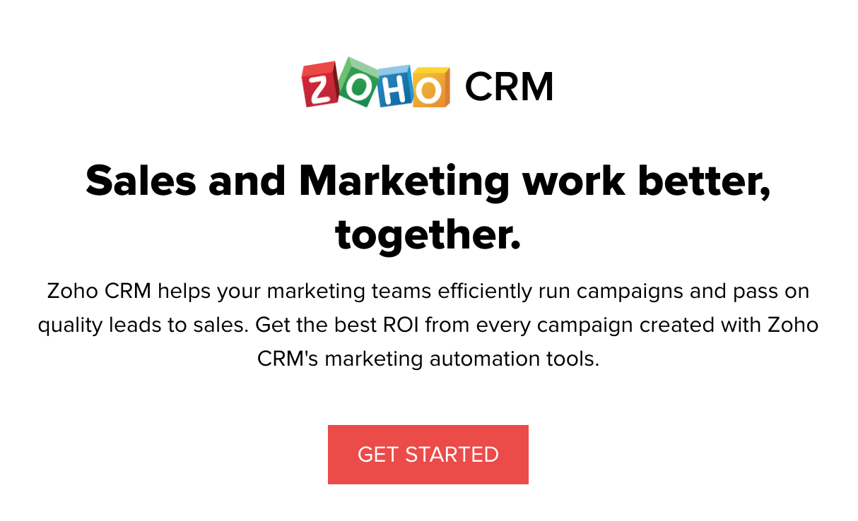
Zoho has ditched the nav menus in recent landing pages to keep users locked into the conversion process.
If you can’t stand the idea of giving users no navigation menu, try testing one out in the footer of your landing pages and see how this compares to not having one at all. Thanks to the magic of A/B testing, getting answers to the crucial questions is relatively straightforward these days.
#6: Unconvincing calls to action
Of course, there has to be a section in this article about calls to action but I’m not going tell you how changing one word in your CTA button is going to increase conversions by 3,000% and save the rainforests.
No, let’s focus on the core fundamentals here: convincing calls to action.
The simple fact is, if you’re CTAs aren’t convincing, you’re literally not going to get the conversion. Unfortunately, “convincing” is an objective term and there’s no fixed blueprint for a CTA that really makes people click.
How to fix this conversion killer
The good news is, you’re already off to a good start by targeting niche audiences with your inbound marketing campaigns and creating unique, relevant landing pages for each one.
This naturally creates CTAs that a more relevant to user interests and this is definitely going to help in the convincing department.
Reiterate that key selling point used in your ad and the top of your landing page – this is what convinced people to click through, keep scrolling through your page and this is what will ultimately get the conversion.
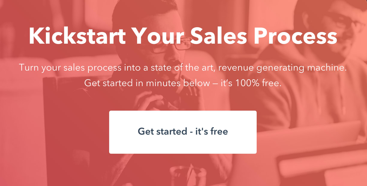
Next, you need to make sure your CTAs are grabbing user attention. It doesn’t matter how convincing your CTAs are if people can’t see or notice them. So, before you start testing minute details like buttons colours and font styles, make sure you’ve got the basics covered.
Your CTA should be visible, bold and use plenty of contrast to jump out of the page. Surround your CTAs with plenty of white space to make them even more prominent and don’t forget about those poor mobile users trying to look at your page outside with daylight blaring down on their displays.
With all that covered, understand that the text surrounding your CTA button and the content that comes before your CTA has far more of an impact on conversion rates the button itself. So don’t go crazy over optimising buttons when you should be focusing on the text in your CTA, the content around it and where you place your CTAs on the page.
#7: Hitting users with the CTAs too early
Apparently, one section on calls to action isn’t enough for this article and we’re back with a second CTA conversion killer. This one deserves a section of its own, though, because it might change the way you think about CTAs and landing pages in general.
Once upon a time, CTAs were put above the fold on landing pages but the dawn of mobile internet forced them further down the page. Then, the world realised that calls to action can actually be better off placed further down landing pages, giving you more space to add compelling content before hitting them with the buy-or-get-lost ultimatum.
How to fix this conversion killer
Sometimes, a call to action in the hero section is going to do the trick. However, there are plenty of situations where telling users to pay up right away is going to put them off.
We’re now seeing a growing trend in landing page designs where conversions aren’t the primary goal. A lot of brands are now creating “click-through” landing pages that are designed to engage users, increase their interest in what’s available and direct users to relevant offers through selective navigation options.
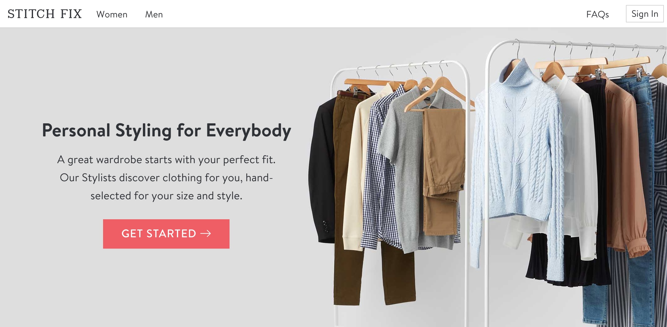
This landing page from Stitch Fix doesn’t ask users to convert at all. Instead, it prompts them to get started on a personalised experience, regardless of whether it ends in a sale.
The aim here is to engage users and guide them through a content journey that demonstrates the value of Stitch Fix’s service. There aren’t even any product listings on this site because the company isn’t looking to sell a few t-shirts. It’s aiming to create an ongoing experience with customers that’s valuable to both parties.
I’m not saying the hero section “buy now” CTA is dead but there are other (sometimes better) options worth exploring.
#8: Poor form UX
Web forms stand between users and every conversion, which is why it pains me so much to see how poor the average form experience still is. All of the progress we’ve made over the past 10 years or so and trying to complete most web forms still sucks the life out of you.
No wonder conversion rates are generally so low.
Web forms don’t get the same kind of attention as calls to action when it comes to conversion optimisation, even though they’re equally (if not more) important. And, when talk turns to form optimisation, the same “best practice” keeps on cropping up: make your forms shorter.
This is really bad advice.
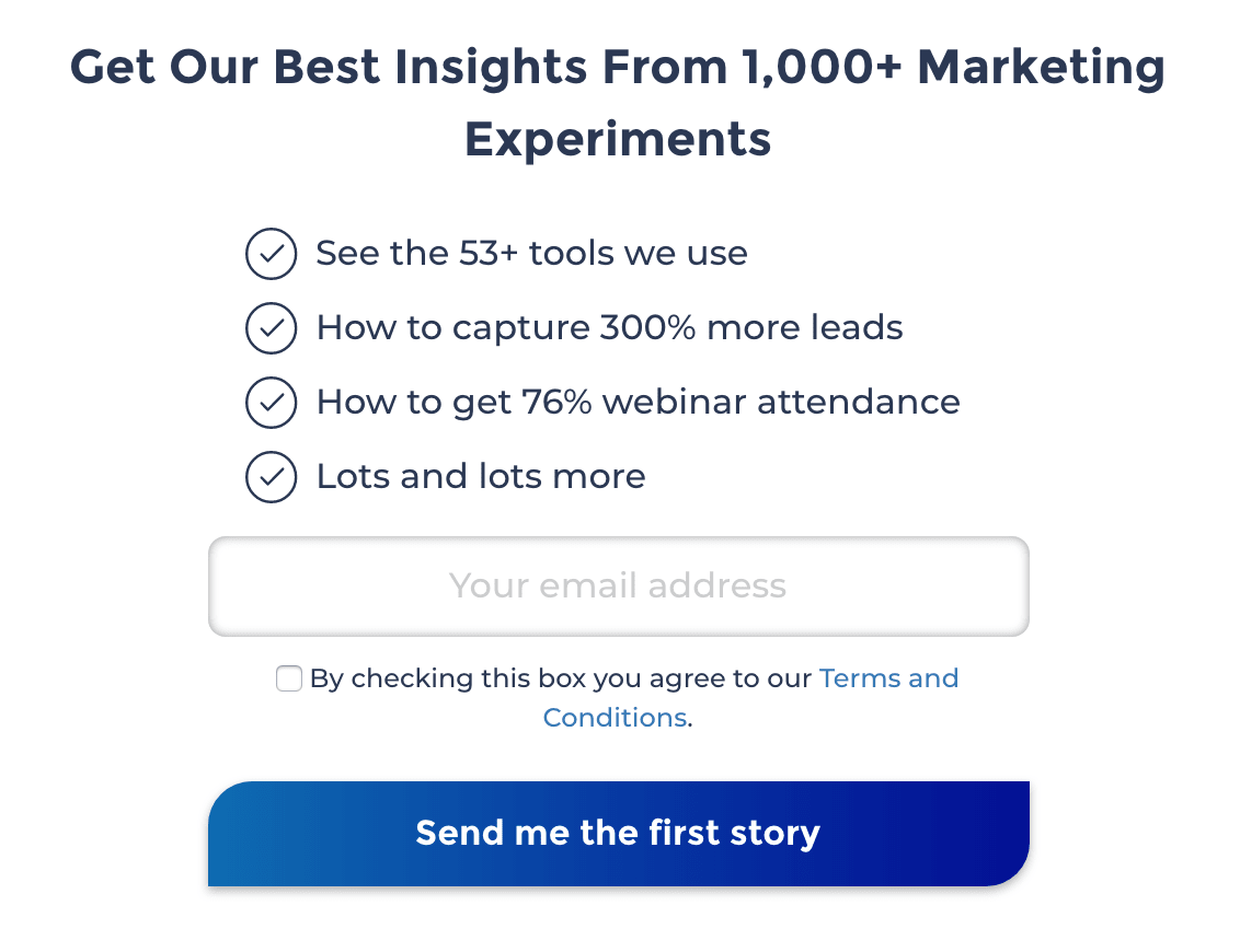
Yes, some forms should be a short as possible but the idea that shorter forms automatically increase conversions is dangerous. Think about it: would you trust an insurance company that only asked for your email address and credit card details? No. You expect to fill out a lengthy form when you’re applying for insurance and anything less would raise alarm bells.
There are plenty of scenarios where longer forms increase conversions rates – let’s get that part out of the way.
However, poor form UX (regardless of length) is always going to hurt conversions.
How to fix this conversion killer
One of the biggest breakthroughs we’ve made here at Venture Harbour was exploring why longer forms sometimes outperform shorter versions. There are many reasons why this can be the case:
- Longer forms can increase engagement
- They can also compel users to complete the form after investing time in filling part of it out
- Longer forms can filter out lower quality leads
- They allow you to collect more relevant information
- Sometimes users want to provide more information
The more tests we ran, the clearer it became to us that longer forms were often converting more users but, crucially, they were increasing the quality of those conversions. However, the intimidating look of long forms remained an issue and this forced us to completely rethink form design.
This is how we landed on multi-step form designs, which remove all of the friction from traditional forms. By only showing and asking one question at a time, users are never bombarded with a page full of form fields. Instead, they get a highly engaging experience with visual questions and image buttons, sliders and other formats.
This reduces the need to type and allows mobile users to complete forms with a number of touches.
We took this principle even further when we developed Leadformly, a multistep form builder, by integrating conditional logic. This means users are only asked the questions relevant to them based on the information they submit as they fill out your forms. So a form of 10 fields can become a form of five by filtering out the questions that aren’t relevant to individual users.
Poor form UX is no longer a problem.
#9: Slow email responses
When a user converts, you need to follow up quickly or that lead will turn colder than you think. As we’ve said before, Harvard research shows leads can lose most of their value of you fail to respond within 24 hours.
all that work you’ve put into generating traffic, creating compelling messages and optimising for conversions goes to waste if you’re not fast enough to respond to new leads.
How to fix this conversion killer
Luckily, this is the easiest conversion killer in this list to fix and all you need is a decent email marketing automation tool to send out responses to new leads instantly – on time, every time.
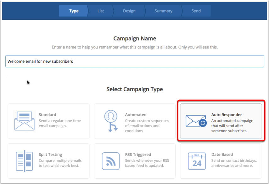
We use ActiveCampaign as our all-in-one email marketing, marketing automation and CRM platform. Email auto responders are a standard feature, meaning you can respond to every new lead while they’re still hot – either instantly or after a set delay
#10: Generic email responses
Auto responders are great for keeping leads engaged after the initial conversion but sending generic responses to every lead is always going to get limited results. When you’re creating multiple landing pages for the same product, you want your email responses to match the individual interests of each audience in the same way.
Fail to do this and you’re not going to get the post-conversion engagement you need to keep these leads on board with your business.
How to fix this conversion killer
Again, this conversion killer is relatively easy to fix with email automation. What you need is a platform that offers solid list segmentation features, so you can target users on each list with relevant emails.
This is a standard feature with most email marketing tools these days but you also want a platform that allows you to feed data from your web forms.
With Leadformly, we can send our form data to ActiveCampaign and place users on segmented lists, based on the information they provide us. This means we can send relevant email responses to each target audience from the very first email and we can also prioritise which kinds of leads are most important to us.
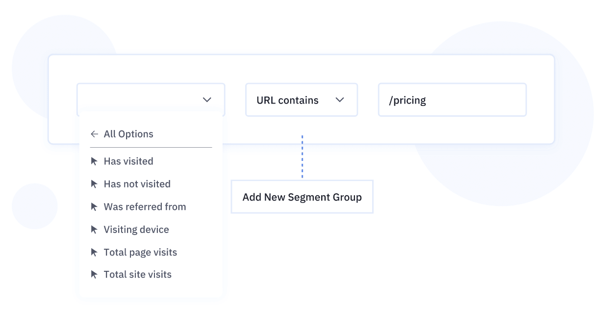
Combine this with ActiveCampaign’s Site Tracking and we can create highly targeted list segments with email messages that really capture the interests of any audience we consider valuable.
#11: You’re letting users leave your website
No matter how much you optimise your pages, the majority of users are still going to leave without converting. Going back to Unbounce’s landing page conversion rate report, the highest conversion rate it saw from more than 74 million user sessions was 27.4%.
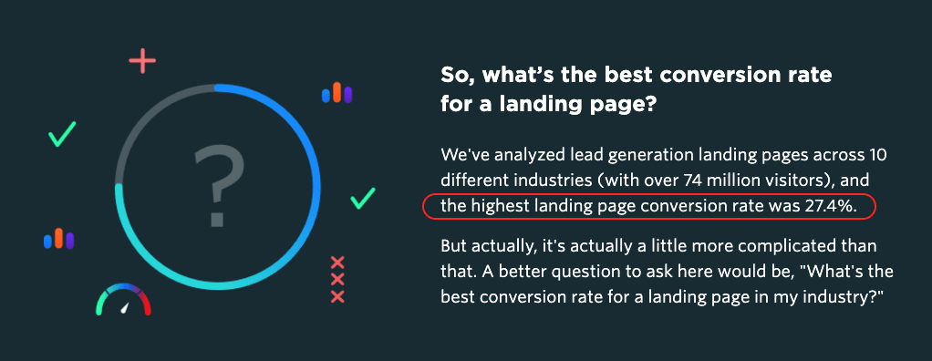
Let’s be clear, 27.4% is a very good conversion rate by anyone’s standards but you would still be looking at more than 70% of visitors failing to convert.
Whatever you’re current conversion rates may be, there’s always more than can be done to increase conversion and/or increase the quality of conversions.
How to fix this conversion killer
To maximise conversion rates, you need to get into the mentality that you’re not going to simply sit back and let users leave your site without completing some kind of profitable action.
There are two key strategies for turning outgoing traffic into potential conversions.
First, you’re going to want to use remarketing on your paid advertising platforms. Google Ads has a particularly effective remarketing infrastructure that you can use to bring back previous visitors to your site and target them with unique messages.
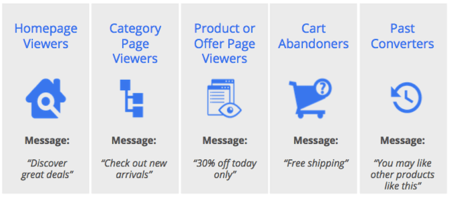
You can also create remarketing lists to segment leads, based on the actions they’ve taken on your website. Link Google Ads with Google Analytics and you can target users based on the elements they click on your page (CTA buttons, form fields, media player interfaces, etc.).
Next up, we’ve got exit-intent pop-ups which trigger when users look like they’re about to leave your site. This gives you the opportunity to hit users with one last offer to tempt them into converting, rather than simply leaving your site completely.
The key thing with exit-intent pop-ups is to come up with a different offer because people clearly haven’t bought into the one on your landing page if they’re trying to leave your site.
So forget the main conversion goal for now and come up with an offer that might convince users to hand over their email address, which allows you to nurture leads until they’re ready to commit.
Put a stop to those conversion killers
The 11 conversion killers we’ve looked at in this article are issues every business should be optimising. So, if you’re struggling to decide what needs testing on your website, start with these – and come back to them again in the future if you’re ever out of ideas.
And, if you’re still looking for ideas on how to increase conversions and boost sales, take a look at our 100+ conversion rate optimisation tips.


