

According to data from HubSpot, 99% of consumers check their email every day while 80% of business professionals believe email marketing increases customer retention.
This shouldn’t come as a surprise.
Email is one of the only channels that gives you a direct line to leads and customers individually. Crucially, it’s also the only channel, aside from your website, that you own 100%, meaning you’re not at the mercy of third-party tech giants.
Impressive stats and benefits aside, though, you can’t unlock the magic of this marketing channel unless you’re able to design emails that get results. So, in this article, we’re looking at 11 secrets of designing emails that convert.
What makes a great email design?
Before we get into the secrets that make high-converting emails, let’s take a moment to clarify what a great email looks like. There are a number of key aspects you need to focus on throughout the design process; the factors that decide whether a user is going to read your emails and buy into your message.
Here they are.
Compelling messages
As with most types of content, it’s not so much the visual design that people buy into but the message it delivers. From the subject lines in your email to the header text they see in message previews and the main content in the body of your emails, this is the most important factor in everything you send out.
Weak messaging will get every campaign off to a false start - so this is going to be a key area of focus for us in this article.
There are visual and informational design factors to consider in this, too: information architecture, layout, text size, font styles and the use of images. We’ll be looking at all of these elements, too.
Strong layouts
A good email layout helps people navigate, read, digest and remember your messages more effectively. You can also create layouts to direct the user’s eye to key elements of the page and make sure the most important parts of your message stand out.
Contrast and whitespace are crucially important when it comes to designing and weighting layouts so we’ll be having a good look at these two design factors in this article.
High-converting CTAs
While it’s the main messaging in your emails that have to do the majority of convincing, when it comes down to taking action, it’s your CTAs that need to step up and seal the deal.
This is one of the most talked-about subjects in every post about lead gen marketing strategies so I’m not going to repeat what’s already been said. I’ll quickly list the key essentials in some bullet points and then add some insights you don’t often hear elsewhere.
Deliverability
It doesn’t matter how great your email designs are if people never get to see them. You have fake email addresses, spam filters, unsubscribers and all kinds of hurdles potentially getting in the way of your emails reaching their intended destination.
Poor deliverability rates mean poor email marketing results so we’ll be talking about how to maximise deliverability throughout this article as well.
The right design and email marketing tools
To run a mature email marketing strategy that guides each target audience along the customer journey, you need the right mix of tools. First off, you need a solid set of email templates and design tools to build your fleet of campaigns. Then, you want the right piece of email marketing software to manage those campaigns and minimise the manual workload.
You also want to think about web forms because these are what sign people up to your email lists and, ultimately, convert leads after they click your CTA buttons. Finally, you’ll need to A/B test email variations to help maximise performance and we’ll be looking at these kinds of tools throughout this article.
That gives you a good idea of what we’ll be covering in this article and, by the time you’ve finished reading, you’ll have everything you need to design high-performing email campaigns.
So now let’s delve into our 11 secrets of designing emails that convert.
01Get the right email builder/templates
Before you can start creating emails, you need to the design tools and there are two key things you want: email templates and a solid email builder. Templates give you a starting point to work with and its really the layouts you want to be looking out for when you browse templates.
What I will say is, you should create the content for your emails before you choose any templates because you don’t want to be squeezing text into boxes. Layouts should enhance your messages, not compress the life out of them.
More important than templates is having a good email builder on your side. This allows you to create layouts and emails from scratch, create your own templates and fully customise everything in your designs.
You don’t need coding any coding skills to create emails in this day and age. There are plenty of drag-and-drop email builders that allow you to put just about any design together in minimal time.
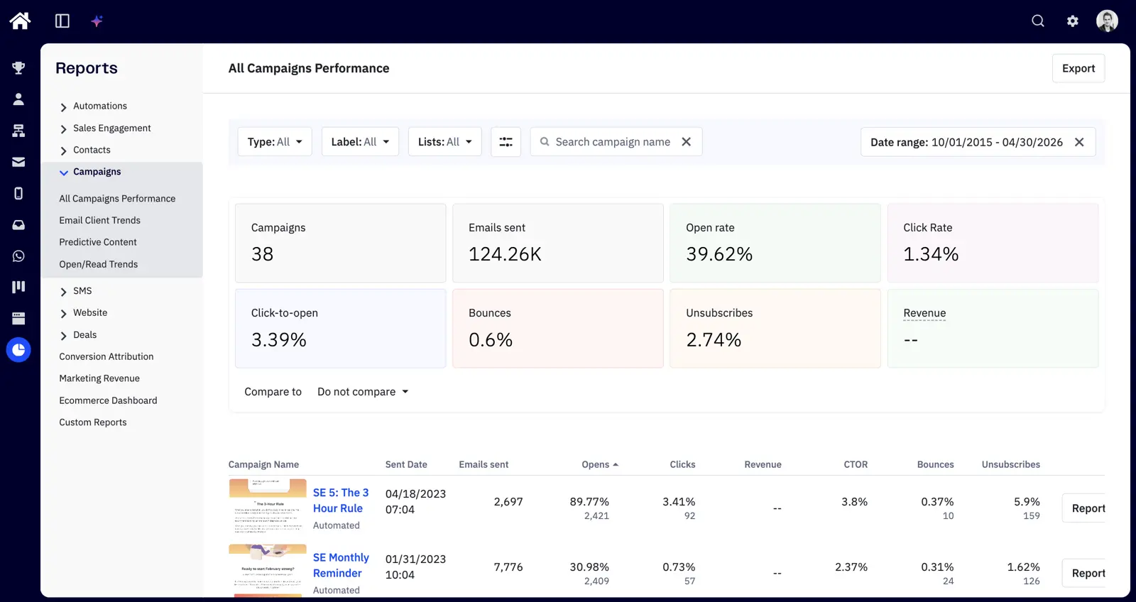
Here at Venture Harbour, we use ActiveCampaign which comes with an excellent email builder (above) packed into a wider piece of email marketing software. I can safely say this is one of the best email builders on the market right now but there are plenty of other great options. It was other features that secured ActiveCampaign as our primary email marketing platform and I’ll explain more about these later.
Note: Deliverability is really important when you’re choosing any email marketing software. Make sure you go with reputable names that will be trusted by ISPs, otherwise your emails could get snagged in spam folders.
02Design for segmented campaigns
The whole point of email marketing is to establish that personalised channel with users on an individual basis.
You’re letting this go to waste if you send generic emails to everyone on your list.
Great email campaigns target the individual needs/expectations of each recipient and this is why segmentation is so important.
Segmented campaigns allow you to send highly relevant messages to recipients based on their data and previous actions.
Why is this important for email design?
Because you need to get into the mindset of designing emails for segmented campaigns. More than anything, this means you need to pinpoint the unique needs of individual audiences and create highly-focused messages that entice them to take action.
Generic emails are not invited to the party.
Once again, you’re going to need the right tools to manage segmented email campaigns.
We use lead forms to segment email sign-ups as they fill out our forms and we send this data to ActiveCampaign, which places them on our segmented lists.
ActiveCampaign takes the lead from here, automatically sending out emails to users on each list and it moves them onto other lists, based on how they interact with our emails and website.
This allows us to target users with highly-targeted messages at every stage of our sale funnel and guide them towards the next conversion.
03Start with your subject lines
As mentioned earlier, a good email has a focused message and segmenting campaigns give you the ability to really hone in on specific user interests/needs - so make the most of it.
A study from Return Path suggests email subject lines between 61-70 characters long are most effective.
To make sure the messaging in your emails is focused enough, I recommend you start with your subject line. You don’t need to come up with the perfect subject line right now but getting a concise message into 61-70 characters is really going to force you to narrow down on your key selling point.
Next, start working on your preheader text - this is what shows in message previews in inboxes and notifications. Again, you don’t need to get the perfect preheader text right away (you can rework this later) but it’s a good exercise for clarifying the key message you want to get across.
04Clean, responsive email layouts
With your email content sorted, it’s time to think about layouts. The goal here is to present your content in the most compelling way. Generally speaking, you want to stick to single column layouts and stack divs on top of each other with centre-aligned text.
Source: Charity Water
Visually, your emails are going to look a lot like landing pages with a hero section and your content divided into vertically stacked divs.
This means your emails will pretty much look the same on mobile and desktop.
Source: InVision
Use plenty of contrast to make text and buttons stand out. A good rule of thumb is to choose a background colour that works with white text and then invert this with divs containing black text on white backgrounds, as shown above.
You can then use the same background colour for your CTA buttons with white text, which adds balance to the high-contrast design.
Also, make sure you use plenty of white space to break up sections of text and vary font styles, sizes and weights to help group and differentiate pieces of information.
05The inverted pyramid
This is one of the most fundamental design principles for emails, landing pages and CTAs in general.
The inverted pyramid vertically stacks content that continuously decreases in width, essentially pointing towards a CTA button - or another key element you want to highlight.
Source: InVision, Campaign Monitor
This design approach is effective because it guides users’ eyes to the most important elements on the page and it makes your content easier to scan.
You need to get across the key benefit of your message in a bold, concise headline. You can expand on this with smaller text placed below your heading and wrap things up with a compelling CTA.
This inverted pyramid template is a good starting pint for every email, landing page and CTA elsewhere on your website.
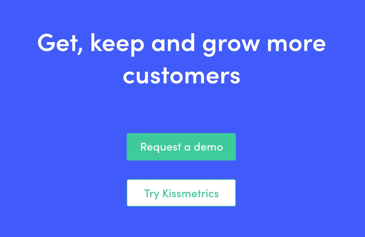
06Images that immerse users in the customer experience
It’s easy to sit here and talk about the importance of compelling images on your landing pages - but what does that actually mean?
Well, the best landing page visuals (images and/or videos) immerse users in the experience of using your products or services.
It’s not your product people are buying into, it’s the idea of what it’s like to use it and the lifestyle they associate around it.
Luxury bath products don’t make you any cleaner than cheaper alternatives and, in many cases, the only difference is in the packaging.
Likewise, mobile phones have barely progressed in terms of technology but people continue to buy flagship devices because luxury products hint of a luxury lifestyle - and this perception is what your images need to capture.
Services and software products are a little more challenging but the same principle applies.
Clear provides biometric security products for airports, stadiums and other venues - and it knows its selling points.
Source: Really Good Emails
Security is clearly a priority but so are convenience, productivity and time efficiency. All of which you’ll find featured in its email campaigns, complete with simple but compelling images.
07Knowing what really matters with CTAs
Earlier, we looked at the inverted pyramid design principle and I recommend applying this to all of your email CTAs as a starting point. By all means, test variations and try to find something that works better but the inverted pyramid approach will take some beating.
If your conversion rates are lower than expected, chances are your problems lie elsewhere. Here’s a quick run through some CTA best practices to make sure you’re on the right track:
- Width - Place your CTAs in a full-width div with centre-alighned text to make them unmissable as users scroll down.
- Copy - Make your CTA copy actionable and compelling.
- Contrast - Use plenty of contrast so your text and CTA button stand out.
- Size - Make sure your text and buttons are large enough to read and your buttons large enough to tap in touchscreens.
- Secondary CTA - Have a secondary CTA further down your email for users who don’t convert with your first one.
When it comes to A/B testing CTAs, I suggest focusing most of your efforts on improving the copy in your CTAs and confirming where the best placement is.
The best CTAs pinpoint a truly compelling message that encourages people to click and this is far more important than aspects like background colours, fonts and button shapes.
I’m not saying those factors don’t matter but you have to make the biggest impact with your optimisation efforts. For more tips on CTAs, check out our articles on 15 best practices that’ll increase conversions and CTA psychology: what makes people click.
08Getting personal (but not too personal)
Email personalisation can increase transaction rates by 600% but there are two common mistakes marketers make with email personalisation:
- Not using email personalisation at all.
- Going too far with email personalisation.
You want to use personalisation to increase email open rates, engagement and conversion rates.
You don’t want to creep users out by getting too personal.
Address people by name in your main content, send them special gifts on their birthday and reward them for being loyal customers.
Avoid using people’s names in your subject lines, though. It screams “spam”.
Beyond those basics, I don’t recommend using personal details too much. Focus the rest of your personalisation efforts on user actions: previous product purchases, software usage data, content engaged with, resources downloaded, etc.
Send email content, based on these actions, that improves the experience for users - for example, reports showing how they can get more from your software platform or related products that are currently on sale.
Personalising content via customer data is far more important than reminding them that you know where they live.
09Ramp up the incentive
As with anything designed to convert users, your primary goal is to create incentive. This starts with identifying bg what your target audiences want and then delivering messages that prove you can deliver.
To enhance your messages even further, there are a number of tactics you can use.
- Scarcity: Make it clear there’s a limited supply of something and people are going to fear they’ll miss out by not converting now.
- Urgency: Likewise, putting a deadline on special deals will encourage people to convert now or risk missing out.
- Freebies: Throw in freebies, 2-for-1s and other incentives to make people feel like they’re getting a great deal.
- Money-back guarantees: Show people they’ve got nothing to lose.
- Free trials: Give customers a free taste and show them what you can really do.
- Exclusivity: Create VIP memberships or special incentives for higher price tags.
Incentive is the most important aspect of high-converting emails - or high-converting anything, for that matter.
Make this a priority in your copy and A/B testing.
10Knowing what to A/B test
You’ll often hear marketers in articles like this one spout this lazy cliche: that you should test everything in your emails, landing pages, etc. What a load of rubbish. Conversion optimisation needs to be profitable and that’s never going to happen if you’re constantly running tests on every minute detail of your email and pages.
No.
Profitable conversion optimisation starts with knowing what to test.
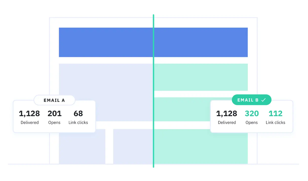
Much like the converted pyramid design principle we looked at earlier, you want to start testing the biggest and most important aspects of your email and then narrow down to the finer details, once you’ve got the key essentials sorted.
Here’s my recommended approach:
- Email subject lines: Start by testing different email subject lines and measure the impact on deliverability and open rates.
- Email copy: Test entirely different messages, key selling points and styles, not small wording changes.
- Sender info: Test variations of your sender info and measure the impact on deliverability and open rates.
- Images & visuals: Test different images to see how these impact engagement and conversions.
- Calls to action: Now it’s time to test those CTAs: conversion goal, copy, placement, number of CTAs, etc.
Above all, you need to make sure people are opening your emails before you start optimising their contents. And, once people open your emails, it’s the copy inside that has most influence over whether they take action or not. So don’t get caught up in changes images or CTA buttons until you know the copy in your emails is compelling people to take action.
By the time you come to optimising your CTAs, you should be confident that nothing else is getting in the way of conversions.
11It takes more than one email
With everything we’ve covered in this article, the final step is to apply these design approaches across an entire email marketing strategy - not only individually emails.
The goal with email marketing is to guide prospects along the buying process, keep them engaged as customers and turn them into repeat buyers. To pull this off, you need to determine which messages users are going to respond to at each stage of the sales funnel and have a system in place to deliver them.
Drip campaigns allow you to send email messages to users within defined time frames (e.g.: a week after the first purchase with recommended products, a month after for customer reviews, etc.) but you’re limited to what you can do with these campaigns.
To take that next step, you want to create campaigns based on user actions (pages visits, content downloads, product purchases, email engagement, etc.) and deliver messages encouraging users to take the next action towards a more profitable conversion.
This is where email automation becomes so important, allowing you to preset your strategy and know the relevant emails are going to be sent out as users take each action along the buying process.
Take your email marketing efforts to the next level
With these 11 secrets to designing emails that convert, you should be able to design and deliver emails that generate higher open rates and inspire more users to take action. As mentioned in the final point, this isn’t something you should only apply to individual emails, but your entire email marketing strategy.
If you want to know more about the best email design and marketing tools available right now, take a look at our article on the Best Email Marketing Software & Email Automation Tools of 2019.