


Whether you’re looking to optimise your checkout, lead capture, or onboarding forms the 10 strategies below will help drive a high percentage of people through your forms.

Before we jump into these 10 tips it’s important to understand how your visitors’ expectations and experience impact their likelihood of completing your form.
While most advice on form optimisation focuses on improving form usability and ease, this is only the tip of the iceberg. As illustrated in Leadformly’s Form Optimisation Pyramid, there are five elements that influence how likely someone is to complete your form.
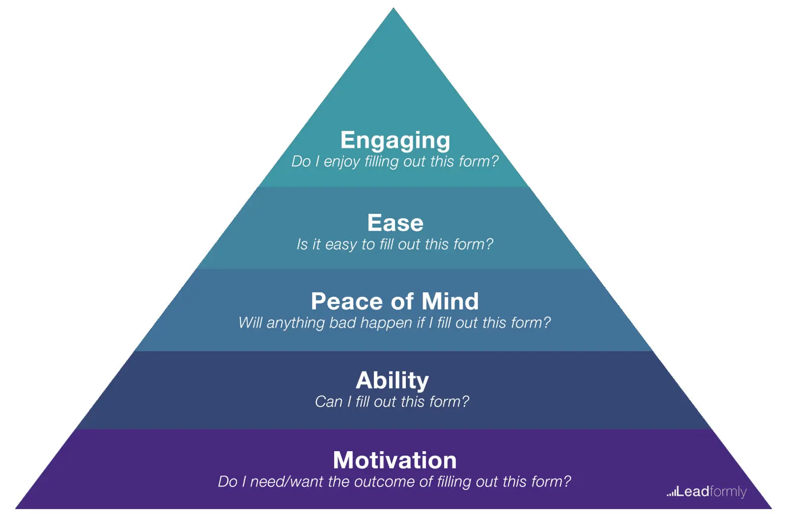
Imagine I asked you to fill out a 50-question form as a favour. Your initial reaction is likely to be ”…I’m outta here”
Now imagine I offered you a Ferrari for completing the same form. Suddenly, you’re far more likely to complete the form, despite nothing changing on the actual form itself. The thing that changed was your motivation.
Motivation is the foundation of building a high-converting form. Without it, any usability or design-oriented efforts will be wasted. Your form optimisation strategy should start here and then work through the four remaining stages of the pyramid.
With that in mind, here are ten strategies for decreasing form abandonment.
01Simplify
When in doubt, simplify your forms. There are two very straightforward ways to do this.
The first is to delete all unnecessary fields and distractions. Asking for a password confirmation? Less than 1% of your visitors will type their password incorrectly, so consider a better approach like masking/unmasking the password field. Asking for their country? Consider capturing this from their IP address and setting it as the default selected option.
The second way to simplify your forms is by using logic to ask different questions to different people.
If your visitors/leads are a mixture of different groups of people, there may be certain questions that are not relevant or required for everyone. Using conditional logic to remove questions based on previous answers allows you to shorten the length of your forms without compromising the data quality.
02Think cross-device and cross-browser
For the majority of websites, mobile and tablet traffic represents a major segment. Ignoring this in your form design is effectively like burning money.
Given the nature of how we use mobile devices, you need to go beyond making your forms responsive and passing Google’s mobile friendliness test. Your forms probably need to be shorter on mobile, and potentially use more tap-based UI elements such as checkboxes and dropdown menus.
Similarly, there’s nothing worse than losing leads or customers due to poor cross-browser testing.
03Emphasise trust & counter objections
When we buy things online or sign-up to lists it’s natural to get a bit anxious. Whether consciously or not, we often wonder whether there are bad consequences around the corner.
Will I be spammed? Will my email list be sold? Will I regret this purchase? Will my credit card number get stolen or hacked from this site?
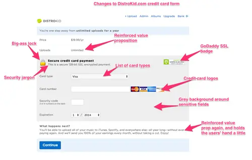
Distrokid, a music distribution service for artists, found that emphasising their value proposition and adding trust signals to their checkout form increased conversions by 60%.
Your visitors are likely to have their own unique cocktail of anxiety-inducing questions running through their mind. Survey your users to understand these concerns, and then address them directly on your forms.
04Use your words wisely
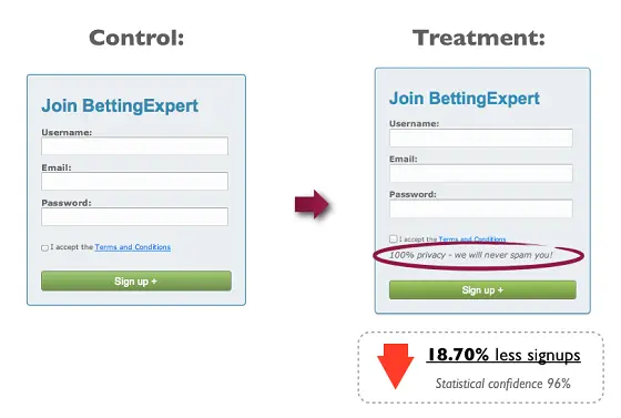
It’s a common practice to include some variation of ‘no-spam guarantee’ on your forms.
However, because the word ‘spam’ has negative connotations this may actually be hurting your form conversion rates. That’s precisely what ContentVerve found when they tested showing a privacy policy vs. not displaying anything.
Are there words or images in your form that may consciously or subconsciously be deterring people from completing your form?
05Reduce your minimum required clicks
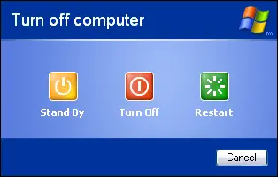
I’m told that when Microsoft changed their shut down screen from a one-click button to a dropdown menu, a large percentage of users stopped shutting their computers down as often.
This is because a dropdown menu requires three clicks (open the menu, make the selection, confirm the selection) as opposed to the clickable button approach which only required one click.
While not the be all and end all, thinking in terms of ‘minimum required clicks’ can help you to find simpler form elements to reduce clicks, and ultimately reduce the time and cognitive load required to complete your form.
What are you doing to protect your visitor’s sign-up information? You may want to include a privacy policy, or perhaps display your SSL certificate at the bottom of the page, to let visitors know that you take their personal data seriously.
06Create validation rules that help your users
Validation rules are often used to tell users when they’ve missed a field or entered information incorrectly.
Generally, validation rules are frustrating. I’m sure you’ve used forms in the past where the validation rules make it seemingly impossible to complete. Validation rules can, however, be useful and appreciated by the user.
The best practice is to display inline validation that provides real-time feedback to the user, rather than waiting until the user clicks submit.
07Invest in the best design you can afford
Design is perhaps the single most important factor when it comes to building high-converting forms. Design impacts trust, first impressions, ease of completion, and even the motivation to fill out the form. In other words, when you improve design, you improve virtually all of the aspects in the Form Optimisation Pyramid above.
For great examples of form designs, I’d recommend searching for forms on Dribbble.
08Speed it up
We live in a face-paced world, and even a few extra seconds that a webpage can take to load could lose you leads and sign-ups. For more tips on improving page, check out our post on ‘How to Improve Your Page Load Speed by 70.39% in 45 Minutes’.
09Make it quiz-like
If you asked 100 people whether they enjoy filling out forms, you’ll likely hear 100 resounding no’s. People fundamentally don’t enjoy filling out forms because they stand between people and the things they want. Filling out forms is a bit like going through customs in an airport - an undesirable necessity that you must do to get your desired outcome (travelling to a new country).
As a marketer or product designer it’s your job to minimise the exposure to forms, or to make them more enjoyable.
One way to do this is to make your forms unlike a form. Instead of text fields and dropdown boxes, you could experiment with an lead capture form that feels more quiz-like, using toggles, sliders, and more engaging elements.
While this may sound counterintuitive and against UX common wisdom, I have plenty of data to back up the effectiveness of this approach. In fact, this is one of the principles that we’ve found make Leadformly’s lead forms so effective.
In one of my favourite case studies, we increased BrokerNotes’ lead capture conversion rate from 13.6% to 41.6% (more than tripling inbound leads) by using a more quiz-like lead capture form.

The TopTal onboarding form is another great example of an engaging quiz-like lead generation form. Want to see more examples? We shared 12 examples of high-converting lead generation forms here.
10Emphasise the outcome
Form abandonment implies that a user started filling out your form.
This means that they must want whatever is on the other side of your form, whether that’s a free consultation, joining a community, or ordering a product.
The problem is that they don’t want it enough that they’re willing to resist whatever distracted them, or to to overcome whatever hurdles caused them to drop out of your form. Sometimes the solution is simple - remind users why they’re filling out your form.
Tell them about the difference their donation is making, or how their life will improve with your product, or how your service will help them achieve their goals. This booster shot of motivation may be all that’s needed to reduce your form abandonment.
Bonus tip: What gets measured gets managed
It’s uncertain whether it was said by the legendary management consultant Peter Drucker, or by the statistician William Edwards Deming, but either way, the quote ‘what gets measured gets managed’ rings true.
I recommend setting up a dashboard with daily statistics on form completion, along with a breakdown of which fields or questions have the highest drop-offs. This will give you a great feedback loop to identify what’s causing your form funnel to leak.
When you know precisely what needs fixing, you can begin to hypothesise variations using the tips above, and then run an A/B test to boost your form completion and conversion rates.
Remember - when you decrease form abandonment this has a huge knock-on effect across all of your marketing KPIs. Your cost per acquisition will go down, your paid ads will have a higher return on ad spend, and your overall ROI will improve.
I hope the tips above are useful, and I wish you good luck in driving your form conversion rates through the roof!
FAQ
What is a good form abandonment rate?
Most industries experience form abandonment rates between 60-90%, meaning a rate below 50% is considered excellent performance. The benchmark varies significantly by industry and form type—checkout forms typically see higher abandonment than newsletter signups. Tracking your industry-specific abandonment rate allows you to set realistic improvement targets rather than aiming for an arbitrary number.
How do I reduce form abandonment on mobile?
Mobile form abandonment is primarily caused by poor responsive design, excessive fields, and slow load times—so prioritise single-column layouts, minimise required fields, and test your forms on actual mobile devices. Mobile-optimised forms with progress indicators significantly outperform desktop-centric designs, as users expect frictionless experiences on smaller screens. Consider implementing autofill functionality and larger touch targets to reduce friction further.
What are the main reasons people abandon forms?
The primary culprits are too many required fields, unexpected charges or hidden fees, unclear value propositions, and security concerns about data privacy. Excessive form length is the leading cause of abandonment—studies show conversion rates drop dramatically after 5-7 fields. Other significant factors include confusing navigation, poor mobile optimisation, and lack of trust signals like security badges.
How can I track form abandonment?
Use analytics tools like Google Analytics 4, Hotjar, or dedicated form analytics platforms to monitor where users drop off within your forms. Heatmaps and session recordings reveal exactly which fields cause abandonment, allowing you to identify problem areas with precision rather than guessing. Set up event tracking for each form step to quantify abandonment at every stage.
Should I use mandatory or optional form fields?
Mandatory fields should be limited to only essential information—every additional required field increases abandonment risk exponentially. Marking non-essential fields as optional reduces friction and improves completion rates without sacrificing data quality. Test different field combinations to find the minimum viable set needed for your business goals.
How does form design affect abandonment rates?
Form design directly impacts abandonment through visual clarity, field organisation, and perceived complexity—poorly designed forms feel overwhelming and untrustworthy. Clean, single-column layouts with clear labels and logical field grouping reduce cognitive load and improve completion rates by up to 40%. Visual hierarchy, whitespace, and progress indicators all signal professionalism and guide users toward submission.
What’s the impact of form abandonment on conversion rates?
Form abandonment directly reduces your overall conversion rate—if 70% of users abandon your form, you’re losing three-quarters of potential customers regardless of traffic quality. Improving form completion by just 10% can increase conversions by 10-15% without requiring additional marketing spend. This makes form optimisation one of the highest-ROI conversion tactics available.
Can exit-intent popups help reduce form abandonment?
Exit-intent popups can recover some abandoning users by offering incentives or addressing objections at the moment of departure, though they work best as a last-resort tactic. Preventing abandonment through better form design is more effective than attempting to recover abandoners with popups. Use exit-intent strategically—offering discounts, extended trials, or clarifying value propositions—rather than as a blanket solution.