


Below are 58 of the best insights I’ve come across on form design from seeing countless form design A/B tests, and studying the work of companies that have invested heavily into form optimisation.
Before we jump in, I should caveat that while most of the tips are based on statistically valid experiments ran across numerous sites and industries, they shouldn’t be taken as gospel. Forms are highly-contextual and depend on more than just the design of the form itself to convert well.
General Form Design & Structure
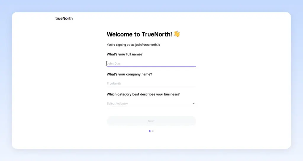
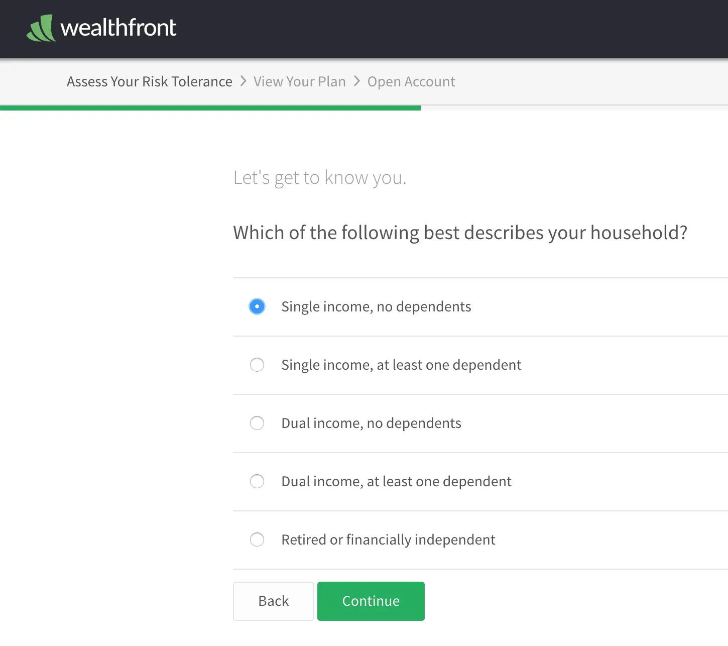
01Multi-step forms out-perform single-step forms
Splitting your forms into two or three steps will almost always increase form completion. We’ve tested this across all kinds of lead generation forms, from webinar registration forms to B2B enquiry forms, and consistently we’ve found multi-step forms out-perform generic single-step forms.
There are three reasons why multi-step forms work so well:
- The first impression is less intimidating than a long form with lots of question fields.
- By asking for sensitive information (email, phone) on the final step of a multi-step form, users are more likely to fill out these fields - otherwise they lose the progress made by filling out the previous steps (this is a proven cognitive bias known as the ‘sunk cost fallacy’).
- By seeing a progress bar, users are more motivated to complete the form. This is, again, based on numerous proven cognitive biases such as the endowed progress effect.
02Remove all non-essential fields.
Expedia lost $12 million per year by asking one additional question (company name) in their booking form. Marketo also found that a few non-essential fields were inflating their cost per lead by ~25%.
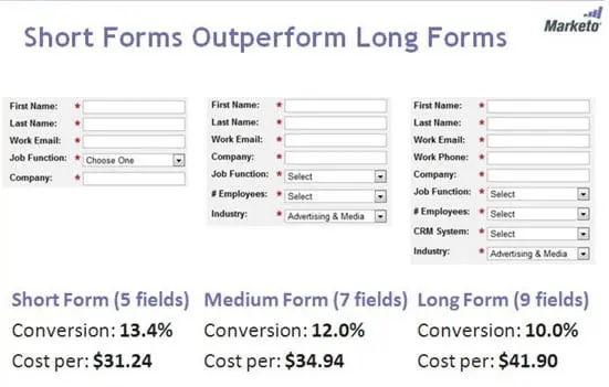
Every additional field in your form is losing you leads - so consider whether each question justifies the incremental loss in leads or opt-ins.
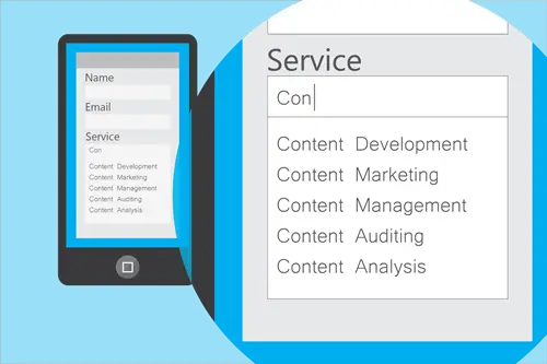
03Use conditional logic to shorten your forms
Conditional logic (sometimes called ‘branch logic’) is where you only display a question if a user has answered a previous question in a certain way.
This technique reduces the average length of your form, while also reducing form abandonment by not displaying questions that might be irrelevant to certain users.
One of our clients used this feature to create a unique enquiry form for their web agency. Using conditional logic, their visitors could tell them precisely what service they were looking for just by clicking a series of icons.
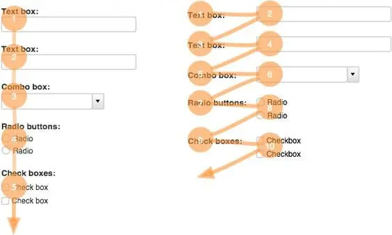
04Top-left aligned labels are best for readability & completion
Google’s UX researchers found that aligning labels above fields on the left-hand side increased form completion time. This is because it requires fewer ‘visual fixations’, as illustrated in the diagram below.
There is one acceptable alternative to top-aligned labels, which I’ll discuss in point #16.
05Avoid placing questions side-by-side.
Eye-tracking studies have shown that simple one-column layouts are better than multi-column layouts with questions positioned side-by-side.
The only exception to this rule is when asking for dates (day, month, year) or time (hours and minutes), where multiple fields are expected to be on one line.
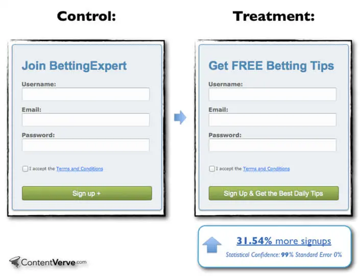
06Give people a reason to use your form
Imagine you had a long form that took an hour to complete. Nobody would use it, right?
Well, not if you gave everyone a free Ferrari for completing it. The promise of a Ferrari would give people the motivation to push through, despite the long and poor user experience. While extreme, this example illustrates the role that motivation plays in form optimisation.
In one simple example, BettingExpert received 31.54% more sign-ups by changing their form title and call to action to emphasise why people should sign up.
07Group related fields together into sections or steps
If your form has more than six fields, it’s considered good practice to group questions into logical sections or steps.
Questions & Field Types
08Choose field types that reduce the number of clicks required to complete
When Microsoft changed its shutdown prompt from a clickable shutdown icon to a dropdown box, they found that fewer people were shutting their computers down - just because of an additional two clicks.
When choosing which question field type to use, try to optimise for as fewer clicks as possible.
09Use smart defaults
If you’re asking questions like phone number or country, you should suggest a default phone extension or country based on the user’s IP address.
10Know when to use radio buttons, checkboxes, and dropdowns
As a general rule of thumb, radio buttons should be used when there’s a range of options and only one option can be chosen.
Checkboxes are should be used when more than one option can be selected.
Where possible, checkboxes and radio buttons should be used instead of dropdowns, as they less cognitive load to process. Typically, I use dropdowns when there are more than six options to choose from.
11Radio buttons should be vertically-stacked
Vertically-stacking radio buttons (and checkboxes) makes them faster to process compared to a horizontal layout.
12Do not slice fields when asking for phone numbers or date of birth.
Sliced fields force the user to unnecessarily make additional clicks to move to the next field. Instead, it’s better to have one single field with clear formatting guidelines in the placeholder.
Even if you auto-advance users onto the next field, field slicing imposes stricter validation that has the potential to backfire. In the diagram above, for example, this field slicing would be confusing for anyone entering a phone number outside of the United States.
13Clearly explain why you’re asking for sensitive information
People are increasingly concerned over privacy and information security. If you must ask for sensitive information, make sure you explain why it is needed using support text below the field.
14When asking for addresses, use a postcode / zip code lookup to reduce field entry
When asking users to fill out their address, it’s best practice to just ask for a house number and postcode/zip code, and then use a lookup service to suggest the full address.
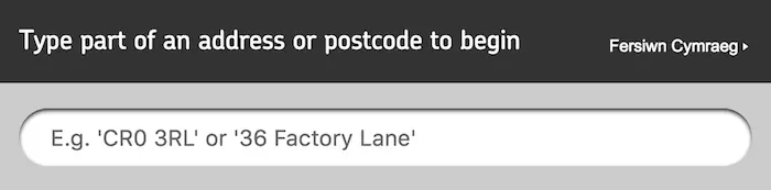
15Use placeholders correctly
A placeholder is the light text that appears within a form field. In the example above, you can see a placeholder that says ‘E.g. ‘CR0 3RL…’.
Placeholders should be used to guide users on how to fill out the field if there’s any ambiguity. In other words, you probably don’t need to have a placeholder for fields like ‘First name’ as most people know how to answer their first name.
16Always display a field label
A field label is the question text that sits above the field. These should always be present and should not be replaced with placeholders. Why? Because when you start entering text into a field the placeholder text disappears which forces people to use their memory to recall them.
The only instance where it may be acceptable to not have a field label is if you’re using inline labels. Inline labels are a hybrid solution that is always in view but do not take up as much vertical space as top-aligned labels.

17Use predictive search for fields with lots of pre-defined options
When asking users to choose their country, occupation, or something else with a large number of predefined options, it’s best to provide a predictive search function to reduce the amount of typing and cognitive load required.
18If you must ask an optional question, make it clear that it’s optional
While I’d advise removing optional fields or using milestone submissions to ask them after users have already submitted their data, sometimes internal politics require them to be asked.
If you must ask optional questions, make it clear that they’re optional using placeholders.
19Selectable images are among the most engaging question type
Where it makes sense, use clickable images as a question type. From the data we’ve seen at Leadformly, they’re among the most engaging question types and provide a great form user experience.
20Be careful when asking for phone numbers
People are increasingly less happy handing out their phone numbers. In fact, one study by Clicktale found that marking the phone number field as optional decreased the form abandonment rate from 39% to 4%.
21Input fields should be sized accordingly
The size of a field should reflect how much text the user is expected to enter. Therefore, fields like zip code or house number should be shorter in width than fields like the address line.
Accessibility & Ease of Use
22Avoid using Captchas.
A study by Stanford University found that Captchas will cost you a drop in subscribers/leads of up to 30%. When Animoto removed captchas from their sign-up form, they received 33.3% more sign-ups.
Captchas force the problem of spam management onto the user, causing friction, and ultimately deterring leads. A better alternative would be to use an automated spam detection service like Akismet or create a ‘honeypot’ using hidden fields. Using a Captcha should be your absolute last resort.
23Do not rely on colour to communicate
While less common in women, 1 in 12 men have some degree of colour blindness.
When displaying validation errors or success messages, be sure to not rely on making the field green or red. Wherever colour is used, try to also display text and/or icons to communicate a message to the user.
24Ensure that your entire form can be navigated using the tab key
While many people use the tab key to navigate through forms, this is particularly important for disabled users who may be relying on software that uses the tab function to move from one question to the next.
25When asking a question that users may not understand, provide clear explanations to guide them to the correct answer.
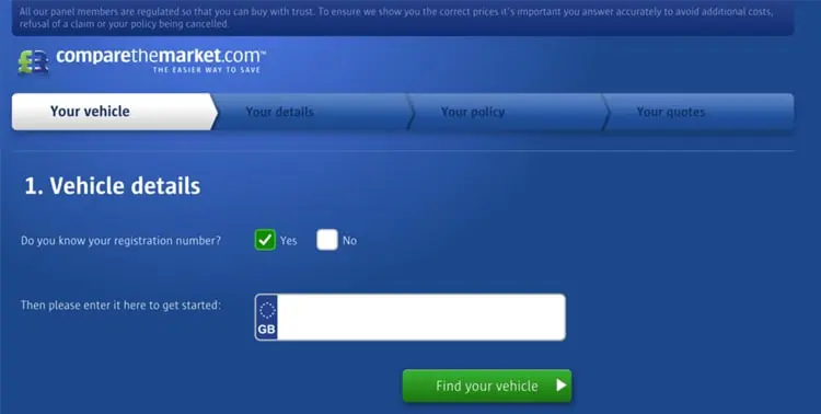
Insurance lead generation forms are not easy. Unfortunately, there’s a lot of mandatory information that must be asked that can confuse users.
Fortunately, there’s a lot that we can all learn from insurance companies on how to tackle this challenge. ComparetheMarket.com do a great job of providing detailed visual explanations when you hover over a question.
26Does your form work on all major browsers and devices?
It may sound like common sense, but it’s good to check that your forms work and are easy to use across all major browsers and devices. When in doubt, use a service like BrowserStack.
27Is your form easy to use in bright or low-light situations?
If people are likely to use your forms outdoors on their mobile devices, it’s best to ensure that your question fields contrast against the form background. Otherwise, users may not be able to see where to tap.
28Ensure that nothing flashes more than twice per second
If you plan on using blinking cursors, animated progress bars, gifs, or anything else that flashes, ensure that they do not flash more than twice per second. Otherwise, this may trigger seizures for some people.
29Enables browser auto-fill
Browsers like Google Chrome & Firefox now have an auto-fill function that lets users fill out standard form fields in one click.
For this to work, Google Chrome / Firefox look for contextual clues in the ‘name’, ‘label’, and placeholder text. Therefore, it’s good practice to ensure your fields are properly tagged with terms that a browser would recognise e.g. ‘email’, ‘first name’, or ‘city’.
30Use milestone submissions
How do you keep your forms short enough not to deter users, while still capturing more information if a user is willing to provide more information? Milestone submissions is one option.
Milestone submissions is a technique that allows you to submit the form when a user has reached a certain step in the form, and then continue providing more information if they want to. Toptal.com use this feature to fast-track people who are willing to answer a few additional questions.

31Optimise the speed of your forms
Users expect websites and forms to load fast. In fact, for every 100 milliseconds Amazon speed up their website, they see a 1% increase in revenue. If you want to increase your conversions, ensure your form is as fast as it can be.
32Avoid auto-advancing (automatically jumping to the next question)
It’s not expected and generally confusing.
33Use visual cues and icons to make form fields more intuitive
Our brains process visual images significantly faster than text. As illustrated by the Compare the Market form below, visual prompts can be used to signal how a field should be filled out.
Input Validation & error handling
34Don’t make your validation too strict
Strict validation is a symptom of lazy programming. It’s bad for users, and your business will pay a price for it.
If there’s a lot of variation in how users answer a field (for example, responding to phone number with +12345678912, +44 12345678912, 012345678912), your programmers should use a rule that converts these to a consistent format on your end.
Alternatively, use field placeholders to clearly show the suggested format.
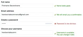
35Do not ask people to confirm their email or password twice
If you must use an email/password confirmation system, it’s better to have an icon or checkbox that unmasks the password when clicked.
36If you must use validation, ensure that it’s inline (to the right of the field) and reports errors early on.
Don’t wait until a user hits submit to report validation errors. At the same time, inline validation should not be real-time, as this is likely to report errors before a user has completed the field.
Ideally, inline validation messages should appear around 500ms after a user has stopped typing.
Trust & Social proof
37Make your form design beautiful
It has been proven that people trust beautifully designed forms/websites more than forms that don’t look as impressive.
38Address likely concerns near your form
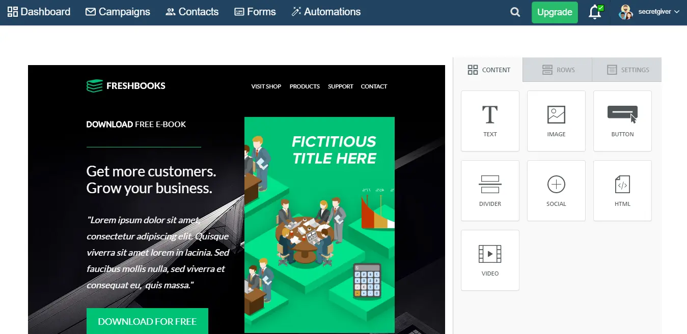
There are likely a number of reasons why people might feel uncomfortable using your forms. For example, how long will it take? Will I need to enter my credit card details? Will I receive annoying phone calls from a salesperson?
By addressing these up front, you can break down the barriers and make using your form more of a no-brainer. Freshbooks address their users’ concerns by displaying “No credit card required. No Contracts. Cancel anytime” beneath their form’s call to action.

39Display strong social proof in close proximity to your form
Statements like ‘used by 100,000 people’ and testimonials by other people in a similar situation are powerful persuasion techniques that make users more likely to trust you and use your form.
40Be careful using security seals, unless you’re asking for payment
People associate privacy and security seals with making a payment. In the A/B test below, adding a payment seal actually decreased conversions because people thought they would be taking to a page to pay for something.
41Display live chat or contact information within view of your form
Despite their registration form being very simple, Intercom display a live chat window in clear view to answer any questions or objections you might have prior to registering for an account.
For more complex forms where users might have questions about the form itself this is an extremely powerful technique. Not only does it build social proof, but it also helps potential leads answer any questions stopping them from using your form.
Multi-step forms & progress indicators
42When using multi-step forms, always display a progress bar
Progress bars encourage completion and reduce your user’s anxiety by clearly communicating how far they are from finishing.
As an interesting side note, we’ve found from our experiments at Leadformly that animated progress bars (like the one on Leadformly.com) typically outperform static progress bars.
Also, starting your progress bar with some progress already made increases the number of people that use the form.
43Be mindful of your transition speeds
A good friend of mine was capturing leads for his dating company’s website using a 5-step lead generation form. But he couldn’t figure out why people were clicking the next buttons and then abandoning the form.
It turned out that their transition speed was too fast. Users were clicking the next button and not noticing that the content on the step had changed because it changed so fast. After slowing down their transition speed their conversion increased.
This is one of the most counterintuitive lessons I’ve come across on multi-step form design. After all, we’re often told that faster is better. Not when it comes to transition speeds, it seems.
44Use clear signposting
A progress bar by itself is not enough. You should also display the total number of steps and which step the user is currently on to remove any ambiguity. In the example below you can see how it clearly shows users that they’re on step one of two.

Buttons & Call to Actions
45Call to Actions Should Finish the Sentence ‘I Want To…’
By default, many forms use dull call-to-action buttons like ‘submit’ or ‘send’. These should be avoided and replaced with call to actions that match what the user is hoping to achieve when they complete your form.
A good rule of thumb is to answer the question “I want to…” from the user’s perspective. For example, if it’s an enquiry form for a free consultation, the call to action could be ‘Request My Free Consultation’.
In this study, Unbounce found that even just changing ‘start your free trial’ to ‘start my free trial’ increased clicks of the call to action by 90%.
46Make sure call to actions are highly contrasted
We’ve all heard about those infamous studies where changing the colour of a button increased conversions. These studies can be dangerous when interpreted literally, as it’s usually not the specific colour that matters - it’s the contrast.
Notice how the orange call to action stands out from the blue/white in the Unbounce example above? That’s what you’re aiming for.
47Call to actions should be the same width as fields
Uber’s forms use large full-width call to actions that are highly contrasted against the form backgrounds. By making call to actions the same width as fields you remove any doubt over where the button is located.
For an example of how not to do this, see UPS’s form in the tip below.
48Avoid using ‘clear’ or ‘reset’ buttons
Below is a screenshot of UPS’s registration form. Not only are the call to actions small, but the next button is also right next to a ‘cancel’ button that is styled and located in a similar position to the ‘next’ button.
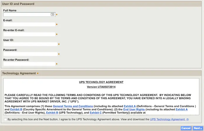
The risk of accidentally deleting all of the information you’ve entered outweighs the small convenience of having to start again. Most users are aware that refreshing the page or just re-entering information will enable them to start over again. As such, cancel or reset buttons should be avoided.
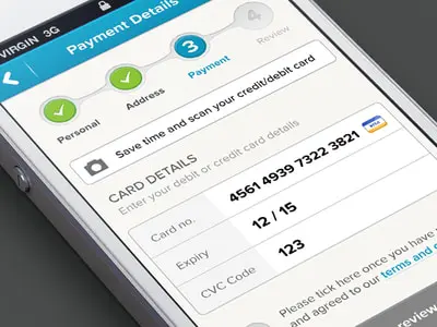
49Sequence your questions logically
When asking for credit card details, for example, ask for information in the same order that it typically appears on the physical card (credit card number, expiry date, security code).
50Do not place overly complicated legal messages near your buttons.
If you must have your users agree to lots of complex disclaimers, try to combine these into as few files as possible and keep legal messages as concise as possible.
51Do not trick users by auto-enrolling them into your mailing list.
This comes across as manipulative and forces most users to make an additional click to opt-out of your list.
52Clearly explain what’s next upon clicking the submit button
When someone uses your form they might be wondering how long they’ll have to wait, whether they need to prepare anything, or what is going to happen.
Ideally, your form should redirect users to a page that clearly communicates what will happen next and what they can expect.
53Upon submit, disable the submit button from being pressed again
This is to prevent duplicate submissions and to also provide an extra signal to the user that their submission has been successful.
54Make it clear what the user can expect to happen next
Your call to action (and landing page in general) should clearly communicate what the user can expect to happen as soon as they complete your form.
Mobile form optimisation
55Use the mobile device’s native features (camera, geolocation, date picker) to simplify tasks
Last year, I spent a lot of time with a forex broker trying to help them optimise their onboarding forms. For regulation reasons, this company had to ask users to submit ‘KYC’ (Know Your Customer) documents, such as their driving license and a recent bill.
On desktop this is a clunky process at the best of time, as users would typically have to abandon the form to scan a document and then upload it.
For mobile users, it was even more difficult. Ultimately, we found that tapping into the mobile device’s camera was the best user experience, as it enabled users to take a photo of their driving license without leaving the form.
I have even seen this same approach used to let users ‘scan’ their credit card, instead of having to fill out their credit card information manually.
56Question fields and buttons should be at least 48 pixels high.
The average adult finger pad size is about 10mm wide. In web terms, this is approximately 48 pixels. Therefore, when designing forms that are to be used on mobile devices, ensure that your fields are at least 48 pixels high.
57All form labels & placeholder fonts should be above 16px
After redesigning an entire user interface for a client last year, I received an email from their CEO saying “It looks great Marcus, but I can’t read a thing!”.
The font was 14px, which is a fairly standard font size… for web. But my client was viewing this interface on a mobile device. When designing for mobile or an older audience, your text should be at least 16px in size.
As a side note, iOS devices will zoom in when any text below 16px is tapped, but not if the text is 16px or above, as it’s deemed unnecessary.
58Use specific HTML input types to show the correct keypad
Ever noticed how, when using a mobile device, the phone displays different keyboards depending on which question you’re asking? Sometimes the ‘.com’ button displays, while other times a date selector comes up?
That’s all thanks to HTML input types. For mobile form design, they’re awesome and you should use them. There are eight input types that are relevant to form design:
- input type=“text” displays the normal mobile device keyboard
- input type=“email” displays the normal keyboard plus ‘@’ and ‘.com’
- input type=“tel” displays the numeric 0-9 keypad
- input type=“number” displays a keyboard with numbers and symbols
- input type=“password” this hides characters as they’re typed in the field
- input type=“date” this displays the mobile’s date selector
- input type=“datetime” this displays the mobile’s date and time selector
- input type=“month” this displays the mobile’s month/year selector
Now, over to you.
Form optimisation is not an event, it’s a never-ending process. This is why we built Leadformly, as we believe that constantly testing assumptions and design changes can lead to big increases in your bottom line over time.
Even if you were to action all of the advice in this article, you’d be far from complete as there would still be countless variations and assumptions to test.
My hope is that this article has provided you with the inspiration and insight needed to take your forms to the next level and convert leads at a rate that’s higher than if you hadn’t come across this guide.
FAQ
What is the best form design for conversion rates?
The best form design minimises friction by asking only essential questions and using single-column layouts instead of multi-column designs. Studies show that reducing form fields by just one can increase completion rates significantly, so prioritise what information you actually need from users.
How many fields should a form have?
There’s no magic number, but fewer fields always outperform longer forms when conversion is your goal. Each additional field creates abandonment risk, so audit your form ruthlessly and remove any field that doesn’t directly support your business objective.
What makes a good form UX design?
Good form UX combines clear labelling, logical field ordering, and real-time validation feedback that helps users correct errors before submission. Mobile optimisation is equally critical—forms must work seamlessly on small screens with appropriately sized touch targets.
Should forms have progress indicators?
Yes, progress indicators significantly reduce abandonment in multi-step forms by showing users how much work remains. They set expectations and provide psychological momentum, particularly for forms with more than three steps.
How do you design forms for mobile?
Mobile forms require single-column layouts, larger input fields, and simplified keyboards that match the input type (numeric for phone numbers, email for addresses). Test on actual devices to ensure buttons are easily tappable and forms don’t require horizontal scrolling.
What’s the best CTA button text for forms?
Action-specific button text like ‘Create Account’ or ‘Get My Quote’ outperforms generic labels such as ‘Submit’ because it clarifies what happens next. Users are more likely to complete forms when they understand the exact outcome of clicking the button.
How should form errors be displayed?
Inline error messages positioned near the problematic field are far more effective than summary errors at the top of the form. Users should understand exactly what went wrong and how to fix it without scrolling or searching for the error location.
10 Reader Comments
Thanks for the wonderful article
Fantastic article. Well played. :)
Very interesting, helpful and just WOW!!!
Thank you so much for putting all these together.
Thanks for this! Helped my process
wow
very useful
Brilliant
Really helpful for product designer...
great!!
good tips, thanks :)
Absolutely helpful! Thanks for sharing it :)