


Landing pages are one of your most important lead generation tools, but the majority of examples you’ll come across are uninspiring, to say the least. Despite all the design guidelines and best practices available these days, I see far too many brands make the same mistakes time and again wth their landing pages.
Today I’m going to lay it out straight: don’t make these mistakes with your own landing page designs because you’ll only be wasting time and money on getting poor results.
01Not having enough landing pages
All the way back in 2011, studies were showing that the more landing pages businesses had, the better results they were getting. Why? Because these businesses are creating landing pages to highly specific buyer needs rather than trying to appeal to everyone with the same few pages. Trying to do too much with any one landing page sets you up for failure before you’ve even started.
How to avoid this landing page mistake

Destinology.co.uk targets honeymooners specifically with this landing page
Create separate landing pages for different conversion goals, buyer personas, each stage of the consumer journey - not just your products/services. For example, if on of your conversion goals is to generate sign-ups to a free trial for your SaaS product, create specific landing pages to target IT pros, marketing managers, sales teams or whatever your target audiences may be.
02Beating around the bush
With a specific goal and message in mind, you now have to get this across in a compelling way - and you’ve got a matter of seconds to do this. All the way back in 2006, studies found users make up their minds about a website “in the blink of an eye” - or 50 milliseconds to be precise.
Which means, if your message doesn’t get right to the point and convince visitors you have something valuable to offer, you’ve got a problem.
How to avoid this landing page mistake
Strip down your marketing message to the core value proposition you’re offering. Tell people what problem you’re solving, how you’re improving their daily lives or whatever benefit is key to your offer. For PPC landing pages try to match the headline in your page with the headline of your ad. None of this should be difficult if you’re creating enough landing pages, each with their own relevant message.
03Creating distractions
When your aim is a concise message, the last thing you want to do is create unnecessary distractions. This is an important part of getting your message across quickly (as mentioned above), but it applies to every other part of your landing page, too.
Distractions take user attention away from the core benefit your offer provides. They can also confuse visitors about which action to take and choice fatigue is always a danger if you provided too many options - none of which is good for conversions.
How to avoid this landing page mistake
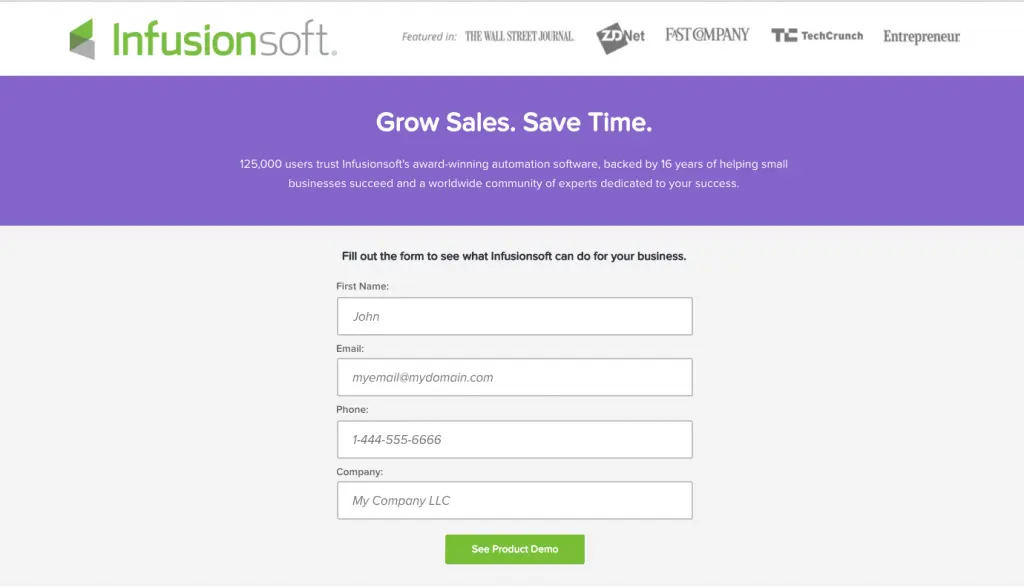
Infusionsoft ditches the header and all other distraction on this landing page for its free demo
Remove any element from your landing pages that doesn’t reinforce the main message of your offer. Ditch the header navigation to remove choice fatigue and keep users focused on the task at hand, making it absolutely clear what action they should be taking. If you have a secondary conversion (and it’s fine if you do), make sure it’s 100% obvious that it’s not the main action you expect users to take.
04Adding friction
With distraction-free landing page designs, there’s nothing getting in the way of your message and its intended audience. As for conversions, though, there’s still the matter of minimising friction to think about. Any unnecessary barrier you place between users and taking action is one extra reason for them to quit the session without converting.
How to avoid this landing page mistake
Put yourself in the shoes of your target audience and look for excuses they might find to avoid converting. Stay away from obvious UX mistakes like pop-ups and scroll hijacking, paying special attention to your CTAs and the steps users actually have to take to convert - e.g.: which form fields they have to fill out and whether they add any friction.
05Not optimising your forms for conversions
One of the biggest friction points on any landing page is web forms. There’s no easy way to approach this topic but the best place to start is designing forms with conversions in mind from the beginning. From here you have the task of optimising your forms over time to remove problematic fields and other design issues preventing conversions.
How to avoid this landing page mistake
First, get yourself a good form optimisation tool that helps you track performance and easily edit your forms to make improvements. Best practices used to tell us that shorter forms outperform their longer cousins, but recent studies have shown this isn’t always the case. Multi-step forms are a relatively new trend that’s generating some incredible conversion rates - especially those designed so they don’t actually look like forms at all.
06Neglecting buyer concerns
No matter how good your offer is - or how good your landing page sells it - people will still have doubts about buying into your brand. It’s difficult for people to trust a faceless brand - especially when they’re seeing your landing page/brand for the first time - and neglecting these buyer concerns is a big mistake.
How to avoid this landing page mistake
The most obvious way to tackle this problem is using trust factors like testimonials, customer reviews, industry awards and other forms of third-party feedback that give users their seal of approval. Another tactic is to provide guarantees over common concerns - for example:
- Money-back guarantee
- No credit card details required
- Privacy policy
Identify what concerns each of your target audiences will have with your conversion goals and try to reassure them.
07Slow loading times
All your hard work to create landing pages that convert count for nothing if people leave before they finish loading. As the web matures, user expectations on loading times become more demanding and many brands are falling behind. Pages that take longer than 2-3 seconds to load lose more than 50% of visitors, which counts for the vast majority of landing pages. Don’t let yourself fall into this category
How to avoid this landing page mistake
Keeping on top of loading times needs to be one of your priorities and this involves a number of key factors:
- Use a fast hosting provider
- Keep your web code clean
- Minify your website files (HTML, CSS, JS, etc.)
- Sign up to a content delivery network (CDN)
- Use web caching
- Regular speed tests
- Minimise server requests
- Image optimisation
- Minimise page redirects
Loading times are one of those things you have to work at regularly and it’s not only users who demand speedy landing pages. Page speed is a ranking factor in Google’s search algorithm and it also plays a role in Ad Rank, which determines whether your PPC ads show and where they appear on the page.
08Poor mobile experience
It almost pains me to talk about mobile optimisation in 2026 (I know, old news) but the majority of landing pages fail miserably at providing a decent experience across devices. Loading times are a big part of this, of course, but there are basic design mistakes that crop up constantly. When the majority of searches take place on mobile, failing to provide a consistent experience across devices is crazy.
How to avoid this landing page mistake
If you’re using landing page builders, make sure the code is lightweight and optimised for mobile performance. Stick to single column layouts with plenty of whitespace and full-width sections; these are easy to make responsive across while maintaining a consistent experience. Take a look at this example from Asana that couldn’t be more mobile friendly (this is from my desktop, btw):
Also, avoid using any unnecessary JavaScript that’ll add bloat to your code and loading times (including pop-ups). Optimise your visuals for size and performance and use responsive form designs that adapt to different screen sizes.
09Weak calls to action
The whole point of your landing pages is to generate leads and convert people, which means your calls to action are the defining factor in that crucial moment. Weak CTAs kill your conversion opportunity cold dead. You need to grab people’s attention and make your offer hard to refuse - anythings less and your landing pages are underperforming.
How to avoid this landing page landing page mistake:
First of all your CTAs need to stand out, so use good colour contrast and bold elements to make them visually striking. Next, they need to convince people to take action. Reaffirm the core benefit of your offer and spell out the action users should take with your button text (e.g.: “Create my free account”, “Build your first landing page”, etc.).
Another example from Infusionsoft - simple yet powerful CTA copy
Placement is always important, too, but don’t get caught up in moving your CTA buttons a few pixels in A/B tests, hoping for miraculous results. These kinds of tests are misleading and time-consuming. The same thing goes for button colours, font styles and other minute details. Focus on the things that matter: contrast, copy and a layout that makes for a powerful, convincing CTA.
Landing pages are serious business
All of the mistakes we’ve looked at today can be avoided by taking three things seriously: audience research, relevancy and user experience. Once you know what each of your target users wants, you’re able to create highly specific marketing messages that strike a cord with their desires. Suddenly, your copy sounds more convincing, the benefits of your offer become clear and your calls to action are more difficult to resist.
All that’s left is to package this in a user experience that removes all conversion barriers and your fleet of landing pages is getting serious business results.
FAQ
What should not be on a landing page?
You should avoid adding navigation menus, external links, and other elements that distract visitors from your primary conversion goal. Distractions like header navigation or footer links can reduce conversion rates by up to 26% because they give users an easy escape route before they’ve engaged with your offer.
What is the most common landing page mistake?
Not having enough landing pages for different audience segments and campaigns is the most widespread error brands make. Creating multiple targeted landing pages instead of funnelling all traffic to a single generic page can increase conversions significantly, as each page can address specific buyer concerns and messaging.
What should you not do on a landing page?
You should not add unnecessary form fields, auto-playing videos, or slow-loading elements that create friction in the conversion process. Minimising form friction by asking only for essential information can dramatically improve your conversion rate, as every additional field reduces the likelihood of completion.
What is landing page friction and why does it matter?
Landing page friction refers to any element that makes it harder for visitors to convert, such as complex forms, confusing copy, or slow page load times. Friction directly impacts your conversion rate—studies show that pages loading in under 2 seconds convert significantly better than those taking 5+ seconds.
How do landing page design mistakes affect conversions?
Poor design choices like unclear value propositions, cluttered layouts, and unoptimised forms can reduce conversions by 20-40% or more. Design mistakes that don’t clearly communicate your offer within the first few seconds cause visitors to leave before understanding what you’re asking them to do.
Why is mobile optimisation critical for landing pages?
Over 60% of web traffic now comes from mobile devices, yet many brands neglect mobile-specific optimisation on their landing pages. A poor mobile experience causes high bounce rates because forms are difficult to complete, text is hard to read, and buttons are too small to tap accurately on smaller screens.
What landing page optimisation mistakes hurt conversion rates the most?
Failing to address buyer objections, using vague headlines, and not optimising form fields for conversions are the three biggest optimisation mistakes. Neglecting to anticipate and overcome buyer concerns means visitors leave with unanswered questions instead of converting, even if they were genuinely interested in your offer.