


If you’re looking for the usual landing page advice like ‘change your buttons from blue to orange’ or ‘reduce your form fields’, you’re in the wrong place.
In this BS-free article, you’ll learn the most effective techniques and processes that I’ve come across in 9 years of optimising landing pages. Many of the insights below have generated 700-800% increases in conversions for our sites.
First, though, I want to share with you an important philosophy that, when understood and applied, will transform your approach to landing page optimization.
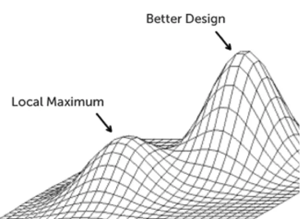
If you want big results, stop tweaking
We’ve all been there – someone in the office says “Do you think this thing should be X or Y?” and another person enthusiastically responds with the stock phrase “Why don’t we A/B test it!”
There’s a big problem with this.
First of all, it’s driven by silver bullet thinking. We read about how Amazon made a few million extra dollars by changing their buttons from rounded edges to square edges, and assume that the same applies to us.
But the bigger problem is that making small tweaks keeps you in your local maximum (the highest conversion rate that you could get with your current landing page design).
I’ve focused the majority of this guide on the strategies, processes and techniques to use to upgrade your landing page, rather than specific changes to make. My intention is that you take away these techniques and use them to do your own research to identify new ways to take your landing pages to the next level.
With that caveat out the way, we can move onto the 12 landing page best practices and examples – enjoy!
01Reduce your attention ratio
A few years ago, I attended a CRO event in Estonia called Digital Elite Camp.
One of the concepts that stuck with me from the event is an idea shared by Unbounce’s Oli Gardner called ‘Attention Ratio’. Attention Ratio is the ratio between the number of things you can do on a given page to the number of things you want people to do.
Your landing page should, ideally, have an attention ratio of 1:1.
In other words, the only thing that people should be able to do on your landing page is the thing that you want them to do. Every other link, button, or offer is merely a distraction.
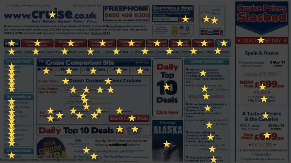
In reality, most landing pages have 50-100 different things competing for a visitor’s attention.
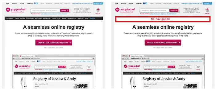
When VWO removed the navigation from one of their landing pages (reducing their attention ratio from 13:1 down to 3:1) their conversions increased by 100%.
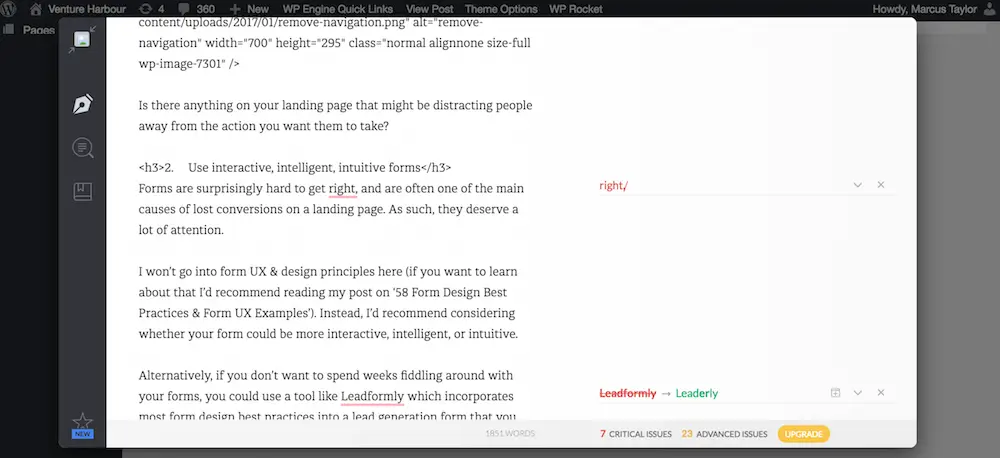
Is there anything on your landing page that might be distracting people away from the action you want them to take?
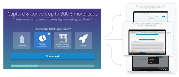
02Use interactive, intelligent, intuitive forms
Forms are surprisingly hard to get right and are often one of the main causes of lost conversions on a landing page. As such, they deserve a lot of attention.
I won’t go into form UX & design principles here (if you want to learn about that I’d recommend reading my post on ‘58 Form Design Best Practices & Form UX Examples’). Instead, I’d recommend considering whether your form could be more intelligent or interactive (e.g. by using a multi-step or quiz-like form).
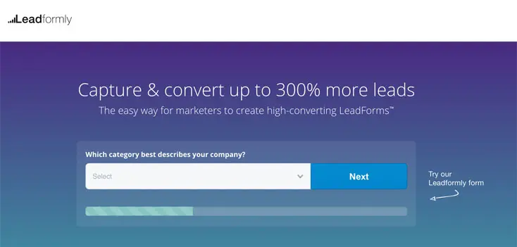
Alternatively, if you don’t want to spend weeks fiddling around with your forms, you could use a tool like Leadformly which incorporates most form design best practices into a lead capture form that you can embed on your website.
03Optimise for motivation, then for ability
According to Stanford professor BJ Fogg, there are two ways to influence the likelihood of someone taking action. You can either increase someone’s motivation to do that action, or you can increase the ability, make it easier for them to do.
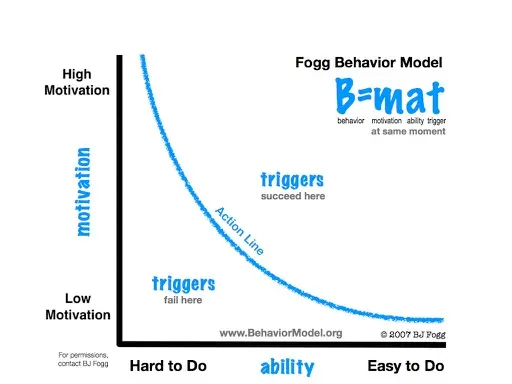
Most landing page optimisation advice focuses improving the page’s design to make it easier for visitors to take action. While important, optimising for ability pales in comparison to optimising for motivation.
Ultimately, every person visiting your website is trying to achieve some kind of outcome. This is driven by a cocktail of emotions that stem from either a desire for pleasure or a desire to avoid pain.
Take a look at Booking.com. Their landing pages are definitely not easy to use, so why are Booking.com one of the fastest growing online travel sites?
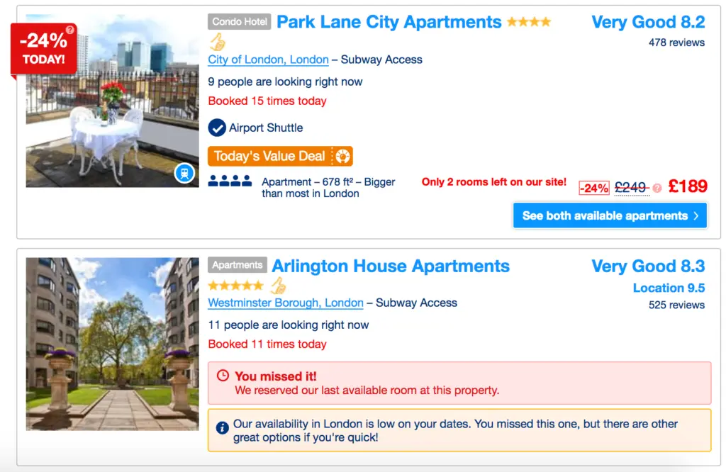
As you can see, Booking.com have clearly spent a lot of time optimising their pages for a strong emotional response. By leveraging many cognitive biases, scarcity, and urgency, they’ve driven up the motivation to book a hotel on their site.
04Increase urgency & scarcity
According to WiderFunnel’s LIFT model (one of my favourite conversion optimization frameworks) there are six things you can change to increase the conversion rate of a landing page:
- Increase the relevance of the page to the visitor
- Increase the clarity of your offer
- Reduce anxiety
- Reduce distractions)
- Improve the value proposition
- Increase the urgency of the offer
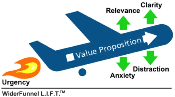
We’ve already covered one of these (reducing distractions), so let’s now look at one of the most potent, yet underused, tactics: Increasing urgency.
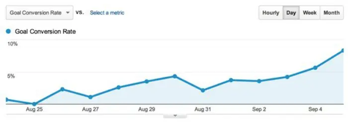
In 2012, I A/B tested adding urgency to a landing page by adding a countdown timer and the number of products remaining near to the page’s call to action.
While subtle, this change increased our conversion rate increased from 3.5% to 10%. In other words, we generated almost three times as many sales just by adding some urgency.
Now, there are a lot of ethics and considerations to take into account when adding urgency and scarcity to your landing page. Fake or implied urgency (e.g. saying ‘hurry! Sale ending soon’ when it’s not) is not nearly as effective as genuine urgency and scarcity.
05Write call to values, not call to actions
Common wisdom is that every landing page should have a call to action (a button telling the user to do something e.g. ‘Get started’).
While clear, most call to actions lack any clear value proposition. Why should I ‘get started’?
A better approach is to write a call to value – an action that has a value proposition attached to it. For example, if you run a financial advice firm a good call to value might be ‘Start saving money’ or ‘See my recommended portfolio’. These are not only more specific, but they give the user a reason why they should take this action.
One of my favourite examples of this is TimothySykes.com. While he arguably takes this concept too far, you won’t find any generic CTAs on any of Timothy’s landing pages.
06Create multiple versions of your page to boost relevancy
If 500 people visit your landing page it’s likely that they represent different cohorts of your audience.
Your UK visitors may behave differently to your US visitors.
Your high budget visitors may behave differently to your low budget visitors.
Instead of offering the same experience to all visitors you can tailor your landing page to different people to make it more relevant. If you want to do location / geo-based personalisation, you can do this either with browser redirection or with content swapping based on IP address (there are free WordPress plugins like custom content by country that do this).
If you want to personalise the landing page experience based on other factors e.g. industry, budget, or what a person’s looking for, you could do this using an interactive form that redirects visitors to a different landing page based on a person’s answer to a question in the form.
07What’s in it for me?
People don’t care about your company or product. They care about how it can help them achieve something they want or need.
In their brilliant book ‘Neuromarketing’, author Patrick Venoise outlines a range of tips for selling to the lizard brain, the part of our brain that makes the majority of our buying decisions.
One of the simplest, yet most potent, tips that I took away from this book is using the word ‘You’ more often in your marketing copy. We’re hard-wired to pay attention to things that are about us - which is focusing on your visitors rather than your company is a powerful technique.
08Avoid video backgrounds at all costs
When I tell people to ditch video and slider backgrounds, I often get responses like “But AirBnB do it”.
True, but AirBnB are most likely losing conversions due to this. They may not care, as the reduction in conversions may be justified by achieving some arbitrary goal like ‘telling the brand story’ or increasing ‘brand value’.
While video backgrounds and fancy hover effects may look cool, I’ve yet to see them convert better than a simple static alternative.
Movement is an extremely effective way to capture someone’s attention - we’re hard-wired as animals to pay attention to movement, as thousands of years ago this was the difference between staying alive or being killed by a saber-tooth tiger.
So, why on Earth would you want to attract people’s attention towards the background of your page when they’re supposed to be reading your copy or clicking on your call to actions?
As Coco Chanel put it, simplicity is elegance.
09Combine two types of social proof
There are two types of social proof: ‘Authority’ and ‘People like me’.
Authority social proof communicates that your offer has garnered the support of experts and authorities. A good example of this is featuring logos of press publications you’ve been featured on, or a testimonial from a respected expert in your industry.
‘People like me’ social proof answers the question ‘Is this suitable for people like me?’ - this is where a ‘wall of client logos’ and testimonials from customers is important.
Social proof is one of the most effective ways to improve the credibility and trustworthiness of your offer.
10Grammar & spelling matter
A study by Global Lingo found that poor spelling and grammar was the #1 factor that people claimed made them not trust a web page.
This point doesn’t need much embellishing – just check and then double check that your spelling and grammar is immaculate. It costs $10 to hire an English graduate to proof-read your landing page on Freelancer.com, so there’s no excuse. A final recommendation is to install Grammarly, a free plugin that will highlight spelling or grammatical errors in your work.
11Tackle every objection before the user thinks of them
Like great salespeople, a great landing page tackles objections before the visitor thinks of them.
Before designing a landing page, I like to spend 30-45 minutes somewhere out of the office to write down every possible objection I would have if I were a visitor learning about the offer. While there are some common objections like those listed below, your offer will probably have some unique objections to tackle.
Common objections:
- What if I don’t like the product? (is there a refund policy?)
- What payment methods are accepted?
- Is this product trustworthy? Who else uses it?
- When will I receive this product?
- How much does it cost?
A good practice when launching a new landing page is to install a free live chat plugin like Olark on the page for the first 1-2 weeks to monitor what questions people are asking through live chat. Then, add your responses to these questions in an FAQ section on your landing page.
12The right picture is worth 1,000 words
The old adage of ‘A picture tells 1,000 words’ is only half right. For an image to have a potent impact, it must convey a complex or hard to explain concept in simple terms.
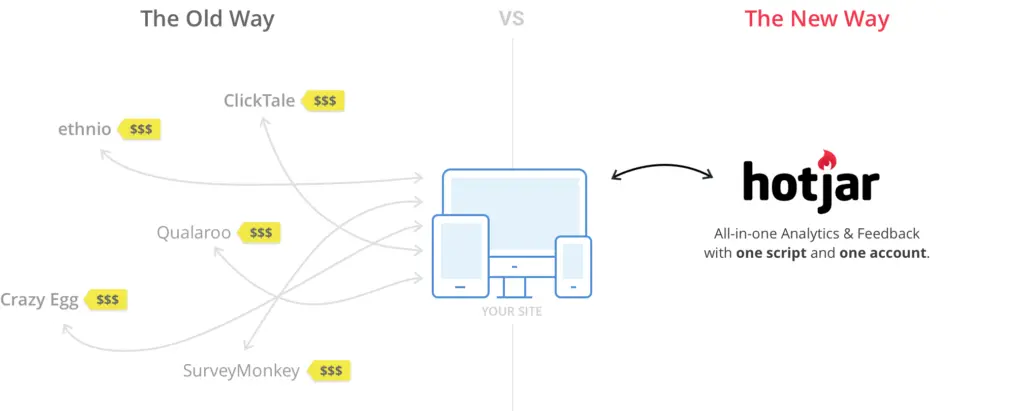
For example, the image below is taken from Hotjar’s homepage. This is probably one of the most copied images of 2026 in the B2B SaaS community, and for good reason. It’s so simple, yet the story it tells is so powerful that it needs no further explanation.
Boiling your value proposition down to a single image is hard, but worth the effort. Whether it takes you a day, a week or a month to identify what that image is, getting this right has the potential to transform your landing page conversion results.
What next?
If there’s one point in this article worth re-reading and arranging a discussion with your team about its #3. Optimising for motivation rather than ability is perhaps the best secret weapon available to anyone in charge of optimising a landing page.
Why? Because optimising for motivation forces you to ask the right questions - what emotions are you provoking? How intensely? Should you be using fear or pleasure to drive engagement with your offer? What images would provoke a stronger emotional response?
These are the questions that few digital marketers ask, but the ones that do are killing it.
FAQ
What are the most important landing page optimisation practices for improving conversion rates?
The most effective landing page optimisation focuses on strategic testing and process rather than cosmetic tweaks like button colour changes. Rather than making minor adjustments, successful optimisation requires a systematic approach to understanding user behaviour and removing friction from your conversion funnel. This article reveals techniques developed over 9 years of real-world optimisation work that go far beyond surface-level design changes.
What should a landing page structure include for best results?
An effective landing page structure must prioritise removing barriers to conversion and aligning messaging with user intent throughout the entire page. The best-performing pages follow a logical flow that guides visitors toward a single, clear action without unnecessary form fields or distracting elements. Structure should be informed by data about your specific audience rather than generic design templates.
How often should you test and optimise your landing pages?
You should stop making constant tweaks and instead implement meaningful testing cycles with sufficient traffic to validate results. Running endless minor experiments without statistical significance wastes resources and prevents you from identifying what actually moves the needle. The article emphasises that big results come from strategic changes, not continuous micro-optimisations.
What’s the difference between landing page design best practices and conversion optimisation?
Design best practices focus on aesthetics, whilst conversion optimisation focuses on removing friction and aligning with user psychology. A beautifully designed page can still underperform if it doesn’t address the psychological barriers preventing conversions. True landing page optimisation requires understanding your audience’s objections and motivations, not just following design trends.
How do you develop a landing page strategy that actually works?
A working landing page strategy starts with understanding your specific audience’s needs and objections rather than applying generic best practices. You need to analyse what’s preventing conversions for your particular offer, then systematically test solutions with enough traffic to validate results. The most effective strategies are built on data from your own campaigns, not industry benchmarks.
Should you reduce form fields on landing pages to improve conversions?
Reducing form fields is often cited as best practice, but the optimal number depends entirely on your conversion goal and audience expectations. Whilst fewer fields generally reduce friction, removing fields that qualify leads or gather essential information can hurt your results downstream. The key is testing what works for your specific offer rather than blindly following the ‘fewer fields’ rule.
What makes landing page optimisation different in 2026?
Modern landing page optimisation in 2026 requires moving beyond outdated cosmetic changes to focus on psychological triggers and user intent alignment. The fundamentals of conversion psychology remain constant, but successful optimisation now demands more sophisticated audience segmentation and personalisation. Generic advice about button colours has been replaced by data-driven strategies that address real user objections.