


SaaS companies have some of the most demanding analytics needs, not only needing a system to optimise their website and online presence but also their software products. Web-oriented tools like Google Analytics can’t provide the depth of insights software companies need to optimise product performance and maximise revenue.
In this article, we’re looking at some of the best SaaS analytics systems for tracking user behaviour in your products and measuring every in-app event that’s important to your business. Many of these platforms prioritise user tracking to lift the lid on what users are getting up to in your products while some of them place more focus on other purposes like UX optimisation or technical performance.
What are we looking at in this article?
This article aims to help you build the best SaaS analytics system for your product and customers. Here, at Venture Harbour, we’ve tested dozens of analytics products for optimising our own software products and we’ve learned a lot over the past seven years.
We know how difficult it is to put together a robust analytics system that covers everything you need, especially when no single platform can do it all. So we’ve selected our favourite SaaS analytics platforms for the full development and customer cycles.
Here’s a quick preview of what’s coming up in this article:
- What is SaaS analytics & reporting software? A quick definition of the software tools we’re reviewing today and key features to look out for.
- Mixpanel review: Affordable SaaS analytics for smaller ventures.
- Amplitude review: Product analytics, personalisation & testing.
- Heap review: Increase conversions, engagement & retention.
- Userpilot review: Product UX and onboarding optimisation.
- Pendo review: Product experience, adoption & customer support.
- UXCam review: The mobile app analytics system.
- LogRocket review: Session recordings, performance monitoring & product analysis.
- Comparison: We help you choose the best software by comparing pricing, features and usability.
Before we start reviewing our favourite SaaS analytics tools, we’ll take some time to explain what SaaS analytics software is and how it’s different from standard web analytics. We’ll also explore some of the most important features SaaS companies need from analytics tools.
In our product reviews, we discuss each platform’s key features and the pros and cons you can expect from them. We also take a detailed look at pricing and the plans on offer so you can see what to expect for your money and what kind of upgrade path you’ll be dealing with.
Finally, we wrap this article up with a comparison section to see how each product stacks up on pricing, key features and usability. Where possible, we include tables like this one to help you quickly scan and compare each SaaS analytics system.
| Tool | Free plan? | Starting price | Top plan |
|---|---|---|---|
| Mixpanel | ✔ | $25/mo | $POA/mo |
| Amplitude | ✔ | POA | POA |
| Heap | ✔ | POA | POA |
| Userpilot | - | $249/mo | $1,000/mo |
| Pendo | - | $583.33/mo | POA |
| UXCam | ✔ | POA | POA |
| LogRocket | ✔ | $99/mo | $500/mo |
By the time you’re done with this article, you’ll have a better idea of what you need from a SaaS analytics system and which combination of tools will get the job done.
What is SaaS analytics software?
SaaS analytics software can refer to a variety of insights tools designed specifically for software providers. Most commonly, this includes systems that allow SaaS companies to monitor the performance of their software products and track user behaviour to align user actions with revenue and other business goals.
This differs from traditional web analytics tools in the sense that you’re not simply measuring visitor numbers and where users come from. You’re analysing how users behave and interact with your product so that you can optimise experiences that keep them engaged and moving towards your next conversion goal.
Before we start reviewing our favourite SaaS analytics tools, let’s quickly look at some of the most important features you should look for.
User behaviour tracking
The most important feature of any SaaS analytics system is user behaviour tracking, allowing you to monitor what they’re doing in your software product. You want to know which pages and dashboards users are visiting, how long they spend on each of them, which features they’re using most and a range of other insights.
If you’re running a web app, you can set up some of this tracking in Google Analytics but only for shallow insights at the start and end of sessions. You can’t track meaningful behaviour during sessions and this is one of the most important roles of a dedicated SaaS analytics system.
Other important insights include onboarding completion rates, renewals, upgrades, feature adoption and - most importantly - revenue. The best SaaS analytics will also provide audience insights so you can see where users are located and how their behaviour varies across a variety of factors: devices, demographics, the plan they’re signed up to, conversion history and user behaviour.
Also, keep in mind that some systems can track user behaviour in web apps but may not support native applications or mobile apps. So, if you’re providing a cross-platform experience for web, mobile and desktop apps, make sure you get a system that can provide the insights you need across every platform.
Event tracking
General behaviour tracking is the most fundamental feature of a SaaS analytics system but you also need a way of prioritising the behaviours and actions that generate revenue and complete your marketing goals.
For example, you might want to track actions throughout the onboarding process to track completion rates and identify potential issues causing some users to drop out before completing the setup process. Likewise, you’ll also probably want to track in-app actions that lead to conversions, such as users clicking on the “upgrade” button in your software.
To track these custom actions, you want a feature that most platforms call event tracking that allows you to specify any action users take in your product.
Essentially, you assign events to three key actions:
- Element clicks: When users click a button, link, form field or any other interactive element in your software.
- Page views: When users navigate to any specific page or dashboard in your product.
- Process completions: A successful database exchange that either writes or retrieves data for processes like account creations, sign-ins or payments.
With event tracking, you can gain in-depth insights into almost any interaction with your software. Let’s go back to the onboarding process for an example and imagine a user filling out their account details after signing up: account name, user role, profile picture, etc.
With event tracking, you can create an event for the page view to see which users make it to this stage of the onboarding process. Next, you can track element clicks to see which form fields they click on (and don’t) as well as submit button clicks. Finally, you can also track process completions to differentiate between users who click the submit button and successfully submit their data, ruling out any network errors or other technical issues.
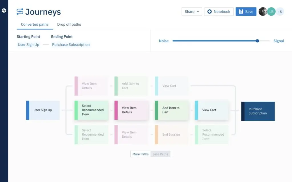
Funnel & user flow analysis
Tracking user behaviour on individual pages and dashboards is, obviously, important but you also need to see how users navigate through your software and interact with different features. This is where you need funnel and user flow analysis tools to track the paths users take in your software and the actions they complete along the way.
Over time, these insights will help you determine behavioural patterns that lead to key revenue events, including renewals, upgrades and customer churn. You can also identify patterns that differentiate important user groups, such as power users, early feature adopters and those who might be losing interest in your software or gaining less value from it.
Data auto-capture
A common but non-essential feature you’ll find in many SaaS analytics systems is something called data auto-capture. This feature has its pros and cons so you have to decide whether it’s right for you but it’s something you can choose to either use or not use on a platform that provides it. However, if you decide that you do want this feature, you’ll need to choose a system that includes - as many don’t.
Data auto-capture removes the manual workload from event tracking and customised reporting. With events and any metrics that an analytics tool doesn’t track by standard, you have to define every event and custom metric before the system will collect this data.
Aside from the manual workload involved, the other issue with this is that you can’t perform retroactive analysis for anything you haven’t already defined and tracked for several months. So, let’s say you decide you want to analyse user interactions with a specific feature in your product. You have to manually create the events for tracking and, then, collect data for several months before you can start performing any analysis at all - and you’re still only working with a few months of data.
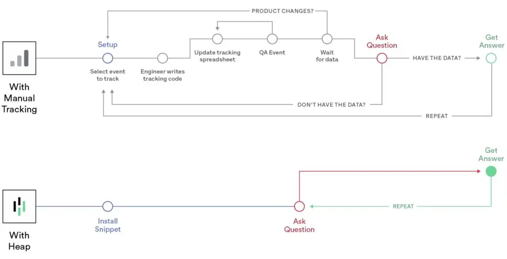
With data auto-capture, you add one line of code to your product and the analytics system will automatically track every user interaction without you needing to set up events. First of all, this removes the manual workload of in-depth analysis but, more importantly, it allows you to create a report for that feature at any time and start comparing all of your historical data right away.
The downside to data auto-capture is the sheer volume of data you collect. Depending on your setup, this can result in storage space issues or an expensive system, especially if your provider charges for data volume. The other big issue with this is that inexperienced data teams may find themselves overwhelmed by the volume of data they have access to. Likewise, they could get caught up in chasing vanity metrics or diluting the value of insights by including non-essential metrics in reports and calculations.
In-app messaging
Technically speaking, in-app messaging is more of an optimisation feature than a true analytics tool but a couple of the platforms we’re looking at today provide this - and it adds great value throughout the customer experience.
With in-app messaging, you can guide users through the onboarding process and increase product engagement by delivering targeted messages at each stage of the customer journey.
One of the analytics systems we’re reviewing today also allows you to provide customer support within your software products through in-app messages. To maximise the impact of in-app messaging, you want an analytics/optimisation platform that includes solid audience segmentation and targeting features so you can deliver relevant messages to different user cohorts - eg: onboarding, feature usage, upcoming renewals, customer health scores, etc.
Performance analysis
With product analytics, a lot of focus lands on user behaviour but the technical performance of your software product is just as important. You want to know your product is functioning properly and technical issues aren’t getting in the way of your business goals. Likewise, you need an analytics setup capable of differentiating between outcomes like customer churn caused by technical issues from those caused by other problems, such as UX friction.
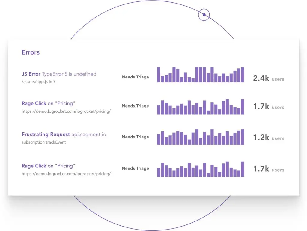
Common technical issues you want to keep track of include: downtime, server issues, slow loading times, unresponsive elements, rage clicks, JavaScript errors and plenty more. Several of the products we’re reviewing in this article include technical performance reporting but one platform, in particular, really stands apart for this purpose: LogRocket.
Qualitative insights
The final feature we want to talk about in this section is a collective set of features that provide qualitative insights. All of the features we’ve discussed so far provide quantitative insights that are great for analysing what users are doing in your software but they don’t necessarily tell you why.
Key features for getting qualitative insights include:
- Session replays: Record user sessions to see exactly what they’re doing in your product and what happens at key events.
- Heatmaps: See which elements users click on, what they’re clicking on most often and elements not getting as many clicks as they should.
- User flows: View user paths to see how they’re navigating through your software, which features they’re using and the key actions they complete.
- Scroll maps: Check that users are scrolling to important elements below the fold and not missing out on anything.
- User feedback: Collect feedback directly from users to find out what they love about your product and which improvements they would like to see.
You’ll find a variety of these features available across several of the products featured in this article and a couple provide all of the features listed above - and more. Keep in mind, you’ll generally get the most comprehensive set of qualitative insights from dedicated usability testing software, which may also include a variety of other tools like A/B testing, controlled user testing, live interviews, etc.
That’s it for the key features we want to discuss in this section so let’s take a look at our first SaaS analytics and reporting tool, Mixpanel.
01Mixpanel: Affordable SaaS analytics for smaller ventures
From $25/month (free plan available)
Mixpanel is a product analytics system designed for software development and optimisation, promising to help you “build better products”. It’s a capable system and it’s also one of the most affordable SaaS analytics tools with a lower entry price than most alternatives, scalable pricing and a free plan that’s genuinely useful for newer and smaller ventures.
The product is designed to help you build b better products with three core strategies:
- Convert: Analyse conversions, friction points and drop-offs to identify optimisation opportunities for maximising conversion rates.
- Engage: Measure product usage and feature adoption, guide users along the right path and re-engage customers losing interest.
- Retain: Maximise recurring revenue by identifying churn factors, analysing loyalty habits and unveiling the motivators for renewals and upgrades.
With Mixpanel, you can track events across the customer cycle and prioritise the metrics you care about most. You can set up retroactive funnels to track engagement within your product and analyse behaviour every step of the way. Customisable reports let you track users across every engagement stage you define and segment data to identify user cohorts and prioritise your optimisation efforts.
For example, you can identify cohorts that are most likely to renew, upgrade or spend the most throughout the entire customer lifecycle and prioritise their preferences in your optimisation strategy.
Mixpanel can join the dots between retention metrics and user behaviours that reveal the characteristics behind key conversion actions. You might determine that users who complete an average of 4+ valuable actions per day are the most likely to renew at the end of their current subscription period and prioritise users who are completing ~3 valuable actions per day in the final quarter of their subscription.
Key features:
- Event tracking: Create and track custom events to understand how users are interacting with your products.
- Conversion analysis: Advanced conversion reports and churn analysis right out of the box.
- Engagement analysis: Track engagement through the entire customer journey to maximise renewals and upgrades.
- Retention analysis: Find out why customers renew, upgrade and churn.
- Interactive reports: Visualise trends, build funnels, interact with your data and see the impact of experiments and launches.
- Behavioural insights: Gain deep insights into user behaviour with your software – how often they use your product, how often they perform meaningful actions and more.
- Identify user flows: See which actions users take after signing up, before making a purchase and other important actions to understand what makes your most valuable customers tick.
- Limitless segmentation: Work with your own data any way you want to unearth actionable insights.
With Mixpanel’s conversion reports, you can monitor conversion trends across the whole customer cycle and see where users drop out of the funnel. The company says its conversion analysis system can help you increase conversions by up to 71% among paid users and boost signups by 58%. Again, you can segment conversion data to uncover user behaviours linked to key actions and adjust your optimisation strategy to prioritise the most important cohorts.
You can build reports covering the full path to each conversion goal, tracking user behaviour at each step and diagnosing the causes of drop-offs. You can also attribute sudden increases or drops in conversions related to new product developments, such as updates and feature rollouts.
Mixpanel’s engagement reports reveal how interaction with your product changes throughout the lifecycle. You can see how usage varies throughout each subscription period and identify key audiences, including power users, loyal customers and those most likely to churn. These insights will help you distinguish between vanity engagement metrics and the usage habits that truly align with revenue.
Interactive reports help your team discover the most valuable insights faster with extensive segmentation features giving you the freedom to mould your data around the KPIs you care about most. Meanwhile, team dashboards give everyone access to the insights they need to do their job and you can set up alerts to notify key personnel when anything unusual requires their attention.
How much does Mixpanel cost?
Mixpanel runs three plans for software companies at different stages of growth. First, you’ve got the Free plan that covers you for up to 100K monthly tracked users. You get access to all of the system’s core reporting functionality on this plan for everyone on your team (unlimited seats) with no restriction on historical data.
Unfortunately, you miss out on some of Mixpanel’s most advanced analysis features (eg: impact and experiment reports) but this is an impressive system available to smaller development teams for free. However, you can still track user behaviour across the whole customer cycle, optimise for conversions, engagement and retention, and set up alerts for the relevant team members for sudden performance dips.
Mixpanel’s Growth plan starts from $25/month for 100K monthly tracked users (same as the free plan) and pricing scales depending on how many users you want to track. This plan also unlocks some of the system’s more advanced analysis and data management features, such as feature impact reports and automatic audience segment detection.
The pricing model on this plan is excellent for smaller growth-driven companies, scaling as your active monthly user base increases. The system remains affordable at every step and most software companies will find the platform keeps up with them as they grow - at least, until you reach the point where you need features like predictive analytics.
Mixpanel pros & cons
Pros
- Reporting templates: Mixpanel makes it easy to create and customise dashboards to suit your needs.
- Usability: Once you’re over the initial learning curve, Mixpanel is intuitive, powerful and highly customisable.
- Affordability: Mixpanel is one of the most affordable SaaS analytics tools available at this level.
Cons
- Speed: Mixpanel isn’t always the fastest system, especially when loading up extensive reports.
- Learning curve: It takes time to get the most out of Mixpanel but it’s a much faster process than learning Google Analytics from scratch.
- Intelligent insights: With limited automation and a lack of predictive analytics, some companies may outgrow the platform.
Mixpanel verdict
Mixpanel isn’t the most advanced product analytics system on the market but it is one of the most affordable. It strikes an excellent balance between power and value for money, especially for new and smaller ventures that may not have the finances for enterprise software analytics systems (or even need their most advanced features).
You’ll only run into the limitations of Mixpanel when you start to need advanced automation and intelligent reporting features. We’re talking about things like predictive analytics, customer health scores, churn predictions and customer lifetime value estimations.
Mixpanel isn’t going to provide this level of insight but the system is best suited for products at earlier stages of growth - the kind of products that don’t have enough user data to get reliable predictions anyway. The biggest risk with Mixpanel is that, if all goes well, you might outgrow the system but this could be the analytics tool that helps you reach that stage of growth faster.
02Amplitude: Product analytics, personalisation & testing
Pricing: POA (free plan available)
If you’re looking for a more advanced product analysis tool, Amplitude is one of the first Mixpanel alternatives you should consider. This system is more suitable for bigger software companies and products with larger user bases, let’s say a minimum of 25,000-100,000 monthly active users.
While Amplitude also offers a free plan, paid plans are significantly more expensive than Mixpanel’s - but also more capable in terms of features.
The biggest advantage Amplitude has over Mixpanel is its intelligent analysis capabilities that can identify key behaviours and attribute them to actions that affect revenue, such as renewal and churn. Machine learning maps out usage patterns with the most important metrics for your product, helping you to identify valuable trends faster. The system is also capable of predicting future outcomes by analysing behaviour trends across audience cohorts - so you can respond to opportunities and risks before it’s too late.
Aside from Amplitude’s more intelligent analysis features, you also get all of the core essentials Mixpanel has to offer: funnel analytics, engagement tracking, retention analysis, lifecycle analysis, etc. The only feature Amplitude really lacks that Mixpanel has to offer is the alerting and notifications offered by the latter. However, it offers a range of features you won’t find in Mixpanel: A/B test analysis, user personas, stickiness reports, anomaly detection and plenty more - without mentioning any of the predictive analytics features.
Key features:
- Event tracking: Create and track custom events to understand how users are interacting with your products.
- Funnel analysis: Get visibility into your customer journeys with different levels of precision by analysing unstructured journeys in aggregate views.
- Conversion analysis: See how your customers convert and retain with the industry’s smartest conversion and retention reports.
- Engagement tracking: Analyse engagement across multiple apps and understand how users move between platforms and products.
- Behavioural cohorts: Go beyond surface-level data like page views and clicks to analyse user behaviours, attributes, channels and more.
- Predictive analytics: Use the power of machine learning to forecast behaviour patterns over time.
- Collaborative reporting: Create team spaces and dashboards for collaborative analysis and reporting.
- Behavioural analysis: Target customers based on actual or predicted behaviour without extra engineering work.
Another key benefit of using Amplitude as your SaaS analytics system is the company also provides several other products to help you drive growth and revenue. So far, we’ve talked about Amplitude Analytics but the company also offers the following three additional products:
- Amplitude Audiences: Push behavioural audiences to other tools or take personalisation further with predictive segmentation and recommendations.
- Amplitude Experiment: Turn insights from analytics into action for your customers with the first end-to-end experimentation platform powered by product analytics.
- Amplitude CDP: Power your data-to-insights-to-action loop with the first insights-driven CDP.
By signing up for Amplitude’s analytics system, you get access to several core features available in Amplitude Audiences - namely, user ID tracking, behavioural cohorts and audience data exports (to push data to other marketing tools). You can enhance this further by signing up for Amplitude Audiences, which makes the predictive capabilities and data export options available to you.
Then you’ve got Amplitude Experiment, which provides extensive testing capabilities for A/B and multivariate testing. The system also incorporates feature flagging into testing and rollouts that fit perfectly with Amplitude Analytics for tracking adoption and engagement.
Finally, Amplitude CDP gives you advanced data management and integration features to incorporate Amplitude’s products into your wider tech stack.
How much does Amplitude cost?
Amplitude doesn’t provide any pricing information for its products but the entry prices on its paid plans are higher than anything you’ll pay for Mixpanel, unless you’ve got millions of monthly active users.
Amplitude offers a free plan for its analytics system that covers you for up to 10 million events per month. How far this free plan will take you depends entirely on how many actions your users tend to complete on a monthly basis. For example, if you’ve got 25,000 monthly active users, the free plan will cover you for up to 400 events per user every month. Likewise, if you’ve got 100,000 MAUs, the free plan will cover you for up to 100 monthly events each.
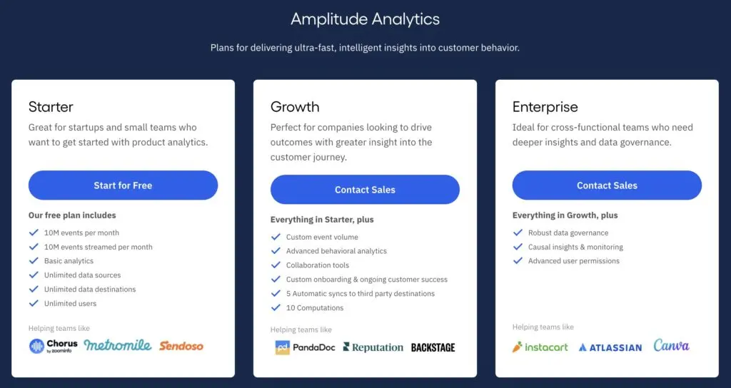
If you’re signing up for the Growth plan (or upgrading), you should expect starting prices in the lower thousands. Obviously, this covers you for more than 10 million events per month and pricing scales depending on the amount of data you work with through the system. This is directly linked to the volume of monthly active users you have although growing software companies may refine the volume of events they track per user over time, as they refine their metrics and KPIs.
This event-based pricing model is a smart approach as it means you’re paying for insights, not the growth of your user base.
Amplitude pros & cons
Pros
- Advanced product analytics: Amplitude is a comprehensive product analytics system that provides in-depth insights, tools and features - as long as you’re willing to pay for them.
- Behavioural analysis: The ability to optimise experiences based on both actual and predictive behaviour is a huge asset.
- Free plan: Amplitude also offers a free plan that allows you to track 10 million events per month, even if you don’t get the platform’s most advanced features.
Cons
- Pricey: Get ready to open your wallet if you want to access Amplitude’s most advanced features.
- Learning curve: It takes time and technical knowledge to set up the kind of in-depth analysis Amplitude is designed for.
Amplitude verdict
Amplitude isn’t a direct competitor with Mixpanel; the two systems are aimed at entirely different companies. Mixpanel is a great option for smaller software companies that need an affordable system for optimising products with relatively small user bases - eg: 1,000-20,000 MAUs.
Amplitude is more suitable for companies managing products with larger user bases, starting from 20,000-100,000 active users. The system is far more capable as an analytics system, largely thanks to its intelligent insights capabilities and data management features. Aside from this, Amplitude also provides the option to implement its other products for enterprise-level experimentation, feature rollouts and optimisation - as long as you’re ready to pay for it.
03Heap: Increase conversions, engagement & retention
Pricing: POA (free plan available)
At a glance, Heap looks very similar to Amplitude but it approaches product optimisation from a completely different angle. While Mixpanel and Amplitude allow you to create and track events in your software, Heap uses data auto-capture technology to track all events in your product without needing to manually set them up.
The key benefit of this is the system captures event data for you from day one and you can create reports using this data at any time. With products like Mixpanel and Amplitude, you have to create events in order to track specific user actions - eg: create a new task, set a deadline, update task status, etc.
Heap allows you to track all events automatically by adding a single line of code to your product, meaning you don’t need to create events for every single action you want to track. Instead, you simply pick the actions you want to analyse and you have access to all of the historical data you need.
The downside to manually creating events is that you can’t collect data until you set each specific event up for tracking. Heap’s data auto-capture means you could decide to create a report for a new set of KPIs in three months’ time and start analysing right away. With the manual event tracking system in tools like Mixpanel and Amplitude, you have to create events and wait to collect data before you can start analysing.
The advantages of Heap’s data auto-capture are clear but it also comes with some downsides of its own. The first issue you’ll come across is the sheer amount of data this stores on the system and this can also cause analysis problems if your team doesn’t have a clear idea of what it wants to analyse.
Key features:
- Product analysis: Understand how people interact with your product, increase acquisition and retention, reduce your engineering burden, and create a powerful product experience.
- Heap Illuminate: Automatically analyses digital user behaviour in the background, evaluating conversion paths of every visitor to identify the most important points of friction.
- Data auto-capture: Automatically capture all user data on your website, from the moment of installation forward.
- Data sources: Import data from other sources to compile all of your insights in one platform.
- Event visualiser: A point-and-click tool for creating and tracking user events on your website without writing any code.
- Data dictionary: Keeps data clean, organised, and understandable for everyone in your team.
- Data governance: Control permissions for viewing, modifying, and reporting with default user roles.
- Playbooks: Dashboard templates you can personalise to generate reports and see relevant insights faster.
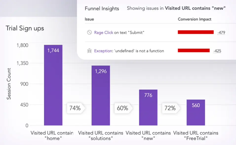
Data auto-capture isn’t the only potential advantage Heap brings to the table. The other headline feature is Heap’s session replay system that records user sessions for your team to view for qualitative insights.
This is built into the platform’s funnel analysis toolkit, allowing you to align session replays to the user actions you care about most. Analysts can skip right to the events they want to pay attention to - without needing to watch sessions in full - so they can understand the context behind the metrics and KPIs most important to your business goals.
Heap also allows you to set up alerts to notify team members when metrics and KPIs drop below your performance requirements. To clarify, this feature is only available on Heap’s most expensive plan but you can also purchase it as an add-on if you’re signed up for the Pro plan (we’ll take a closer look at each plan in a moment).
How much does Heap cost?
Much like Amplitude, Heap doesn’t provide any pricing information on its website but it does offer a free plan. The key difference is Heap bases its pricing model around the number of user sessions you collect data from every month. This makes sense because Amplitude’s event-based pricing strategy simply wouldn’t work with Heap’s data auto-capture system.
Heap’s free plan covers you for up to 10K monthly sessions, allowing you to have unlimited user licences on the plan and make full use of its auto-capture system. The other main data restriction on this plan is that you’re limited to analysing up to 12 months’ worth of historical data but this also applies to the Growth, too.
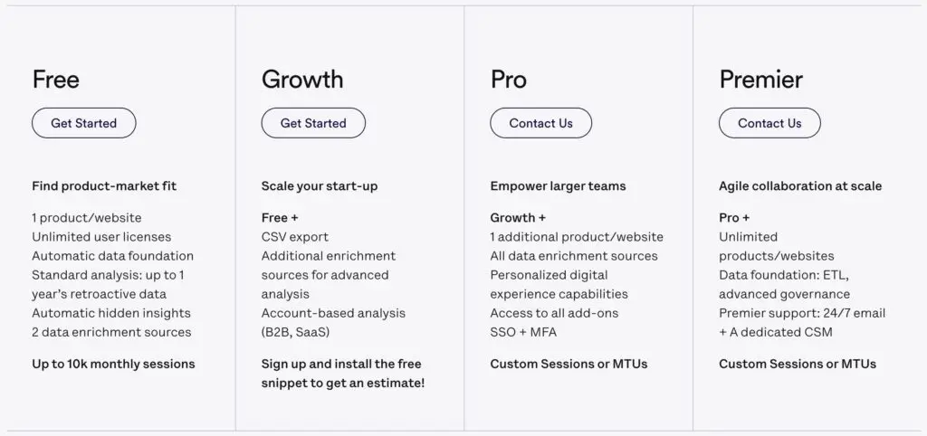
If you sign up for the Growth plan, you can access Heap’s account-based analytics system and collect data from more than 10K user sessions per month (custom pricing applies). You can also use the system for two projects (products and or websites) on this plan and you get basic technical support.
With the Pro plan, you can run three projects, as standard, and add more for an additional fee. You’re still limited to one year of historical data on the plan but you also add more years for an additional fee. This is the first plan that allows you to create reporting alerts to notify team members about performance dips, but you’ll have to pay for an add-on to do this on the Pro plan.
The Premier plan gives you access to the best of Heap’s support and security features for unlimited projects and you don’t need to pay for add-ons to get features like report alerts, Heap Activate or advanced data governance.
Heap pros & cons
Pros
- Usability: Considering the capabilities of Heap’s product analysis system, it’s surprisingly easy to use - and you can do almost everything without writing any code.
- Data auto-capture: Heap automatically collects data for events, even if you haven’t defined them yet.
- Retroactive reporting: With auto-capture, you can create a new report and start analysing historical performance right away - no need to collect data for several months.
Cons
- Implementation: Getting Heap set up and ready to use takes a bit of work.
- Documentation: Given the technical knowledge required to take full advantage of Heap, we would like to see more online documentation and self-service resources.
- Data load: The big downside of Heap’s auto-capture is it captures a lot of data, which could overwhelm inexperienced teams.
Heap verdict
Heap takes a different approach to product analytics than Mixpanel or Amplitude, most notably with its focus on automatic data capture. This can be a powerful asset for highly experiential teams that may need to pull back historical data for new reports. In a practical sense, this can include new products that are still finding their feet or projects with new teams that may not get reporting 100% right from day one.
The danger with a system like this is that inexperienced teams could get overwhelmed by the volume of data they have access to. You really need a clear idea of what your most important metrics and KPIs are to use a system like Heap - otherwise, your team will end up chasing loose ends.
04Userpilot: Product UX & onboarding optimisation
From $249/month
Userpilot is a growth-oriented product analysis system that focuses on optimising experiences to maximise revenue through engagement and retention. The platform incorporates three core toolkits through a combination of product analytics, in-app messaging and feedback collection:
- Growth Insights: Track and analyse your product’s growth – understand feature usage among different segments across the user journey and get actionable product analytics and insights.
- Engagement Layer: Help new and existing customers discover more value – engage users with personalised in-product experiences to drive user activation, feature adoption and retention.
- User Sentiment: Get qualitative user feedback, at scale – run micro surveys in-app to gather user feedback insights at scale.
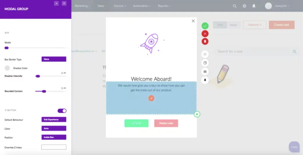
The standout feature Userpilot is offering that you won’t get from Mixpanel, Amplitude or Heap is in-app messaging. You can use this to send targeted messages and prompts to users throughout the customer journey, starting with the onboarding process.
With in-app messaging, you can create interactive onboarding processes, guiding new users through each of setting up your product. This should maximize the number of users who successfully complete the onboarding process and start using your product after they sign up - a crucial first stage in the customer journey where you can often lose users to onboarding dropouts.
You can also use in-app messaging to point users to the most important features in your product, boosting adoption and helping them to get value from your software faster. Likewise, you can take the same approach with new feature rollouts, pointing experienced users to your latest features and maximising adoption rates for everything you introduce from your roadmap.
Key features:
- Product Analytics: Gain insights into product usage, feature adoption, and goal completions in your software.
- Goal Tracking: Define and track goals throughout the customer journey.
- Usage Trends: Identify user trends, changes in behaviour, and roadblocks to goal completions.
- In-App Messaging: Deliver messages inside your product to personalise and enhance the experience.
- Onboarding Optimisation: Maximise the number of new signups who complete the onboarding process and start using your software.
- Contextual Messaging: Deliver in-app messages based on user behaviour to guide them towards features and goals.
- Software A/B Testing: Test changes with in-app experiments.
- User Feedback: Collect feedback from users for qualitative insights on customer satisfaction.
- Net Promoter Scores: Measure your net promoter score (NPS) to calculate how likely customers are to recommend your product.
Aside from in-app messaging, Userpilot allows you to track user behaviour in your applications. The platform makes it easy to track key metrics without writing any code and actions including feature adoption and usage. This helps you to measure the impact of your onboarding optimisation efforts and feature rollouts.
You can also define custom events to ensure the system is tracking the user actions you care about the most.
Userpilot includes its own segmentation system, too, so you can analyse behaviours by different audience cohorts and make informed decisions. You can identify groups most likely to adopt certain features and those most likely to renew, upgrade or churn.
With the platform’s engagement layer, you can deliver personalised experiences to users based on how they interact with your products and the priorities they demonstrate. Going back to in-app messages, you can send nudges to users who may be running into engagement issues, such as not using certain features as often as they could, spending too much idle time in the software or not completing valuable actions often enough.
Userpilot also includes its own feedback collection system for gaining qualitative insights from the people most important to your product. You can request feedback with in-app surveys, personalise questions for different cohorts, target user segments and test different approaches to maximise submissions.
How much does Userpilot cost?
Userpilot offers three plans with variable pricing, based on the number of active monthly users your product has. The Traction plan starts from $249/month but this only covers you for 0-2,500 users with prices increasing to $349/month (2,500-10,000 users), $449/month (10,000-20,000 users) and $549/month (20,000-50,000) before you’ll need to speak to the company’s sales team about pricing.
You also get access to most of Userpliot’s product analytics features on the Traction plan, including user tracking, engagement tracking, user sentiment analysis, in-app messaging and onboarding optimisation - among other things.
You’re limited to one app with the Traction plan for up to 10 team members and you’re also limited to using 20 feature tags.
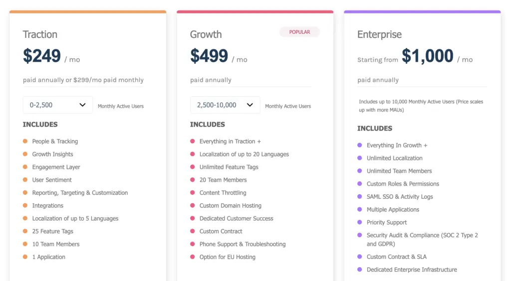
The Growth plan starts at $499/month and this covers you for up to 20 team members and 2,500-10,000 monthly active users as standard. Once again, prices increment by a further $100 per month for the same user brackets as the Traction plan: $599/month (10,000-20,000 users) and $699/month (20,000-50,000) with custom prices for anything over 50K monthly active users.
In terms of features, the Growth plan gives you unlimited feature tags, content throttling, custom domain hosting, advanced support and some other upgrades - plus, it increases the team member limit to 20.
Honestly, though, you get the vast majority of features on the Traction plan so it really comes down to whether any of these minor upgrades are valuable enough to justify the price difference.
The Enterprise plan starts at $1,000/month and this covers you for 10,000 monthly active users with pricing increasing incrementally, once again. This plan covers you for unlimited team members and you also gain priority support, custom roles and permission, support for multiple applications and other incentives.
Userpilot pros & cons
Pros
- Product optimisation: Userpilot is one of the best platforms we’ve used for optimising software experiences.
- In-app messaging: The ability to interact with users in your software products with non-intrusive messages is a huge asset for crafting the experience you want users to enjoy.
- Engagement reporting: Userpilot makes it easy to track usage metrics, understand how much value users are getting from your products and measure the impact of your optimisation efforts.
Cons
- Limited to product CX: Userpilot is great for optimising the in-product aspects of customer experiences but it’s not going to help you outside of this.
- Qualitative feedback: While the platform includes feedback collection features, these aren’t anywhere near as advanced as SurveySparrow.
Userpilot verdict
Userpilot combines an interesting mix of product analytics and optimisation features to help you maximise revenue through engagement and retention. It’s the first platform we’ve looked at today that provides dedicated features for optimising onboarding experiences to minimise churn at the first stage of the customer journey. It also brings in-app messaging into the equation and UX personalisation that’s easy to implement without writing any code.
It’s not the most advanced analytics system we’ve looked at today but it provides several toolkits for you to take action on insights and implement meaningful optimisation strategies. Aside from increasing onboarding completions, you can maximise engagement, point users towards your most important features, re-engage users who are losing interest and motivate customers to renew or upgrade.
05Pendo: Product experience, adoption & customer support
From $7,000/yr ($583.33/mo)
Pendo offers one of the most advanced SaaS analytics systems we’re looking at today and combines this with a fleet of engagement and retention features. Not only can you deliver in-app messages to users, but the platform also allows you to incorporate full user guides into your software to help users solve issues without leaving your product.
You can personalise in-app messages and guides to match the needs of different audience cohorts and target them with relevant content. For example, you can send messages to new users who don’t use a key feature within the first hour or a starter guide to those who don’t complete their user profile.
Overall, Pendo’s in-app messaging system is more advanced than Userpilot’s but the two solutions more or less achieve the same things. Pendo is definitely the more advanced analytics tool, putting it on the same level as products like Heap and Amplitude.
Like Heap, Pendo includes a data auto-capture feature so you don’t need to set up event tracking manually - something that comes with the same pros and cons we’ve already discussed. Pendo doesn’t offer quite the same depth of insights as Heap, though, and you also don’t get the same level of data management features, either. Likewise, Pendo doesn’t have a suite of comparable software products for A/B testing and data exporting as Heap does.
However, Pendo offers several features you won’t get from Heap, including its in-app messaging system and user feedback collection tools. Userpilot also offers similar features but Pendo’s systems are more sophisticated and the analytics system provides more native insights than you’ll get from Userpilot.
Key features:
- Website & product analytics: Empower your teams with comprehensive product analytics to inform data-driven decisions.
- Data auto-capture: Automatically capture all user data on your website, from the moment of installation.
- Product engagement: Understand which features customers embrace, which ones they ignore and increase awareness of valuable (but underused) features.
- Onboarding optimisation: Personalised user onboarding and in-app training.
- In-app messaging: Help customers get the most out of your product with in-app guides and prompts.
- In-app support: Support your users when and where they need it.
- Feedback: Make it simple to collect and digest feedback.
- Growth analytics: Identify revenue-driving activities, increase trial conversions and build features customers are willing to pay for.
Another similarity Pendo shares with Userpilot is its onboarding optimisation system that revolves around in-app messaging to guide new users through the setup process. Again, Pendo’s implementation is more sophisticated than Userpilot’s but they broadly achieve the same thing.
Pendo’s more advanced analytics system allows you to create audience cohorts with greater accuracy and target them with more relevant messaging - and, then, you’ve got the in-app guide feature for providing customer support within your product.
With your onboarding experience fully optimised, Pendo turns its attention to maximising user engagement throughout the latter stages of the customer cycle. The platform puts a lot of emphasis on feature usage with customisable reports showing overall feature adoption as a benchmark. You can also define priority features to view adoption rates for the most important parts of your software in a single place.
Adoption insights help you identify features users are ignoring or underusing and monitor usage across different audience segments. With this data, you can start delivering targeted in-app messages to guide relevant users to the most important parts of your software. This adoption-led approach to experience optimisation is designed to help you maximise engagement where it matters most and help users get the best value from your product.
The end goal of optimising product engagement is to drive revenue growth by winning more customers and holding onto more of them for longer. Pendo includes its own revenue analysis system to help you attract, retain and nurture more customers to the actions that generate revenue for your company. The system helps you identify user actions and pathways that lead to revenue-driving activities: free trials, paid signups, upgrades, renewals, etc.
You can also track and optimise experiences that align with these pathways, such as the onboarding process and free trial periods. According to the company, “75% of customers who use Pendo to improve trial performance saw a 10% improvement in their conversion rate”.
How much does Pendo cost?
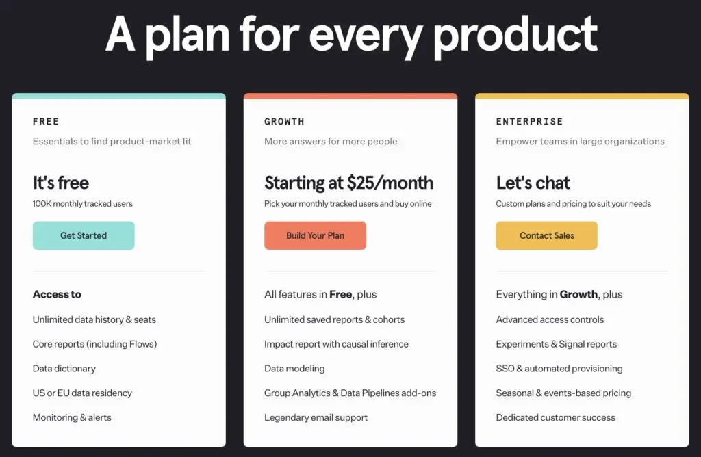
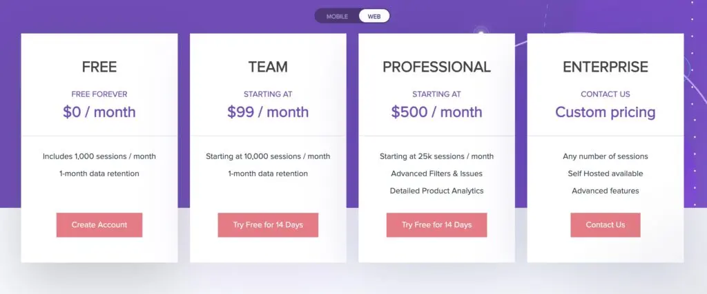
Until recently, Pendo didn’t include any pricing information on its website at all but, now, the company gives you an idea of what kind of starting price to expect. The Starter plan is priced at $7,000 per year, which works out at $583.33/month, and covers you for up to 2,000 monthly active users.
This gives the system’s core analytics features, the in-app messaging system and Net Promoter Score calculations. You can also use the system’s data auto-capture on this plan and the platform stores historical data for two years on the Starter plan (seven years on the others).
That gives you an idea of the enterprise-level pricing to expect with Pendo.
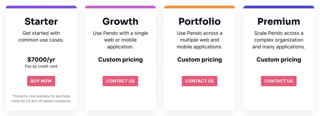
Upgrading to the Growth plan can cover you for any number of monthly active users and enhances your insights with product engagement scores (PESs) and customisable reports while also giving you the option to include a help centre within your software product.
The Portfolio plan covers you for multiple products with cross-app journey reports and executive dashboards, plus enhanced security and support features. Finally, the Premium plan allows you to set custom roles and permissions for people on your team.
Pendo pros & cons
Pros
- Onboarding optimisation: Pendo includes a dedicated system for optimising the product onboarding process.
- In-app guides: Sending in-app guides and resources to users helps them get the best out of your products.
- Feature adoption: The system helps you maximise feature adoption with targeted interactions.
Cons
- Knowledge base: Although Pendo is great for delivering in-app support material, we wish it also included a tool for adding knowledge bases to websites.
- Usability quirks: Some tools and functions within the software feel awkwardly placed and certain control options - such as filters - are missing.
Pendo verdict
Pendo brings advanced in-app messaging and feedback features to an enterprise product analysis system. On paper, this combines the product optimisation features of a system like Userpilot into a more sophisticated analytics tool like Heap. In reality, Pendo doesn’t quite Heap when it comes to the analytics side of things but it does offer a more sophisticated system for in-app messaging and feedback than Userpilot - at a significantly higher price point, though.
That being said, Pendo is reasonably-priced for an enterprise SaaS analytics system. The only issue we ran into with the product was a number of usability quirks - for example, some buttons only show when hovering over them with the mouse and it takes a lot of steps to create reports, filters or segments. This adds to the learning curve and makes the platform a little frustrating to use when you’ve got a lot on.
06UXCam: The mobile app analytics system
Pricing: POA
UXCam is a mobile app analytics system that provides qualitative insights with a mix of event tracking, heatmaps and other session-based analysis tools. If you’ve ever used a platform like Hotjar to optimise websites, UXCam is a similar system designed specifically for optimising mobile apps.
Like Hotjar, you can use heatmaps to see which elements users interact with but UXCam’s system is designed specifically for mobile experiences, allowing you to analyse single taps, double taps, swipes (left, right, up and down), long presses and a range of other touchscreen interactions.
You can compare heatmaps across devices to see how user habits vary between different OSs and models, including specific devices (iPhone 14, Pixel 6, etc.).
With UXCam’s session replay system, you can record videos of user sessions and analyse interactions, seeing everything that happens on-screen. You can automate recordings and organise sessions based on key events like crashes, UI freezes and rage taps to see which problems users are experiencing most often and determine exactly what’s happening.
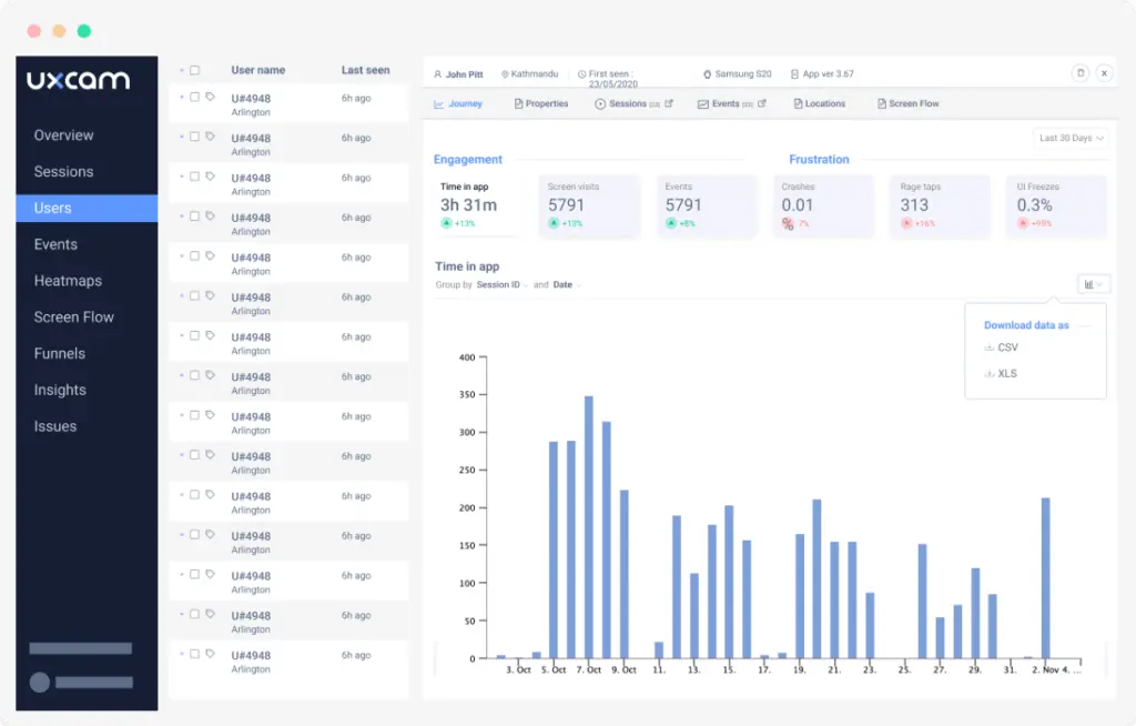
Key features:
- Team dashboards: Show all of the most important metrics for your mobile app in one place.
- User analytics: Get a powerful visual narrative of how individual users are engaging with your app.
- Event Tracking: Monitor the user interactions in your app that are most important to your business with the help of embedded event tracking.
- Funnel analysis: Create conversion funnels for the specific KPIs that you are interested in and understand the causes behind drop-offs.
- Heatmaps: See how users interact with elements in your app and identify usability issues.
- Screen flow analysis: Get a complete overview of how users engage with and navigate through your app.
- Issue analysis: Deliver a world-class mobile app experience and stay on top of crashes and bugs.
- Session replays: See the app experience through your users’ eyes - and any problems they experience along the way.
Like most of the platforms we’ve looked at in this article, UXCam also allows you to track events in your software to analyse the interactions that drive engagement and revenue. As with many of the systems featured in this review, UXCam includes a tagless data auto-capture feature that allows you to track events in your software without manually setting them up individually. You simply add one line of code to your product and the system will capture data for all events from day one.
This is great for retroactive reporting, as long as your team is comfortable working with large volumes of data - and knowing what to analyse.
UXCam’s screen flow analysis system ties everything together, revealing how users navigate through different pages and dashboards within your application. You can analyse user flows to map out typical sessions and identify potential issues getting in users’ way. The tool also allows you to click on any specific screen within a user flow to analyse with heatmaps for more granular insights.
Finally, UXCam’s issue analysis tool tracks crashes and bugs so you can fix critical errors faster and stop them from hurting your bottom line.
How much does UXCam cost?
UXCam doesn’t provide any pricing information on its website but our quote was based on the number of monthly sessions we were analysing on the system. So we’re talking about a pay-as-you-grow pricing model with UXCam and this makes a lot of sense for a product analytics system.
On the plus side, UXCam offers a free plan that covers you for up to 10,000 monthly sessions and gives you access to its basic analysis features: tagless auto-capture, event analysis, session replays and user analytics.
You don’t get heatmaps or funnel analysis on the free plan (among other features), though.
Upgrading to the Growth plan unlocks both heatmaps and funnel analysis, as well as user journey maps and frustration signals in your reporting. You can also track technical issues and bugs on this plan, as well as capture app logs and issue alerts.
UXCam’s Enterprise plan mostly enhances data management and security, starting with data visualisations, advanced permissions and collaboration tools. You also get SSO / SAML and enterprise support during the onboarding process, in addition to your own customer success manager.
UXCam pros & cons
Pros
- Mobile app analysis: UXCam is a dedicated mobile app analytics and optimisation system, which is ideal if your products are mobile-only.
- Session insights: You can easily gain insights into real user sessions with secure recordings, heatmaps and other tools.
- Autocapture: Automatically capture data from your mobile app, including interactions you haven’t tagged.
Cons
- Mobile-only: UXCam is only suitable for analysing and optimising mobile applications.
- Speed: We ran into several slowdowns when loading funnels and using filters on reports.
UXCam verdict
UXCam is a dedicated analytics system for mobile apps and one of the few on the market designed specifically for optimising mobile experiences. While plenty of SaaS analytics tools allow you to compare data between desktop and mobile, UXCam goes far deeper with mobile analysis with built-in metrics for touchscreen interactions and mobile-specific habits like rage taps.
The obvious downside is that UXCam is no good for analysing desktop or web apps but there are plenty of systems available for that. On the other hand, there’s a real shortage of quality analytics tools for mobile apps so UXCam is filling an important niche that many providers still overlook.
07LogRocket: Session recordings, performance monitoring & product analysis
From $99/mo (free plan available)
LogRocket is a product analysis system that has a lot in common with UXCam, except it’s designed with web apps in mind. As we touched on in our UXCam review, you can use LogRocket to analyse mobile sessions and compare them with web app sessions on desktop but the system doesn’t offer the same kind of insights for touchscreen interactions.
However, LogRocket provides a more in-depth and technical breakdown of application performance with its session replay system. It records every DOM event for comprehensive analysis of sessions - not only what users are getting up to but how your app is responding to their actions. This includes network requests, JavaScript exceptions and performance monitoring for loading times, response times (including Core Web Vitals) and an array of performance insights.
This integrates seamlessly with LogRocket’s frontend performance monitoring system that not only tracks loading times, but also network speed, CPU and memory usage, browser crashes, React component rendering and time between events - as well as custom metrics that you can define and track.
Crucially, you can also set alerts to notify team members when performance metrics drop below minimum requirements so they can take action faster.
Key features:
- Session replays: Record user sessions to see how they’re interacting with your website and web app.
- Product analysis: Track usage and engagement to learn what customers love about your product and what needs improving.
- User experience analysis: Increase engagement and improve the design of your app by identifying frustrations, such as rage clicks, dead clicks and session quits.
- Page analysis: Use heatmaps, click maps and scroll maps to see how users are interacting with key pages.
- Frontend monitoring: Monitor page load times, browser crashes, CPU/memory usage, rendering, etc. the impact on conversions and other business goals.
- Custom funnels: Build custom funnels, time series charts, tables and other visualisations to break down every data point to the individual user.
- Error tracking: Monitor Javascript errors, network failures and other performance issues hurting the user experience.
- Intelligent alerts: Get notified of issues that impact your users before they report them.
- Prioritise issues: Automatically surface and categorise your highest-priority bugs and issues.
With LogRocket’s product analysis system, you can create custom metrics to track conversions, user flows and events to attribute interactions to engagement, revenue and other KPIs. You can create custom dashboards with data visualisations prioritising the metrics you care about the most, speeding up analysis for everyone on your team.
You can pick anything LogRocket’s analysis and error detection picks up as a metric - anything ranging from conversion events and engagement metrics to bugs and browser crashes.
LogRocket has expanded its funnel insights system, allowing you to set revenue values for conversions and key events. This enhances your ability to forecast revenue performance, set more realistic goals and optimise funnels to maximise the interactions that add the most value to your business.
The platform also includes a dedicated user experience analysis system, complete with heatmaps, click maps and scroll maps for analysing individual pages. It also includes a path analysis tool for viewing user flows through your product and identifying gaps in user behaviour, such as underutilised features.
These page analysis tools integrate seamlessly with LogRocket’s funnel analysis system that gives you a top-level view of actions tied to revenue, allowing you to hone in on specific user flows and pages that require attention.
How much does LogRocket cost?
Unlike many of the providers we’ve looked at today, LogRocket is very transparent with its pricing information. The company offers a free plan covering you for 1,000 sessions per month with access to the platform’s core features: session replays, frontend logs, error tracking, debugging, network requests and plenty more.
Even still, you’re missing out on the best of LogRocket’s features and the bad news is that upgrading to the Team plan doesn’t unlock anything new. Starting from $99/month, the Team plan’s starting price covers you for up to 10,000 monthly sessions and up to five team members but you don’t get any additional features on this plan.
To unlock LogRocket’s full capabilities, you have to sign up for its Professional plan where prices start from $500/month. This covers you for up to 25,000 monthly sessions and opens up most of the platform’s features: product analytics (funnels, user flows, etc.), front-end performance monitoring, alerting and the full suite of heatmaps, click maps and scroll maps - and plenty more.
Upgrading to the Enterprise plan mainly enhances the security and customer support options with prices varying on the number of monthly user sessions, user seats and data retention period required.
LogRocket pros & cons
Pros
- JavaScript debugging: LogRocket includes a dedicated toolkit for debugging server-side and front-end JavaScript for websites and web apps.
- Frontend monitoring: You get in-depth insights on the front-end performance that affects user experience and its impact on conversions, business goals, etc.
- Error tracking: LogRocket is an excellent system for tracking errors and bugs in your app and user browsers.
Cons
- Pricing: Feature restrictions set a high entry price for accessing LogRocket’s best features.
- Usage limitations: Aside from feature restrictions, limits on users, sessions and data retention restrict the value of cheaper plans - including the so-called Team plan.
LogRocket verdict
LogRocket is a powerful system for tracking the performance of web and mobile apps. It places more emphasis on technical performance and error tracking than events and engagement, which is the focus for most of the systems we’ve looked at today. Even still, LogRocket is capable of tracking events, user sessions and key metrics with qualitative insights coming from heatmaps, user flows and a variety of analysis tools.
All in all, LogRocket offers a rounded set of analysis tools for product teams that prioritises technical performance but ties everything to revenue and marketing goals. Unfortunately, you can’t take full advantage of the platform’s capabilities until you sign up for the Professional plan where prices start from $500/month for teams of under five and up to 10,000 monthly sessions.
What is the best SaaS analytics & reporting tool?
We’ve looked at a variety of SaaS analytics tools in this article, each one bringing something unique to the table. Some are designed more for user behaviour tracking while others place greater emphasis on technical product performance or qualitative insights and user experience.
To help you choose the right mix of analytics tools for your needs, we’re going to compare all of the products we’ve reviewed today across the following characteristics:
- Pricing
- Features
- Usability
For the pricing and feature sections, we’ve put together a couple of tables so you can quickly scan and compare each product. Then, for the usability section, we’ve picked the top three products our team enjoys using the most and we’ll explain why they impress us.
Best value for money
To help you get a sense of the immediate and long-term cost of the products we’ve reviewed today, we’ve put a pricing comparison table together. In the table below, you can see which products offer a free plan and the starting price for their cheapest plans, where pricing information is available.
We’ve also included the starting prices for their most expensive plans (again, where available) but only two of the providers featured today list this pricing information.
| Tool | Free plan? | Starting price | Top plan |
|---|---|---|---|
| Mixpanel | ✔ | $25/mo | POA |
| Amplitude | ✔ | POA | POA |
| Heap | ✔ | POA | POA |
| Userpilot | - | $249/mo | $1,000/mo |
| Pendo | - | $583.33/mo | POA |
| UXCam | ✔ | POA | POA |
| LogRocket | ✔ | $99/mo | $500/mo |
Mixpanel is definitely the budget-friendliest SaaS analytics tool we’ve looked at today but it doesn’t offer the same level of features you’ll get from the likes of Amplitude and Heap. Unfortunately, you’re looking at quite a big gap between Mixpanel and the other two with Amplitude and Heap being significantly more expensive, but also more capable as all-in-one SaaS analytics systems.
LogRocket could make a claim for the best-value system overall with decent feature coverage and the best toolkit for tracking technical performance. Just keep in mind that you have to sign up for its more expensive plans to get the best of its features - so don’t get too excited about that $99/mo starting price.
Best for features
To give you a better idea of what you’re getting for your money and which SaaS analytics roles each product is most suitable for, we’ve also put together a feature comparison table. We’ve selected the five most important features to look for in a SaaS analytics tool:
- User tracking
- Event tracking
- Qualitative insights (session recordings, surveys, etc.)
- Data auto-capture
- Product performance analytics
The table below provides an overall impression of feature coverage provided by each tool we’ve looked at today and their suitability for fulfilling these five crucial roles.
| Tool | User tracking | Events | Qual. insights | Auto-capture | Performance |
|---|---|---|---|---|---|
| Mixpanel | ✔ | ✔ | - | - | - |
| Amplitude | ✔ | ✔ | - | - | - |
| Heap | ✔ | ✔ | - | ✔ | - |
| Userpilot | ✔ | - | ✔ | - | - |
| Pendo | ✔ | ✔ | ✔ | ✔ | - |
| UXCam | ✔ | ✔ | ✔ | ✔ | ✔ |
| LogRocket | ✔ | ✔ | ✔ | ✔ | ✔ |
Based on the table above, UXCam and LogRocket provide the best overall feature coverage but we have to raise a couple of points on this. First of all, UXCam is only suitable for mobile apps while both UXCam and LogRocket lack the same depth of features as the more enterprise solutions like Amplitude and Heap.
You can think of LogRocket as the platform that does a little bit of everything and also does technical performance analysis better than the others. Likewise, UXCam does a bit of everything, too, but only for mobile apps.
If you’re looking for the best behavioural analysis systems, then Amplitude and Heap are the first two options to look at. If you want qualitative insights from the same platform, then take a look at Userpilot and Pendo. Alternatively, if you’re looking for an affordable behaviour analysis tool, start off with Mixpanel and integrate with free or affordable tools for other roles.
Best for usability
Unless you’re exporting all of your insights from these SaaS analytics tools into another system, usability will be an important factor in choosing the best tools for your team. The more time you spend interacting with a software product, the more important usability becomes - and the more it impacts productivity.
When we test out new software products, we pay close attention to the following characteristics to assess their usability:
- Smooth operation: The software runs smoothly without lags or slowdowns as you interact with elements.
- Navigation: Elements, tools, settings and everything else you interact with are easy to find.
- Minimal clicks: Simple actions require no more than 1-3 clicks to complete and more complex actions (eg: settings changes) within a reasonable number of clicks.
- Action completions: The quantity of meaningful actions you complete vs time spent interacting directly with the software.
Based on these factors, three of the SaaS analytics products featured in this article stand out as the best performers for usability.
1. Mixpanel
Mixpanel has a usability advantage over the other tools we’ve looked at today because it’s the simplest SaaS analytics system featured in this article - at least in terms of features. It still takes time to set up user tracking and events in the system but, once you’ve got your head around this, you’ll soon start to get the best out of the platform while other tools will require more time and effort.

The big caveat with Mixpanel and many SaaS analytics tools is that you’ll need technical knowledge to implement and customise the system. Your developers will need to get involved in the setup and, ideally, you’ll want a data analyst to manage reporting along with your other analytics tools (Google Analytics, etc.).
None of this should be a problem for SaaS companies that develop their own products in-house. We have heard some complaints about Mixpanel being too technical but normally from entrepreneurial ventures or non-SaaS companies that outsource the development of mobile apps or other products.
2. Pendo
Pendo is a far more complex analytics system than Mixpanel and this undoubtedly makes it more challenging to set up and use. However, the company makes a real effort to simplify SaaS analytics and optimisation at the expense of being quite as capable as Heap and some of the other more advanced product analysis systems on the market.
You’ll still face a technical setup process with Pendo but the system is far easier for non-technical team members to use, once it’s set up, for actions like in-app messaging, compiling reports or prioritising optimisation strategies.
As a result, Pendo is a more accessible tool for non-development teams and users across multiple departments (eg: development, marketing and customer support).
The downside with Pendo is that it can’t quite match the most advanced tools available for any of these departments. There are better SaaS analytics systems, customer support platforms and marketing tools available if you’re willing to pay for the best in each category - and it’s not like Pendo is the most affordable system, in the first place.
3. Heap
Heap is the most advanced SaaS analytics system we’ve looked at today and it comes with the biggest learning curve. For the most part, it’s not as pleasing to use as Pendo and the system is designed for technical product teams, which arguably results in a more challenging product to use.
That being said, it allows development and analytics teams to do more with product data than any of the other systems we’ve looked at. This is helped by the product’s automated intelligence features that analyse user behaviour and conversion paths, identifying friction points that require your attention.
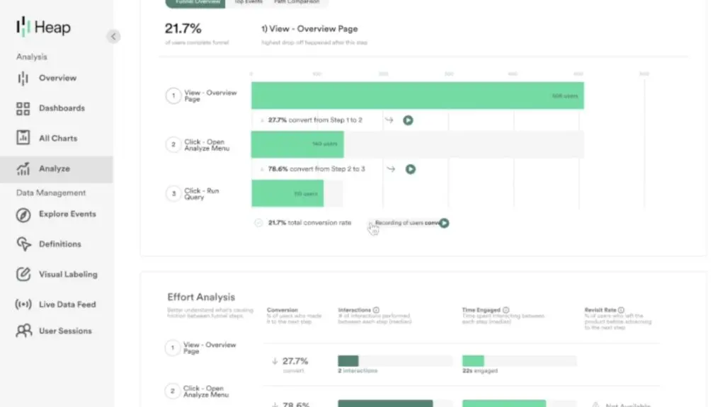
This was also the first tool we looked at today that provides data auto-capture for retroactive reporting. We’ve already explored the pros and cons of this, namely the mass of data you end up collecting, but Heap helps your team deal with potential issues with extensive data governance features - something many analytics systems fail to deliver when they provide data auto-capture.
Drive more product revenue with SaaS analytics
In this article, we’ve looked at some of the best SaaS analytics platforms available at every price point. These tools will help you identify the user actions and metrics that drive revenue and optimise experiences that maximise meaningful growth.
Some of the SaaS analytics systems we’ve looked at today simply allow you to track user behaviour in your software while others offer a variety of advanced features, ranging from predictive insights, data auto-capture, in-app messaging and plenty more.
If you think we’ve missed any SaaS analytics tools that deserve a place in this article, let us know in the comments.
FAQ
What’s the difference between SaaS analytics and Google Analytics?
Google Analytics focuses on website traffic and user behaviour, whilst SaaS analytics tools track product usage, feature adoption, and user engagement within your software application itself. SaaS-specific platforms provide deeper insights into how users interact with your product’s core features, conversion funnels, and retention metrics—data that’s essential for optimising your software rather than just your marketing website.
Which SaaS analytics tool is most affordable for startups?
Mixpanel offers the most cost-effective entry point for early-stage SaaS companies, with transparent pricing that scales as your user base grows. It provides essential product analytics capabilities without the enterprise-level pricing of competitors, making it ideal for startups that need to track user behaviour without breaking their budget.
Can SaaS analytics tools help improve customer retention?
Yes—tools like Heap and Pendo are specifically designed to identify drop-off points in user journeys and optimise engagement, which directly impacts retention rates. By analysing how users interact with your product and identifying friction points, you can implement targeted improvements that keep customers engaged and reduce churn.
What should I look for in a SaaS analytics platform?
Prioritise event tracking capabilities, user segmentation, and cohort analysis to understand how different user groups behave within your product. You’ll also want tools that offer conversion funnel analysis, retention metrics, and ideally integration with your existing tech stack—whether that’s your CRM, email platform, or product management tools.
Are there SaaS analytics tools specifically for mobile apps?
UXCam specialises in mobile app analytics and provides session replay, crash analytics, and user behaviour tracking optimised for iOS and Android applications. If your SaaS product is primarily mobile-based, UXCam offers more granular mobile-specific insights than general-purpose analytics platforms.
How do product analytics tools help with user onboarding?
Platforms like Userpilot and Pendo track where new users struggle during setup and identify which onboarding steps lead to activation. By analysing onboarding drop-off points, you can optimise your user experience and reduce time-to-value, which significantly improves early retention and product adoption rates.
Can SaaS analytics tools track A/B testing and personalisation?
Amplitude includes built-in A/B testing and personalisation capabilities, allowing you to run experiments and deliver tailored experiences based on user behaviour and cohorts. This integrated approach means you can test product changes, measure their impact on key metrics, and personalise the experience—all within a single platform.
What metrics should SaaS companies prioritise in analytics?
Focus on activation rate, feature adoption, retention cohorts, and churn indicators rather than vanity metrics like total signups. These metrics directly correlate with revenue and customer lifetime value, helping you identify which product improvements and user segments drive sustainable growth.