

When designing your Ecommerce product pages, the smallest differences can make a huge impact on the website’s overall conversion rate and profitability.
Before we explore some specific ideas that you incorporate into your product page designs, I want to first introduce a framework I use for all conversion-based design testing.
It’s a called the L.I.F.T model, which was developed by WiderFunnel.
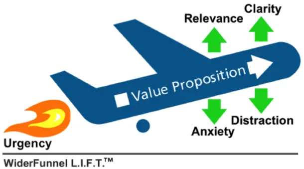
The L.I.F.T model explains that if you want to increase the likelihood of a visitor taking a desired action on your website, there are six things you can do:
- Improve your value proposition
- Improve the relevance of your value proposition to your audience (or vis versa)
- Improve the clarity of your value proposition
- Reduce distractions
- Reduce anxiety
- Add urgency
While reading through the ideas below, or considering other methods of improving your product pages, consider which of the six factors above it is focused on improving.
01Use tabbed navigation to help customers find content
Many e-commerce sites make the mistake of displaying too much information on their product pages in one go. But what do you do when you’ve got a lot of information that the customer might need to know?
The Watches of Switzerland website tackles this beautifully with a well-designed vertical tabbed navigation box.
While you would need to A/B test this design against a ‘text heavy’ variation, it’s visually cleaner and represents a more intuitive way for the customer to find exactly what they’re looking for.
02Display multiple payment options
If you sell high-ticket items on your e-commerce site, you might want to consider featuring various payment plans near to your call-to-actions.
On the Sofaworks website, they offer three separate payment plans for customers looking to buy a new sofa. From monthly payments to ‘buy now pay later’, this helps the customer spread the cost of their purchase over several paychecks.

03Display product reviews, good or bad
According to iPerceptions, customers are 63% more likely to buy from a site that displays customer reviews. In a separate study, eMarketer found that customer reviews were trusted 12x more than manufacturer product descriptions.
So, how should they be displayed? While I advise split testing the location, your customer reviews should be prominently displayed, and implemented in a way that uses rich snippet review markup.
Rich snippet review markup will help your product pages be displayed more prominently in Google’s search results, increasing your click through rates, and traffic.
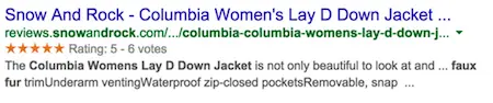
By including customer reviews, you’ll also capture more long tail SEO traffic and traffic from users searching for ‘product name + reviews’ or ‘product name ratings’, which is likely to be extremely high quality converting traffic.
But what about customers leaving negative reviews?
A study by Reevoo found that the presence of bad reviews can actually increase a site’s conversions by 67%. How is that possible?
68% of users claimed to trust a website’s reviews more when they saw bad reviews as well as good reviews. 30% suspected censorship when only positive reviews were present. Needless to say, though, too many bad reviews is not a good thing.
04Offer live chat to customers
About two years ago, one of my sites ran a campaign where we offered a bundle of products worth $1,250 to musicians for $69 for 100 hours only. One of the products included was a 29 pack of music contracts.
It turns out, thanks to live chat, that some of our customers thought they were actually buying a pack of 29 signed contracts ‘signing them’ to various labels etc.
When we changed the landing page to say ‘music contract templates’, our conversion rate increased by several percent and customers were no longer confused.
From experience, live chat is one of the simplest ways to improve a site’s conversion rate, not only because it provides a channel to solve customer’s objections, but also because it provides a constant stream of valuable ideas to improve your product pages.
The Victoria’s Secret website does this particularly well. Although, they could make it even more compelling if they gave you the option to chat directly with the models used in the product images ;)
05Multiple image angles and 360° views
Generally speaking, the larger your product images, the higher your conversion rate will likely be. But what about going beyond large product images to include multi-angle images, 360-degree views, and videos?
DueMaternity.com found that switching from two-dimensional ‘back and front’ images to 360-degree rotating images increased their conversion rate by 27%.
In another experiment, online paintballing website Paintball-Online.com found that visitors who watched a product video were 26.36% more likely to convert.
One of the most comprehensive examples of displaying multiple visual formats that I’ve come across is the Net-a-Porter website.
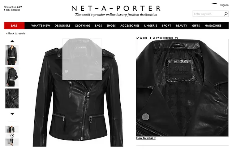
As you can see, this particular product has it all; high-quality multi-angle images, hover-zoom, and product videos. As always, run the experiments to find what works best for you.
06The faster your page speed, the higher your revenue
In 2006, Amazon reported that for every 100 milliseconds they speed up their website, they see a 1% increase in revenue.
So, how does this fit in with our previous points on using large high-res images, videos, and implementing javascript-heavy live chat plugins, all of which slow down your product page’s loading speed?
My advice is this: build your site with functionality in the forefront of your mind, and page speed in the back of your mind. Once you have a functional product page template with all the features that are going to increase your conversion rate, strip out the fat and make it as lean as possible.
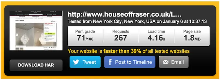
How fast should your product pages be? Ideally, under 2 seconds. However, out of ~15 major e-commerce stores in the UK that I tested, the average product page loading speed according to Pingdom was around 4 seconds.
If your product page loading time is above two seconds, it’s probably influencing conversions. If you follow the tips in ‘How to Improve Your Page Load Speed by 70.39% in 45 Minutes’, you should be able to bring it down to a reasonable level.
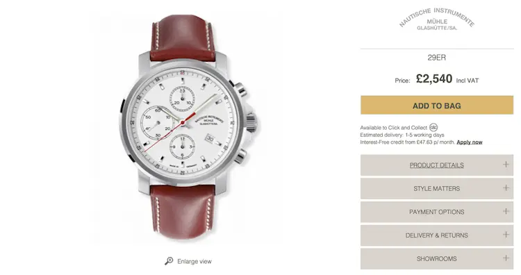
07Use Clear & Contrasting Call to Actions
One of the easiest aspects of your product page to experiment with are your call-to-actions (CTAs). While there’s no such thing as a stylistic best practice, it’s important that your CTAs are clear, compelling, and contrast against other elements on the page.
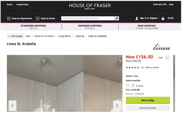
See the House of Fraser screenshot below for a good example of a bright and clear CTA.
08Build trust with security badges and social proof
Remember the LIFT model I mentioned earlier? One of the six aspects to increase the likelihood of a desired action is to reduce anxiety.
On your product pages, this can be achieved by combining trust signals and social proof to assure the customer that they’re in safe hands. Typical ways of doing this include displaying security badges, customer support phone numbers, customer reviews, and using an SSL certificate to display the secure badge in the browser’s URL bar.
KitchenwareDirect do a great job of displaying all of this alongside their product’s call-to-actions.
09Use scarcity & urgency to encourage action
It’s been proven in both humans and monkeys that we’re irrational when it comes to loss aversion. Because we can’t stand missing out on things, urgency and scarcity are powerful tools in a marketer’s toolbox.
When it comes to urgency and scarcity it’s important to note that there is a difference between real and implied urgency/scarcity. Real urgency, for example, is when you actually only have a limited amount of stock or time to sell a product. Implied urgency, however, is when you use phrasing like ‘hurry before they’re sold out’, to evoke the sense of urgency when there is no inherent urgency.
Both are effective and can increase your conversions when used carefully.
Below is a typical example of urgency being used on an American Apparel product page.

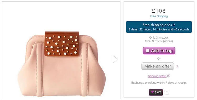
The example below is even more interesting. While I would’ve recommended making the ‘only 3 in stock’ more prominent, it displays a good example of implied urgency by only offering free shipping for a certain amount of time.
If you want to learn more about using real and implied urgency and scarcity on your website, I’ve written an in-depth post about it over on ConversionXL.
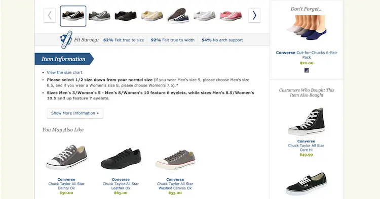
10Cross-sell popular and related products
When people are looking at your product pages, there’s a good chance that they haven’t made their mind up on which product they should buy.
By displaying similar products, and products that other customers bought instead, you’re able to use your previous customer data to help shoppers find the products that might be a better fit for what they’re looking for.
While Amazon is famous for doing a great job of recommending related products, I think Zappos do an even better job of displaying their recommendations in a user-friendly way.
11Show your estimated shipping time
This is particularly important if your website sells products that are often used as gifts for special occasions, as many late shoppers will want peace of mind that their order will arrive in time.
By displaying the estimated shipping time, you further reduce the ambiguity relating to what the customer should expect. By meeting or exceeding those expectations you can ensure that the customer has a great experience with your site.
12Use a clean and distraction-free layout
You might be wondering, how can we include everything outlined in this post without our design becoming overwhelming and clunky?
This is where the skills of a talented designer come in.
If you want proof that it can be done, just visit the Apple website. Their product pages incorporate huge amounts of information, comparisons, related products, images and photos. Yet, the overall experience is relaxing and easy on the eyes.
13Design with mCommerce in mind
In 2012, Google reported that mobile users were 67% more likely to buy from a site that had a mobile friendly design. Those numbers are likely very conservative now, given that responsive and mobile-optimised design is becoming increasingly popular.
Test your product pages using Google’s mobile-friendliness tool. If your score is anything less than 100%, there’s a good chance that money is being left on the table.
14Display your refund and returns policy prominently
One of the biggest concerns that shoppers have when buying products online is ‘what happens if I don’t like it?’
By displaying your refund or returns policy, you eliminate the ambiguity around the concern, as they’re reassured that the worst case scenario is that they have to send the item back.
As always, it’s good to experiment with different ways of displaying this, but I recommend being as specific as possible. Vashi do this very well on their website, by displaying the exact date that you can return the item by, as well as explaining that they will refund your delivery and shipping costs as well.
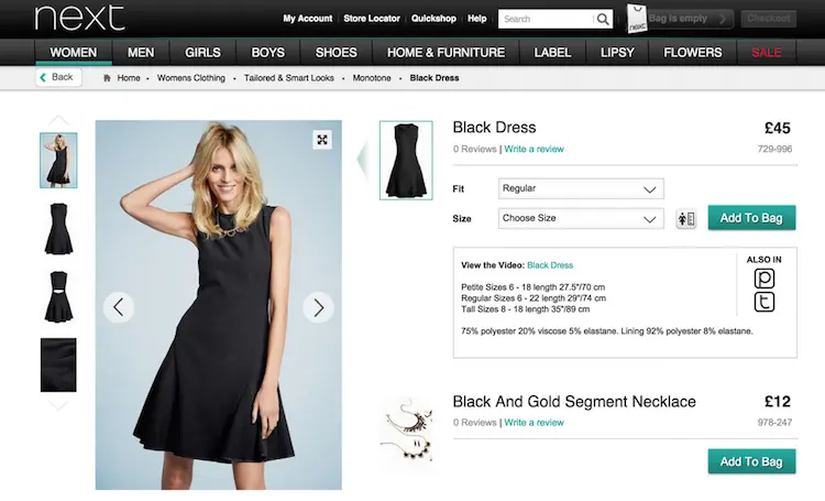
15Upsell related products from the product page
Another technique which, when done well, can have a great impact on your average order value is up selling products that compliment the product they’re looking at.
Next do a great job of this on their clothing section. As you can see below, from the product page of their black dress, you can add a black and gold necklace to complete the look, adding an extra £12 to the transaction value.
In Summary
While we might have only covered the tip of the iceberg, I hope the fifteen examples above have given you some good ideas that you can experiment with and implement into your own e-commerce page designs.
The important thing to remember with all of these tips and best practices is that what works for someone else might not work for your site, and vis versa. As I’ve reiterated multiple times throughout this post, nothing should be implemented without being tested against your current benchmark.
If you have any other good tips or ideas worth sharing, please share them in the comments section below.
FAQ
What is the most important factor for e-commerce product page conversions?
Page speed is the single most critical factor—faster pages generate significantly higher revenue and lower bounce rates. Even a one-second delay can reduce conversions by up to 7%, making page speed optimisation essential for profitability.
How can I reduce customer hesitation on my product pages?
Display security badges, HTTPS encryption, customer service numbers, and social proof prominently to build trust and address common purchase concerns. These trust signals directly reduce cart abandonment and increase conversion rates.
Why should I show negative reviews on my product pages?
Displaying honest reviews—both positive and negative—builds credibility and increases customer confidence in your products. Customers trust pages with mixed reviews more than those showing only perfect ratings, leading to higher conversions.
What product page features increase customer engagement?
Multiple image angles, hover-zoom functionality, 360-degree views, and product videos showing items in use significantly boost engagement and reduce purchase hesitation. Visual variety helps customers make confident buying decisions.
How does live chat impact e-commerce conversions?
Live chat removes friction by answering customer questions in real-time, addressing objections before they abandon their cart. Offering live chat support directly correlates with higher conversion rates and customer satisfaction.
Should I offer multiple payment options on my product pages?
Yes—displaying multiple payment options removes barriers to purchase and accommodates customer preferences. Customers are more likely to complete transactions when their preferred payment method is available.
What makes a call-to-action button effective on product pages?
Clear, contrasting call-to-action buttons that stand out visually from the rest of the page significantly improve click-through rates. High contrast colours and direct language like ‘Buy Now’ or ‘Add to Cart’ drive immediate action.