


Designing killer landing pages for B2B campaigns has a lot in common with their B2C cousins, but there are some key differences. Appealing to consumers weighs far more heavily on emotional impulse and desire than a genuine need to buy a product, whereas business minds are a little more calculated in their buying choices.
This doesn’t mean there’s no emotion involved in B2B purchases, though. You just have to find a more intricate balance between inspiring business minds on an emotional level first and then follow up by appealing to their more logical side.
With this in mind, here are 10 B2B landing page best practices to increase your conversion rate.
01Create a landing page for every campaign message
A recent study by Kissmetrics reveals 52% of B2B PPC ads point towards a homepage, not a landing page. This is just about the worst mistake you can make both in advertising and landing page design.
You should have ad campaigns targeting users at various stages of the buying process with focused messages that encourage them to convert based on their needs at the time. And each ad campaign with a unique message needs an equally unique and targeted landing page to finish off the job.
02Get your message across instantly
You should already know the message you need to get across on each landing page because your PPC campaigns are built around these messages (see point #1). Now you have to convey this message in an instant - especially for B2B customers who expect you to get right to the point.
What does this visitor want and how are you going to deliver it? Bang. Make this absolutely clear from the moment they land on your page with a powerful headline, strong subheading and a compelling call-to-action.
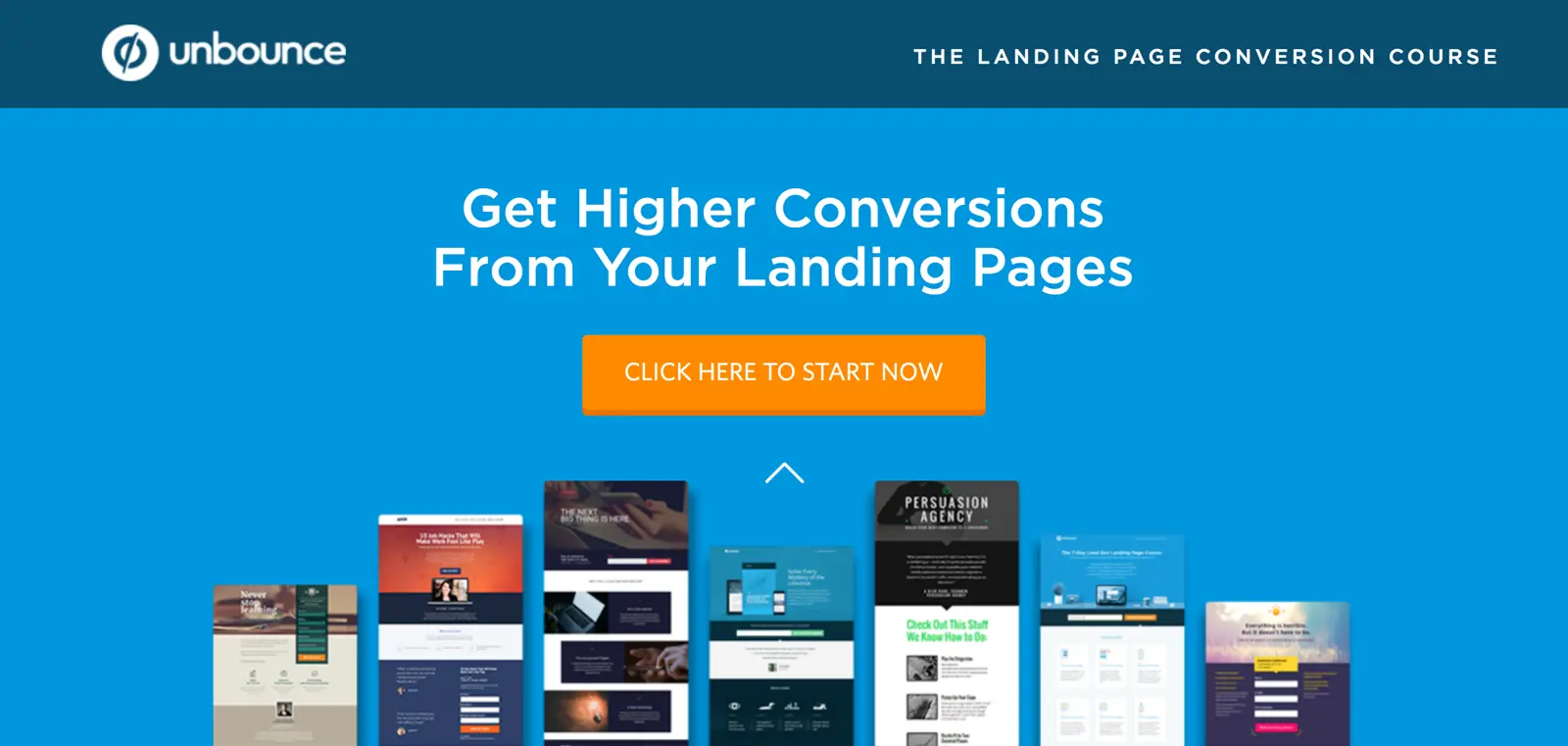
It’s reassuring to see Unbounce get so much right with its own landing pages, considering this is what its entire product is based around. It doesn’t even go for a subheading on this occasion, trimming all the fat it possibly can on content to deliver its message instantly. It’s a classic hero section design that goes for minimal, effective content above the fold.
03B2B ‘hero’ sections should be visually striking, too
Visual hero sections aren’t reserved for B2C landing pages. Even the dullest of business products and services should have a landing page with visual punch, starting from the hero section
Full-screen image backgrounds have been popular for years now - just remember to make sure they’re responsive and optimised for speed. The same goes for full-screen video backgrounds, which have become more popular recently. Be careful with loading times and make sure having video footage doesn’t distract users’ attention from the message you really want to get across.
Product images are still a popular choice (e.g.: the Unbounce example we looked at earlier) but B2B landing page best practices tell us people are better than products.
Notice Apple’s page for the latest iPad devices appeals to consumer desires for its luxury, fashionable devices. Whereas, the Apple Business page focuses on showing people using its products and services.
Data from Chartmogul says 44% of SaaS landing page hero images feature people. This doesn’t mean you should simply follow the crowd and go for images with people. I would suggest testing both options to see which one gets better results. And, if you do go with images featuring people, be careful they don’t end up looking like cheesy stock images.
The homepage for IFTTT proves you don’t need images to create visual impact. A bold choice of colour, text and contrast can be the ultimate way to make an impression and this kind of design isn’t as easy or simple as it looks.
Whichever approach you go for, make the most of that hero section to get people converting there and then or scrolling further down the page.
04Ditch the header navigation
Your landing pages have a clear objective and you don’t want people wandering off to irrelevant parts of your site. So remove that header navigation from your landing pages and keep users focused on the task at hand.
Users will soon get their navigation back once they click through to another page and you can place secondary CTAs and links in the footer to provide next-step options. But in the first view of your landing pages, a header navigation only distracts user attention and contributes to choice fatigue.
05Nail those product benefits
Copywriting 101 tells you to forget about product features and sell people on the benefits of using your product instead (not an exact quote). My favourite elaboration on this point comes from the team at UserOnBoard: “People don’t buy products; they buy better versions of themselves.”
They even manage to squeeze in some Super Mario references for nostalgic bonus points.
“When you’re trying to win customers, are you listing the attributes of the flower or describing how awesome it is to throw fireballs?”
The problem for B2B brands is it can be painfully tempting to include features instead of benefits. You might even find it difficult to tell the two apart sometimes. After all, isn’t 100GB of free cloud storage a benefit to all of your customers, even if it’s a feature?
Well, no. The benefit, in this case, would be something more like “access your files anytime, anywhere” or “never lose a file again”. Features describe your products; benefits describe the “better versions of themselves” your customers want to be. So you need to know who your target audiences aspire to be, what’s getting in the way of that and how your product can remove those barriers.
As for product features, they belong on product pages or price plan pages, not landing pages.
06Hit them with the trust factors
Once you’ve struck your B2B prospects emotionally it’s time to appease the logical side of their business mind - and this is where you hit them with the trust factors. Testimonials, reviews from third-party sources, case studies and examples of your highest-profile clients all reassure your visitors that your offer is the real deal.

Active Campaign uses a number of trust factors on its pages
Adding social proof has become a favourite tactic for B2B brands, providing feedback from real customers - without any censorship on your part. Of course, this means your services really do need to be up to scratch because the last thing you want is a landing page full of customer complaints.
Trust factors are great, but you do have to earn them.
07Make your forms an asset, not a hindrance
Just about every conversion involves some kind of web form and it sucks when all your hard work comes undone at the key moment. For B2B landing pages, form optimisation is a constant battle and you’ll need every advantage you can get to maximise conversions.
Key to landing page success is to making your forms an asset, not a hindrance. So invest in an optimisation tool that highlights problems your users have with the forms on your pages. By gaining insights into what stops people completing your forms you can make informed design improvements to increase conversion and remove friction points that might prevent future leads from making the final purchase.
08Provide access to more information
By the time your visitors get towards the bottom of your page they’re probably not ready to convert without a little more convincing. This is where content becomes so important for B2B leads that don’t convert the first time around. So what kind of content should you be producing for B2B leads?
Well, as Marcus covered in a previous post, here are the forms of content that get the most common types of content produced for B2B leads:
However, as Marcus also says in that post, if you’re following these kinds of trends you end up doing the same thing as everyone else. Which won’t necessarily work for you, especially when you’re publishing various different landing pages with a range of conversion goals and messages. Trends can be useful but nowhere nears as powerful as understanding what your visitors need to take that next step closer to converting.
09Forget the single CTA rule
This is kind of an anti-best practice because the general rule is to only have one call to action per landing page. I’m calling bluff on this one, though. No matter how good your ad campaigns and landing pages are, you’re never going to convert everyone the first time around. This is why things like email and Google Ads remarketing exist - and precisely why having a secondary CTA on your landing pages can make all the difference to conversion rates.
Infusionsoft goes for this second CTA at the bottom of its page, acknowledging that users who got this far might not be ready to buy now. This doesn’t mean they won’t be ready to complete another kind of conversion, though, and offering an intermediate step in the buying process can keep people involved with your brand when they would otherwise leave.
Of course, if you go for a secondary CTA, it should never compete with the main action you’re targeting. Place them further down the page or make them less dominant visually so your main CTA always stands out. They’re called secondary CTAs for a reason.
10Use remarketing in the buying process
In a recent article, I explained how you can use Google Ads remarketing to guide prospects along the buying process and this is particularly important for B2B leads, who often need some extra convincing.
By creating remarketing lists for each stage of your sales funnel you can create highly specific ads that nudge leads onto the next stage. So, instead of harassing all of your B2B leads with product ads as they browse the web, you can target those in the early stages of your funnel with ads to a free webinar or something or another intermediatory step. For these leads, you’re approaching them with an action that requires less commitment but you still get the opportunity to grab their email address.
Of course, your content is going to leave these prospects feeling like they really need your product - at which point you can switch to remarketing ads for the product itself, free trial offers, special discounts and other messages that make it hard to resist.
Wrapping up: B2C vs B2B landing page best practices
The truth is B2B and B2C marketing aren’t as different as many people like to make out. The notion that business folk are robots who only buy out of logic is ridiculous; these are still people who make decisions based on emotion - probably more often than they would like to admit.
The challenge with B2B marketing is striking that emotional reaction first and then providing enough logical reassurance to help your leads buy in confidence. The same thing goes for B2C leads, too, but the balancing act between emotion and logic can be more intricate for business minds. So keep in mind these B2B landing page best practices and always consider the two core elements of business purchase decisions: emotion first; logic second.
FAQ
What’s the main difference between B2B and B2C landing pages?
B2B landing pages must appeal to logical decision-making and business needs rather than emotional impulse, since they’re targeting multiple stakeholders in a purchasing process. This means emphasising ROI, credibility, and tangible business outcomes takes priority over lifestyle imagery and emotional storytelling that works for B2C campaigns.
Should B2B landing pages have navigation menus?
No—removing header navigation from B2B landing pages significantly improves conversion rates by eliminating distractions. Ditching the navigation menu forces visitors to focus exclusively on your offer and call-to-action, rather than wandering off to other pages mid-consideration.
How long should a B2B landing page be?
B2B landing pages should be as long as necessary to address all stakeholder concerns and objections, but every section must earn its place. The key is structuring your page so that each section builds trust and credibility progressively, from your hero section through product benefits, social proof, and detailed information resources.
What should a B2B landing page hero section include?
Your hero section needs both a compelling headline that communicates your value instantly and visually striking imagery or video that reinforces your message. Generic stock photos won’t cut it—B2B buyers expect professional, industry-relevant visuals that demonstrate you understand their world.
Why do B2B landing page forms matter so much?
Forms are often the biggest conversion killers on B2B landing pages, yet they’re essential for lead capture. Optimising your form design—by reducing fields, clarifying what information you actually need, and explaining why you’re asking for it—transforms forms from friction points into natural conversion steps.
What trust factors should appear on a B2B landing page?
B2B buyers need reassurance before committing, so your landing page should prominently feature client logos, case studies, certifications, and testimonials. Social proof and credibility signals are non-negotiable on B2B pages because they address the risk concerns of multiple decision-makers evaluating your solution.
Should every B2B campaign have its own landing page?
Yes—creating dedicated landing pages for each campaign message dramatically improves relevance and conversion rates. Campaign-specific landing pages allow you to match your messaging exactly to what prospects searched for or clicked on, rather than sending them to a generic product page.
How can I provide more information on a B2B landing page without overwhelming visitors?
Offer downloadable resources like whitepapers, case studies, or product guides that visitors can access after converting or via expandable sections. This approach lets you satisfy information-hungry B2B buyers without cluttering your page with lengthy text that might deter quick decision-makers.