


The average conversion rate is 2.35% in 2020 and this median hasn’t changed a great deal over the past five years. Despite all the advances in web design, UX design and conversion optimisation, the average conversion rate still sits around the 2%-region in 2020.
A previous study looking into the performance of different types of web form revealed that contact forms are by far the worst offender with an average conversion rate of just 1%.
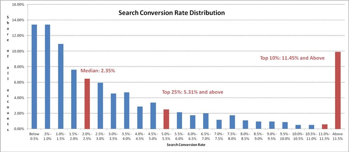
We’re not here to talk about average conversion rate, though. As the chart above shows, the top 25% brands in search achieve more than double the median average conversion rates (on average) and the top 10% almost five times more conversions (again on average).
These are the kind of benchmarks you should be aiming for.
Here at Venture Harbour, we’ve spent a lot of years rethinking, redesigning and optimising web forms to maximise results and squeeze every possible conversion we can out of our forms. We’ve increased conversion rates by as much as 743% through form optimisation and improved the quality of our leads so that more of them turn into paying customers.
We’re pretty confident that we know a good form when we see one and here we’ve got 15 of the best examples from 2020 to inspire your own form optimisation campaigns.
What makes a good contact form?
The answer to this question really comes down to what you’re looking to achieve with your contact forms. There tonnes of articles listing best practices for designing best practices but there’s no single formula for a contact form that actually generates conversions.
If the average conversion rate for a contact form is 1%, clearly the “best practices” aren’t what they’re cracked up to be.
Don’t take best practices too seriously
The most common form design “best practice” you’ll come across is the theory that shorter forms achieve higher conversion rates. The idea is that the more form fields you have, the less likely users are to want to fill them out and the more difficult you make it to complete them.
Sounds like a solid argument.
As we’ve seen before, though, this theory doesn’t pan out in the real world of form optimisation.
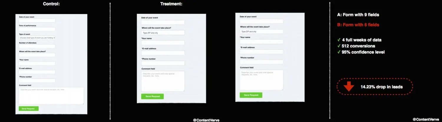
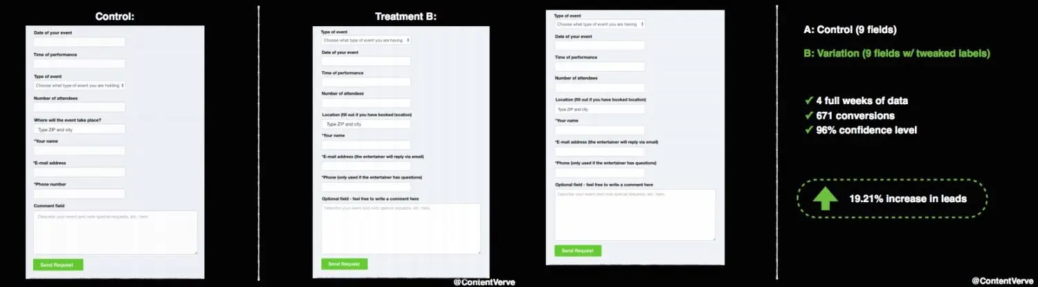
The image above comes from a ConversionXL article written by Unbounce’s former Senior Conversion Optimizer, Michael Aagaard, showing how following the golden best practice of reducing the number of fields in a form resulted in lower conversion rates. And to throw this theory further out of the window, conversion rates increased by 19.21% by simply optimising the field labels on the original.
So the short-form concept clearly doesn’t always increase conversion rates and you’ll see this in a lot of the examples we look at in this article. There are some serious B2B brands in this list who you know are testing their forms and there aren’t many designs you would consider short.
And there’s a reason for this.
Context matters in lead generation
You don’t put a contact form on your website to get an inbox filled with Hey, how’s it going messages and spam from bots. Your contact form is a lead generation tool designed to capture interest from potential customers and provide a channel of communication and support for your existing customers.
As you’ll see throughout this article, the best contact forms guide users into asking the right kind of questions and sending the right messages - the rest simply get filtered out. Which allows you to sort the leads and customer support cases from the spam and wastes of time.
So let’s get into the examples.
01BrokerNotes
BrokerNotes is an online platform that helps investors choose the best brokerage firm for them, based on what they’re investing in and their level of experience.
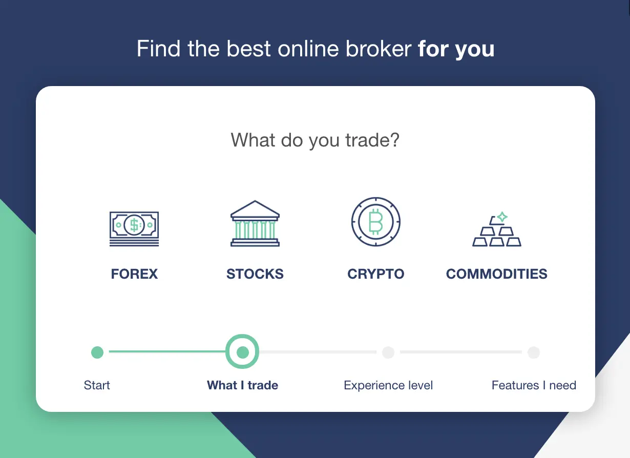
The website uses a multi-step form to ask users relevant questions and refines the list of recommendations to suit their answers.
Now, to provide this service, BrokerNotes needs to work directly with brokers, service providers and the media - all of whom might want to get in touch.
Which brings us to the contact page.
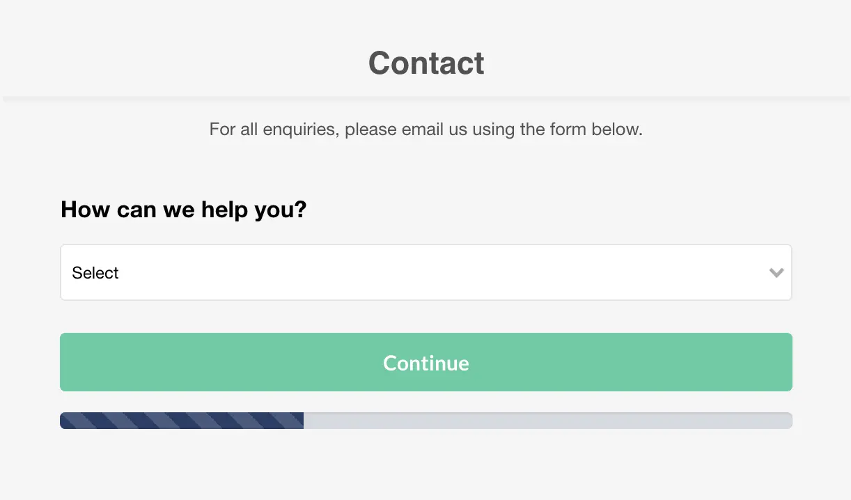
Once again, we see a multi-step form on the contact page rather than the traditional vertical layout we’re so used to. Instead of asking users for personal information from the get-go, BrokerNotes puts all the focus on them by asking what it can do to help.
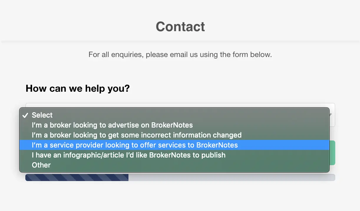
Users can select from predetermined options, which allows BrokerNotes to control the type of contact messages it receives. Anything of value is listed among the options while the form still allows users to select “other,” which BrokerNotes can mark as a non-priority.
We’ve tested a lot of multi-step form designs over the years and found them to increase conversion by as much as 743%. BrokerNotes increased its homepage conversions from 11% to 46% by switching to multi-step forms but the aim with its contact form is a little different.
Here, the company is using a multi-step form to tell users which kind of interactions it wants to receive and increase the quality of its contact leads.
02Sleeknote
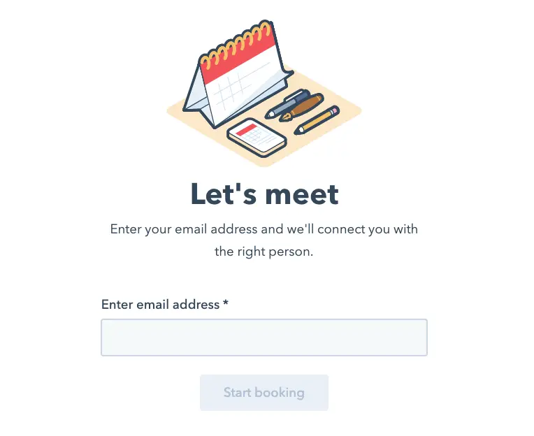
Sleeknote takes a more traditional approach to contact page design with this vertical form aligned next to a trio of almost-CTA prompts: Book a demo, get inspired and become a partner.
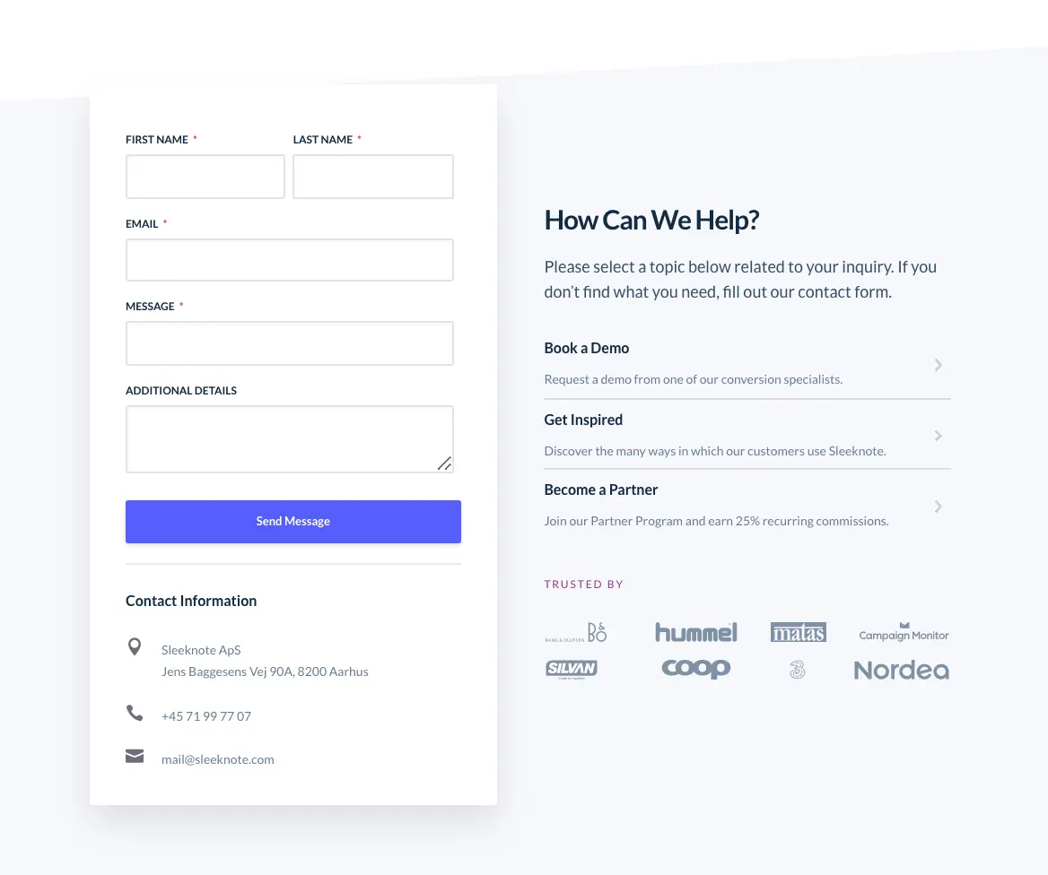
Sleeknote makes it very clear which type of actions users can take via its contact page and this reduces the number of irrelevant messages coming in. Those who want to book a demo will click the link and be directed to the relevant field, for example.
People with more specific or general queries can fill out the contact form although it’s a safe bet these contacts won’t be treated as a priority over the clear conversion goal Sleeknote is aiming for: bookings.
Don’t be afraid to encourage specific actions on your contact pages and prioritise leads that bite.
There’s one other conversion trick Sleekbot uses on its contact page - a chat widget that calls out to users and asks them if they have any questions. This means users don’t even need to fill out a form to put their questions across, which not only increases conversions but also limits the number of not-so-useful messages reaching Sleeknots email inbox.
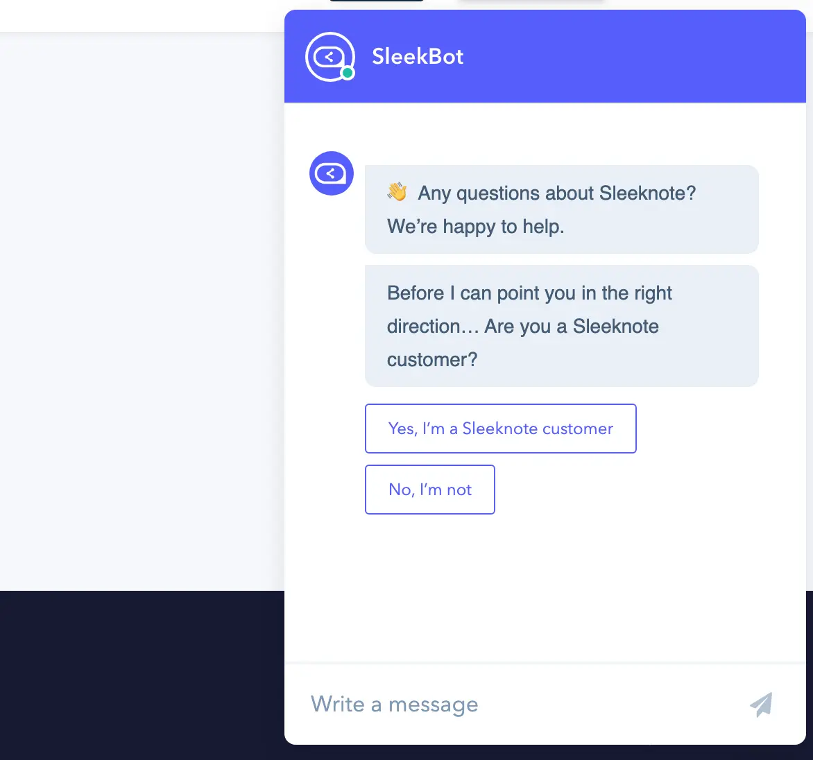
SleekBot can take care of these and pass along the useful interactions to part of the company’s sales team.
This bot is powered by HubSpot, which offers a free chatbot builder for businesses using the company’s free CRM. That said, you’ll want to be a paying customer with its sales software to make the most of the contacts and data your bot generates.
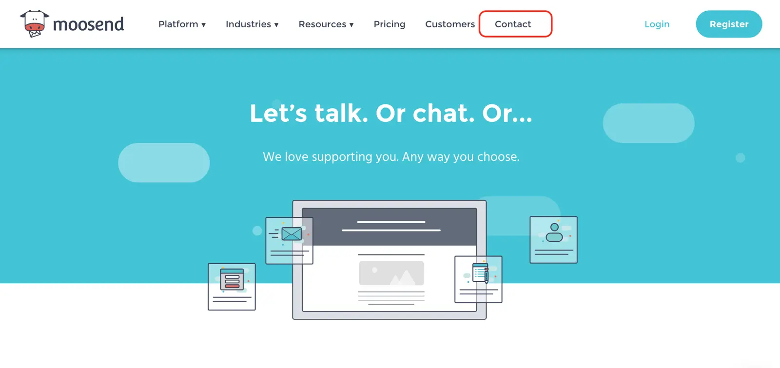
03Moosend
Moosend is an email marketing software provider and like many of the companies we’ll be looking at in this article, it needs to provide extensive contact and support options. In this case, one form isn’t going to cut it and Moosend has to create a single contact page that directs users to where they need to go.
First of all, I want to credit Moosend for having a visible “Contact” link in the header of its website. This kind of navigation is a dying breed but it means users are only ever one click away from the contact page.
Moosend’s contact page has a hero section of its own and it prepares users for the fact that there are plenty of options. These aren’t options for the sake of it, either; these are necessary options aimed at meeting the needs of both potential and existing customers.
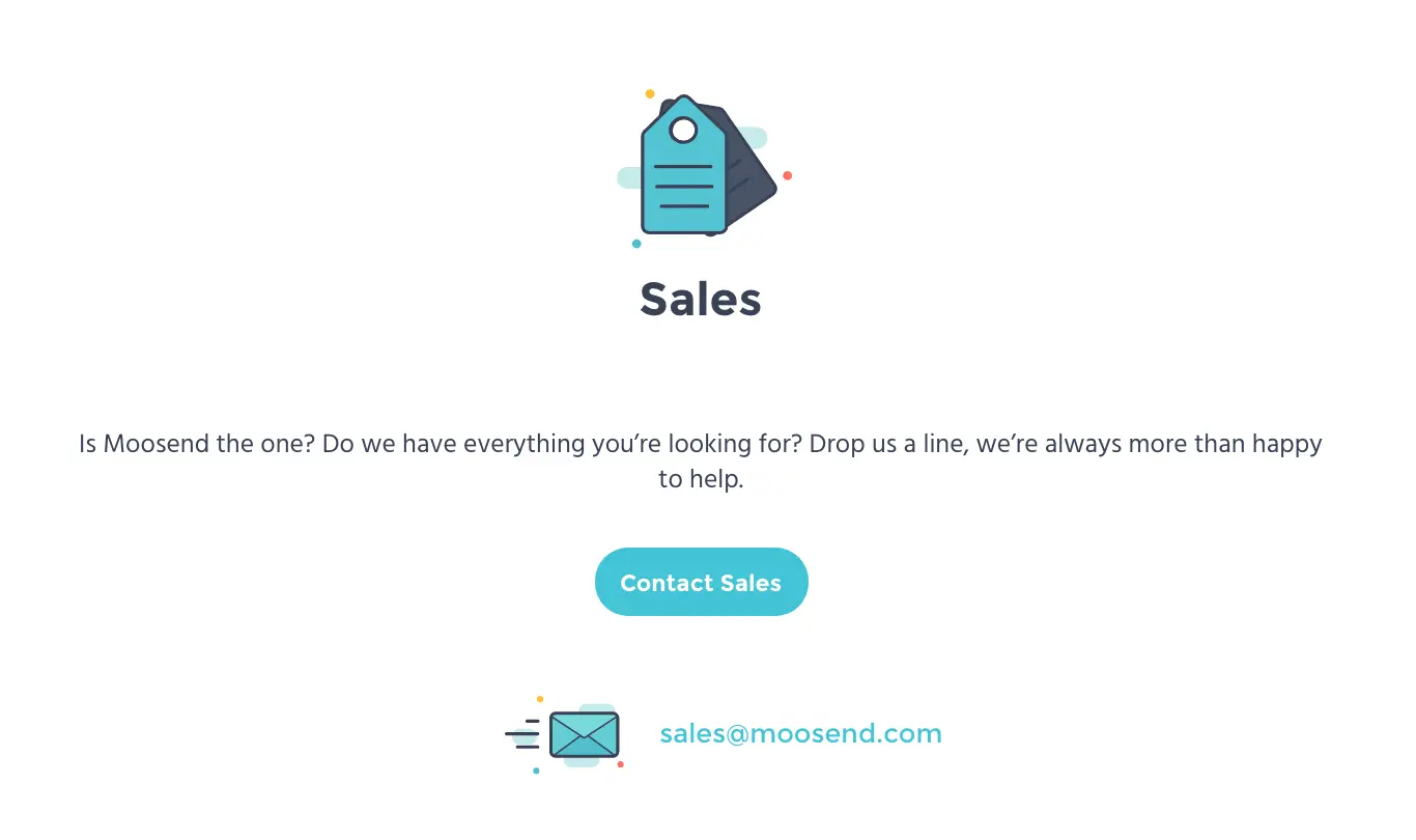
First, Moosend provides a dedicated contact channel for people who want to contact the sales team and talk about pricing, plans, features, etc. Users can click Contact Sales to fill out the relevant contact form or click on the sales email address link to send an email from their chosen email provider.
Or you can scroll down a little more…
Existing customers can get in touch with Moosend’s support team by clicking the Contact Support and visitors also have the options of live chat for an instant response, as well as a help section and a number of webinars for guidance on using Moosend’s software.
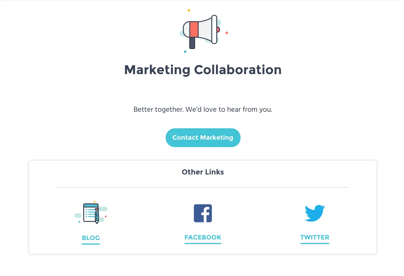
Finally, marketers looking to work with Moosend (e.g.: affiliate marketers) can get in touch with the company’s marketing department.
The company has squeezed a lot into its contact page but delivers all of this information in a concise and structured manner. The experience of using Moosend’s contact page is straightforward and you can find the contact details you need instantly.
As for the forms themselves, these are created with Contact Form 7, one of the most popular contact form plugins on WordPress and Moosend does the tool a lot of justice.
The key thing to learn from this example is that your forms aren’t the only deciding factor in form conversion rates - you also have to consider how your contact page is structured and integrated on your website.
04Scribd
Taking the concept of simplifying complex contact pages even further, we have Scribd. The online publishing company provides a grand total of eight different types of inquiry, allowing it to send users to the relevant contact form or page of the site.
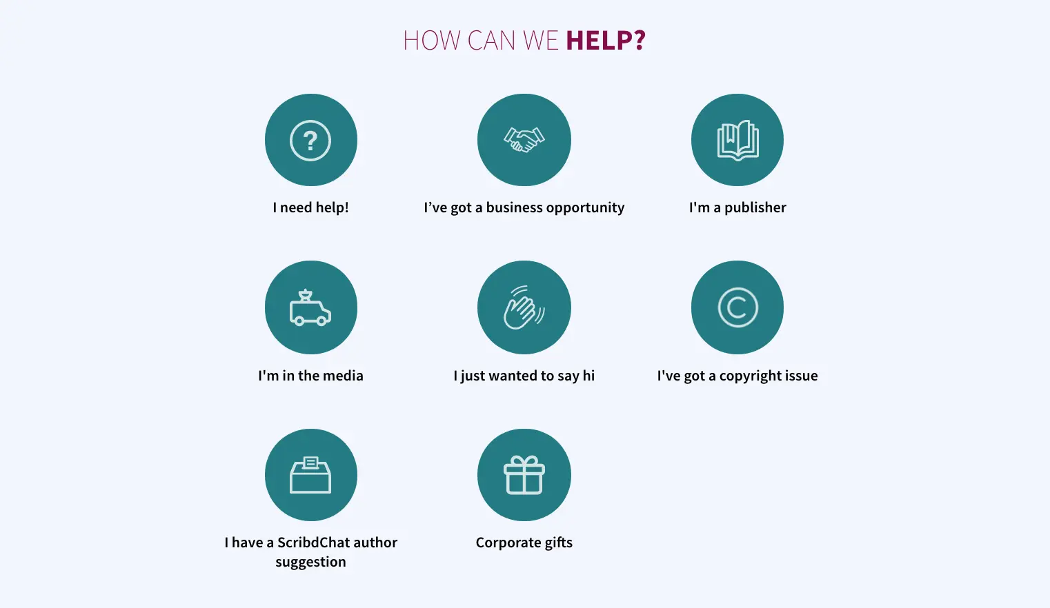
If a user clicks I need help! They’re greeted with an interactive help bot. This is powered by Solvvy, an AI customer support system that provides instant answers to common user problems.
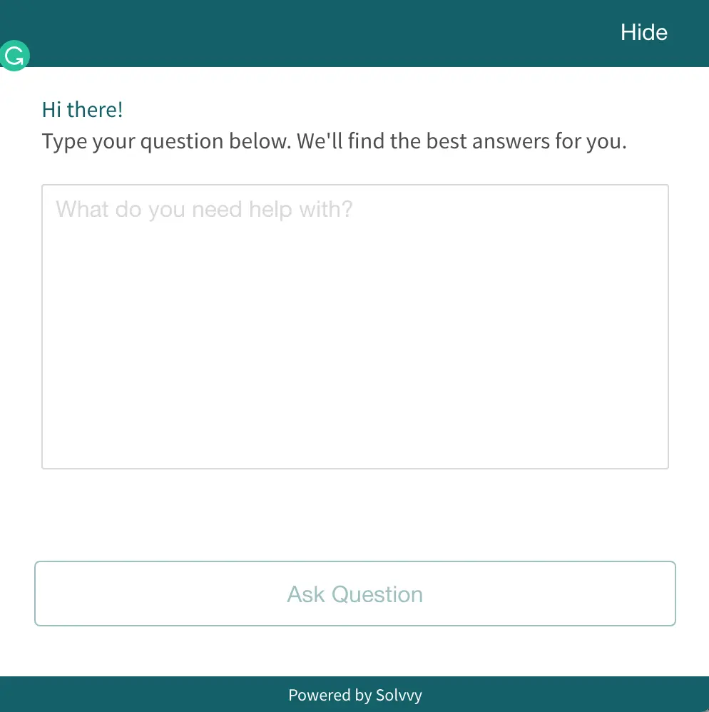
So when I type in “I can’t log in to my account” and hit the Ask Question button, I get an instant of related FAQs and answers helping me with my problem.
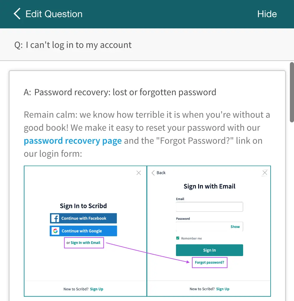
I’m then asked if this information answered my question and, if I’m still stuck, I can click Contact Support and my question automatically appears in the description box.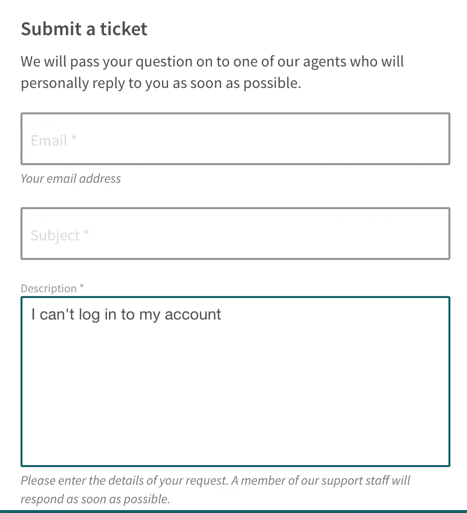
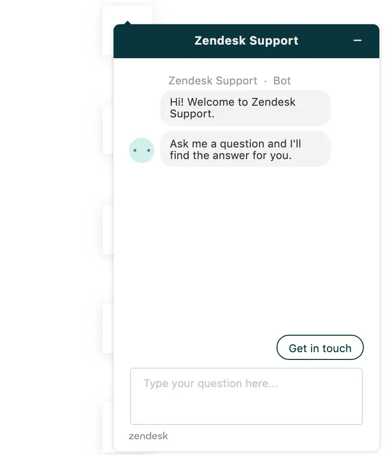
05Zendesk
Zendesk provides customer service and sales software for businesses so you would like to think its own contact page is an example worth learning from. Much like Moosend, Zendesk also has to provide different contact and support options for both potential and existing customers so it will be interesting to compare the two companies’ approaches.
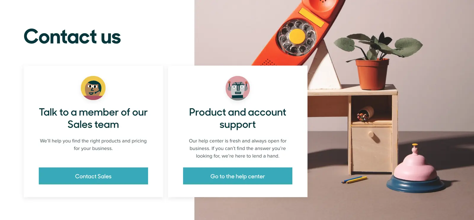
Zendesk horizontally aligns its two contact options and I do like the fact that this makes them both visible to each type of user at the same time. Moosend decides to favour sales over support - and that’s fine. But I do like Zendesk’s approach from a pure UX design perspective.
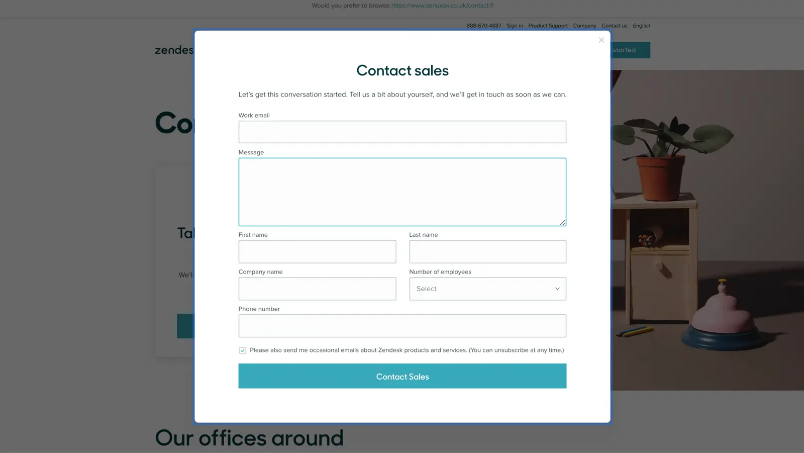
The contact form itself is quite simple in appearance but there’s quite a lot going on at the code level. We’ve got some JavaScript and AJAX code working in sync here to create modal overlay forms that pop-up on the existing page, meaning you don’t need to click through to another page before you can start filling out the form.
Bonus points for implementation
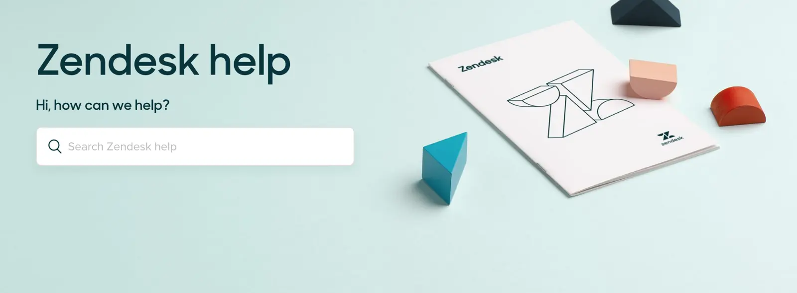
Users who need technical assistance can click Go to the help center where they’ll be greeted with a search bar. Keep scrolling and Zendesk provides direct links to resources for each of its products, which are all packed with guides, FAQs and other useful resources.
Users can also ask the community, update their Zendesk products and request cross-platform help for troubles related to more than one product.
If all that fails, users simply need to click on the (?)Help button at the bottom-right of the screen to contact Zendesk Support via its live chat system.
If you’re a fan of Zendesk’s contact and customer support system the good news is you can implement it for yourself by trying out Zendesk’s range of support and sales products. You can click here to sign up for a free trial and all you have to do is fill out a tidy multi-step form to gain free access to Zendesk’s product for 14 days.
Definitely worth a try.
06Zeroqode
Zeroqode gets right to the point on its contact page, providing a simple, easy contact form for people to fill out.
There are no restrictions, long list of fields or strict validation to get in the way. If you’ve ever read any article on form design best practices, this is probably the kind of contact form you would go on and design afterwards.
In terms of removing friction for the end user, this is great. In terms of generating valuable leads and interactions from users, possibly not so much - but that’s Zeroqode’s call to make.
And Zeroqode isn’t done yet, by the way.
Directly after its nice and easy contact form, the company hits you with a big, bold CTA section asking which kind of project people want to work on.
So, even though Zeroqode is leading with its simple contact form, the company is still making it clear to users what kind of interaction it wants and making it highly accessible.
And, like many of the examples we’re looking at today, Zeroqode reinforces its contact page with a chatbot, this time powered by Intercom - a platform we’ve got a lot of experience with here at Venture Harbour.
In fact, we use Intercom on the Leadformly website to provide instant customer support for users and a direct contact channel for people who prefer an immediate response to filling out forms.
07Unbounce
Unbounce is another software provider that has to provide contact and customer support for a range of different users types, from potential customers and existing ones to journalists and marketing partners.
Like a few of the companies we’ve already looked at, Unbounce specifies which types of interactions it wants from users and this helps to segment actions before they even happen.
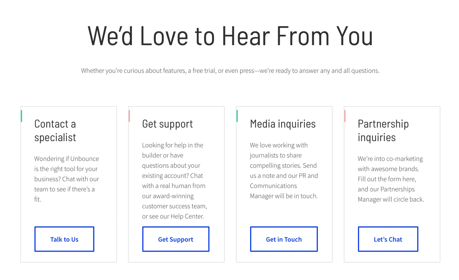
As soon as interested parties click on the Talk to Us button, they’re taken to an enquiries contact page.
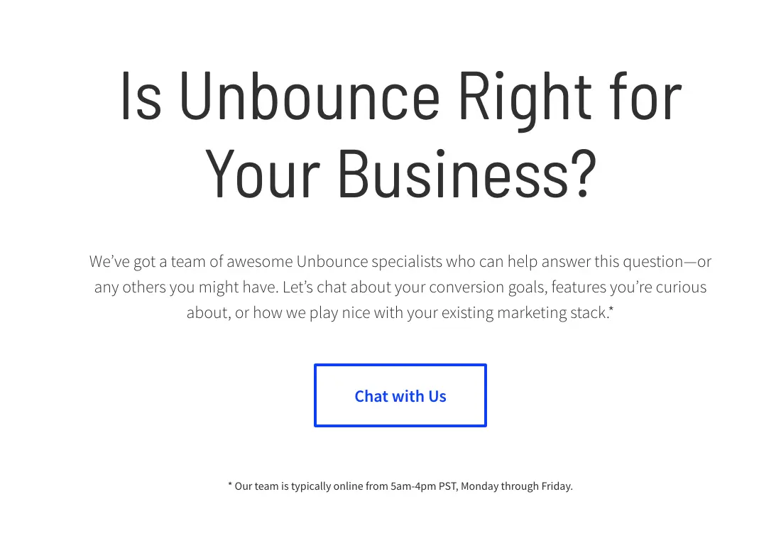
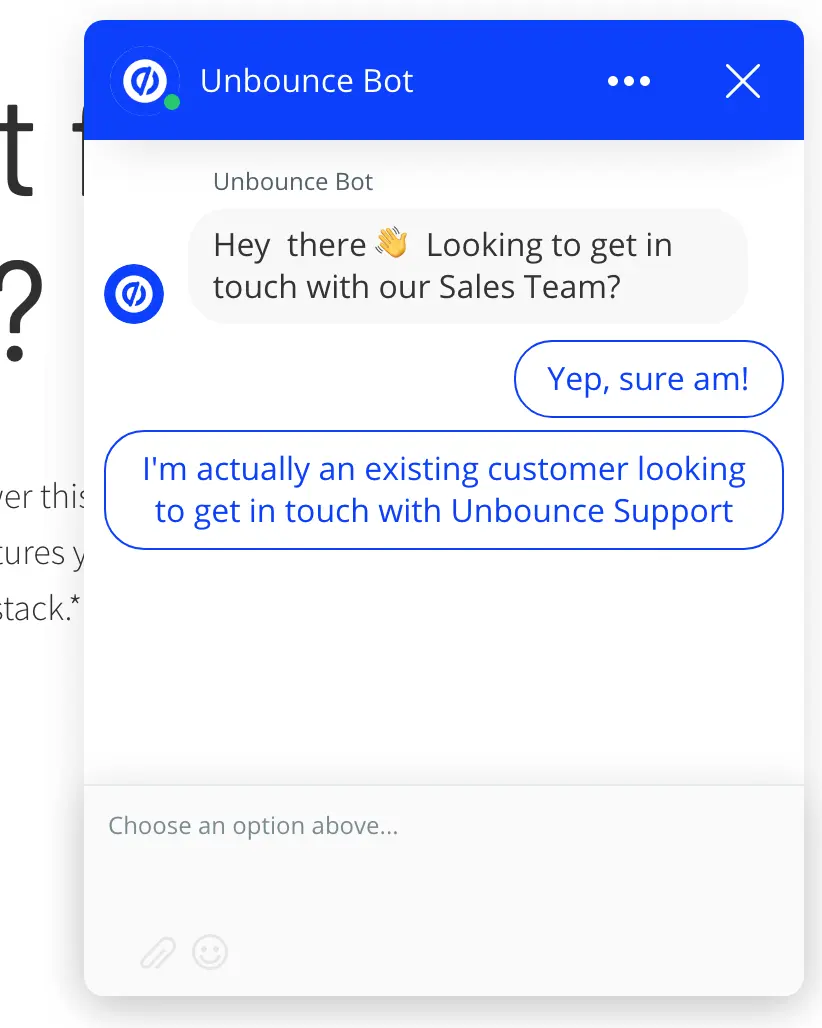
One click of the Chat to Us button and users are greeted with a chatbot powered by Unbounce’s own chat engine, which you can also make use of by choosing Unbounce as your landing page builder (it happens to top our list of best landing page builders).
Unbounce doesn’t rely on chatbots taking care of everything for them, though. Users can scroll down and fill out a more traditional contact form to pitch any questions they might have.
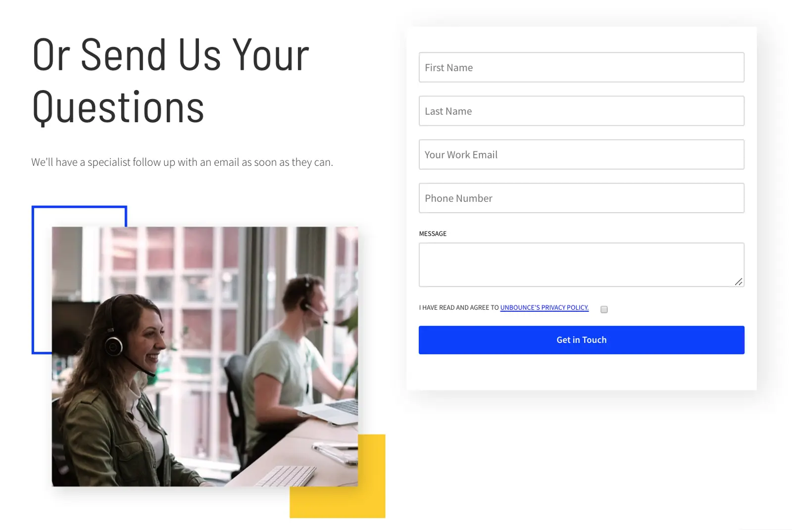
By this point, Unbounce has prompted users into leaving specific types of queries but it doesn’t stop them from putting other questions or enquiries to them. Clearly, it’s prioritising sales enquiries but it’s not closing the door on other interactions and this setup makes it easy for the company to segment messages by value/importance.
08Pixpa
Pixpa goes for the unintimidating three-field contact form and, aside from using the default Submit button, I haven’t got any criticisms. What really sets this contact page apart, though, is the use of calls-to-action above and below the form.
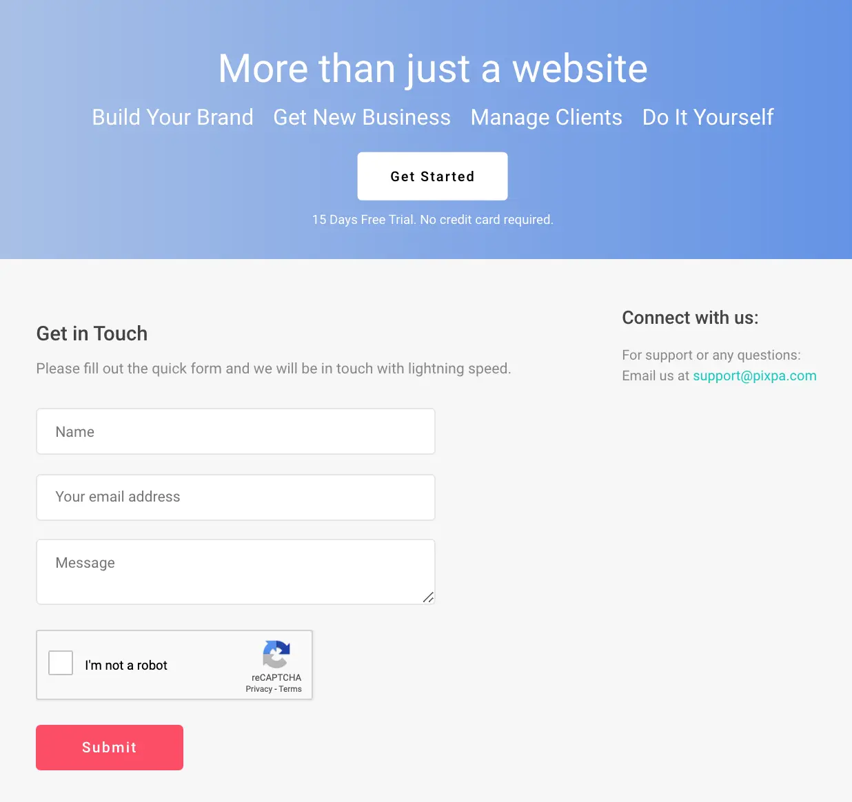
Before users can fill out a single field they’re reminded about why they should be signing up for a free trial instead. That’s not just any call-to-action sitting above the contact there either, it’s a damn good one – and the one waiting just below it is arguably even better.
After all, who wants emails when you could be getting sales instead?
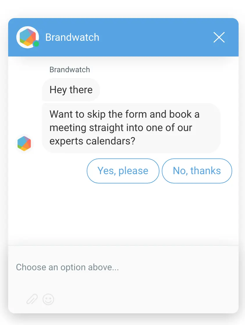
09Brandwatch
Brandwatch takes a more traditional approach to form design on its contact page with a classic vertical layout.
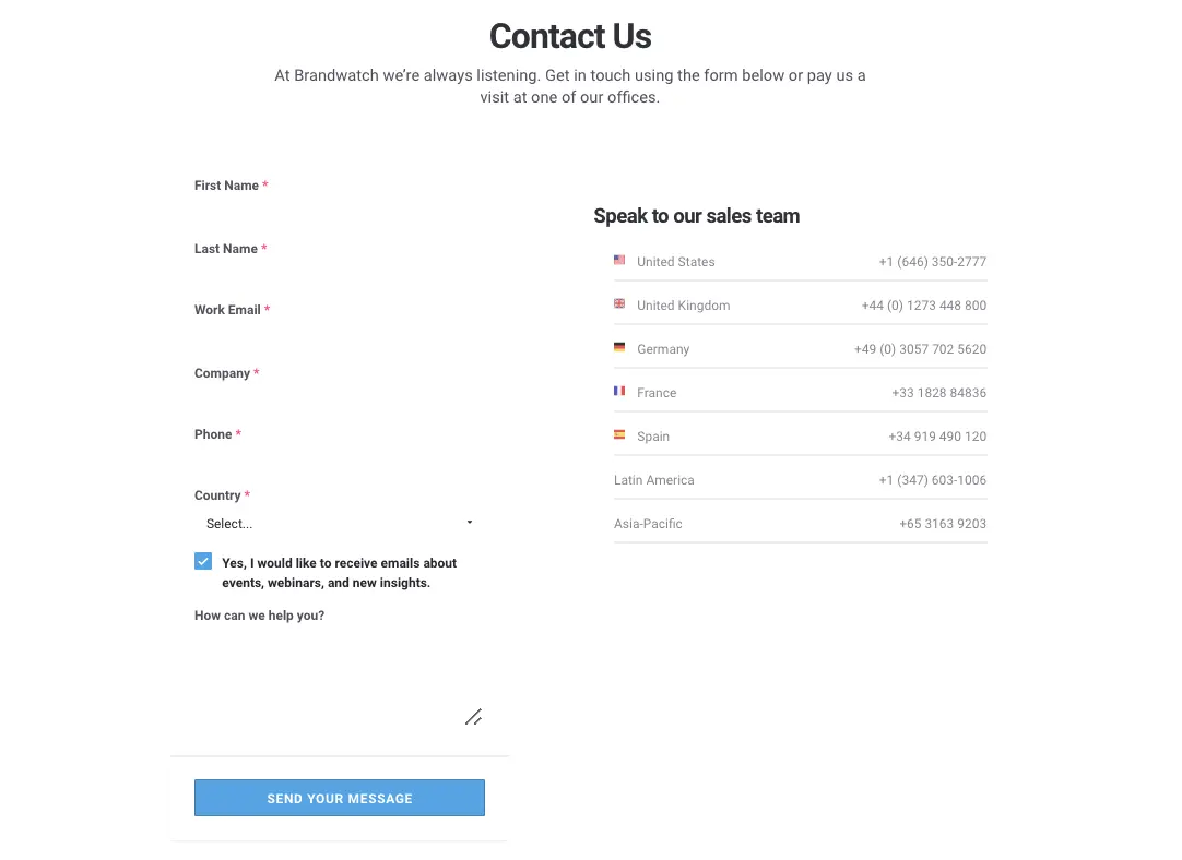
As you can see, the company vertically stacks five input fields and one drop-down list - all of which are required fields - over a textarea for users to write their message.
What Brandwatch is doing here is telling people that they’re going to have to hand over that information if they want to get in touch. In other words, it’s not worth the company’s time dealing with contacts that don’t provide this information and this is their call to make.
Sometimes, it’s worth having a lower total conversion rate if you end up with a list of contact’s that’s more valuable, albeit smaller.
Brandwatch also uses inline form validation to highlight fields that users fail to complete or fill out incorrectly. This encourages users to provide all the necessary information but it also gives them visual feedback to help them avoid common mistakes.
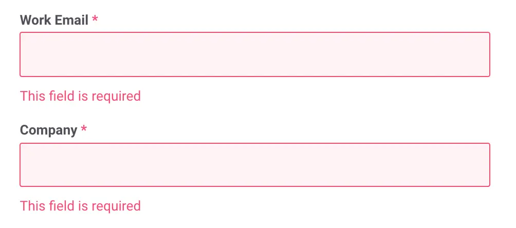
Good form validation should provide users with feedback as they fill your form out so they can see any mistakes before hitting the submit button. At the very least, you want to make sure users have typed in a valid email format (unlike above) and the same goes for phone numbers, if you’re asking for this information.
If you’re thinking this doesn’t look like a high-converting contact form, then you might be right - but Brand watch has another trick up its sleeve.
The company uses a platform called Drift to place chat widgets on its website, including its contact page where the bot delivers a special message.
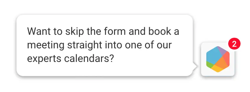
Users can skip the contact form altogether and book a meeting with one of Brandwatches experts by clicking on the message above and engaging with the friendly chatbot that promptly pops up.
Now, if you’re wondering how effective this has been for Brandwatch, there just so happens to be a case study on the Drift website that explains how much of an impact its chat software has had.
We’re talking about a 12.5% increase in leads, 8,300 total conversions via Drift, 674 meetings booked through the bot and 1,300 email captures.
Not bad.
Brandwatch is by no means the only company using Drift to enhance its contact page, either. You’ll find a whole bunch of case studies on the Drift website and one of my other favourite examples is Campaigner.
Campaigner is one of the best email marketing solutions for e-commerce brands and it takes a no-nonsense approach to contact page design by simply not having one.
When users click on the “Contact us” link, they’re greeted by Reggie, another friendly chatbot powered by Drift.
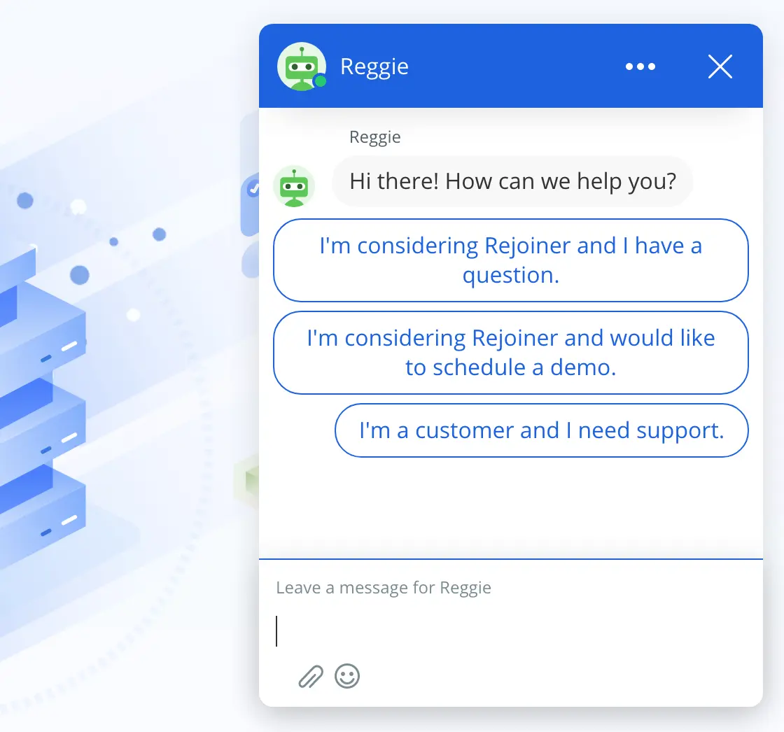
Let me be clear, I’m not recommending anyone to remove the contact page from their website but Campaigner does provide a fitting (even if extreme) example of the alternatives to traditional contact forms.
And, if you like the idea of adding this kind of bot to your contact page/website, simply visit Drift for more details.
10Yummygum
Dutch design studio Yummygum opts for a two-step process to its contact form, which pops up as soon as users click the Contact button located in the site’s header.
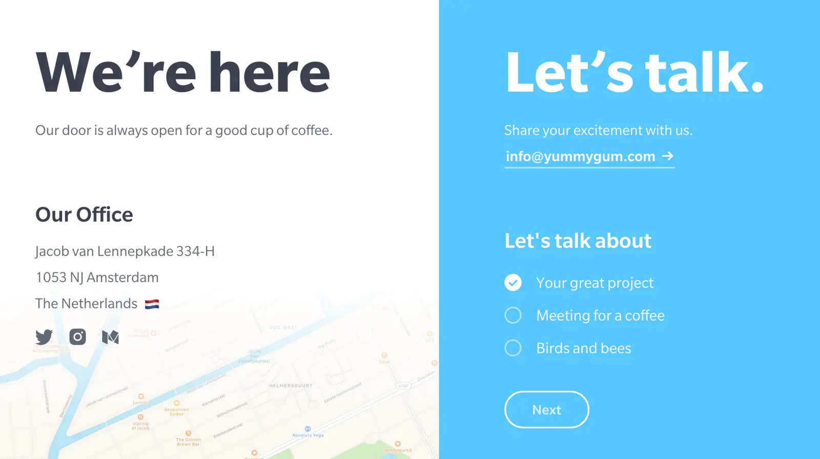
Notice how the copy is very friendly, quite literally inviting people to get in touch with its team. You might not be comfortable with such a casual tone for your own brand (birds and bees anyone?) but you can see the benefit of choosing welcoming language on your contact page.
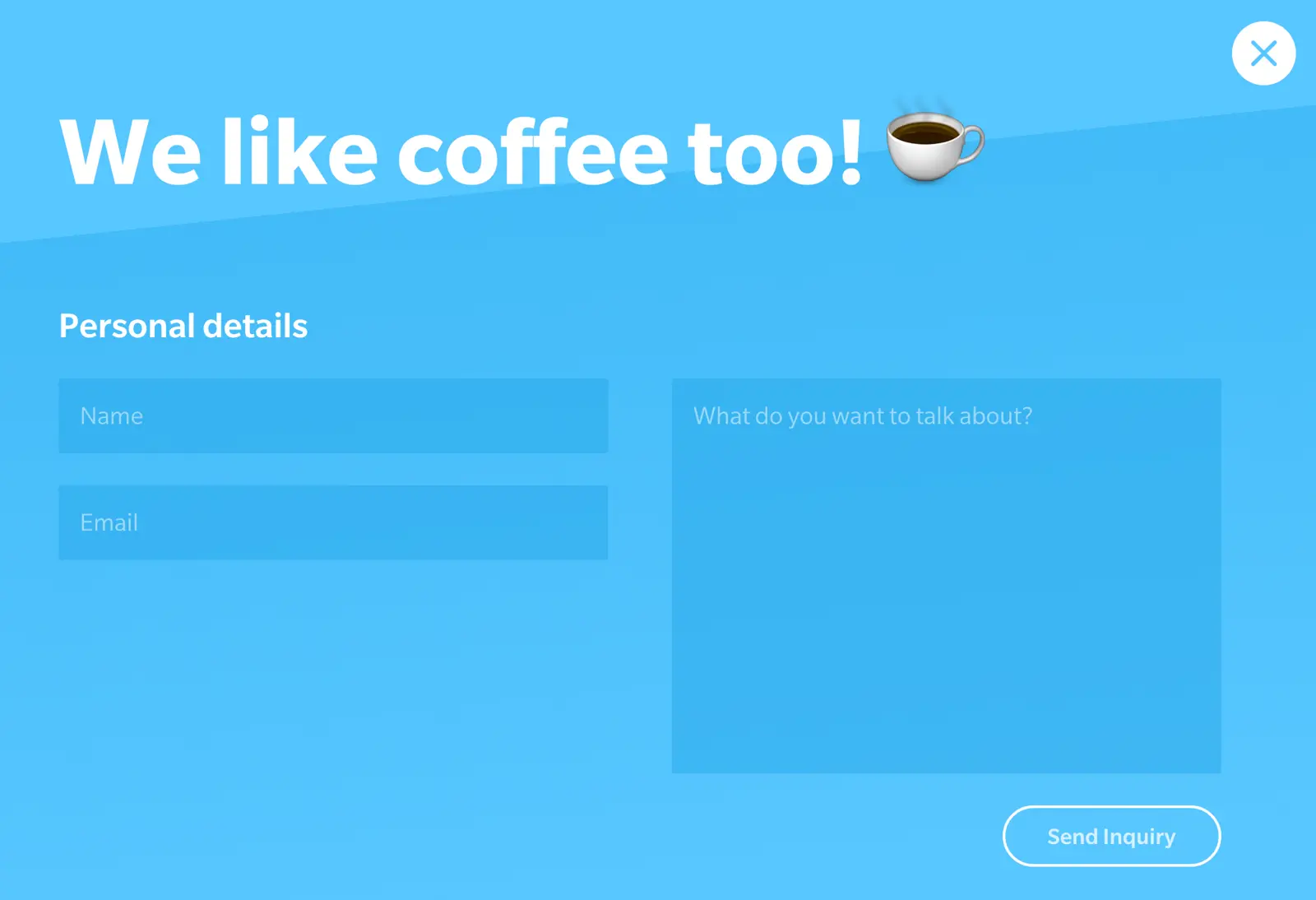
Hitting the Meeting for a coffee option brings up a nice and short general enquiry form while the Your great project selection returns a more in-depth form.
We won’t tell you what the Birds and bees option comes up with.
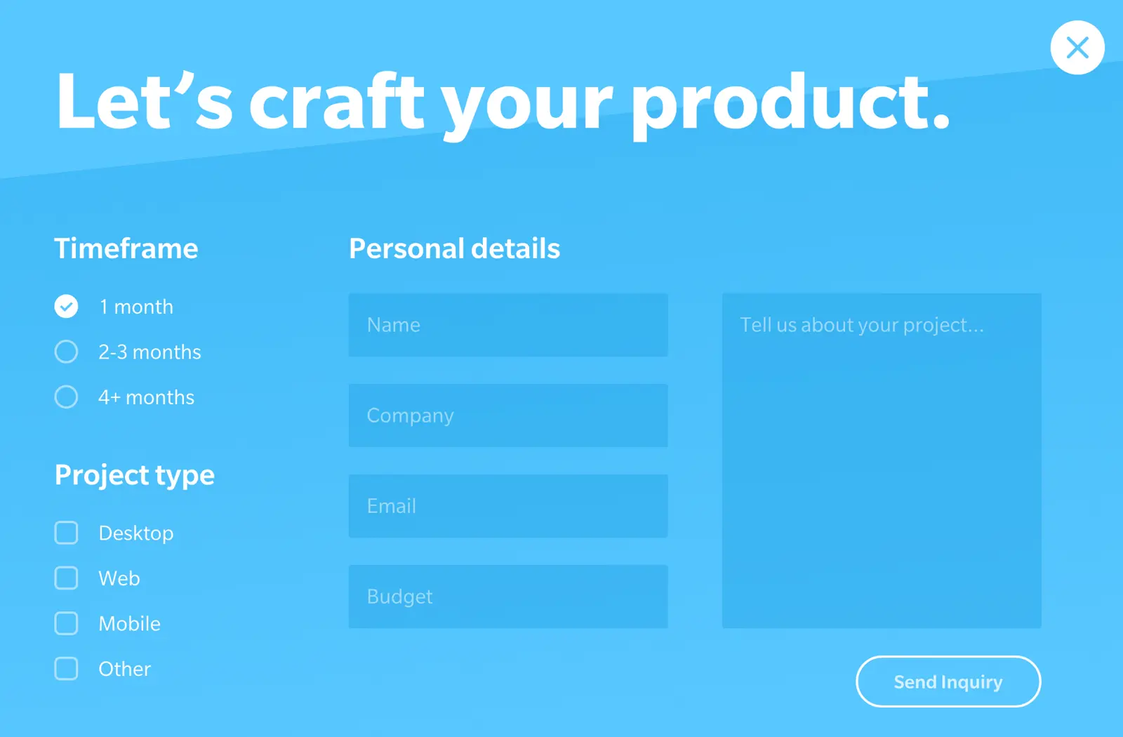
11Mary Lou’s fullscreen design
Our first example today was a multi-step concept by designer Mary Lou and we’re back with another piece of work by the talented woman. This time we’re looking at a fullscreen, multi-step offering that would make a fine alternative to the traditional contact page.
This concept would be perfect for the kind of no-contact-page approach used by Yummygum, where the form pops up as soon as users click on your contact button.
By guiding users through each stage of your form, you’re able to get more information from them without those lengthily forms that put so many people off.
If you like this multi-step design, you can download the source code from Codrops and customise it to meet your needs. You will need some HTML, CSS and PHP skills - or a developer with the same skills - to work with the source code, but this can be a good option if you want something a bit different from typical WordPress plugin contact forms.
12Active Campaign
Active Campaign brings us back to design concepts for contact pages that need to offer multiple options for users. We’re not talking about the most exciting design here, but it really gets the job done in a simple, effective way.
Each option is made clear to users and Active Campaign is able to provide the relevant form (or another resource) depending on their answer. Few of the examples we’ve looked at today provide visitors with seven distinct options in such a concise way.
The visual form design is nothing to get excited about but ActiveCampaign has already segmented interest by the time users get this far so it doesn’t take a very complex form to get the job done by this stage.
Users don’t even need to type in their name - they simply need to select an enquiry type in the first field (more segmentation) and provide their email address before writing their message. There’s also an option to add attachments for users with technical problems (e.g.: for attaching screenshots of an issue with the software).
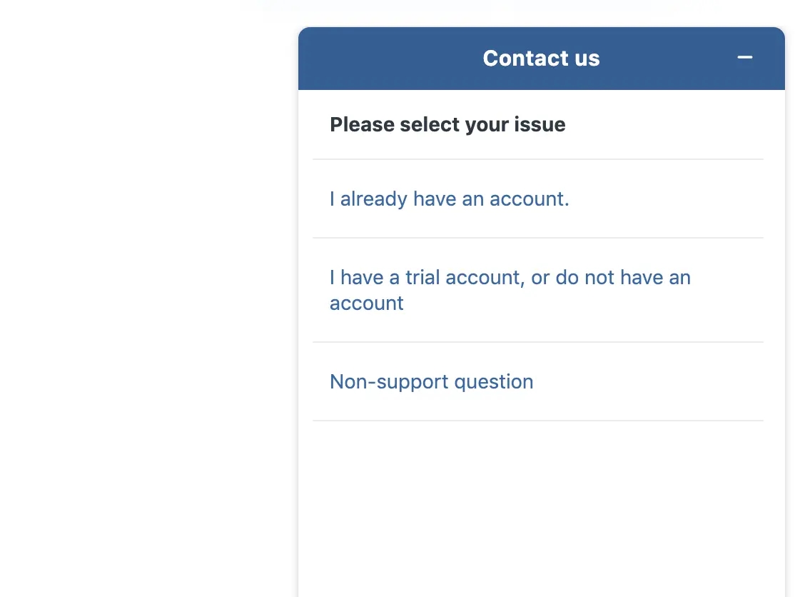
If that doesn’t do the job, ActiveCampaign also has its own live chat system and you can use this feature on your own website by signing up to ActiveCampaign.
For the record, ActiveCampaign is the best all-round CRM, email marketing and marketing automation software platform that we’ve used in almost a decade here at Venture Harbour and it still powers the majority of our marketing strategies to this day.
If you’re looking for an all-in-one solution to customer management and marketing automation, you definitely want to try out ActiveCampaign’s 14-day free trial.
13Mailerlite
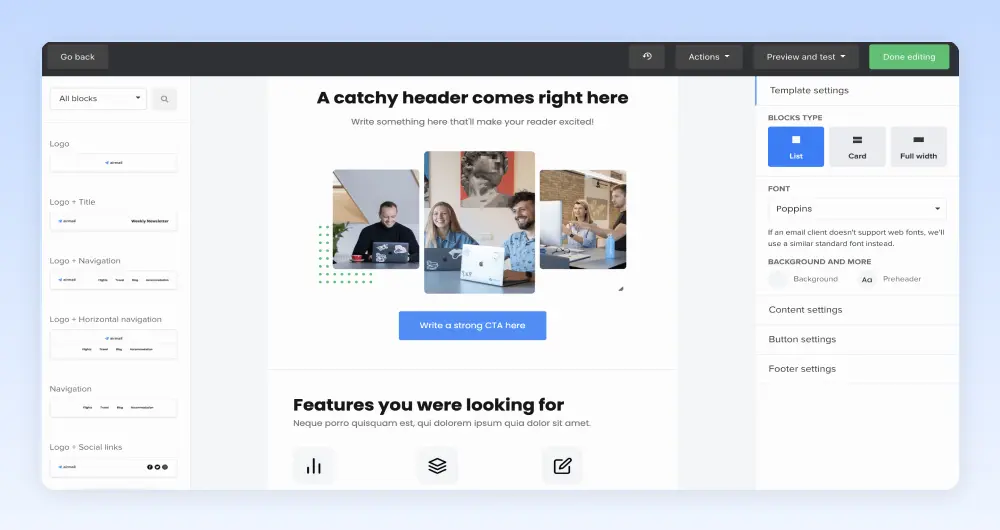
MailerLite is another email marketing platform that’s designed more for the smaller businesses and entrepreneurs of this world. Regardless, it packs some impressive features and this includes its own dedicated form builder tool.
Admittedly, it’s not the most advanced builder on the market and it doesn’t provide any form analytics to help you optimise and improve performance. However, it does make it very easy to create simple, effective contact forms and contact pages.
MailrLite’s own contact page is about as good as an example as you’ll find.
MailrLite is a business run almost entirely by remote workers and its products are largely designed for remote professionals, entrepreneurs and freelancers. This means the company can’t have a sales and support team in the same vein as a company like ActiveCampaign and many of the other examples we’ve looked at today.
So it relies on a simple contact form and email automation to segment and handle queries.
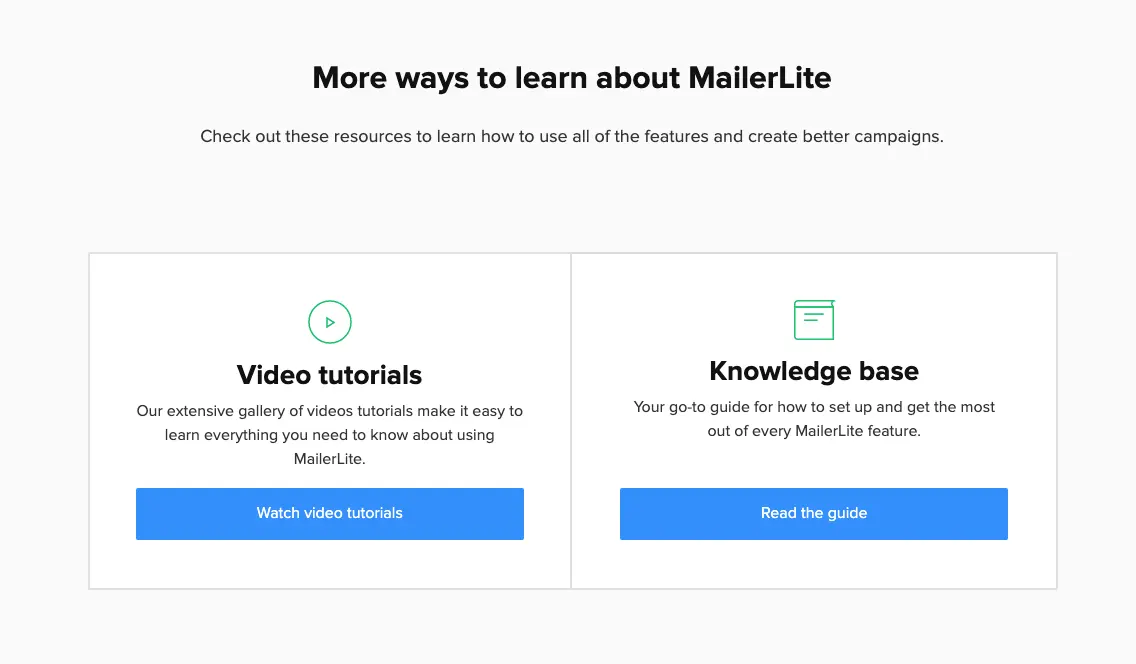
For technical support, it encourages users to turn to video tutorials, its knowledge base and user guides to solve basic problems. For more pressing matters users can contact the support team although they’ll have to wait for a response.
While this might not be the ideal customer support setup, it is a good example of how small businesses can provide online resources to mitigate a lack of a complete support team.
14Tune
Tune is another company that includes key conversion goals on its contact page, alongside a simple form and a chat widget. To draw attention to its conversion goals, Tune simply uses hyperlinks to highlight text in blue and communicate to users that they can click to complete the action described.
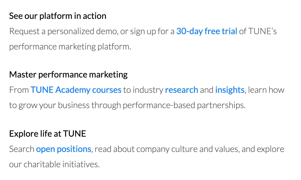
Once again, Tune is encouraging people to complete valuable actions rather than simply filling out contact forms with generic messages. Unsurprisingly, the company is more interested in people signing up for 30-day trials than reading messages that say “hi”.
Users that don’t find what they’re looking for in blue text can always fill out the contact form - a simple, no frills design in itself.
Tune is actually using Marketo to create its forms and this, admittedly, isn’t one of the platform’s biggest strengths. But this is another example of the contact form taking a back seat while Tune encourages users to complete specified action and uses a chatbot to capture leads who might otherwise slip away.
Another powered by Drift, no less.
14The footer form
One approach we don’t see too often is footer form designs, but they can be highly effective. In addition to having a contact page, this approach puts a contact form in your website’s footer, essentially turning every page into a contact page.
In the case of Creative Design Architects, they’ve gone for footer forms instead of a dedicated contact page. However, we always recommend having a contact page as users tend to expect them and they’re also important for local SEO.
Getting back to the footer form, these can be a great way to get people involved with your brand once they reach the bottom of your page. Which is why you’ll see a lot of calls-to-action towards the bottom of important pages - and there’s no reason you can’t have both.
15Creative Design Architects
One approach we don’t see too often is footer form designs, but they can be highly effective. In addition to having a contact page, this approach puts a contact form in your website’s footer, essentially turning every page into a contact page.
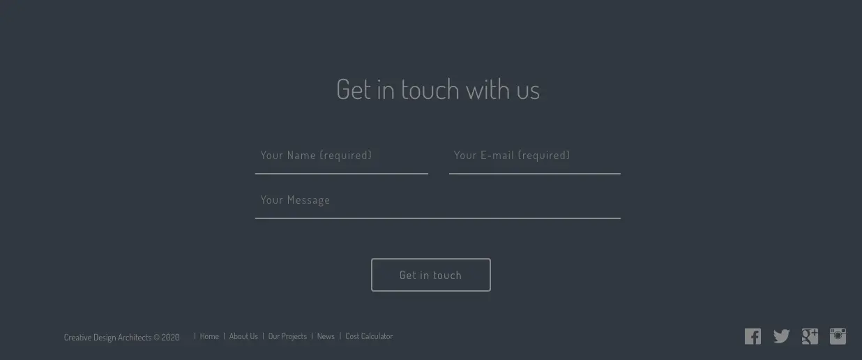
In the case of Creative Design Architects, they’ve gone for footer forms instead of a dedicated contact page. However, we always recommend having a contact page as users tend to expect them and they’re also important for local SEO.
Getting back to the footer form, these can be a great way to get people involved with your brand once they reach the bottom of your page. Which is why you’ll see a lot of calls-to-action towards the bottom of important pages – and there’s no reason you can’t have both.
And, if you’d like to create this kind of contact form on your website, you might be interested to know this was all achieved using the Contact Form 7 plugin for WordPress.
Are your contact forms getting results?
Too many businesses neglect their contact forms and this cuts off a valuable lead generation tool. The examples we’ve looked at in this article illustrate how you can make your contact pages and forms work for your business, both increasing the quantity and quality of queries coming your way.
A lot of the examples we’ve looked at use techniques to segment and qualify these leads by restricting options or guiding users towards specific types of interactions - e.g.: quote requests, sales enquiries, technical questions, etc.
This allows them to filter out the queries that are less valuable and focus on those that represent genuine business opportunities.
We’ve seen a wide variety of design approaches here but every example has one key thing in common: defining specific goals and then designing contact pages and forms that encourage users to complete desired actions.
This is the approach you should be taking with your contact forms.
FAQ
What are the key elements of an effective contact form?
An effective contact form should minimise friction by requesting only essential information whilst maintaining clear visual hierarchy and logical field ordering. The article’s featured examples demonstrate that successful forms typically include a compelling headline, intuitive layout, and a single prominent call-to-action button that stands out visually.
How many form fields should a contact form have?
Contact forms should include only the minimum fields necessary to capture qualified leads, typically between 3-5 fields for basic enquiries. Adding unnecessary fields significantly increases abandonment rates, so prioritise name, email, message, and one qualifying field relevant to your business.
What makes contact form design best practices different in 2026?
Modern contact form design in 2026 prioritises mobile-first responsive design and progressive disclosure over lengthy single-page forms. The best examples now incorporate real-time validation, conversational interfaces, and intelligent field progression that adapts based on user responses.
Should contact forms be single-column or multi-column?
Single-column layouts significantly outperform multi-column designs for contact forms because they reduce cognitive load and improve mobile responsiveness. Multi-column layouts create scanning difficulties and perform poorly on mobile devices, which now account for over 60% of web traffic.
How can I improve my contact form conversion rate?
Improving contact form conversion requires removing unnecessary fields, adding trust signals, and optimising button copy beyond generic ‘Submit’ text. The article’s examples show that specific action-oriented buttons like ‘Get Started’ or ‘Send My Enquiry’ typically convert 20-30% better than standard alternatives.
What colour should contact form buttons be?
Contact form buttons should use high-contrast colours that stand out from your page background whilst maintaining brand consistency. The featured examples demonstrate that buttons using contrasting colours like orange, green, or blue against neutral backgrounds achieve significantly higher click-through rates than low-contrast alternatives.
Is form validation important for contact forms?
Real-time form validation is essential for reducing user frustration and improving completion rates, as it provides immediate feedback before submission. Modern contact forms validate email formats, required fields, and phone numbers as users type, preventing submission errors and reducing support inquiries.