


The golden rule of web form optimisation is simple: shorter forms mean higher conversions. But is this really the case? Yes, shorter forms generally require less work from users and logic suggest fewer form fields reduce friction. Generally speaking, this is a good design principle to start from.
However, like many best practices, this theory doesn’t always pan out. In many cases, we see reducing the number of fields in tests can actually reduce conversion rates - so what’s going on here?
Form length is important - nobody is disputing that - but it’s not always a simple question of fewer fields leading to more conversions. To help illustrate this, I’ve got five case studies for you today that illustrate form length really impacts conversion rates. But firslty:
What is a Form Conversion?
A form conversion is when a user or visitor to your site successfully fills out and submits a form on your website. Generally, form conversions tend to be smaller, leading to a larger conversion down the line, such as a sale of a product or service.
Examples of longer forms
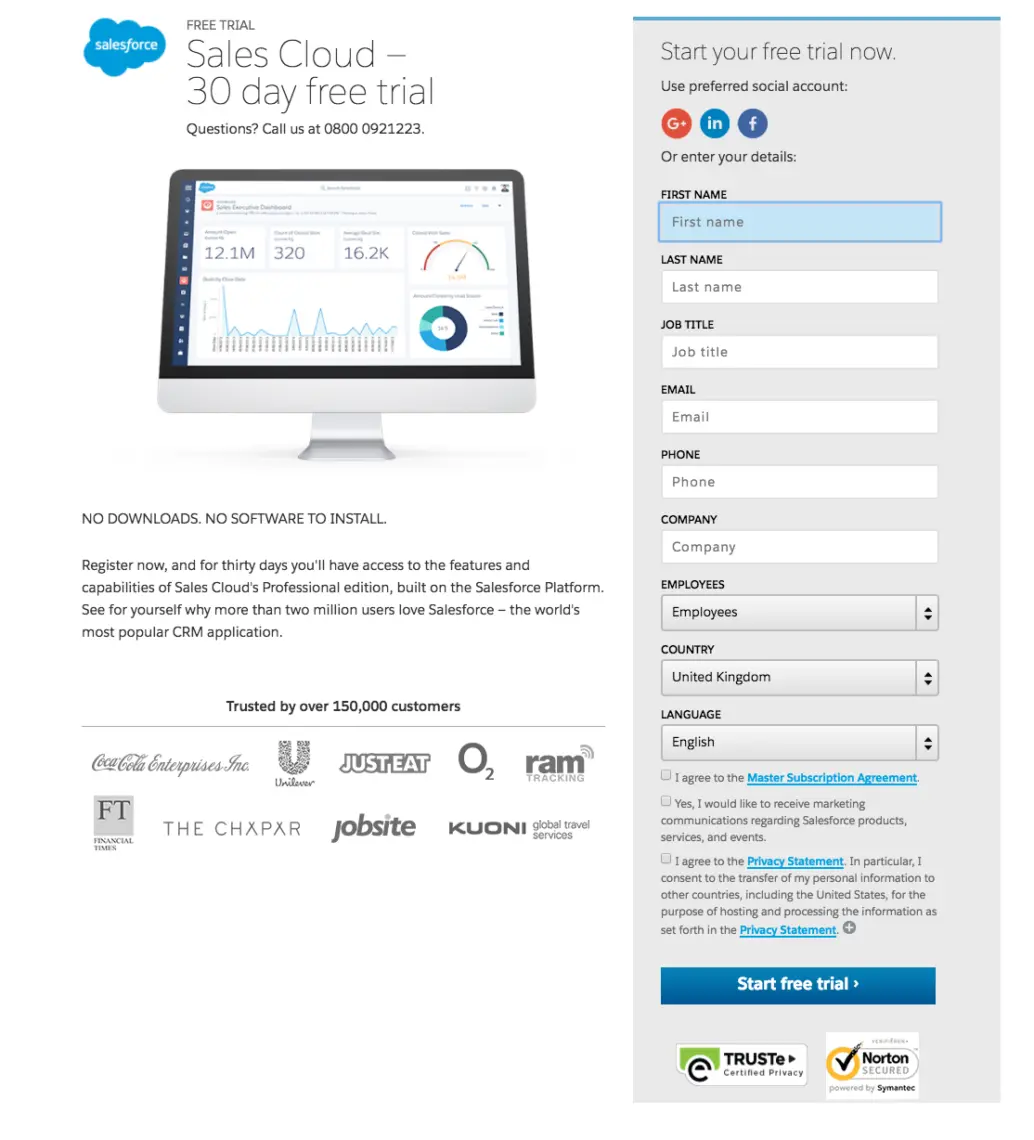
Before we get into the case studies, let’s take a look at some form designs that go for the longer approach. First up is Salesforce, which goes for six custom fields, three dropdown lists and three tick boxes:
Next up we have WhatIsMyComfortZone.com, which asks 30+ questions from users over different sections:
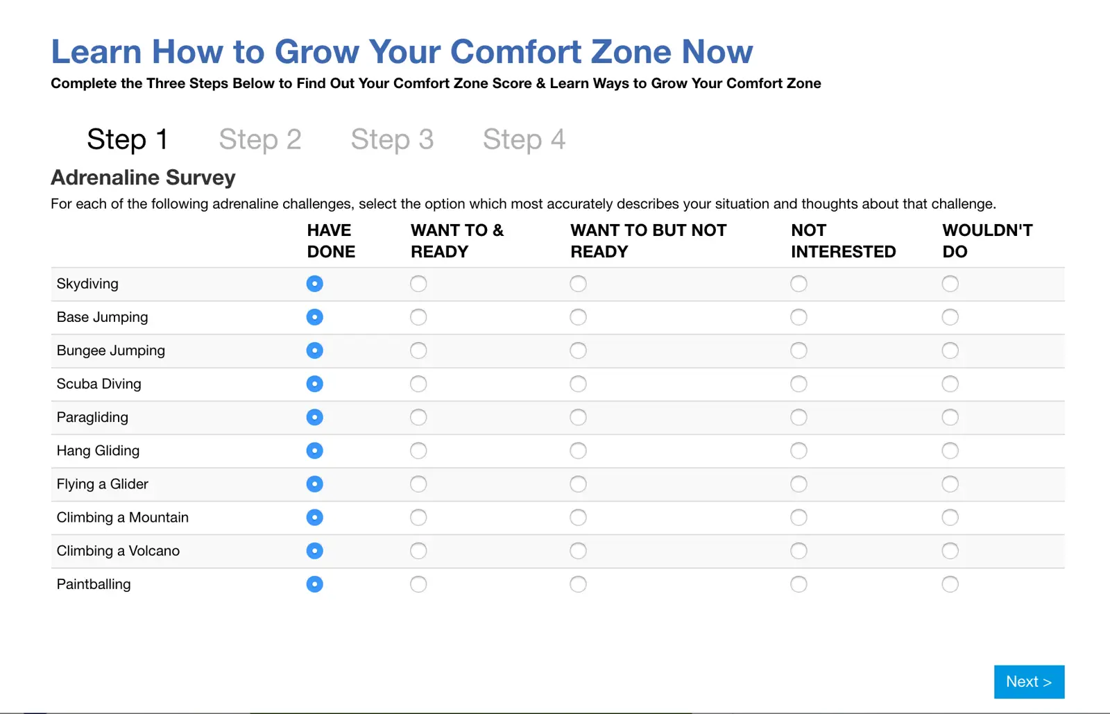
That’s basically wiping your backside with the UX rulebook on form design, yet this site brags an incredible 50%+ conversion rate.
Case study #1: The expected result
Our first case study comes from MarketingExperiements and it offers up the kind of test we would normally expect in this scenario. Marketo reduced the number of fields on its sign-up form and progressively increased conversions.
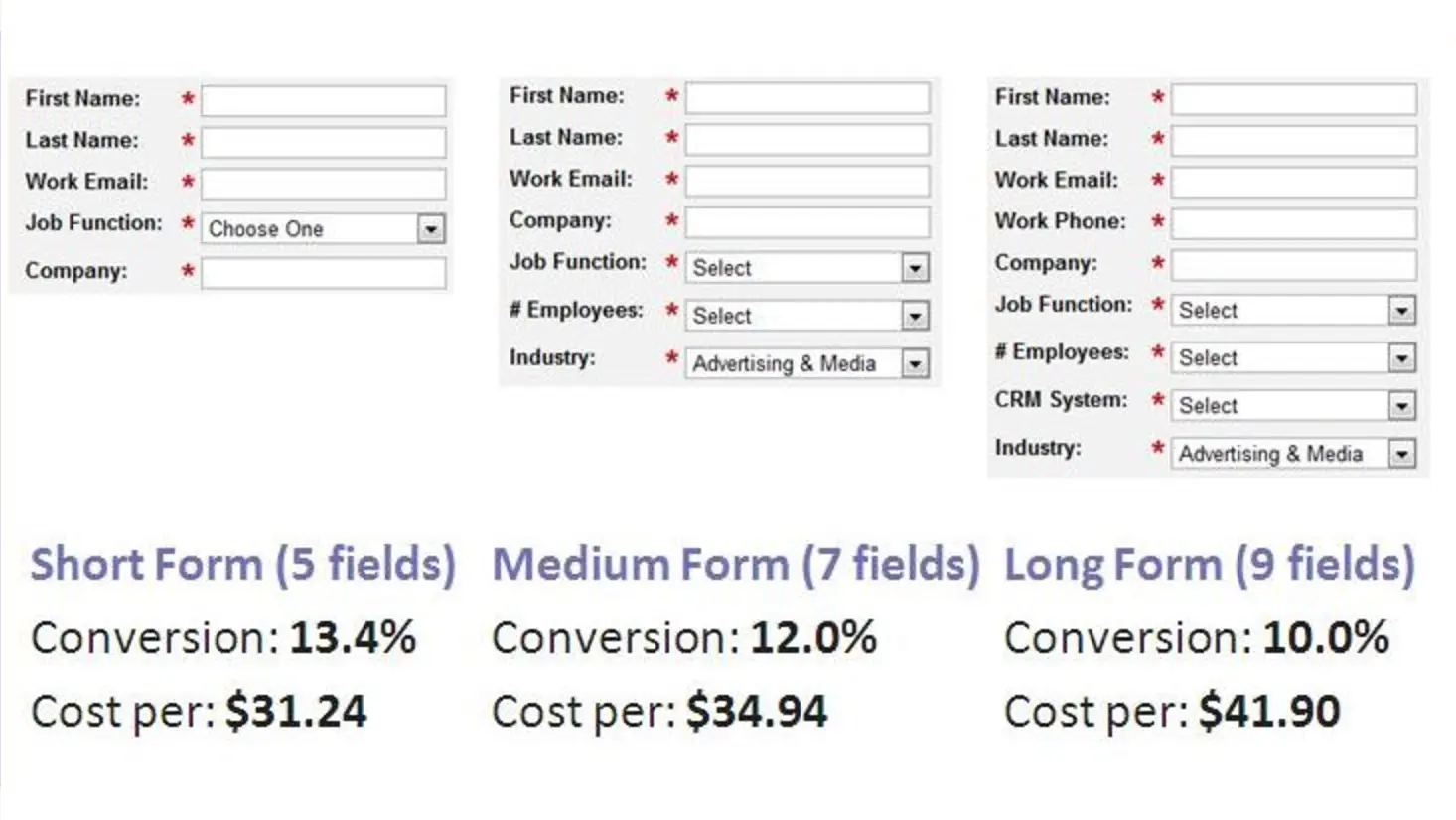
This was all the way back in 2011 and it was studies like this one that led to the best practices we accept today. Design guidelines tell us to stick to five fields or fewer in order to reduce friction and, in theory, increase conversions.
However, nothing is ever quite so straightforward in marketing.
Case study #2: The unpopular result
This one comes courtesy of ConversionXL, which brings up recent research from Unbounce conversion optimiser Michael Aagaard. Testing field length with one of his clients revealed the exact opposite result to our first case study.
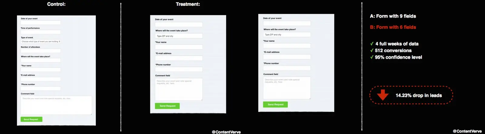
Reducing the number of fields resulted in a 14% drop in conversions. This wasn’t the result Michael was expecting, of course, and he was determined to figure out what happened. He stumbled across a simple, easy-to-make but important mistake:
“I removed all the fields that people actually want to interact with and only left the crappy ones they don’t want to interact with. Kinda stupid.” - Michael Aagaard, speaking at CTA Conference
By putting these fields back in and testing variations of field labels instead, Michael was able to reach a 19.21% increase in conversions.
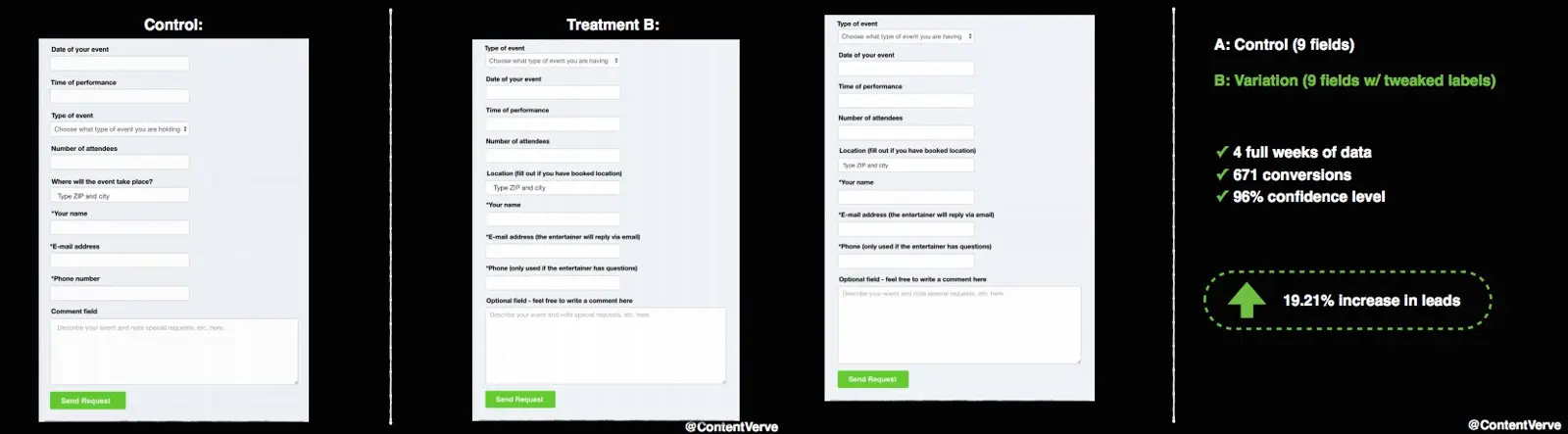
The key takeaway is that sometimes users want and expect more fields. Consider someone looking for an estimate on the value of their house, for example. They understand it’s going to take more than a name and an email address to get their answer.
Context is very important here.
Case study #3: Conversion rates and lead quality
This video case study from MarketingExperiments isn’t the most enjoyable watch, but its findings are interesting and detailed. In this case, a form with 11 fields was tested with two variations: one with 15 fields and one with 10 (plus some other variations).
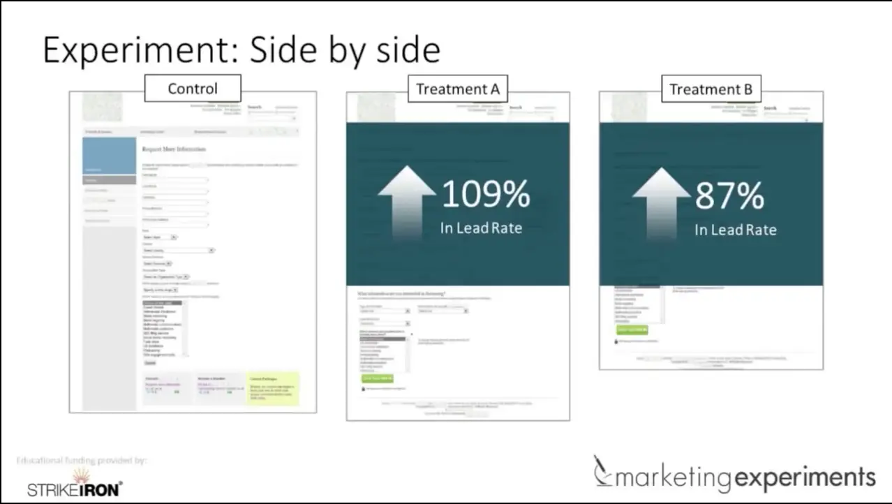
The form with 15 fields resulted in a 109% uplift in conversions and the form with 10 saw an 87% increase. By applying the insights from this test to a membership form, conversions were then increased by 226% from asking more questions.
Except the goal isn’t purely increasing conversions in this case study. The goal is to also increase the quality of leads coming in by collecting enough data to validate each lead. This data tells you how to engage with the people who fill out your forms in the future - you need to decide when and how to get that information.
Case study #4: Moving beyond form length
The reason I want to point out this case study is to show that form length is by no means the only factor you have to consider when designing forms for conversions. This test from non-profit organisation DTS aimed to find out whether copy on its donation page would encourage more people to donate.
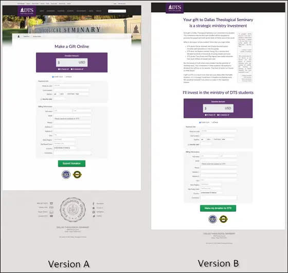
In terms of form length, nothing was changed at all. However, the addition of copy above the form reduced conversions by 28%. It turned out placing copy above DTS’ donation form got in the way of people who were already motivated to convert.
The point is, form length isn’t necessarily the biggest factor in form conversion rates. Imagine this test in reverse, if the original version had copy at the top of the page. Placing too much attention on the number of fields would make you blind to one simple change that results in a significant conversion increase.
Case study #5: The multi-step alternative
Finally, one of our own case studies brings us back to the WhatIsMyComfortZone.com example from before. In this case, formatting 30+ questions in a four-step form resulted in an incredible 53% conversion rate. In this case study, Venture Harbour CEO Marcus Taylor takes us through other examples where multi-step forms increased conversions by 35% for BrokerNotes, 59% for Vendio and 214% for an astroturf company.
Multi-step forms allowed these brands to significantly increase the number of fields without negatively impacting user experience. In fact, many designs psychologically reduce friction because users don’t know exactly how many questions they’ll be asked. The sight of multistep forms is less intimidating, despite the fact they require more from users.
You can also start with less-demanding questions and finish with things like email addresses, once users have already invested time and feel more reluctant to quit the session.
So longer forms convert better than shorter forms?
No, not necessarily. There are too many factors involved in form design to simply turn around and say shorter or longer forms are more effective. Certainly, you want to ask the least number of questions possible to reach your targets, but there are various things to consider:
- The type of conversion: Email sign-ups and account creations demand very different forms.
- **User expectations:**If users see value in filling out a field, they’ll be happy to do so.
- Incentive: With this in mind, can you create incentive to reduce friction?
- How much info you need: Sometimes adding friction is the price you pay for quality leads over quantity.
- Formatting: Multi-step forms create space for much longer forms, formatted in a design that reduces friction.
- Best practices: These are guidelines, not rules. Accepted design trends don’t always work out.
The fact remains that the harder you make it for people to fill out your forms, the less likely they are to do so. In most cases, longer forms only add to the difficulty of completion but there’s one other key factor to consider, which we touched on above.
Applying BJ Fogg’s behaviour model to form design
BJ Fogg’s behaviour model illustrates the key elements behind users taking action: Motivators, Ability, and triggers. In simple terms, the more motivation you give people and the easier you make it for them to take action, the more likely they are to do so.
Credit: Kristen Sunde, Slideshare
As for triggers, these are the interactions you place between users and the desired action: copy, form fields, CTAs, etc. And the sweeter you hit that balance between high motivation and ease-to-do, the better your chances of getting the action you want.
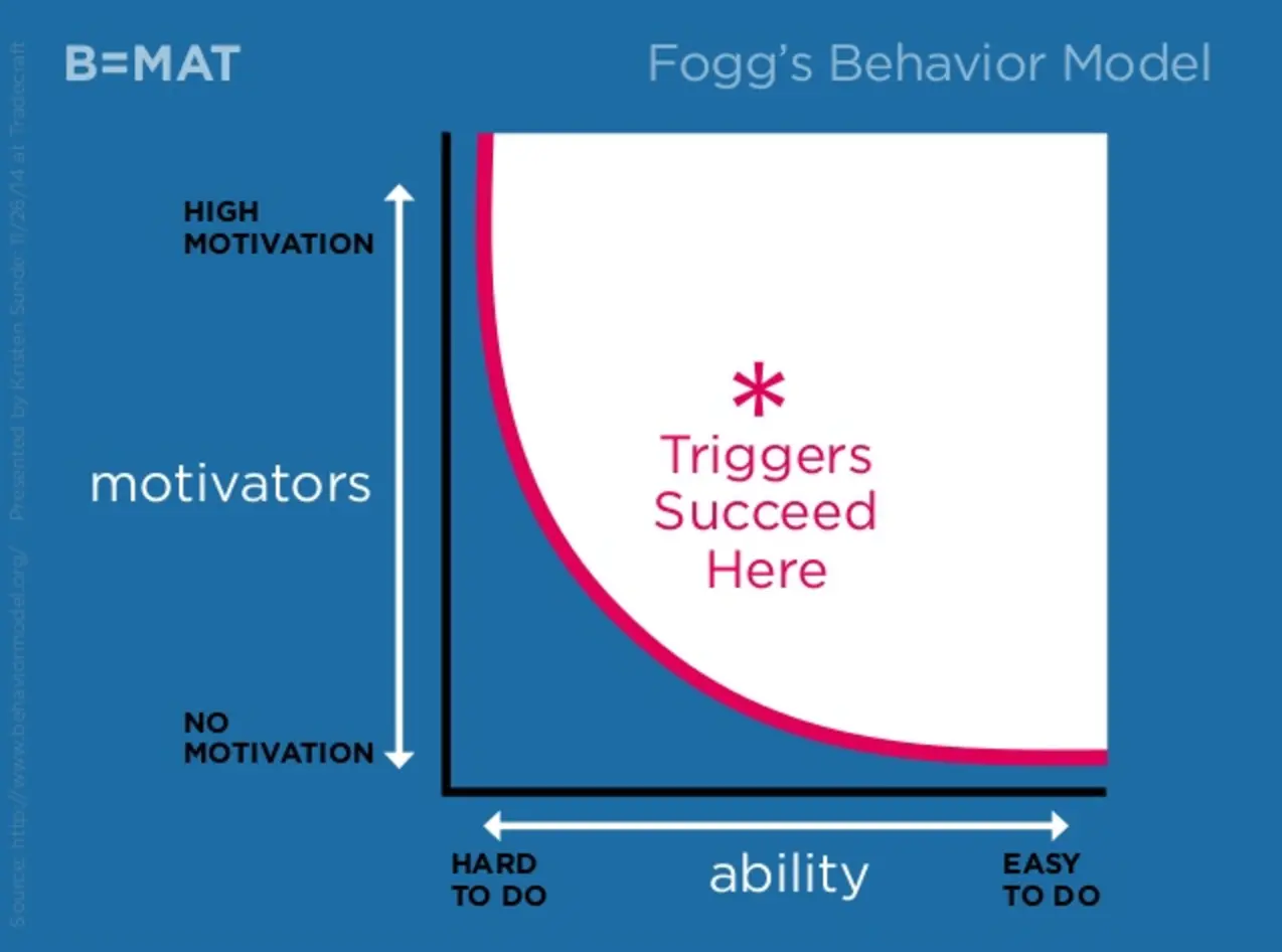
Credit: Kristen Sunde, Slideshare
This helps explain why longer forms can actually increase conversions. If you create enough motivation to complete your forms, the relative ease (e.g.: number of fields) becomes less important. Not unimportant, but less important. So, in the case of promising a faster response via phone if people enter their number, for example, adding this field could potentially encourage people to complete your form.
Make no assumptions
The biggest thing you learn from conversion optimisation is that you can’t afford to make assumptions. All logic suggests shorter forms should perform and there are plenty of case studies to back this theory up. The fact remains that short forms often beat their longer counterparts.
However, this isn’t always the case and we’re seeing more studies reveal cases where longer forms increase conversion rates. More importantly, form length isn’t the only factor you need to think about. How you format these forms to reduce friction and create user incentive to reach the finish line are absolutely paramount. The number of form fields you choose to go with is simply one of many factors to consider in this process.