The SaaS customer cycle is long and complex, requiring constant strategy, development and optimisation to maximise recurring revenue. To achieve goals at every stage of the funnel, you have to work with a lot of data to attribute user actions to campaigns and optimise the experience to guide customers towards the next conversion goal – and, let’s remember, there’s always a next conversion goal in the SaaS customer cycle.
In this article, we look at 50 essential KPIs and metrics for SaaS marketers to optimise the full customer journey and keep that recurring revenue coming in. These are the metrics that matter most to software companies, that’ll help you optimise marketing campaigns, your software products, pricing strategies and every other aspect of your SaaS business.
What are we looking at in this article?
In this article, we group each metric into seven categories for different stages of the funnel and SaaS marketing goals – eg: conversion goals and customer retention. Here’s a quick preview of the sections in this article and you can click on the blue link text to jump ahead to any section:
- KPIs vs metrics: A quick summary of KPIs, metrics and the difference between the two.
- Tools required: A brief description of the tools you need to track the KPIs and metrics we’re looking at in this article.
Before we start looking at specific metrics, we take a moment to explain the difference between KPIs and metrics – an important distinction to understand. Next, we have a quick look at the tools you’ll need to track all of the metrics covered in this article – because you can’t do it all with Google Analytics!
Then, we get into the KPIs and metrics for seven different categories:
- SaaS marketing: A selection of essential marketing metrics for software companies.
- Conversion goals: The most important KPIs and metrics for SaaS conversions.
- Revenue: The numbers that keep you profitable.
- Expenses: Key measures of expense across marketing, service delivery and more.
- Engagement: Usage metrics that help you predict how much recurring revenue will continue to roll in.
- Retention: The figures that show how many customers keep buying from you.
- Customer support: Metrics that show well you keep customers satisfied.
We’re not simply talking about marketing metrics in this article. We look at the KPIs and metrics to ensure every marketing action is profitable, maximise engagement to keep customers in love with your products and drive sustainable growth through increased recurring revenue.
First, let’s clarify the difference between KPIs and metrics.
KPIs vs metrics: What’s the difference?
As we’ve explained before, there’s a lot of confusion about key performance indicators (KPIs) and metrics but it’s crucial to understand the nuances of these two data types. The cause of this confusion is the overlap between these two phrases so remember this: All KPIs are metrics but not all metrics are KPIs.
- KPIs: Data points that measure the success or failure of your primary business and marketing goals.
- Metrics: Data points that provide more context behind the reason for failure or success.
If you consider the phrase “key performance indicator,” it describes the fact that these metrics are indicative of the most important performance factors for your business. So, at the company level, we’re talking about KPIs like profit, revenue and growth with metrics like customer retention rate and monthly active users providing the context behind these business KPIs.
At the sales level, data points like subscriptions, renewals and upgrades become KPIs with metrics like onboarding completion rates, free-to-paid upgrades and time spent in software helping you to understand the reasons behind sales performance.
Whether you’re working at the company level, sales and marketing, product development or specific campaigns (eg: a customer retention email campaign), your KPIs are the data points that directly align with your goals. So, if you’re running a CRO campaign to increase conversions, then conversion rate is your KPI and, if you’re running an email sequence to encourage subscription upgrades, then upgrades are your KPI.
As long as you know what your goals are, the KPIs should be quite obvious and, yes, you can have more than one KPI. Let’s say you’re optimising your software product to increase engagement, you may identify the following metrics as KPIs: daily active users (DAUs), avg. time spent in software and key actions per session. By increasing each of these performance indicators, you should (in theory) increase engagement and you could verify the intended impact of your optimisation efforts by attributing increased engagement to other metrics, such as renewals and upgrades.
Tools for tracking SaaS KPIs & metrics
To track all of the KPIs and metrics we’re covering in this article, you’re going to need more than a regular analytics tool. As a SaaScompany, you’re not only optimising a website to capture leads and convert customers, but also optimising a product to manage engagement, customer retention and every aspect of your platform as a service.
Here’s a quick summary of the tools you’ll need to track all of the KPIs and metrics we’re looking at today:
- SaaS analytics: A dedicated analytics system for software products with the flexibility you need to create custom metrics, dashboards and reports.
- Goal tracking: Software for specifying KPIs, goals and metrics to measure campaign performance.
- Feature management: Software for managing feature rollouts, testing and adoption.
- Subscription management: A platform for managing subscriptions and testing SaaS pricing models.
- Email marketing: Software for automating email marketing across the entire SaaS customer journey.
- Customer service: A system for managing customer and technical support.
Before we move on to our first group of KIPs and metrics, let’s take a quick look at some software recommendations for the six tools above.
SaaS analytics software
First up, you’re going to need an analytics platform that captures data from your website and your software products. You’ll find plenty of recommendations in a recent article we published on the best CRO software for SaaS companies, featuring 11 analytics and CRO systems for software products, web apps and websites.
Mixpanel is a great option if you’re looking for a dedicated analytics tool for optimising your site and software products – one of our recommended tools in the article linked to above.

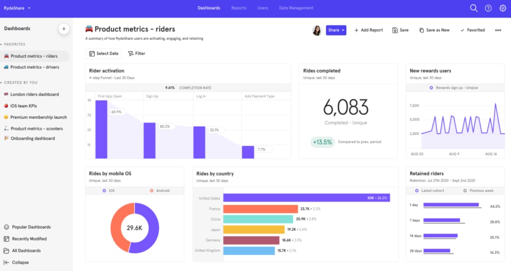
Mixpanel is one of the most comprehensive analytics tools on the market and it doesn’t waste any of its resources on other features like CRO, personalisation or in-app messaging. The company puts all of its effort into building the best analytics system it can and this shows in the depth and quality of its platform. If you want a specialist analytics tool for SaaS, this is the best option available right now.
If you’re looking for an all-purpose analytics and conversion optimisation system, VWO and similar options like Optimizely are great options. They offer less depth in terms of pure analytics, tracking and reporting but provide tools to help you turn data into action.
For the purpose of this article, though, a customisable platform like Mixpanel that allows you to create custom metrics and reports for almost anything is the top recommendation.
Goal tracking software
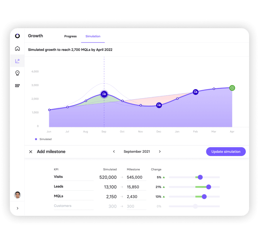
As we explained in the previous section, KPIs are directly aligned with your business and marketing goals so you need a system for managing this relationship. We use a platform called TrueNorth to manage campaigns, set trackable goals and measure campaign performance to make sure we’re hitting targets and optimise any campaigns that fall short of expectation.
For example, let’s say we’re running a series of campaigns designed to hit our growth targets for the next 12 months. We might define monthly recurring revenue (MRR) as our KPI and determine that by optimising to increase traffic, MQLs and customers, we can achieve our goal of $100K MRR by April 2022.

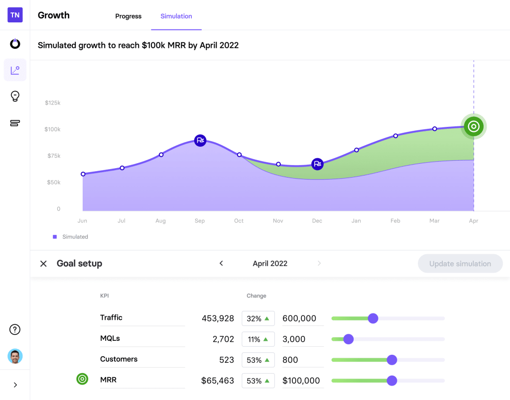
Using TrueNorth, we can set campaign goals, create reports in seconds and use the simulator to see what our targets are for metrics like traffic and MQLs in order to achieve our goal. So, if we manage to generate more traffic than expected, we can adjust our simulation numbers and see what impact this has on hitting our target MRR, which could help us beat our target or spend less on hitting it and invest more budget elsewhere (eg: product optimisation).
Alternatively, if we’re not on track to increase traffic numbers enough to hit the $100k MRR target, we could optimise our campaigns to address these issues or turn our attention to MQLs and start thinking about increasing conversion rates to capture more MQLs from a lower number of visitors.
TrueNorth puts responsive data in our hands so that we can react to the performance of campaigns faster and maximise the return on our investment.
Feature management software
Feature management software gives you control of feature rollout so you can build new functionality into your software and deploy features without interrupting the experience for users. You can also introduce features to specific audiences to test them out and address potential issues before making them accessible to everyone – an essential tool for any software business.
However, for this article, we’re more interested in tracking feature usage and adoption to understand how customers are interacting with new features and getting value from them. Essentially, you want to know that your features are increasing the “stickiness” of your platform, encouraging customers to keep using your software and helping them to achieve their own goals.
Again, many of the tools we looked at in our best CRO software for SaaS companies article include software management features, including VWO, Optimizely and Amplitude, as well as the dedicated feature management tool, LaunchDarkly.
Subscription management
Given the fact that SaaS products revolve around subscription models, this is where some of your most important KPIs and metrics are found: subscriptions, renewals, cancellations, upgrades, etc. A subscription management platform helps you optimise your plans and pricing strategies while making it easy to track some of the most important metrics related to revenue and growth.
Here at Venture Harbour, we’re currently using Paddle although this is a complete revenue management platform that includes subscription management and a fleet of tools for optimising payments, renewals, revenue and the whole finances of your business.
Paddle also offers the best tax compliance features (by a long way) that we’ve found among subscription management systems – the company takes full responsibility for compliance in each territory you operate, which removes basically all the risk and stress that normally comes with running complex SaaS plans across multiple countries or states with different tax regulations.
If you need help choosing the right subscription management platform for your business, make sure you take a look at our in-depth guide to the top subscription billing software for SaaS companies.
Email marketing software
Email marketing is the only channel that covers the full SaaS customer cycle and it’s your biggest weapon in moving customers from one conversion goal to the next. A quality email marketing platform tracks the completion of conversion goals from every email marketing campaign, as well as performative metrics, including email open rates and engagement.
We use ActiveCampaign because, aside from being one of the best email marketing platforms available, it also provides an advanced marketing and sales CRM to manage lead and customer data, as well as the best marketing automation features among any of the providers we’ve tried over the past 6+ years.
This allows us to create fully automated email campaigns that nurture leads and customers across the entire SaaS cycle. For example, we can create automated onboarding campaigns to maximise the number of users who successfully set up their account and start using our software on the first day and re-engagement campaigns to encourage customers to come back to our software if they start spending fewer hours in our product.

Another crucial feature in ActiveCampaign for SaaS analytics is its automated customer health score system, which analyses user behaviour to calculate the risk of churn. We can create campaigns for users at different scores to keep healthy customers excited about our product and incentivise low-scoring customers to achieve more with our products, improve their scores and increase the likelihood of renewals.
Customer service
The final tool we need to talk about in this section is customer service software for dealing with all of those technical support cases. ActiveCampaign has a built-in customer support system and we also use Intercom to add conversational support to our websites. Alternatively, you could look at options like Zendesk, which has a great system for SaaS companies, used by the likes of InVision, Mailchimp and Xero – more information on this page of its website.
The final section of this article looks at several customer support KPIs and metrics that’ll keep your customers happy and increase the chances of renewals.
One last thing to keep in mind about the tools we’ve discussed in this section is that you’re getting your data from several different sources – so you need a way to pull all of this data into a single analytics system. You want to work with this data, create reports and compare insights from a single interface rather than jump between different platforms and expert several datasets into another system.
First, check what integration options are available with each software option because you may find a combination that supports each tool. Otherwise, you’re going to have to look at APIs to automatically export data and send it to your primary analytics platform.
SaaS marketing KPIs and metrics
For our first group of KPIs and metrics, we’re focusing on SaaS marketing campaigns. We could write an entire article on marketing KPIs and metrics alone but we want to cover the full customer cycle in this article, so we’ve selected the following metrics as the most important or unique to SaaS marketing:
- Marketing qualified leads: The quantity of leads who demonstrate a genuine interest in your product.
- Leads by lifecycle stage: Tracking different types of lead across the customer lifecycle.
- Lead velocity rate: Measures growth based on the quantity of qualified leads you have, month by month.
- Lead to customer rate: The percentage of leads turning into paying customers.
- Email open rate: The percentage of email recipients opening your marketing emails.
- Email conversion rate: The percentage of email recipients converting after engaging with your email messages.
The word that keeps repeating here is “lead” and this is because we’re focusing on turning web traffic into potential customers before we get to the conversion goals in our next section.
#1: Marketing qualified leads
The first metric we’re looking at today is called marketing qualified leads (MQLs) and we’ve discussed these in several previous articles:
- What is a Marketing Qualified Lead (MQL) & Sales Qualified Lead (SQL)?
- How to Increase MQLs for SaaS Companies
- The Complete Guide to Lead Qualification & Scoring
As we explain in our MQL and SQL definition article, marketing qualified leads “refer to leads that you’ve identified as being likely to convert into a customer.” You have to define the criteria for what counts as a qualified marketing lead and there’s no standard formula, especially for a field as varied as SaaS.
However, an MQL needs to complete some kind of action that you attribute to saying, now this prospect shows enough promise to invest more marketing resources into. For example, you might decide that a user visiting your pricing page once doesn’t show enough incentive to justify any marketing spend but multiple visits are worth following up. So you might run remarketing campaigns for search visitors who visit your pricing page more than twice and email campaigns for content subscribers who click through to your pricing page several times.
Another example might be a web design software provider that generates a lot of traffic from a wide range of audiences – not all of which are going to buy into its software. This is certainly the case for UXPin, which publishes a lot of content on design trends, tips and techniques that are valuable to students, new designers and a bunch of people with no immediate interest in the company’s software.


To solve this problem, UXPin publishes eBooks, such as the Web Design Trends 2020 piece shown above, which requires users to provide their email address. This allows UXPin to send automated email campaigns to the provided addresses and capture more information from recipients to clarify whether they have a genuine interest in the company’s software.
Obviously, we don’t know what criteria UXPin has for MQLs but let’s say they want prospects who either work at design agencies or have an established freelance design career. Prospects that meet these criteria are added to the list of marketing qualified leads and the company can invest more marketing resources into prospects that are most likely to buy.
For more information on how to quality marketing and sales leads, take a look at our complete guide to lead qualification and scoring.
#2: Leads by lifecycle stage
Marketing qualified leads (MQLs) are the first step in a sequence across the SaaS customer journey and the illustration below shows how this works:

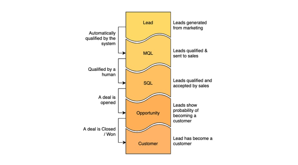
At each step, leads are segmented and qualified as purchase intent becomes clearer and you need a measure of how many leads you have at each lifecycle stage. This is important because you could have millions of prospects at the initial Lead stage but a fraction of these reaching the Opportunity and Customer stages. This may be fine if your software fees are high enough to generate profit from such disparity but, chances are, this means you’re spending too much on marketing and not generating enough profit.
By having lead data at every stage of the customer cycle, you can identify where leads drop out and put strategies in place to get the number back on track. For example, if you see a disproportionate drop in leads at the Opportunity stage, you can assess the quality of leads generated at earlier stages, your qualification procedures and your lead nurturing strategies to identify the problem. It could be that you’re simply capturing too many low-quality leads at earlier stages of the funnel or that your lead nurturing efforts at the Opportunity stage are underperforming.
#3: Lead velocity rate
Lead velocity rate (LVR) quantifies business growth by measuring the volume of qualified leads over time. The theory is that, as your business grows, you should capture a higher volume of MQLs, SQLs, etc. and your lead velocity rate should increase over time, as a result.
To calculate your lead velocity score, you first need to define the time period you’re measuring – normally monthly, quarterly or annually. If you’re looking at monthly growth, you can subtract last month’s lead volume from the current month, take that figure and, then, divide it by last month’s figure (x100).
Here’s a visualisation from Plecto.com for the formula you can use.

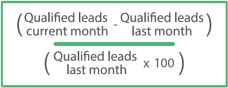
Obviously, if you want to calculate lead velocity rate annually, you take figures for the current and previous year instead. Hopefully, your SaaS analytics platform will come with LVR as a standard metric but you may have to create this for yourself on some platforms and you’ll want to implement it so that you can filter and segment this data at each time frame. You’ll certainly want filters to compare annual and monthly rates but you may also want to add filters for quarters and shorter time frames to show weekly and daily growth.
#4: Lead to customer rate
This is probably self-explanatory after the previous metric, but lead to customer rate measures the percentage of leads that convert into paying customers. To calculate this, you simply divide the number of customers won from a pool of leads over the same time period.
So, if a campaign has captured 1,000 leads for the previous month and 75 of those leads bought into your product, your lead to customer rate will be:
Lead to customer rate = (75/1000) x 100 = 7.5%
This is an important metric for measuring the effectiveness of lead nurturing campaigns but you need a solid attribution system in place to measure lead to customer rate accurately at the campaign level.
#5: Email open rate
Email open rate (this is often called average open rate in email marketing software) tells you how many recipients of marketing emails are clicking through to see your message. High open rates suggest you’re sending relevant messages to recipients with enticing subject lines that compel them to open your emails – in other words, high open rates are synonymous with effective email marketing campaigns.
Any decent email marketing software will show open rates at the account and campaign level and the metric is simply calculated by dividing the number of opens by the number of emails sent:
Email open rate = (email opens / total emails sent) x 100
So, if you send 100 emails and 18 recipients open your emails, then you’ve got an open rate of 18%, which just so happens to be the average open rate, according to CampaignMonitor’s Ultimate Email Marketing Benchmarks for 2021 report (the average for IT, tech and software is listed as 19.5%).
#6: Email conversion rate
There are plenty of other email metrics we could talk about (CTRs, unsubscribe rate, etc.) but we’re jumping right ahead to one of the most important email marketing metrics: email conversion rate. This specifically tracks completed conversion goals after a user clicks through to your website from an email campaign.
So, let’s say you’re sending email campaigns designed to upgrade free users to paid plans. Your conversion goal for these campaigns would be paid upgrades and a conversion should only be registered when an existing free user upgrades to a paid plan – any other action (or lack of) doesn’t count as a conversion for this campaign.
To measure email conversion rates, you simply divide the number of completed conversion goals by the number of emails delivered and multiply this figure by 100 to get your percentage figure.

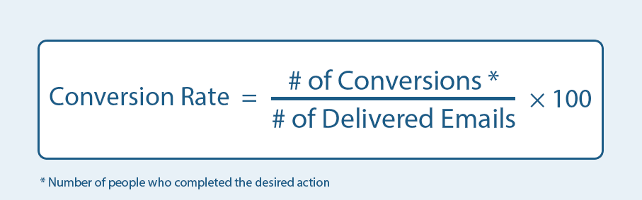
For email sequences where you’re sending multiple emails to the same recipients, you’ll want to distinguish between the total number of emails sent and the number of emails sent to unique recipients. As a standalone metric, you’ll generally want to go with unique recipients (and visitors) for conversion rates and the key benefit of email marketing is you have the account data you need to avoid any of the tracking issues so common with web analytics.
SaaS conversion goals
In this section, we focus on the most important conversion goals for SaaS companies, which means most of these metrics are user actions. This also means many of these metrics could be used as KPIs for specific campaigns, such as the imaginary email marketing campaign we discussed above with the conversion goal of free-to-paid upgrades, which is covered in this section, along with:
- Conversion rate: The percentage of users who complete a campaign’s conversion goal.
- Free signups: Users who sign up for the free trial or free version of your software.
- Onboarding completions: The percentage of users who successfully complete your onboarding process.
- Free-to-paid upgrades: Free users who upgrade to paid plans of your software.
- Paid upgrades: Paid users who upgrade to more expensive plans.
- Purchases: In-app purchases, add-ons and other one-off purchases.
- Renewals: Users who renew their subscription (or don’t cancel) at the end of their current term.
Before we start looking at specific conversion goals, we have to talk about the more general (but still important) metric of conversion rates.
#7: Conversion rate
Conversion rate is a measure of the users who take action on a web page or dashboard in your app where purchases or other conversion goals are accessible (eg: upgrades, add-on purchases, etc.). When it comes to measuring conversions on a website, you simply divide the number of completed conversions but the number of pages visits (either sessions or unique visitors), as shown in this illustration:

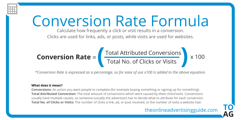
Tracking conversions inside your software may be a little more complex depending on how conversion goals are implemented. Rather than page visits, you may need to measure in-app conversions based on CTA impressions or at the campaign level if you target users with in-app messages designed to encourage plan upgrades or purchases, based on their usage.
Note: Keep in mind that, if you run a web app or have online accounts as part of your SaaS product, traffic numbers will be skewed by returning visitors, especially as user numbers increase – so make sure you segment unique visitors data from total traffic volumes.
#8: Free trial signups
For most SaaS companies, the first major conversion goal is free trial signups – that or signups to free plans or freemium products, depending on your pricing model. There’s no calculation required for this – all you need to do is track free trial signups as a conversion goal and optimise campaigns to increase signups. You can apply this to other calculations we’ve already looked at, starting with conversion rates to measure the percentage of visitors who sign up for free trials or merge it with lead to customer rate to measure the percentage of leads who convert to free users.
#9: Onboarding completion rate
Onboarding completion rate tracks the percentage of users who sign up to your product and successfully complete the onboarding process and start using your software. Inevitably, some people who click the signup buttons are going to drop out before they complete the setup process: they might experience friction, have trouble choosing a unique username, get tired of filling out forms or get stuck at a certain stage – eg: your account verification email gets stuck in their spam folder.
There are countless reasons users may fail to complete your onboarding process and, before you can fix any potential issues, you need to know how many people are dropping out. By tracking onboarding completion rates, you can assess whether issues need fixing and test optimisations while measuring the impact on completion rates.
This is an important metric that a lot of SaaS companies overlook and it’s not something that comes as standard with many analytics platforms. Luckily, it’s easy to calculate and measure – all you do is divide the number of onboarding completions by the total number of attempts:
Onboarding completion rate = (onboarding completions / onboarding attempts) x 100
So, if 1,000 users start your onboarding process and 350 of them successfully complete it, you’re dividing 300 by 1,000 to get 0.3 and, then, you times this figure by 100 to get a completion rate of 30%.
#10: Free-to-paid upgrades
Free-to-paid upgrades is an important measure of revenue generation and profitability, as well as a key performance indicator for marketing campaigns, lead nurturing, customer experience and everything your company does to turn free users into paying customers.
Some of the biggest names in SaaS have struggled to generate profit. Slack was famously evaluated at $20bn in 2019, despite having never made any profit, before Salesforce bought the company out in 2020 for $27bn with Slack still in the red.

This is a common issue for freemium products that often prioritise user growth over maximising profitability – but who cares when you cash out on a money-burning venture for $27bn, right?
Either way, paid-to-free upgrades is an essential metric for any SaaS company running free plans or freemium products because the Slack fairytale isn’t happening for most companies that fail to turn a profit. If your free-to-paid upgrade rate is too low, all of that money you’re pumping into product development, services, marketing and sales is putting you in the red.
#11: Paid upgrades
Once paid users onboard, your aim is to maximise lifetime customer value and encouraging paid users to upgrade to more expensive plans is a key strategy.
The best SaaS products create an upgrade path that users follow as their needs become more demanding. Your product should continue to help customers achieve more and justify the upgrades by opening up even more opportunities as they progress from one plan to the next.

In terms of tracking paid upgrades, you’ll want to monitor this figure across the board (total upgrades across all plans) as a measure of general performance in terms of engagement, upgrades and revenue growth. You’ll also want to look at upgrades at each plan level to see how many users upgrade between each plan. You’ll often find fewer users upgrade at each level but the extra revenue generated by upgrades to your more expensive plans are the most lucrative.
You’ll also want to track upgrades at the campaign level and attribute upgrades as a conversion goal so that you can see where email campaigns have convinced users to take the next step or product optimisations that encourage more users to upgrade.
#12: Purchases
If your product includes any in-app purchases or you’re selling add-ons, plugins or any kind of additional products outside of your main product, then purchases are obviously an important metric. For example, Pipedrive sells two add-ons that extend the functionality of its CRM platform with monthly prices that are more expensive than two of the four plans for its main product.

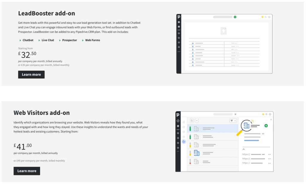
These add-ons can drive a significant revenue boost for the company while other SaaS providers target a larger quantity of cheaper purchases, such as credits, apps or individual feature add-ons. The danger is customers may resent having to spend money in addition to the monthly fee they signed up to but a lot of this depends on how purchases are implemented around the software.
#13: Renewals
If we’re talking about recurring revenue, renewals may be the single most important metric and KPI for any SaaS company. It doesn’t matter how many new customers you’re bringing in if you can’t hold on to the ones you’ve already got and sustain recurring revenue to drive growth and increase profits year-on-year.
Aside from being one of the most important KPIs related to revenue and business performance, renewals also tell you a lot about customer satisfaction, the quality of your product and the value perception of your users. Any campaign or optimisation that has a positive impact on renewals suggests you’re making a big step in the right direction.
Revenue KPIs and metrics
In this section, we focus on the KPIs metrics directly associated with revenue and growth, which are the most important data points for any business. We’ve got eight metrics to talk about and here’s a quick preview of what’s coming up:
- Profit: The money your SaaS company makes, minus all expenses.
- Monthly recurring revenue: The ongoing monthly revenue generated by your subscription plans.
- Annual recurring revenue: The ongoing annual revenue generated by your SaaS products.
- Avg. annual contract value: The average price customers pay for an annual contract.
- Average revenue per account: The average revenue generated by each account type.
- Customer lifetime value: The average gross revenue generated by each customer throughout the lifecycle.
- Revenue retention rate: The total recurring revenue retained over time periods (monthly, quarterly, annually, etc.).
- Annual growth rate: The annual growth of recurring revenue.
A lot of companies fail to attribute marketing actions to revenue and profit. While marketers commonly talk about return on investment (ROI), they often misuse the metric as a measure of marketing profitability when it should be used as a gauge of campaign performance and nothing else.
This section explains the KPIs and metrics SaaS companies should use to attribute marketing and user actions to revenue, profit and growth.
#14: Profit
You can measure profit in many different ways but two of the most common metrics are gross profit and gross margin (or gross profit margin). Both measure a company’s income after the expenses of producing and selling products/services are taken from total revenue – ie: profit.
The key difference between these two metrics is that gross profit provides a specific financial figure (eg: gross profit for Q2 2022 could be $1,384,000) while gross margin is a ratio.
To calculate gross profit, you simply subtract the cost of goods sold (COGS) from total revenue from the same period and you’ve got your figure. So, if you generate $1,384,000 in Q4 2020 and it costs you $683,000 to generate that revenue, your gross profit is $701,000 for the same quarter ($1,384,000 – $683,000).
To calculate your gross margin, once again, you subtract COGS from your revenue but, then, you divide this figure by revenue once again:


So, if we stick with the same figures, the calculation would be: 1,384,000 – 683,000 (=701,000) / 1,384,000 = 0.506. All you need to do now is multiply this figure by 100 and you get a gross profit margin of 50.6%.
#15: Monthly recurring revenue
Monthly recurring revenue (MRR) is the sum of all subscription revenue generated on a monthly basis. Most SaaS companies encourage users to sign up for annual contracts although many allow customers to sign up on a month-to-month basis for a higher equivalent fee.
So you have to divide the revenue of annual contracts by 12 and, then, add any monthly fees to get an accurate figure for MRR. The other big variable is plans being priced differently and the fact that recurring revenue from individual customers can increase or decrease if they upgrade/downgrade.
For many SaaS companies, MRR can fluctuate significantly so a month-to-month drop isn’t necessarily an issue although a series of drops could be more problematic. MRR is also an important metric to keep an eye on when rolling out new features, redesigns or significant changes (eg: pricing) to your software to see if new features prompt more upgrades or other changes negatively impact revenue.
#16: Annual recurring revenue
Annual recurring revenue (ARR) is the sum of all subscription revenue generated on an annual basis. Essentially, ARR is exactly the same as MRR, except you’re assessing the same data over annual periods but ARR is the more stable metric for measuring business growth.
A lot of things can change from one month to the next (especially if you have a high volume of customers on monthly subscriptions) with potential upgrades, downgrades, cancellations, and churn. As a result, MRR can be a volatile metric while ARR smooths out a lot of these variations – although it may miss some of the immediate impacts referenced in the MRR section above.
#17: Avg. annual contract value
Average annual contract value (ACV) tells you how much annual revenue each deal generates for your business, on average. You can calculate ACV using this formula, as illustrated by SmartKarrot:

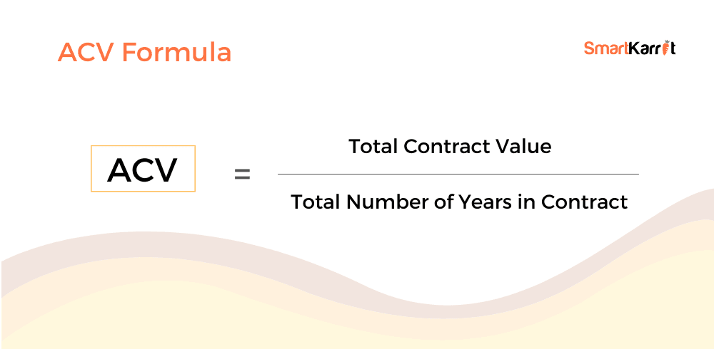
Given all of the variables that influence SaaS revenue, avg. annual contract value can offer a helpful summary metric for understanding the returns on marketing and sales efforts. Essentially, it finds the middle ground between different price plans, upgrades and downgrades and (depending on how you calculate ACV) the expenses of providing the services associated with an annual contract.
Of course, you want ACV to be as high as possible and it’s a good measure of how effective you are at converting users to your higher paid plans – as long as you don’t cut total revenue (by selling a higher quality of lower-value contracts) for the sake of increasing the average value.
#18: Avg. revenue per account
Average revenue per account (ARPA) tells you how much the average customer is spending over a defined period. You can calculate this by dividing the revenue from all accounts by the total number of accounts over the time period in question and you can view this data to compare monthly, quarterly and annual ARPA.
With enough historical data, you can also calculate the ARPA for customer lifecycles to understand the average revenue generated by customers until their relationship with your business ends, which is typically referred to as customer lifetime value.
#19: Customer lifetime value
Customer lifetime value (CLV) measures the gross revenue generated by a customer throughout the retention period – from the very first payment, until the last. You can view CLV at the customer level by simply checking how much they spend throughout the retention period but, as a metric, customer lifetime value is calculated as an average, using the ARPA (above) and your customer churn rate.
Here’s the basic formula, as illustrated in this Userlane article:

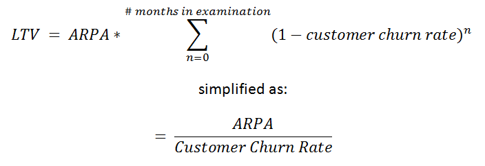
So, you’re basically dividing ARPA by your customer churn rate to calculate the average customer lifetime value – how much revenue each customer generates (on average) throughout the period of retention. This gives you an idea of how much revenue each new customer generates throughout their time with your software.
Accurately calculating CLV is more complex than the formula above suggests, though. The main reason for this is that churn rates, upgrades and downgrades aren’t linear – for example, most of your churn probably occurs during the first month of the customer lifecycle while upgrades can occur at any point during a contract period.
To get a more accurate calculation of CLV, you can use a discount adjustment in the equation and include a calculation of monthly ARPA adjustments to consider upgrades and downgrades. Here’s the proposed formula in the same Userlane article linked to above, using a 0.75 discount adjustment to factor for the variance of churn rates over time:


If you want a more in-depth explanation of this equation, take a look at the full article on Userlane.
Once again, with enough historical data, you can use predictive modelling to predict the lifetime value of new customers to prioritise your marketing efforts. The latest machine learning tools even predict the customer lifetime value of leads so you can focus on your marketing and sales resources on the prospects expected to drive the largest long-term value for your business.
In this respect, customer lifetime value is one of the most important SaaS metrics – not only in terms of reactive analysis but also predictive analytics.
#20: Revenue retention rate
Revenue retention rate measures the total amount of recurring revenue your company retains over a defined period of time. To calculate revenue retention rate, you can use the following formula, as visualised by Paddle:

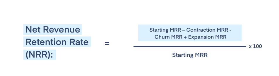
Once again, you have to factor for churn, contraction, and expansion in this calculation to accurately demonstrate revenue retention. As Chloe Dormand explains in the Paddle article linked above, you should aim for an average revenue retention rate of 109% to hit the industry benchmark and anything higher suggests you’re a top-performing SaaS company for this metric.
#21: Annual growth rate
Annual growth rate (AGR) is an important calculation that you can use to track the progress of key metrics, including revenue, active users, market share and any other growth data points. For the sake of example, let’s focus on annual revenue growth as our metric for this calculation, using this formula:
Annual growth rate = Current revenue – previous revenue / previous revenue x 100
Let’ say your company generated $213,000 in revenue for the year 2020, up from $198,000 in 2019. In this case, your calculation would be: 213,000 – 198,000 (15,000) / 198,000 (0.076) x 100 = 7.6% annual growth rate.
SaaS expenses
We can’t talk about revenue and profit metrics without talking about expenses and, in this section, we’ve got seven KPIs and metrics to talk about:
- Customer acquisition cost (CAC): A measure of how much you’re paying to acquire each customer.
- LTV:CAC Customer lifetime value to customer acquisition cost.
- CAC payback period: How long it takes you to recover your customer acquisition cost.
- Customer retention cost: How much you spend to retain customers.
- Cost of goods sold: The cost of producing and maintaining your products.
- Cost of services: The cost of providing services around your product.
- Cash burn rate: A measure of operational losses.
These metrics provide crucial information for the financial efficiency of your business and marketing efforts, helping you allocate budgets more effectively, calculate how long your business can run on current expenses and accurately measure/forecast profit.
#22: Customer acquisition cost
Customer acquisition cost (CAC) tells you how much you pay to secure a new customer, on average. To calculate this accurately, you should identify and attribute all marketing and sales expenses that contribute to customer acquisition – everything from personnel and time to marketing campaigns, landing pages and blog posts.
With your expenses tallied up, you can calculate CAC by dividing the total sum of marketing and sales expenses by the number of new customers acquired over the same period of time.

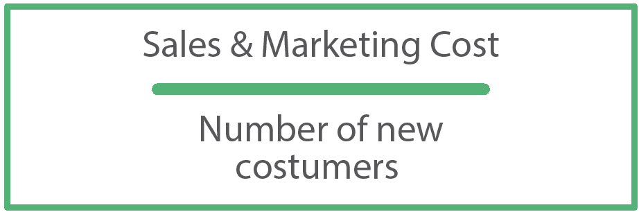
Customer acquisition cost helps you determine where marketing spend can be increased to boost acquisition and revenue without exceeding budgets, prioritise campaigns that achieve results within your target CAC and optimise campaigns to lower acquisition costs where necessary.
#23: Customer lifetime value to customer acquisition cost (LTV:CAC)
Now that we’ve covered customer lifetime value (LTV) and customer acquisition cost (CAC), we can discuss a new metric that combines these two. Customer lifetime value to customer acquisition cost (LTV:CAC) may be a mouthful but it’s an important metric and very easy to calculate.
LTV:CAC is simply a ratio of LTV and CAC but it helps you gauge the profitability of customers and your sales and marketing efforts. It compares the lifetime value of customers vs the cost of acquiring them and you can calculate LTV:CAC with this formula:
LTV:CAC = LTV / CAC : CAC/CAC
As the CAC/CAC calculation always results in one, you’re basically dividing customer lifetime value by customer acquisition cost and placing the result on the left side of the ratio (x:1). So, let’s say your average customer lifetime value is $55,000 and your average CAC is $12,000, your calculation would be 55,000 / 12,000 = 4.58 and your LTV:CAC would be 4.5:1.
Generally speaking, you want to aim for an LTV:CAC of 3:1 to maximise growth and a ratio of 5:1 suggests you probably want to invest more marketing and sales spend to maximise your opportunities while anything closer to 1:1 suggests you’re spending too much to acquire new customers.
#24: CAC payback period
CAC payback period calculates the number of months it takes to recover the money invested into acquiring new customers and the cost of providing your service. This measures your breaking even point for each plan and this number should be significantly lower than the average length of subscription to ensure you’re making a profit on your investment.
To calculate your CAC payback period (also called time to recover CAC or months to recover CAC), you need to use the following three metrics:
- Customer acquisition cost (CAC)
- Average revenue per account (ARPA)
- Gross profit margin
Then, you can use the following formula to calculate your CAC payback period:
CAC payback period = CAC / (ARPA x gross margin)
Obviously, the shorter your CAC payback period is, the sooner your company starts making a profit on your marketing spend but you should always monitor this metric alongside total profit, revenue, LTV:CAC and other revenue/expense metrics to ensure you’re maximising long-term revenue. After all, you don’t want to over-optimise your CAC payback period if you end up reducing customer lifetime value or increasing churn.
#25: Customer retention cost
Customer retention cost (CRC) is another important expense metric that shows how much you’re spending to retain your customers – crucial for SaaS companies and any subscription-based service. This accounts for all of the expenses (campaigns, tools personnel, etc.) assigned to keeping customers on board after they make the first payment.
You can calculate customer retention cost using the following formula, as illustrated by Userlane:

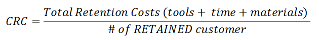
The key here is to accurately track the number of retained customers – not total customers – to get the correct figure for retention cost.
#26: Cost of goods sold
Cost of goods sold (COGS) is a metric typically associated with companies selling physical goods but it’s an important metric for SaaS companies, too. After all, you’re in the business of selling digital products (albeit, as a service) and there are significant costs associated with developing these products.
In the next section, we’re going to talk about cost of service (ACS) in relation to the ongoing costs of running the service side of your SaaS business but COGS focuses on the upfront cost of developing and delivering your products. Some SaaS companies may combine COS into their COGS calculation and this is fine – as long as you understand and consider the difference between the two.
#27: Avg. cost of service
Average cost of service (ACS) measures the average ongoing expenses of delivering your software product as a service – everything from R&D and customer support to server fees, accounting and software. The costs of providing your product and services vary greatly, depending on customer growth, their usage and the effectiveness of key processes, such as customer service systems.
Many of the services you rely upon to deliver your product get more expensive as your pool of active users increases (hosting services, CRM software, etc.) but you can offset these expenses elsewhere by automating processes, such as customer support and email marketing that reduce the cost of personnel and the resources required to complete important tasks.
#28: Cash burn rate
Cash burn rate (or simply burn rate) is a measure of your operational losses and this is a vital metric for any business during the earliest growth stages. Essentially, this metric tells you how much money you’re losing every month until you reach profitability and helps you calculate how long you can continue running until the funds dry up – an essential metric for investors.
For example, let’s say your SaaS company has an investment fund of $500,000 and you’re currently spending $50,000 to generate $40,000 in MRR. This means your company is operating at a cash burn of $10,000 or $120,000 per year.
Burn isn’t a good metric for forecasting, though, especially for SaaS companies where revenue, user numbers and important KPIs vary from one month to the next. So annual burn is more like an if you don’t change things kind of metric and month-to-month comparisons provide more meaningful insights.
SaaS engagement metrics
Now, we move out of the financials and into the user-oriented KPIs and metrics that measure engagement, which is the strongest influence on renewals, retention, recurring revenue and all of the key goals for any SaaS company. Here’s a preview of the metrics we’re looking at in this section:
- Active users: Daily active users (DAU) and monthly active users (MAU).
- Avg. time in software: The measure of how much customers are using your software.
- Avg. time per session: How long users spend in your software before exiting.
- Customer health / engagement score: A rating that aims to predict the likelihood of customers renewing or churning.
- Adoption rate: Product adoption and new feature adoption rates.
- Key actions per session: A measure of how much value users are getting from your product.
- Time to value: The time it takes for new users to complete their first key action.
- Stickiness: A measure of how well your product keeps customers using your software.
Make no mistake, these are some of the most important metrics for SaaS companies and taking care of these should have a positive impact across all of your KPIs.
#29: Active users
Active users is one of the most important metrics for engagement and growth, often measured on two scales: daily active users (DAU) and monthly active users (MAU). The key word in the phrasing here is “active,” which reflects people who are actually using your software – on a monthly or daily basis. A lot of companies use monthly active users to represent growth figures but it only reflects users who log into your software at least once a month.
Daily active users is a far more meaningful measure of active use and certainly engagement, even if MAU provides the more attractive dataset for investors and financial reports.
There are certain caveats and challenges with accurately measuring active users that are worth keeping in mind. One is that customer accounts often include multiple user accounts and this can conflate figures (it’s a good idea to track an equivalent metric for active customer accounts). Another potential issue is the action you use to register active use – are you simply clocking a login as active use or do you insist that users complete some kind of meaningful action inside your software?
Again, financial reports and investor briefs benefit from having the highest active user numbers but, from an internal optimisation standpoint, you may want to be more demanding about what you class as active use.
#30: Avg. time in software
Average time in software measures engagement by showing how much time users spend inside your software over various time periods. Measured in hours and minutes, you’ll want to see how much time users spend using your software daily and weekly for the purposes of tracking engagement and you’ll want the ability to view data at the monthly and annual level for optimisation purposes.
Depending on the kind of software you provide, certain timeframes will be more important than others. For example, if you want customers to be using your software every day, then the daily and weekly views are the most important datasets but some software products are more likely to be used at weekends, certain evenings or days of the week/month.
You may also experience usage peaks – for example, higher usage figures on Mondays, the final week of each month or certain months of the year.
#31: Avg. time per session
Average time per session is a different measurement of engagement because it specifically tracks the amount of time users spend in your software per session – from logging in until logging out. Aside from being a powerful measurement of engagement, avg. time per session can also help you understand the value your product has for users. Are they logged in all day, every day or is this a product customers are using at key times of the week or casually, whenever they have free time or the inclination?
For example, a platform like Slack wants users to have the app open all day, working in the background, even if they’re not actively using the platform. This raises another interesting point about active use and you also have to question whether users simply having the app open in the background contributes towards time per session.
I would argue that it should always count and that, if you have an issue with inactive use contributing, that you use other metrics to reflect this, such as a specific metric for active time in software or valuable actions per session.
#32: Customer health / engagement score
Customer health and engagement score are broad metrics calculated in a variety of ways – and, just to be clear, these are two different metrics, not interchangeable terms for the same metric. Customer health aims to quantify the likelihood of customers renewing at one end of the scale and churning at the other end while engagement scores focus specifically on creating a single score from all of your combined engagement metrics.
Engagement is a key component of customer health so this should always be included in any calculation for the latter.
Calculating customer health and engagement scores can be quite complex but many systems like ActiveCampaign and Userlane include systems for calculating these scores, based on a wide range of engagement and other datasets. With these scores, you can identify customers who are dropping in engagement or showing increased risks of churning and take action before it’s too late.
#33: Adoption rate
Adoption rate is another broad metric that can mean several things, depending on your needs and how you calculate it. For example, you want to track the percentage of free trial, free plan or freemium users that upgrade to paid plans and many SaaS companies label this metric as their adoption rate or rate of adoption.
The thing is, there are other adoption rates you want to track as well – such as feature adoption rates, new feature adoption (post-rollout), add-on adoption and anything else related to features, tools or integrations you know are important to maximising engagement and stickiness.
By tracking the adoption rate of specific features, tools, add-ons and the usable elements of your software, you can identify users who aren’t getting as much value as they should from specific features and encourage them to get more involved. The idea is that higher adoption rates aren’t only indicative of engagement but, by increasing the adoption rates of important features, you can increase the value customers get from your product and lift renewals, growth and recurring revenue as a result.
#34: Key actions per session
Key actions per session measures how many meaningful actions users complete, on average, during a session inside your software. A key action is any activity you define as being indicative of valuable activity – for example, using a specific feature or completing certain actions vs simply logging into your software and viewing certain dashboards.
In the case of TrueNorth, we consider key actions to include: creating a new campaign idea, setting a campaign goal, using the campaign simulator and interacting with the simulator’s sliders to preview optimisations (among many other actions).

So, when a user logs in and simply checks a report, we’re not logging this as a key action because it’s a relatively passive activity. If the same user experiments with campaign settings, runs a new simulation or adapts their campaign milestones before logging out, then a key action is registered.
Key actions per session is a great way to quantify the value your customers get from your software product and, generally speaking, a high level of key actions per session is indicative of strong engagement and value. There are some exceptions to this – for example, if your software or certain features are designed specifically for users to quickly achieve a single task and immediately quit the session.
A common example of this is calendar apps that integrate with email clients, such as Gmail and Google Calendar. When you arrange a meeting or activity with someone in Gmail, the app often prompts you to create the event in Google Calendar and you end up opening the calendar app for a few seconds to create the event before quitting the session, maxing out at one key action. So, if your software has a lot of these integrations, lower values for key actions per session are acceptable.
#35: Time to value
Time to value tracks the time between users signing up for your software product and completing the first action that results in meaningful value for them. In other words, this metric quantifies how long it takes for new users to get value from your product, on average.
This is a critical metric of engagement, onboarding success and value perception for SaaS companies. In every conceivable scenario, the faster you can get new users to gain genuine value from your product, the lower churn rates will be during the crucial first month, the greater engagement you’ll achieve and the stronger your foundations will be for every engagement metric that matters.
The hardest aspect of time to value as a metric is identifying the actions that best represent value to your customers – something that requires a mix of user feedback and statistical analysis.
#36: Stickiness
Product stickiness aims to measure the desire or compulsion users have to continue using your software product. There are several ways to achieve stickiness but the key characteristic of this metric is that your customers want to keep paying for your product.
For example, social media platforms like Instagram use dopamine triggers to create apps that are truly addictive and you can replicate this in your software with micro-interactions and gamification that constantly rewards actions, achievements and goal completions. A more ethical (and, perhaps, sustainable) method of creating stickiness is to deliver continued value that makes your product an invaluable part of your customers’ lives, careers, aspirations or whatever role your product plays.
Whatever approach you aim for, the simplest way to measure product stickiness is to divide daily active users by monthly active users, as shown in this visualisation from Userlane:

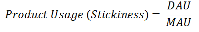
Like many of the metrics, we discuss in this article, your stickiness values will vary greatly depending on the type of software you provide (as well as quality, of course). Some products are inherently stickier than others and, if you’re using the calculation above, platforms geared towards daily use are always going to achieve higher stickiness ratings. If your platform is geared towards less frequent use, you may need to calculate stickiness using key actions rather than simple usage metrics – it all depends on how you quantify the value of engagement.
SaaS retention KPIs and metrics
With your engagement KPIs and metrics moving in the right direction, you should see a positive lift in retention rates and the associated KPIs:
- Retention rate: The percentage of customers who keep buying from you over a defined period.
- Churn rate: The percentage of customers you lose over a defined period.
- Revenue churn: A measure of revenue lost due to customer churn and downgrades.
- Renewal rate: The percentage of users renewing their contracts (or not cancelling).
- Cancellation rate: The percentage of users who cancel their subscription.
- Expansion & contraction: Revenue increases from upgrades and decreases from downgrades.
Now, we’re getting into the metrics that directly result in renewals, long-term recurring revenue and sustainable growth for SaaS companies.
#37: Retention rate
Retention rate measures the percentage of customers you successfully retain over a defined period and you can calculate it by dividing the number of active users over a period of time by the number of active users over a previous equivalent period of time – eg: 2021 vs 2020.
Here’s a visualisation of this formula, courtesy of Amplitude:

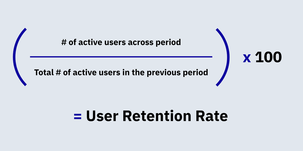
The important distinction here is that you should always use active users to calculate retention rates because inactive user accounts are no good to you when it comes to renewals.
#38: Churn rate
Churn rate (or churn) is essentially the opposite of customer retention, measuring the percentage of customers who stop paying for your software. To calculate churn rates, you divide the number of customers who leave by the number of active users at the beginning of the same time period.
Churn rate = (Users who leave / active users at start of period) x 100
So, if you’re calculating your churn rate for the previous year, you would take the number of customers who left and divide it by the total number of active users at the beginning of the year being analysed.
Logic suggests that, if you take your churn rate and add it to your customer retention rate, the two figures should add up to 100%. For example, if you’ve got a customer retention rate of 80% over a period of time, then your churn rate should equal 20% but, as mentioned in the previous section, the key component of retention rates for SaaS companies is active users. So there’s a potential gap between retention and churn where users lose engagement and become inactive, which results in users unaccounted for by retention and churn calculations.
As a result, it’s perfectly normal to see figures like an 80% retention rate and a 16% churn rate.
#39: Revenue churn
Revenue churn (or MRR/ARR churn) measures the loss of revenue due to customer churn and downgrades, plus any other reduction in revenue – eg: a drop in purchase rates. To calculate revenue churn, you simply add the revenue lost from churn to the revenue drops from downgrades and any other reductions:
Revenue churn = lost MRR from churn + lost MRR from downgrades
That measures revenue churn in financial figures ($) but you can work out your revenue churn rate by using the following formula, this time visualised by Userlane:

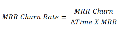
As Andy Mura explains in the Userlane article featuring the above equation, revenue churn is directly related to customer churn but it also reveals lost revenue as a result of user behaviour (downgrades, reduced engagement, drops in purchases, etc.).
#40: Renewal rate
Renewal rate measures the percentage of users who renew their subscription at the end of their current commitment but there are several ways to approach and use renewal metrics. The most simplistic calculation of renewal rates is to divide the number of customers who renew over a period of time by the total number of customers who could have renewed over the same period (both those who did and didn’t renew):
Renewal rate = (# of customers who renew / # of potential renewals) x 100
Let’s say you’ve got 1,000 customers over your period of analysis and 800 of them renew, leaving you with 200 non-renewals. You would divide 800 by 1000 (0.8) and times the figure 100 to get a renewal rate of 80%. Many SaaS companies also measure revenue renewal rates, which you can calculate with this formula:
Revenue renewal rate = (revenue from renewals / potential revenue from renewals) x100
So, if you generate $2,350,000 in revenue from renewals from a potential $3,000,000, you divide 2,400,000 by 3,000,000 (0.78) and times the result by 100 to get a revenue retention rate of 78%. This helps you understand the relationship between renewals rates and the revenue generated by renewals, which is important when some plans generate more than others.
#41: Cancellation rate
Cancellation rate specifically measures the percentage of users who cancel their subscription over a period of time. This differs from churn rate, which includes non-renewals and any other loss of paying customers, while cancellation rate specifically tracks users who actively cancel their subscription.
Another important distinction to make here is that cancellations do not always result in churn. When a customer cancels their subscription, there’s a delay between this action and the actual expiration of their membership (the period covered by their most recent payment) and this leaves you with a window of opportunity to win them back before their account expires.
So you also want to track account expiration rates, which reveals how many cancellations lead to customer loss and how effective your retention strategies are at winning customers back during this grace period.
#42: Expansion & contraction
Expansion and contraction are two related metrics that measure the revenue gained/lost through paying customers spending more or less through your software. Expansion measures the gain in revenue from upgrades, purchases (add-ons, credits, etc.) and additional services while contraction measures revenue losses from downgrades or reduced spend through other means (lower purchase rates, reduced purchase values, discounts, etc.).
These are important metrics because expansion can offset some of the losses resulting from churn and contraction can limit the gains of upselling, renewals and other revenue drivers. By tracking these metrics, you gain a deeper understanding of the financial impact upselling and retention campaigns have on revenue and profit with the ability to optimise results on both axes of gains and losses.
Customer support KPIs and metrics
In this final section, we look at the most important KPIs and metrics for customer support – an essential strategy for keeping customers happy and maximising recurring revenue through renewals and sustained growth.
Here are the metrics we’re looking at in this section:
- First response time: The average time it takes for your support team to respond to customer issues.
- Avg. ticket resolution time: How long it takes your team to resolve issues.
- Resolution rate: The percentage of customer cases successfully resolved.
- Ticket volume per user: The average number of tickets raised per customer over a defined period.
- Most common issue: The most common issue raised by your customers.
- Negative feedback rate: The percentage of customers who leave negative feedback.
- Positive feedback rate: The percentage of customers who leave positive feedback.
- Net promoter score: The likelihood of customers promoting you to others.
With these insights, you can improve the quality of your product to reduce the occurrence of issues and optimise your customer support process to deal with tickets more effectively.
#43: First response time
First response time (FRT), sometimes called time to first response, measures the average delay between users getting in touch with your support team and the first response. Your target FRT varies depending on the channel used by customers – for example, the response of chatbots and automated emails should take seconds while email responses from team members understandably take longer.
Keep in mind, there are two ways you can measure first response time: you can count automated messages as the first response or you can be more strict and only measure the first person-to-person interaction when customers use channels that require a human response.
Whichever approach you take, fast human response times are crucial for keeping customers happy but you can reduce the perceived response time with automated channels and interactions (chatbots, automated emails, etc.) and provide value during delays by pointing customers to valuable resources, such as online documentation and relevant tutorials.
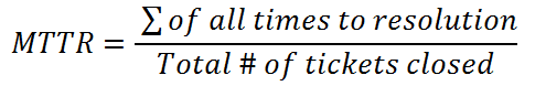
#44: Avg. ticket resolution time
Average tick resolution time measures the time it takes for your support team to deal with customer support cases, from the moment a ticket is raised to its completion. Some platforms also refer to this as mean time to resolve (MTTR), as shown in this calculation from Userlane:

You can use this metric in several ways to assess the performance of your customer support system and the problems your customers experience:
- Measure the effectiveness of your customer support team
- Track the performance of individual team members
- Identify issues that take a long time to resolve
- Compare resolution times with the number of interactions to identify complex issues
- Optimise support to reduce the average resolution time
As you can see, average resolution time as a standalone metric is pretty self-explanatory but it’s an information datapoint, especially when you compare it with other customer support metrics to gain deeper insights into the performance of your customer support system and the nature of the problems your customers face.
#45: Resolution rate
Resolution rate (often called ticket resolution rate or issue resolution rate) calculates the percentage of tickets that are resolved as a measure of performance. Essentially, this is a success rate metric for your customer support system and, to calculate your resolution rate, you simply divide the number of resolved cases by the total number of cases:
Resolution rate = total cases resolved / total cases raised
Again, you can use this metric to track the performance of your entire customer support team but you can also segment this data to analyse the success rate of individual team members and look at the resolution rate of specific types of issues. For example, you may encounter a regular issue that has both low resolution rates and a high number of interactions, suggesting that the issue needs addressing as a development or design case rather than a customer support issue.
#46: Ticket volume per user
Ticket volume per user measures the average quantity of support tickets raised by each customer. This metric is calculated by dividing the total number of tickets received by the total number of active users:
Ticket volume per user = total number of tickets / total number of active users
Obviously, you want this number to be as low as possible but you can also use this metric to analyse ticket volumes for users on different plans, as it’s common for customers who pay more to have higher expectations from your platform. You may also offer improved support on your most expensive plans and prioritise these cases to optimise this metric for your most important customers.
You could also filter your data to see how average ticket volumes change over time, as customers become more familiar with your product or check ticket volumes after renewals. In theory, you would expect customers to experience fewer problems once they’ve been using your software for more than 12 months (although the nature of problems also often changes, too).
#47: Most common issue
Most common issue (MCI) identifies the problem customers experience most frequently, resulting in the highest volume of customer support cases. While we’re calling this a customer service metric, it’s actually most informative (as a standalone metric) from an R&D perspective, highlighting development issues that need addressing and guiding your roadmap for updates and new features.
Once again, though, MCI reveals a lot about your customer service performance once you start comparing it with other data points. For example, you can identify common issues with low resolution rates or long resolution times to prioritise these in product development or track the occurrence of issues to spot emerging problems, particularly after updates and feature rollouts.
#48: Positive & negative feedback rates
Feedback rates measure the percentage of customers who leave feedback about your product and/or services. Many SaaS companies include reviews in their feedback rates but I recommend keeping these two types of feedback separate – and I’ll explain why.
The biggest issue with including reviews in your feedback rates is that negative feedback and negative reviews have different qualities. While you certainly want to minimise the number of negative reviews your customers are leaving, you don’t want to minimise negative feedback because this is where your most valuable feedback insights emerge from.
There are three feedback rates you want to track:
- Feedback rate: The percentage of customers who leave feedback (positive or negative).
- Positive feedback rate: The percentage of customers who leave positive feedback.
- Negative feedback rate: The percentage of customers who leave negative feedback.
The purpose of a global feedback rate is to help you gauge the success of your feedback collection efforts and optimise strategies to increase the percentage of customers who provide valuable feedback. Then, you can compare positive and negative feedback rates as a qualitative measure of your product/services and track changes as you implement improvements.
#49: Positive & negative review rate
While feedback collection is an internal system of securing qualitative insights from your customers, reviews are an external channel visible to the general public and potential customers. Prospects comparing you against competitors see your average review scores and the individual reviews left by your customers so there’s more pressure on maximising positive reviews and minimising the negative.
Unlike negative feedback, which is generally more valuable than positive feedback, negative reviews can be seriously damaging while a profile filled with positive reviews is a major sales asset.
Much like feedback rates, there are three equivalent review rates you want to track:
- Review rate: The percentage of customers who leave a review.
- Positive review rate: The percentage of customers who leave a positive review.
- Negative review rate: The percentage of customers who leave a negative review.
By tracking review rates, you can determine how many customers are leaving reviews and optimise campaigns to generate more positive reviews. Generally speaking, customers are more likely to take the effort to leave negative reviews when something is wrong than happy customers are to leave positive reviews when nothing is wrong – so you have to try and shift this balance.
While you want to avoid negative reviews as much as possible, you can still gain value from them and try to mitigate any damage. Respond to every review and address negative comments to show new potential customers that you provide responsive customer support and constantly work to improve your product. Try to avoid automated and repetitive responses when it comes to dealing with negative reviews publicly.
Don’t be one of those companies that respond to every negative review with messages like “hey, sorry you’re experiencing problems – send your account details to support@companyname.com so we can get to the bottom of this”.
Also, take an honest look at the feedback left in negative reviews. Some customers have unreasonable expectations but others will highlight problems you need to address with your product and/or service so be open to accepting criticism.
#50: Net promoter score
Net promoter score (NPS) calculates the likelihood of customers recommending your product or services to someone else. Traditionally, NPS is calculated by asking customers something along the lines of “how likely are you to recommend our software to a friend or colleague?” in feedback surveys, on a scale of 1-10.
Responses are grouped in categories, such as:
- 1-6: Detractors
- 7-8: Neutrals
- 9-10: Promoters
Then, to calculate your NPS, you subtract the proportion of Promoter scores from the proportion of Detractor scores.
This approach to calculating NPS has a few problems, though:
- Most customers don’t leave feedback which limits the value of your calculation.
- Unhappy customers are more likely to leave feedback which could skew your results.
- Friends and colleagues normally aren’t valuable recommendations.
If you’re only collecting data from feedback surveys, your NPS scores are going to be unreliable and there’s an issue with the question itself. The phrasing is a copy and paste job from consumer surveys in the ’90s, which isn’t relevant to the vast majority of software companies. Sure, some consumer-aimed platforms like Dropbox may benefit from recommendations to friends and family but this isn’t true for most SaaS companies – especially in the B2B space.
So there’s little value in the type of promotion traditional NPS calculations measure.
However, there is value in digital interactions, such as positive reviews, referrals, social media mentions, blog posts and other positive things your customers say about you online. You can also track these interactions with greater reliability, using citation software, monitoring review platforms and any other promotions attributed to customers.
Measure your way to SaaS success
The purpose of this article is to highlight the most important SaaS KPIs and metrics while also explaining the role each one plays, their strengths and weaknesses, and how they enhance each other when combined together. The SaaS customer journey is one of the most complex around but the good news is it’s almost entirely digital and you have the privilege of accessing customer data throughout the majority of the customer lifecycle – not only on your website but inside your product.
Most businesses could only dream of having so much data readily available and SaaS companies have a huge advantage in this regard – as long as you’re able to make full use of this data.
We’ve shown you the tools that will help you collect, analyse and put these insights into action and, hopefully, this article has either introduced you to some valuable new metrics or helped you learn a bit more about once you’re already tracking.