In conversion rate optimisation (CRO), there’s this terrible misconception that friction is a bad thing. Marketers, software companies and self-proclaimed experts are constantly telling us that we need to reduce friction at all costs (normally via expensive CRO software) to maximise conversion rates.
What a load of nonsense.
Friction isn’t inherently a bad thing. It’s a tool we can use to influence user behaviour and the vast majority of what we do as marketers, designers and developers is utilise friction in calculated ways that shape the user experience. When we use friction poorly or create it unintentionally, conversion rates are likely going to suffer – and this is the kind of “bad” friction you want to remove through optimisation.
However, “good” friction is one of the most powerful tools at your disposal and, in this article, we’re looking at nine common examples of how you can increase conversions by adding friction.
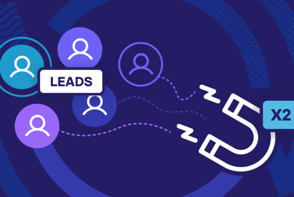
#1: Using form friction to increase conversion rates, improve lead quality
All the guides on optimising web forms tell us that shorter forms are better for conversions. Reduce the number of fields, they tell us, and watch the leads roll in.
So why have multiple studies found that longer forms outperform shorter versions? Take the following experient carried out by conversion expert Michael Aagaard, which he published in a blog post for ConversionXL. After running a series of form optimisation test, removing form fields actually reduced conversion rates by more than 14% while opting for a longer field with more context provided in field labels increased conversions by 19.21%.

That’s right. Longer forms can achieve higher conversion rates.
As with most things in digital marketing, there are no absolute rules. So any time you read or hear a statement like shorter forms are better for conversions or any kind of X = Y absolute, you should question it.
There are always variables.
For example, let’s imagine someone is buying an expensive product online and they want to pay using finance. Users are going to be pretty suspicious if a supposed lender only aks for their email address and bank details. In this case, short forms could appear untrustworthy but lenders also need to make sure applicants meet the right criteria – so it’s also a question of improving lead quality, not only quantity.
Adding ‘good’ friction with multistep forms
You can also use longer forms to enhance the conversion process for users. One of the worst metrics for poor conversion rates is form dropouts. These are people who start filling out your form but fail to complete it for whatever reason. They’ve bought into your message but your web form has somehow killed the motivation.
We spent years trying to solve this problem and we finally cracked it by creating multi-step forms that guide users through the conversion. We’ve increased lead generation by up to 743% on the Venture Harbour website and our clients’ products.
Now, there are a number of things that contributed to those huge conversion increases by switching to multistep forms:
- The multistep design means users only see the first step of each form, removing form length from the equation as people decide whether to convert or not. Every form looks like a short form, no matter how long it actually is.
- Conditional logic removes questions that aren’t relevant to each user as they fill out your form. This shortens your forms in real-time, based on the information users provide.
- Conditional logic also means you only ask relevant questions to each prospect, which means every part of the form engages them on a personal level.
- Progress bars provide visual feedback on how much of your form users have completed. More importantly, studies show this encourages form completion because people don’t want to lose the time they’ve already invested in making it this far – a psychological phenomenon known as sunk cost bias.
- Image buttons drastically reduce the amount of typing users need to do in order to complete your forms and this is where the majority of bad friction comes from in terms of form optimisation.
- By replacing text fields with image buttons, your forms are far better suited for the mobile experience where typing form information is particularly frustrating.
- Built-in form analytics allows you to pinpoint any issues users are experiencing with your forms and minimise form dropouts.
By implementing and optimising multistep forms across our ventures (and our clients’) we’ve removed bad friction from the form process, e.g.: unnecessary typing, poor mobile optimisation, irrelevant fields, etc. However, we’ve also managed to add good friction by asking more questions to increase engagement and relevance. The trick was formatting these longer forms in a way that enhanced the experience of completing forms rather than compromising it.
The end results has been significantly higher conversion rates but also a much higher quality of leads that are more engaged and likely to buy from us.
#2: Using exit-intent pop-ups to capture lost leads
This technique is simple and common enough that it doesn’t need too much explanation. Exit-intent pop-ups triggered on desktop devices when it looks like a user is about to quit the session. Now, in terms of pure UX principles, this adds bad friction by making it more difficult for people to quit your website. However, from a lead generation point of view, this gives you one final chance to convert users who would otherwise leave your website.

Once a user decides to leave your site, you haven’t really got anything else to lose by adding a bit of friction to the experience. This tactic isn’t without its risks, though. If the message in your exit-intent pop-ups doesn’t tempt outgoing visitors, you might put them off your brand for good by making it more difficult for them to leave.
So it’s really important the message in your pop-ups is compelling – something you’ll want to test.
Unbounce has a really great pop-ups feature built into its platform that makes it easy to add and test pop-up messages. This is one of those pros/cons compromises you have to make in terms of compromising UX for the sake of increasing conversions.
#3: Adding friction to create personalised experiences
According to research from Salesforce, 57% of online buyers are happy to exchange personal data in return for personalised offers or discounts. Now, personalisation is one of the biggest trends in marketing right now but something that seems to be left out of the conversation is that personalisation drastically increases friction. The key thing is this: effective personalisation adds good friction by enhancing the customer experience and studies show consumers are willing to accept this friction when it’s clear that they’re going to receive better offers/services in exchange.
Effective personalisation adds good friction by enhancing the customer experience and studies show consumers are willing to accept this friction when it’s clear that they’re going to receive better offers/services in exchange.
Let’s look at a couple of examples.
Bull&Bear adds navigational friction to personalise the on-site experience
Clothing retailer Pull&Bear uses a data-free navigational approach to personalising every session on its website. This refines the options available to users based on the preferences they define by navigation through the site, starting by selecting which gender of clothes they’re interested in.

Users are then prompted to choose more specific clothing categories rather than simply using the search field or working their way through a complex navigation menu.

In theory, this is a restrictive approach to navigation that adds friction by increasing the number of clicks users need to take to get to their destination. But this added friction allows Pull&Bear to deliver more relevant content at each step of the way. Users can still use the search and navigation menu options if they know what they’re looking for but this navigational approach to personalisation creates a more intuitive experience for users who are more interested in browsing before they make any purchases.
Care/of turns friction into a personalised service
Care/of requires a lot of personal information from users in order to deliver unique health supplement recommendations to every user. The main CTA on its homepage asks users to “Take the quiz,” which makes it clear that this isn’t going to be a quick name and email process.

However, this is the entire concept behind Care/of’s business model. It provides 100% personalised services to each customer and makes it clear that it’s in-depth data collection process is precisely what makes the brand able to improve the health of each and every customer.
The perceived value Care/of’s service outweighs the friction users experience while signing up. Users know that the more information they provide, the more relevant Care/of’s recommendations will be and this is the crucial exchange brands need to deliver when it comes to highly-personalised experiences.
#4: Adding friction to prevent errors
There are other cases, where adding friction can improve user experiences by making it more difficult for people to make mistakes. We see this in software design all the time – for example, when we’re asked if we’re sure we want to delete files permanently before they discarded into oblivion.

We also see friction being used to prevent errors during the conversion process. For example, form validation prevents people from successfully submitting information if it’s not provided correctly. Essentially, you’re making it more difficult to complete forms as a way of guaranteeing the data you really need is there. Good form validation benefits the user by helping them to add accurate info, such as their correct email address.
Implemented well, form validations also provides visual feedback to show users everything they have entered is suitable while picking up any errors as they fill the form out.

Source: Baymard Institute
In theory, this should lead to fewer mistakes and fewer users quitting the session before successfully converting.
Another example of this is using dialogue boxes asking users if they’re sure they want to leave the checkout process before completing the purchase. By adding friction, you can rule out accidental dropouts and use this as an opportunity to deliver a message that encourages users to complete the purchase now. Alternatively, you could push for a softer conversion by asking users to save their cart by submitting their email address.

Source: Sleeknote
Users don’t need to make any commitment now but getting your hands on their email address now means you’re able to chase up the lead and even tempt them with other purchases that might peak their interests.
#5: Encouraging users to create accounts
This is a common technique used by e-commerce brands that have a lot to gain from users creating an account before completing a purchase. Having that all-important email address allows you to send follow-up campaigns featuring purchase recommendations, upselling/cross-selling offers, new promotions and personalised offers.
For e-commerce brands, having customer data assigned to a user account can be invaluable. Well worth the price of adding friction.

For consumers, this friction might be too much for them to willingly complete the purchase so it’s worth thinking about providing an option to checkout as a guest.
e-commerce brands aren’t the only ones pushing people to create user accounts, either. Software platforms ranging from SEMrush to Spotify revolve around user accounts and publishers are increasingly asking users to create accounts in exchange for accessing content.
In many cases, these are paid memberships designed to monetise websites that have lost out on advertising revenue over the years. However, a lot of publishers also ask users to create free accounts in order to access content, especially if the publisher monetises its brand in other ways.

It all comes down to what you need from conversions. Some brands have little choice but to ramp up the friction in order to guarantee all conversions are of a certain value, even if this means accepting lower conversion rates overall.
#6: Adding friction to secure the data you need
As we’ve established multiple times already in this article, getting user data from people adds all kinds of friction. Sadly, this is a necessary evil in today’s digital world but we’ve also looked at a number of ways that you can add “good” friction to enhance the user experience while collecting the data you need.
There is another approach, though.
In this blog post, Growthmentor‘s Foti Panagiotakopoulos explains how the company intentionally added friction to its onboarding process, for a temporary period, purely for the sake of collecting data. The experiment resulted in conversions dropping by more than 80% (ouch!) by creating a sign-up process that “disjointed, annoying, and completely hacked together,” in his own words.

Source: Growthmentor
However, the experiment also provided the company with the critical data it needed to better understand its user base. Once Growthmentor had the data it needed, it reverted to a more user-friendly sign-up process and doing what it can to secure additional data from users after they’ve already signed up.
In this particular example, we see a brand introducing “bad” friction temporarily for the sake of achieving a higher, long-term objective.
#7: Adding friction to reassure users
Earlier, I mentioned an example where friction during the process of applying for finance helps reassure potential customers that they’re dealing with a legitimate lender. At the time, I was talking specifically about form optimisation and why shorter web forms don’t always convert well. However, this principle applies to all kinds of online transactions where customer trust in the retailer needs to be earned.
Adding the right kind of friction here is crucial.
For example, making it too easy for existing customers to buy additional products with a single click could result in accidental purchases and discourage them from continuing to use the same site/platform. Again, adding friction to prevent errors, in this case, can help secure ongoing conversions over a long-term basis.
Before users even get to this stage, though, adding friction can reassure users that they’re dealing with a legitimate brand and build trust. In this article for Smashing Magazine, Zoltan Kollin cites an example where users of a Well’s Fargo eye-scanning system didn’t trust the application because it worked too quickly.
According to another anecdote, Well’s Fargo developed an eye-scan-based log-in to its mobile banking app that worked really quickly. The user’s eyes were scanned and processed, and the user was logged in in milliseconds. In fact, the log-in experience was too fast for users; they felt that they had been logged in without their eye patterns being thoroughly validated, and they reported that they would not continue using such an unreliable log-in method. So, in the next iteration, designers simply added a few seconds of delay to the authentication process, and customers immediately started to claim that the log-in process was thorough and secure.
Zoltan Kollin goes on to explain how adding fake progress bars for certain interactions can increase the perception of trust, especially when it comes to actions people expect to be secure.

He uses the example of Facebook allegedly adding a fake progress bar after users update their privacy and security settings to illustrate the fact those changes are actually taking place.
#8: Creating value by adding friction
We’ve already looked at how software companies use friction to prevent mistakes, collect data and provide personalised experiences. Arguably, though, the most important application of friction for software companies is using it to create a perception of value between the different versions of its product.

By restricting features on cheaper versions of subscription-based products, companies can use friction as a motivator to buy a more expensive plan. They can also ramp up the friction these lacking features create while using cheaper versions of the platform to increase the incentive for existing users to upgrade to a more expensive version.
#9: Friction as a cross-selling/upselling technique
Software companies aren’t the only brands that use friction as a cross-selling/upselling technique. In fact, retail brands can use this to great effect as well, as you’ll see if you add an item to your basket on the Jessops website.

As soon as I add a nice new Nikon Z 6 to my basket, the website hits me with this pop-up asking me if I want to add these related items. I can add them if I want, continue shopping or head right to the checkout to complete the purchase.
The quality of Jessops’ recommendations is crucial, too. Here’s it’s asking me whether I want to add a Sony XQD card, one of the few types of cards that are compatible with Nikon Z (regular SD cards are no good). The other recommendation is an extra battery compatible with the Z 6, which is tempting because mirrorless cameras like the Z 6 have inferior battery life to modern DSLR type cameras.
Both of these recommendations are highly tempting because they’re so relevant to the needs of Nikon Z 6 users.
Reduce the bad, utilise the good
So, there you have it. Don’t buy into the misconception that friction is a conversion killer. If it is, it means you’re not using it properly. Understanding the difference between “good” and “bad” friction is a learning process that never ends but the first step along this journey is realising that not all friction is bad.
Generally speaking, good friction should do one of two things: either add value to the user experience or add value to the leads you’re generating, even if it comes at the expense of hurting UX to some extent. It all comes down to finding the right balance between optimum conversion rates and capturing the right quality of conversions.