

With landing page builders like Unbounce and Instapage so readily available - not to mention years worth of best practices to fall back on - the visual side of landing page design isn’t the challenge it once was.
Unfortunately, none of this helps you when it comes to crafting landing page copy that convinces people to convert. Behind all the design tricks, this is the core ingredient that really inspires action and there are no templates or formulas for guaranteed success.
Creating landing page copy that captivates people is a real art form - so here are ten examples that get it spot on.
01CrazyEgg
CrazyEgg jumps right in with the burning question people have in mind when they land on the page. It then backs this up with a demo where users can type in their URL to get their first heatmap. That’s a pretty difficult proposition to turn down for any website owner.
02Unbounce
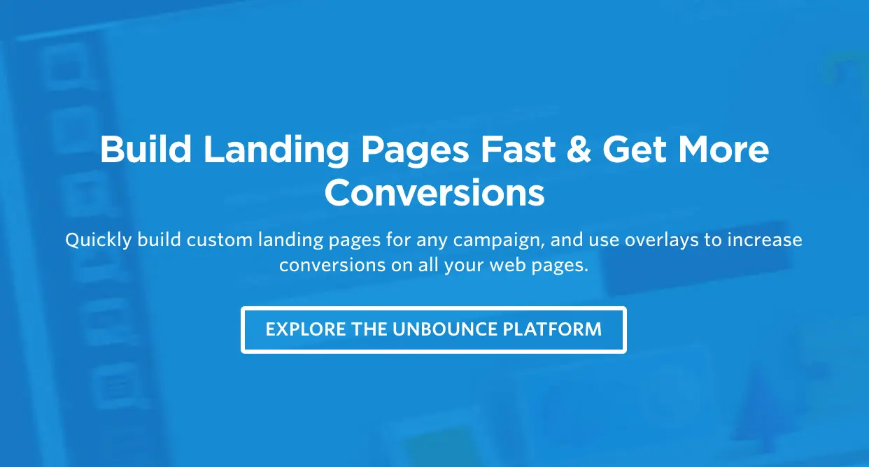
Unbounce takes a different approach by telling users what they’ll be doing by using its product. It’s literally telling users to “build landing pages fast and get more conversions” by signing up to the Unbounce platform. Essentially, this implies they’re wasting their time and not getting the conversions they could by not using Unbounce.
This use of imperative sentence structure is the most common approach to CTA copy you’ll find.
03ActiveCampaign
If you’ve got a lot of information to get across, it can be hard to organise everything into a visually compelling format. ActiveCampaign’s landing page uses clickable icons to break up its content into email marketing, site messaging and SMS categories. This gives users an overview of what information is available and all they need to do is click an icon to get more information.
Here’s what users get when they click the email marketing icon:
Information overload is something you want to avoid with landing page design but, like many enterprise software platforms, ActiveCampaign has a lot of stuff to get across. I personally prefer a more minimal approach but check out the ActiveCampaign page if you’re going for a content-heavy design.
04Asana
The landing page for Asana’s free trial campaign shows how minimal SaaS landing pages can be. The copy is stripped down to the bare minimum of key benefits and calls to action:
This is no accident either. One of Asana’s key selling points is “from chaos to clarity” and the tech company stays true to its brand image across all of its landing pages. Of course, this wouldn’t work if Asana didn’t have such a strong grasp of writing great copy.
It’s easy to say “less is more” when it comes to landing page copy, this only applies when you make the most of every word you write.
05IFTTT
IFTTT is another SaaS platform but this fits into a very different category than ActiveCampaign and Asana. IFTTT is a lightweight app that links other platforms together, meaning it doesn’t have a tonne of features to plug, unlike our previous two examples. So, while Asana has a real decision to make regarding how much copy it fills its landing pages with, it only makes sense for IFTTT to take the minimal approach - and this is precisely what it does.
Once again, there’s short, punchy copy that tells users what they’re missing out on by not using IFTTT and what they have to gain by signing up.
And, of course, it wouldn’t be right to get through a landing page copy article without mentioning the classic benefits vs features best practice:
IFTTT doesn’t have the largest collection of landing pages but it certainly knows how to pen some good copy.
06Hootsuite
While I’m not the biggest fan of Hootsuite page designs, this established name in social media management has been writing great copy for years. When it comes to any automation tool, there is one key selling point: convenience. Hootsuite sets itself us as the most convenient of automation tools by billing itself as “the easiest way to schedule posts on social media.
This point is reinforced throughout Hootsuite’s free trial landing page, with a full section dedicated to explaining the various ways its platform saves you time.
07Shopify
Shopify gives us another example of minimal copy, despite being a platform with a lot to say. I’ve seen a lot of Shopify landing pages over the years and they get lighter on the copy front as time goes by. Once again, though, it’s long descriptions replaced by punchy, compelling language that highlights the key benefits of using the platform.
The point is, you don’t need to say everything on your landing page. The goal is to capture people’s interest and encourage them to convert - or, failing that, lead them to another part of your site where you can capture them as a different kind of lead.
08Leadformly
Leadformly hits users with the big promise as soon as they land on the page. Let’s face it, who wouldn’t want to capture and convert up to 300% more leads? This theme continues nicely as users scroll down the page when they come across the key question:
Of course they’re not getting enough qualified leads - this is precisely why users landed on this page in the first place. By echoing user concerns in its copy, Leadformly tells them it can deliver precisely what they’re looking for and, once again, this is backed up by another promise: capturing 2-3X more leads.
It’s powerful, confident copy that leaves little doubt in visitors’ minds. And, before we move on, there’s one more snippet I want to talk about:
Finally, Leadformly sets itself apart from other form builders by explaining the science behind its product and the years of experience that went into creating it. For a tool that makes big promises, it’s important that Leadformly is able to convince visitors that it has a history of getting proven results.
09Infusionsoft
Infusionsoft is another big name in the automation game, this time providing a sales and lead nurturing platform for brands that need to streamline customer interactions. Much like Hootsuite earlier, Infusionsoft knows what its selling point is and the core benefit its product provides.
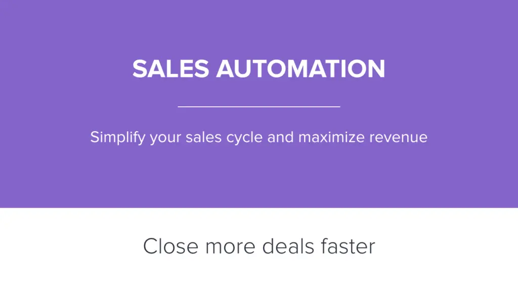
Automation, simplicity and speed are how Infusionsoft helps you maximise revenue and not a single word is wasted on saying anything else.
The tone implies businesses that aren’t using Infusionsoft are unorganised, underperforming in the sales department and wasting time while they’re at it.
10Pocket
Much like IFTTT, Pocket is a relatively simple productivity app that serves a single, but powerful function. It starts by highlighting a common user problem: discovering interesting content you’re not ready to read right now. Is this enough to get people signing up, though?
Pocket takes users through the actions they can take using the app, recreating the experience of browsing the web with Pocket on their devices.
Pocket has the exact opposite problem most SaaS companies experience when it comes to landing page copy. Instead of having a tonne of information to condense down, it had to come up with a way to turn a basic function into something exciting - and it does a great job.
Give landing page copy the attention it deserves
Most brands are slowly coming round to the idea that design and visual elements are incredibly important with landing pages. When it comes to crafting powerful landing page copy, though, there’s a lot of work still to be done. All of the examples we’ve looked at today showcase concise copy that packs a punch with careful wording and short snippets of text.
Not only that but they highlight the key benefits of each product and hint at what users are missing out on by not taking action. And, of course, they all point towards a nearby call to action that makes it difficult for users to resist clicking the all-important button.
FAQ
What are the most important elements of landing page copywriting?
The most critical elements are a compelling headline, clear value proposition, and a single focused call-to-action that guides visitors toward conversion. Your copy should address the visitor’s primary pain point in the first few seconds, then build credibility through social proof or specific benefits. Focused messaging that eliminates distractions consistently outperforms generic or multi-purpose landing page copy.
How do you write landing page copy that converts?
Write copy that speaks directly to your visitor’s desired outcome rather than listing features of your product or service. Use specific, benefit-driven language and remove any friction from your messaging by being transparent about what happens after they convert. Visitor-centric copy that emphasises outcomes performs significantly better than product-focused alternatives, as demonstrated by high-converting landing pages across industries.
What should a landing page copywriting template include?
A solid template should contain sections for headline, subheading, problem statement, solution overview, key benefits, social proof, objection handling, and a clear call-to-action. Each section should build on the previous one to create a logical narrative flow that moves the visitor closer to conversion. Structured templates that follow a problem-solution-action framework remove guesswork and accelerate the copywriting process.
How long should landing page copy be?
Landing page copy length depends entirely on your product complexity and audience familiarity, but most high-converting pages range from 200-500 words for simple offers to 1,000+ words for complex B2B solutions. The key is eliminating every word that doesn’t serve your conversion goal, not hitting a specific word count. Concise, purposeful copy that removes fluff outperforms lengthy pages filled with unnecessary information.
What copywriting mistakes should you avoid on landing pages?
Avoid vague claims without proof, multiple competing calls-to-action, jargon your audience won’t understand, and copy that focuses on your company instead of visitor benefits. Many marketers also make the mistake of writing for themselves rather than their target audience, resulting in messaging that fails to resonate. Audience-specific language and single-focus messaging eliminate the most common copywriting pitfalls that tank conversion rates.
How do you optimise landing page copy for conversions?
Test different headlines, value propositions, and call-to-action wording using A/B testing to identify which messaging resonates most with your audience. Analyse visitor behaviour through tools like heatmaps to understand where attention drops, then refine your copy to address objections at those critical moments. Continuous testing and data-driven refinement transforms average landing page copy into high-performing conversion machines.
What makes landing page copywriting different from other types of copywriting?
Landing page copy must accomplish conversion within a single, focused page without navigation distractions, whereas other copywriting (emails, ads, blog posts) can build interest across multiple touchpoints. Your landing page copy is the final persuasion step before a visitor makes a decision, so it requires extreme clarity and specificity about the next action. Single-page conversion focus makes landing page copywriting fundamentally different from broader marketing copy.
Should you use emotional or logical appeals in landing page copy?
The most effective landing pages combine both emotional appeals that create desire with logical appeals that justify the decision through facts, data, or social proof. Your headline might use emotional language to capture attention, but your supporting copy should provide rational reasons why your solution solves their problem. Balanced emotional-logical messaging creates the psychological conditions necessary for conversion across diverse audiences.