


The average web form converts roughly 2.35% of users who click through to a landing. We’re really not fans of that statistic here are Venture harbour because we can tell you a 2.35% conversion rate from any of your lead generation forms is way lower than it should be.
We’re not saying the stat is inaccurate; we’re saying the average web form convert nowhere near as well as it should do.
That 2.35% average is for landing pages, too. But what about forms on your homepage, blog posts and pages that aren’t aggressively optimised for conversions - are you going to accept conversion rates lower than 2.35%?
No, of course you’re not.
You’re going to follow the steps in this ultimate guide to web form optimisation and walk all over the average conversion rates from underperforming web forms.
Designing forms that convert
It might be a cliche, but prevention is the best cure when it comes to crappy form conversion rates. Make no mistake about it, conversion optimisation is time-consuming, trick and a lot more difficult to make profitable than any of the CRO software providers will ever let on.
Designing forms that convert from day one is always better than optimising for performance later - so let’s start with this.
For a comprehensive look at form design and UX best practices, check out this blog post from earlier this year. In the meantime, here’s a quick summary of the essentials you need to know for designing high-converting forms from the get-go.
Multi-step forms outperform traditional designs

The single biggest takeaway we’ve had from testing forms over the past few years is that multi-step forms perform significantly better than traditional form designs - especially for important conversion goals or long forms.
Otherwise, stick to single column layouts

If you’re going for the traditional single-step form design, then stick to a single column layout. Aside from making them more legible and easier to comprehend, single-column layouts look less intimidating and they’re relatively simple to make responsive for different screen sizes.
The only exception I would suggest here is if your form has two or fewer fields (e.g.: email address and password) and a button. In this case, you might want to explore other layouts, such as horizontally stacking your fields above the CTA button.

*Note: This design from FreshBooks is using placeholders as field labels which is generally considered a UX bad practice (naughty, naughty)
Going back to single-column designs, here are some more guidelines for you to follow:
- Place labels above fields and align them to the left
- Make fields the same width and responsive
- Make your CTA button the same width as your fields
- Don’t use placeholders as labels*
- Use placeholders to provide context where needed - e.g.: date formats
- Avoid slicing fields for phone numbers, dates, etc.
You’ll also want to follow general best practices for readability in terms of font choices, text size, colour contrast and spacing.
Shorter forms are not always better
Most best practice guides will tell you to keep the number of form field to an absolute minimum. The logic is this: more fields mean more friction and more friction means fewer conversions - but this isn’t always the case. Countless tests by ourselves and other UX pros have found that shorter forms can actually hurt your conversion rates in many scenarios.
Sometimes more fields will get better results; other times fewer fields will do the trick.
We’ll show you how to do this later in this guide but, for now, don’t stress yourself over the number of fields on your forms. Ask for the info you need (think lead nurturing) and just avoid adding any unnecessary field.
Remove unnecessary fields
While you shouldn’t be afraid of asking for all the information you need from users, having unnecessary fields in your form is always going to add unwanted friction.
First of all, forget about asking people to retype their email addresses and passwords. It wasn’t cool in 2001 and it’s certainly not welcome now. Then, look at the fields in your form design and ask yourself Do we really need that piece of data from users now?
If the answer is no, then you’re probably looking at an unnecessary field that could be removed. You can always test variations with and without this field later to see if there’s an impact on conversions.
Another dead giveaway is when you find yourself putting required and non-required fields on your form. If that phone number field isn’t required then why is it there in the first place?
Don’t forget, you can get more data after form completion
The whole point of your form is to collect the info you need from users, but you don’t need to get it all right now. You can get more data from users after they’ve completed your initial form through your follow-up emails.
If you’re simply asking people to create an account, all you really need at this stage is their email address and a password. You can get the extra data you need later when they fill out their account details, removing any friction points before the initial conversion.
This isn’t going to work for every form or conversion type but it’s something to consider with each form design. Once again, ask yourself Do we really need that piece of data from users now?
Make your forms easy to complete
You can’t expect people to complete your forms if you make life difficult for them. It’s amazing how many web forms fail when it comes to basic usability principles like using the right HTML tags - don’t make these kinds of mistakes.

The HTML5 month input type brings up this month selector on Android devices
- Use HTML5 input types: To make it easier for mobile users to enter email addresses, phone numbers, dates and other details.
- Allow tab navigation: Make sure desktop users can navigate your form fields by using the tab key.
- Use postcode lookups: To make filling out addresses faster.
- Use predictive search: For fields with a lot of predefined options
- Enable browser autofill: To save users retying the same old information time and again.
- Don’t use CAPTCHAS: All you’re doing is advertising that you’ve got a spam problem and making life harder for your users.
- Use plenty of contrast: Make sure people can see your forms in dull and harsh light, indoors and outdoors.
- Use validation wisely: Validation should make it easier to fill out forms correctly, not more difficult.
Predictive search making it easier for users to type and choose a category answer
Before you start worrying about the number of form fields or the colour of your CTA buttons, make sure you understand the fundamentals of form usability. These will have far more of an impact on performance than tweaking the finer details.
Why best practices don’t always work
Earlier, we mentioned the popular form best practice principle that says shorter forms with fewer fields perform better than longer forms - and said this isn’t always the case.
There are multiple reasons for this:
- Some conversion goals require more data
- Sometimes users want to give you more information
- Short forms can sometimes appear untrustworthy
- Loss aversion makes longer forms more compelling
- Longer forms tend to generate a higher quality of lead
Imagine a user who is looking for legal advice - are they going to hire a lawyer who only asks for their name and email address? Of course not. They want to hire a professional they can trust; someone who asks the right questions and a longer contact form is going to reassure this user they’re dealing with the legal advisor for them.
There are plenty of conversion goals like this: account registrations, insurance forms, loan applications, price comparisons, property searches and all kinds of other online actions.
The point is this: best practices are only general guidelines and it’s your job to find out which ones work for you and which ones don’t. Here are some of the form insights we’ve unveiled from optimising hundreds of forms over the past few years.
You won’t find these in your “best practice” guides.
Multistep forms get up to 300% more conversions

We touched on this earlier and said we’d have more details for you - so here they are. Our tests have revealed that multi-step forms increased conversions by up to 300% for major brands like Expedia and HP, as well as startups like Crew. These brands are now generating thousands of extra leads every month after switching to multi-step lead generation forms.
So how did we discover this? Well, it was with a bit of luck mixed in with a whole bunch of psychological science and design savvy.
Friction is psychological
In terms of physics, friction is a force - something you can feel, hear and sometimes even smell (think burning rubber of tarmac). When it comes to conversions, though, friction is entirely psychological and this means you don’t need to remove friction points if you can change people’s perception of them.
When a user sees a long form stuffed with fields, they understandably feel unenthusiastic about filling it out. When the same user completes a multistep form with the exact same questions, they never see that long list of fields and they never feel that sense of dread before starting.
You haven’t reduced the friction, you’ve simply repackaged it in a way that it doesn’t stir negative emotions. Now, you’ve got all the data you need for your conversion goals and your users didn’t even blink.
Friction isn’t always a bad thing
Imagine a travel comparison app that seeks out the best deal on flight tickets. Users have spent a just over a minute filling out their search criteria and then they hit the “find my flights” button.
All the data this app needs to instantly return a list of the cheapest available flights is already there - so why do comparison sites leave users waiting with those progress bars for a few needless seconds?
It’s because users have just spent time filling out a form and they want to receive some kind of perceived value. They want to feel like the app is doing a whole bunch of hard work on their behalf. They don’t want to see results load instantly; they want to see the app work up a sweat, watch that progress bar struggle for a moment and then receive their well-earned list of results.
Remove this friction and the perceived value of the app is reduced.
Once again, there are countless other examples of when friction can be a good thing. Slack stops you from sending messages to people in the early hours of the morning, ActiveCampaign stops you from deleting automations with one click and Pinterest forces new users to follow at least five interests so they can deliver more relevant content.
Progress bars make it difficult to quit your forms
Users think progress bars are there to tell them how much work is left to do, but they’re not. Progress bars are actually there to tell them how much work they’ve already completed and this is because users are unlikely to quit a form after they invested time in filling half of it out.
This is due to a psychological phenomenon known as loss aversion. Essentially, people feel like they’ll be losing the time they’ve already invested in filling out your forms to this stage and be compelled to finish the job.
So make sure you have progress indicators of some kind on your multistep forms.
Reduce typing to a minimum
Reducing the number of fields in your forms can have a positive impact but we’ve found that reducing the amount of typing users need to do is far more important.
Make sure you allow autofill (users can turn it off if they want), never ask users to fill out the same info more than once and use auto-complete where appropriate. This is especially important on mobile because typing on phones is still a major drag.
Also, replace traditional form fields with selectable images where possible. These things make a huge difference to field and form completion rates.
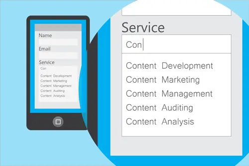
Selectable images are among the most engaging question type
Instead of radio buttons and checkboxes, we’ve found that clickable image icons are the most engaging way to ask users to choose between defined options. This is especially true for mobile users who can simply tap the screen without worrying about accidentally selecting the wrong option.
Psychologically speaking, selectable images look nothing like the radio buttons and checkboxes that easily overwhelm users - even though they’re essentially the same thing, just designed differently.
Once again, it’s not so much the number or type of fields in your form but how you present them that really matters.
Conditional logic turns long forms into engaging experiences
Conditional logic adapts the fields users see in your forms based on how they complete previous fields. So, instead of showing all your fields to every user, you can remove all of the questions directed at small business owners when they’ve already confirmed they’re an enterprise brand, for example.
Aside from hiding irrelevant fields from each user, this increases the relevance of every field they say, creating shorter and more engaging form experiences. Combine this with multistep form designs and even the longest forms can hit the most ambitious of conversion targets.
More importantly, you can use this tactic to segment leads instantly on your website and this is one of the biggest ways modern form builders like Typeform, Jotform, and Paperform have transformed the way we generate and nurture leads.
Analysing the performance of your forms
With your forms designed to convert from the get-go, your next move is to analyse their performance to make sure you’re hitting targets and spot room for improvement.
This is where form analytics is crucial and you’re going to need to look beyond conversion rates to see where things are going right/wrong. You’re going to need a dedicated form analytics tool that helps you diagnose specific issues with your web forms and fix or remove them.
Form analytics: looking beyond conversion rates
Conversion rates are an important metric, of course, but you can’t just make changes to your forms and hope they’re going to have a positive impact. Profit is always more important than the volume of conversions and a profitable CRO strategy pinpoints specific problems instead of trying out design changes and hoping for the best.
With a dedicated form analytics tool, you get detailed insights into what users are doing with your forms - things like:
- The percentage of users who start filling out your forms
- The percentage of users who successfully complete your forms
- How many users fail to complete your forms
- How long it takes users to complete your form
- How long it takes users to complete specific fields
- The last field users attempt to complete before quitting the session
If people aren’t even starting to fill out your forms, this tells you your problems lie elsewhere: form location, page copy, UX issues, etc. While a low completion rate tells you something no your form is getting in the way and you can then pinpoint which fields are causing problems.
Stop wasting crucial time and budget on form optimisation tests that don’t yield a positive result. Get yourself a dedicated form analytics tool and pinpoint the exact issues that are getting in the way of conversions.
And remember, conversion rates aren’t the be all and end all. If your forms are generating a large number of leads but few of these are turning into profitable customers/users then you might need to optimise your pages and forms to generate leads that are more likely to open their wallets, even if this means lower conversion rates.
Look at performance across devices
Make sure you segment your form data by device and look at performance across mobile and desktop. Mobile form conversions are often lower than desktop for a number of reasons:
- A lot of users turn to mobile for browsing/research and then switch to desktop before converting
- Forms are often poorly optimised for mobile
- Typing on mobile can be a chore
- Forms can appear longer on smaller devices
- Digital downloads can use precious mobile data
What you don’t want to do is optimise your forms for one device type and then throttle performance on the other - especially if your conversion goal is simply better suited to the other device type.
Ask users about your forms
Who better to tell you what’s wrong with your web forms than the users that fail to complete them? It’s amazing how many marketers I speak to that don’t reach out to users for feedback. Sure, you’re not always going the response you’re looking for and adding more friction after someone’s just failed to fill out your form seems like adding insult to injury - I get it.
Reality check: the damage is already done for users who fail to fill out your forms. These guys/girls are no good to you but it only take the right piece of feedback from one or a few of them to completely transform results with the users who matter most: the next few hundred or thousand.
Meanwhile, users who have failed to fill out your forms might appreciate you asking for feedback and asking the question gives you one last chance to turn this user into a valuable lead.
Hotjar’s feedback features are one of the main reasons we still use the platform and there’s another great tool you can use to pinpoint problems with your forms.
Record user sessions to see what users are doing
This one is time-consuming but it can really pay to look at user session recordings to see what’s going wrong with your own eyes. This is another great feature you get from Hotjar and it’s helped us unearth some issues that data identify by itself.
Read our Hotjar review for more details about why we like it and where we think it could be improved.
Key things to look out for
As we say, your goal at this stage is to pinpoint specific issues that are preventing people from completing your forms, rather than blindly remove fields or test new buttons in the hope of better results.
Here are some of the most common form issues you should look out for:
- Low start rates: Very few users are even starting to fill out your form.
- Low completion rates: A low percentage of users who start filling out your forms successfully complete them.
- Field abandonment: If a lot of users are quitting the session after hitting a specific field, you know this is causing problems.
- Time in fields: Users spending a lot of time in fields that should be quick to fill out.
- Corrections: Fields where users are regularly having to correct their entries.
- Multiple corrections: When users need to correct the same field more than once.
- Unsuccessful submissions: When a user hits the send button but your validation blocks the submission.
- Missing data: When a user hits the send button but they haven’t entered a piece of required data and the submission is blocked.
- Validation drop-offs: Where users quit the session instead of correcting entries flagged by validation.
- Format issues: Where users enter the correct format but your validation doesn’t accept the format - e.g.: dates and phone numbers.
- Creating account details: Where users have problems creating usernames and/or passwords that are available and pass your validation requirements.
- Problems entering card details: One of the most common causes of cart abandonment.
All of these warning signs will help you narrow down on specific issues your users are having and test highly relevant fixes. This is essential if you want to achieve a high rate of successful tests and make form optimisation time-effective and profitable.
If you’re looking at low start rates (people aren’t even starting to fill out your forms), then you need to look at issues such as where your form is placed on the page, how effectively it stands out (e.g.: colour contrast), the content surrounding your form and UX issues that could prevent users from reaching your form - such as slow loading times.
All of the other issues on the list above point to specific completion issues between the moment a user starts filling out your form and seeing that successful submission message.
In most cases, putting a fix to these issues is going to involve removing troublesome fields, rewording your labels, providing more context to help users complete fields, optimising your validation or simply reducing the amount of typing users need to do.
How to run your form optimisation tests
With a wide range of A/B testing platforms available, it’s easier than ever to test changes on your website. The problem is they also means it easy to run unsuccessful tests that tell you nothing - or worse, give you false positives.
You need to know the changes you make actually have a positive impact, otherwise you can cause more harm than good.
A successful A/B test needs to have the following:
- Opportunity: Weaknesses in your forms pinpointed with dedicated form analytics tool.
- Data-driven changes: Design improvements based on data, not guesswork.
- The right metrics and KPIs: How are you going to measure a positive impact?
- Targets: What are your target metrics and KPIs?
- Statistical significance: Enough data to “prove” your outcome is the result of your change, not random chance or other factors.
What you’re not going to do with form optimisation is just test random elements like background colours and see what happens. You’re going to pinpoint specific weaknesses with your form analytics tool so you’re fixing the problems that matter most and each of your tests have a higher chance of making a positive impact.
Wherever possible, test changes backed up by data instead of working on hunches. For example, if you’re removing a form field, what evidence do you have to suggest it will improve completion rates?
If the answer is none, then you’re more likely to run a test that yields negative results. This is going to happen at times but you want to reduce the amount of failed tests as much as possible and data-driven changes give you the best chance.
Finally, make sure your tests are statistically significant. This means running them for long enough that you can trust your result. This is one of the biggest CRO mistakes marketers make and it makes the entire process pointless.
Making form optimisation profitable
To make form optimisation profitable (or any kind of CRO), the positive impact from your tests needs to outweigh the time, cost and use of resources it takes to run them. Every test that yields a negative, inconclusive or insignificant result is another dent in your optimisation ROI.
The problem is negative, inconclusive and insignificant tests are very easy to run while positive and statistically significant test are far more difficult.
This is why it’s so important to have data backing up your choices at every stage of the process. I’m always amazed when I talk to marketers and UX designers about conversion optimisation, how many of them just dive in and start running tests on random elements without any data suggesting there’s a problem to begin with.
Are you sure users really care whether your CTA button says “get my quote” or “get your quote”?
In our experience, you’re going to get much better results by pinpointing genuine user issues, such as fields that are causing people to hesitate and testing direct fixes, such as added hints as placeholders.
Sure, there are times when you want to test out bigger variations, such as forms above the fold vs below the fold or long forms vs short forms - and you can’t start with data you don’t have. These are important design choices that are almost always going to have an impact on conversions and there’s nothing wrong with testing your way to the answer (as long as you achieve statistical significance, once again).
Just don’t start testing out different font styles when you’ve got no reason to believe users care whether you go for serif or sans-serif.
Optimising for post-form conversions
All of this talk about optimising forms for conversions makes it sound like the job is done once users hit the submit button. Of course, this isn’t true and there’s never enough talk in guides like these about how forms fit into your wider marketing strategy and optimising your funnels before and after forms.
First of all, most funnels are going to have multiple forms anyway: newsletter sign-ups, account creations, logins, payment forms, contact forms, feedback forms and probably multiple different types of lead generation forms (free downloads, webinar sign-ups, free trials, etc.).
All of these forms may be pointing towards the end goal of a sale but the journey users take can vary drastically and this is why you’re going to need a solid CRM to manage your leads as they work their way through your sales funnels.
We use ActiveCampaign because, aside from being a quality CRM platform, it also offers 90% of everything we need for email marketing and then you have its incredible automation features - all of which you’re going to need to manage large volumes of leads effectively.
Read our ActiveCampaign review to find out how it transformed our business.
With ActiveCampaign, Typeform, Jotform, Paperform and Brevo (for transactional emails), we’ve got a fully-functional and almost entirely automated lead generation strategy that brings in potential customers for us, segments our leads into lists and sends out email responses based on the information each user provides us.
We’re not just looking at high-converting forms here; we’re looking at a system of forms built into an automated strategy that guide users from one conversion goal to the next and this is your ultimate aim with form optimisation.
It all starts with a modern form builder like Typeform, Jotform, or Paperform and conditional logic - something we mentioned earlier in this guide. This allows us to segment leads instantly from our forms, based on the info users type in and this data is sent directly to ActiveCampaign, which automatically adds them to different marketing lists.
Next, ActiveCampaign automatically sends out response emails with messages we’ve tailored for each list. This way we can personalise content for every kind of lead we’re targeting and then subsequent messages based on how they respond to our messages.
So it’s not only our forms that we’re optimising for conversions but also the messages we send out to users and how we automate our processes after the initial form completion.
We also need to optimise each individual form with the rest of our marketing goals in mind. For example, if we’re not turning enough leads into paying customers with our forms at the end of our sales funnels, we may look at reducing the volume of conversions in our earlier forms while trying to increase the quality of those leads. so they’re more likely to make the final commitment.
When you have multiple forms in your sales funnels, you also need to optimise them collectively - as well as individually.
Get the right data, choose the right tests and build more profitable forms
The biggest mistake you can make with web forms is not designing them for conversions from day one. The second is not optimising for better performance but the third one is becoming increasingly common: trying to optimise forms and failing to make it profitable.
If you’re not making enough of a positive impact to justify the time, money and resources going into your CRO efforts, you’ve got a problem. The solution? Start with the right data, choose the right tests (based on this data) and give every test the best chance of delivering a positive result.
FAQ
How many form fields should you include to maximise conversions?
The fewer fields you include, the higher your conversion rate will be—aim for a minimum viable form that only captures essential information. Each additional field can reduce conversions by 3-5%, so removing even one unnecessary field often yields measurable improvements. Test your form with progressively fewer fields to find the sweet spot between data collection and user friction.
Where should you place forms on your website for better conversions?
Form placement depends on your specific audience and conversion goal, but above-the-fold positioning typically outperforms below-the-fold placements by capturing users before they scroll. However, the most effective location varies by industry and user intent—some high-intent pages convert better with forms mid-page or at the bottom. Test multiple placements on your highest-traffic pages to identify what works for your particular audience.
What’s the average web form conversion rate?
The average web form converts approximately 2.35% of users who click through to a landing page, which is significantly lower than it should be for most organisations. This statistic reveals that most businesses are leaving substantial conversion gains on the table through poor form design and optimisation. By implementing the strategies in this guide, you can realistically double or triple this baseline conversion rate.
How do you test and optimise web forms effectively?
Run A/B tests on individual form elements—such as field labels, button copy, form length, and input types—rather than overhauling your entire form at once. Analyse each test for statistical significance and measure impact on both form completion rates and post-form conversions. Document what works for your specific audience, as best practices don’t always translate across different industries and user segments.
Why don’t standard form best practices always improve conversions?
Best practices are averages, not guarantees—what works for one industry or audience may actually harm conversions for another. Your specific users, traffic source, and conversion goal create a unique context that requires testing rather than assumption. This is why analysing your own form performance data is more valuable than blindly following generic optimisation rules.
What should you optimise after users submit a form?
Post-form optimisation focuses on confirmation pages and follow-up sequences that guide users toward the next conversion step. Many organisations neglect this phase, missing opportunities to upsell, cross-sell, or improve user experience after the initial form submission. Analyse drop-off rates in your post-form funnel and test improvements to confirmation messaging, email sequences, and next-step clarity.
How do you analyse web form performance?
Track form completion rates, abandonment rates, and time-to-completion using analytics tools and heatmapping software to identify where users struggle. Segment this data by traffic source, device type, and user behaviour to spot patterns—for example, mobile users may abandon at different fields than desktop users. Use this data to prioritise which form elements to test first.